The following will achieve this effect :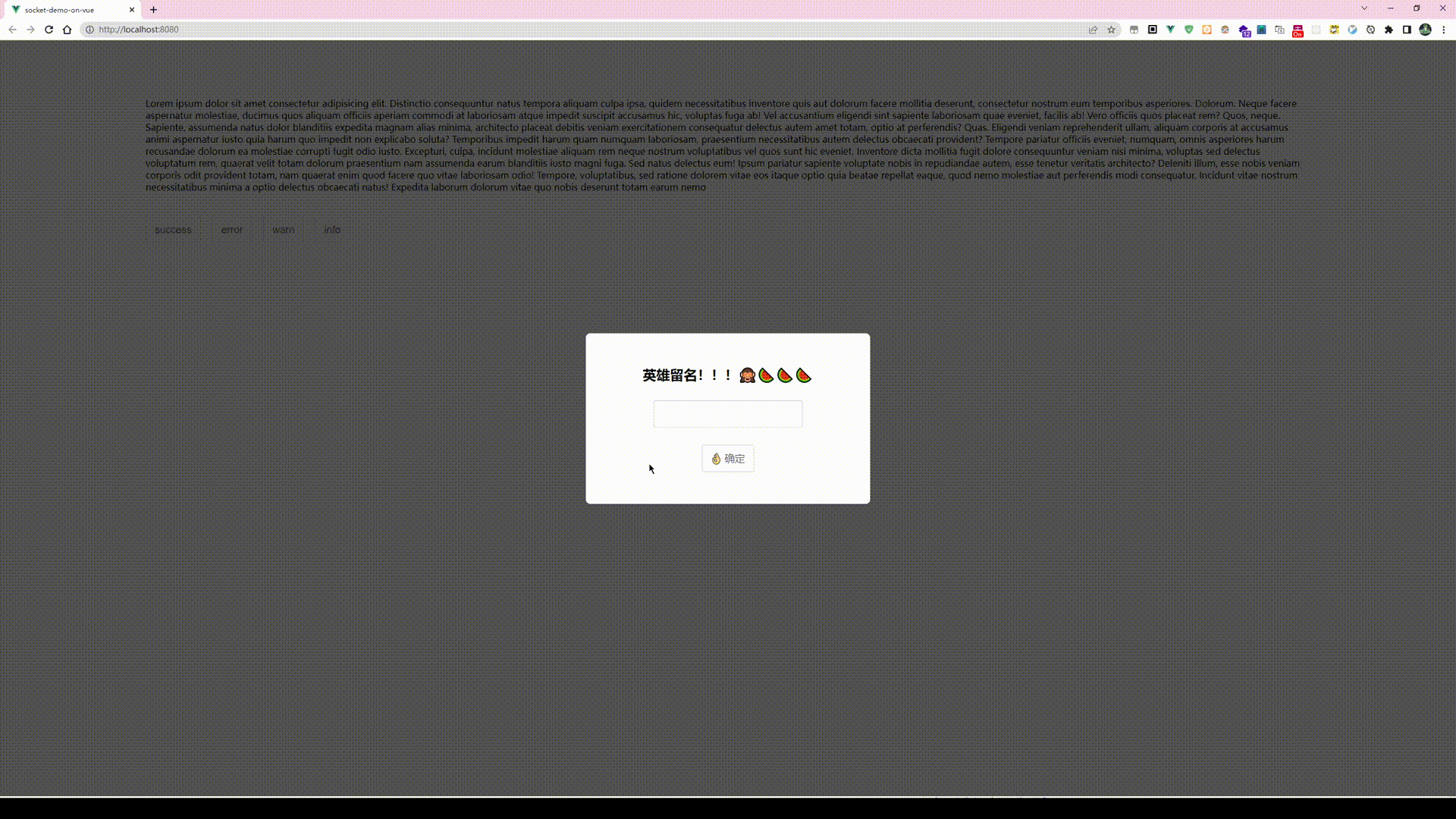
Component dynamic creation script :
import Vue from "vue";
import Notice from "@/components/Noticer/Notice.vue";

function create(Component, props) {
  //  Create an instance first
  const vm = new Vue({
    render(h) {
      //h Namely createElement, It returns VNode
      return h(Component, { props });
    },
  }).$mount();
  //  Manual mount

  //  Judge whether it exists container, If it does not exist, create
  let container;
  container = document.querySelector(".noticer-container");
  if (container == null) {
    container = document.createElement("div");
    container.classList.add("noticer-container");
    container.style.position = "fixed";
    container.style.top = "50px";
    container.style.right = "0px";
    container.style.overflow = "hidden";
    container.style.zIndex = 9999;

    document.body.appendChild(container);
  }

  container.appendChild(vm.$el);

  // Destruction method
  const comp = vm.$children[0];
  comp.remove = function () {
    container.removeChild(comp["$el"]);
    vm.$destroy();
  };
  comp.show();
  return comp;
}

Vue.prototype.$notice = {
  error: function (props) {
    create(Notice, Object.assign(props, { type: "error" }));
  },
  info: function (props) {
    create(Notice, Object.assign(props, { type: "info" }));
  },
  success: function (props) {
    create(Notice, Object.assign(props, { type: "success" }));
  },
  warn: function (props) {
    create(Notice, Object.assign(props, { type: "warn" }));
  },
};
Here are some things worth noting :
- container: The role of is notice The container of , It can be used to locate notice Where on the page , Be careful notice Should not scroll with the page , Therefore, its positioning is
fixed, The reason why it is set tooverflow:hiddenThe reason is ,notice When appearing and removing , The animation offset occurred , Will make the page appear horizontal scroll bar . To avoid duplicate creation container, Here is a judgment logic . Then all dynamically generated notice example dom Will passappendChildAdd to this container . - When removed , What was removed was
vm.$children[0]["$el"], as a result of ,Notice Implementation of the template , The outer layer is covered with a transition , And this transition It doesn't render dom Of .
- container: The role of is notice The container of , It can be used to locate notice Where on the page , Be careful notice Should not scroll with the page , Therefore, its positioning is
establish Notice Component template :
<template> <transition enter-active-class="animate__animated animate__slideInRight" leave-active-class="animate__animated animate__slideOutRight" @after-leave="afterLeave" > <div v-if="isShow" class="notice__root"> <div :class="`notice-type-${type}`" class="noticer"> {{ type === "error" ? "🍓" : type === "success" ? "🍀" : type === "warn" ? "🍋" : "🐳" }} : {{ message }} </div> </div> </transition> </template> <script> export default { props: { title: { type: String, default: "", }, message: { type: String, default: "", }, time: { type: Number, default: 1000, }, type: { type: String, }, }, data() { return { isShow: false, }; }, methods: { show() { this.isShow = true; setTimeout(this.hide, this.time); }, hide() { this.isShow = false; }, afterLeave() { this.remove(); }, }, }; </script> <style lang="less" scoped> @error: rgb(255, 30, 30); @warn: rgb(240, 192, 0); @success: rgb(0, 144, 74); @info: rgb(0, 80, 218); @errorBg: rgb(255, 208, 208); @warnBg: rgb(255, 245, 207); @successBg: rgb(210, 255, 233); @infoBg: rgb(203, 222, 255); .notice__root { user-select: none; padding: 5px 50px 5px 5px; } .noticer { padding: 5px 20px; margin: 10px 0px; // margin-right: 50px; border-radius: 8px; font-size: 16px; width: auto; min-width: 280px; max-width: 300px; word-break: break-all; text-align: center; box-sizing: border-box; } .notice-type-error { color: @error !important; border: 2px solid @error; box-shadow: 1px 1px 5px 2px @errorBg; background-color: @errorBg; // border: 1px solid red; } .notice-type-warn { color: @warn !important; border: 2px solid @warn; background-color: @warnBg; box-shadow: 1px 1px 5px 2px @warnBg; } .notice-type-success { color: @success !important; border: 2px solid @success; background-color: @successBg; box-shadow: 1px 1px 5px 2px @successBg; } .notice-type-info { color: @info !important; border: 2px solid @info; background-color: @infoBg; box-shadow: 1px 1px 5px 2px @infoBg; } </style>stay main.js You can execute the script by importing the script in
import Vue from "vue";
import App from "./App.vue";
import "animate.css";
import "@/components/Noticer/NotificationBanner.js";


new Vue({
  render: (h) => h(App),
}).$mount("#app");
Examples used in code :
if (!this.nickname) {
    this.$notice.error({
        message: " Hero ! whose names ?",
        time: 3000,
    });
} else {
    this.showModal = false;
    this.$notice.info({
        message: this.nickname + " coming !!!",
        time: 3000,
    });
}
Dynamically create the execution logic of components :
When in use :
this.$notice.error({
    message: " Hero ! whose names ?",
    time: 3000,
});
The code above triggers , It actually triggers NotificationBanner.js Medium create function , This function creates one notice Component instance of , And added a remove Method , Then directly trigger the... In the component show Method .
notice In template instance :
methods: {
    show() {
        this.isShow = true;
        setTimeout(this.hide, this.time);
    },
    hide() {
        this.isShow = false;
    },
    afterLeave() {
        this.remove();
    },
},
show Method execution , Apart from showing notice, Immediately set a delay function to execute hide Method .
hide Method execution , vue Provided transition hook afterleave() Will be triggered after the removal animation is completed . Now , To trigger remove Method , Will be notice Component instance removal .
![buuctf [PHP]CVE-2019-11043](/img/ba/d97fe48acfd20daa66d47f34d99cf1.png)