当前位置:网站首页>img 响应式图片的实现(含srcset属性、sizes属性的使用方法,设备像素比详解)
img 响应式图片的实现(含srcset属性、sizes属性的使用方法,设备像素比详解)
2022-07-29 04:30:00 【朝阳39】
什么是响应式图片?
响应式图片即针对不同的设备分辨率和尺寸,显示对应的最佳分辨率的图片。
具体表现为:
- 高分辨率的屏幕,显示高分辨率图像(确保高清屏上,图片依然足够清晰)
- 低分辨率的屏幕,显示低分辨率图像(提升移动端网速较慢时的访问速度)。
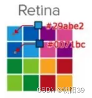
高清屏是怎样让图片变模糊的?
此时需要学习一个新概念 —— 设备像素比
设备像素比 = 物理像素(设备像素) / 独立像素(CSS像素)
- 普通屏上1个css像素对应1个物理像素
- 高清屏上1个css像素对应4个或更多物理像素
以css像素为200px*300px的 img标签为例,普通屏幕下对应的物理像素为200*300,而高清屏(如苹果的retina屏幕)对应物理像素为400*600

即4个物理像素显示一个css像素
若图片资源的分辨率为200*300
在普通屏幕上,1个css像素刚好对应1个物理像素,则图片能清晰显示

在高清屏幕上,1个css像素对应4个物理像素,而位图像素不可分割,屏幕便只能就近取色,导致图片模糊
为了解决高清屏导致图片模糊的问题,便需要使用更高分辨率的图片,如400*600的图片,但更高分辨率的图片尺寸也会更大,需要消耗更长的页面加载时间。
对于普通屏,更高分辨率的图片虽然不会模糊,但会少一些锐利度或者色差,同样会造成资源浪费。
所以最佳方案为:随屏幕分辨率的不同,加载对应分辨率的图片。
响应式图片的实现
通常每个位图图像需要创建至少四个版本:
- source_1x.png “正常”尺寸,如
200*300 - source_2x.png 两倍大小,
400*600 - source_3x.png 三倍大小,
600*900 - source_4x.png 四倍大小,
800*1200
而纯矢量图形,导出一个SVG文件即可。因为SVG文件可无限扩展,无论分辨率如何,在所有屏幕上的显示效果都很好,且当前所有浏览器版本均支持。
srcset属性实现分辨率自适配
srcset 属性内对源图片的数量没有限制
<img src="source_1x.jpg" srcset="source_2x.jpg 2x, source_3x.jpg 3x, source_4x.jpg 4x">
在设备像素比为1时会显示图片source_1x.jpg
在设备像素比为2时会显示图片source_2x.jpg
在设备像素比为3时会显示图片source_3x.jpg
在设备像素比为4时会显示图片source_4x.jpg
浏览器的缩放,也会改变设备像素比,如把页面放大到200%时,设备像素比会变为2,此时便会显示图片source_2x.jpg
srcset 属性实现屏幕宽度自适配
<img src="source.jpg" width="100%" srcset="source_400.jpg 400w, source_600.jpg 600w, source_1280.jpg 1280w">
w 为宽度描述符,已电脑的浏览器为例,设备像素比为1时,当浏览器窗口大小为 400px,则此时图片的实际宽度为 400px*1 = 400w,则会显示图片 source_400.jpg
调整浏览器窗口大小为 600px,则图片的实际宽度为 600px*1 = 600w,显示图片 source_600.jpg
srcset + sizes 属性实现屏幕宽度和分辨率的自适配
sizes 用来表示尺寸临界点,语法为
sizes="[media query] [value], [media query] [value] ... "
所有的值都是指宽度值,且单位可以为PX, VW, EM甚至是CSS3中的计算值CALC
<img src="source.jpg" sizes="(max-width: 376px) 375px, (max-width: 769px) 768px, 1024px" srcset="source_375.jpg 375w, source_768.jpg 768w, source_1024.jpg 1024w">
- 当屏幕宽度为 0 ~ 376px 时,图片宽度按照375px计算
- 当屏幕宽度为 376 ~ 769px 时,图片宽度按照768px计算
- 当屏幕宽度大于 769px 时,图片宽度按照1024px计算
- 在普通的PC电脑上,浏览器缩放比例为100%时,屏幕的设备像素比是1,当浏览器窗口大小为 0 ~ 376px 时,sizes属性计算值为375px,则图片的实际宽度为
375*1=375w,此时浏览器会加载图片 source_375.jpg。 - 在iphone6/7/8中,屏幕的设备像素比是2,sizes属性计算值为375px,则图片的实际宽度为
375*2=750w,此时,375w < 750w < 768w, 则会加载图片 source_768.jpg 。 - iphone plus 和 iphone X中,屏幕的设备像素比是3,sizes属性计算值为375px,则图片的实际宽度为
375*3=1125w,加载图片 source_1024.jpg。
边栏推荐
- Kotlin's list, map, set and other collection classes do not specify types
- 不会就坚持64天吧 查找插入位置
- HC06 HC05 BT
- Webrtc realizes simple audio and video call function
- The daily life of programmers
- DASCTF2022.07赋能赛
- Oracle 插入数据
- Shell string segmentation
- Realize the effect of univariate quadratic equation through JS. Enter the coefficients of a, B and C to calculate the values of X1 and x2
- Make a virtual human with zego avatar | virtual anchor live broadcast solution
猜你喜欢

论pyscript使用感想(实现office预览)

Not for 58 days. Implement prefix tree

Laya中的A星寻路

14.haproxy+keepalived负载均衡和高可用

Machine vision Series 2: vs DLL debugging

STL source code analysis (Hou Jie) notes - STL overview

redux快速上手

Jenkins 参数化构建中 各参数介绍与示例
Several simple and difficult OJ problems with sequential force deduction

MySQL - deep parsing of MySQL index data structure
随机推荐
On quotation
LeetCode(剑指 Offer)- 53 - I. 在排序数组中查找数字 I
Implementation of jump connection of RESNET (pytorch)
Not for 60 days, magical dictionary
Visio draw grid
Update learning materials daily
settings.xml
What is the difference between field, variable and property
Laya中的A星寻路
6.pytest生成allure报告
[c language] PTA 7-55 query fruit price
Exception resolution: error of not finding edu.stanford.nlp.semgraph.semgrex.semgrexpattern in cococaption package
Hengxing Ketong invites you to the 24th China expressway informatization conference and technical product exhibition in Hunan
Multi rotor six axis hardware selection
[C language] PTA 7-47 binary leading zero
[c language] PTA 7-63 falling ball
14. Haproxy+kept load balancing and high availability
Pycharm reports an error when connecting to the virtual machine database
Machine vision series 3:vs2019 opencv environment configuration
On the use of pyscript (realizing office preview)