当前位置:网站首页>How to solve the existing 1px problem?
How to solve the existing 1px problem?
2022-06-09 11:47:00 【Front end talent】

Recently, I have been deeply influenced by 1px Trouble , The style displayed on the mobile terminal is either thick or thin 、 Can't even see . Maybe everyone has tried or is using various solutions , But for physical pixels 、 Logical pixels 、 What is the concept of device pixel ratio , Why does it produce 1 Pixels and other issues are always confused .. After some research , I found that some details and principles are not clearly described on the Internet . So this article combines some personal understandings , Its principle and implementation are discussed in detail , I hope I can completely solve the problems related to pixels .
In order to better understand this article , Following pair Pixel related concepts To comb .
| Concept | describe | |
|---|---|---|
| Pixels | px | It is the basic unit of image display , Relative units . |
| Device pixel ( Physical pixel ) | dp | device pixels, The display screen is composed of physical pixels , The physical pixels have been fixed since the day the screen came out of the factory . That is, we often see the number described by the resolution of mobile phones . |
| Device independent pixel ( Logical pixels ) | dip | device-independent pixels, Is the actual viewport size of our mobile phone . It is an abstraction provided by the operating system for the convenience of developers . The description length between the program and the operating system is in the unit of device independent pixels . Do not scale with page 、 Browser window size changes . |
| CSS Pixels | stay CSS Used in px All refer to CSS Pixels . Regardless of scaling ,1 individual CSS Pixels are equal to 1 Device independent pixels . | |
| Device pixel ratio | dpr | devicePixelRatio, Is the ratio of physical pixels to device independent pixels . |
| Screen size | inch | Screen diagonal length |
| Screen resolution | Resoution | 750*1334, Mobile screen vertical 、 Number of pixels in horizontal direction , The unit is px. Resolution is often referred to as physical pixels . For a screen of the same size , The higher the screen resolution, the more pixels are displayed , The size of a single pixel is small , The finer the display effect . |
| Pixel density | dpi/ppi | dot per inch(pixels per inch), Pixels per inch , Calculate pixel density by screen size and resolution . It is also determined when the screen leaves the factory . |
Simply put, there are basically three types of pixel units : Device pixel ( Physical pixel )、 Device independent pixel ( Logical pixels )、CSS Pixels . The following discussion will focus on related concepts .
Don't talk much , Text begins ~~
Why use 1px There will be problems
since 2010 year iPhone4 Launched Retina Screen start , The pixel density of mobile device screen is getting higher and higher , So there was 2 Double screen 、3 The concept of double screen . Simply speaking , The screen size of the mobile phone has not changed , But the resolution of the screen has doubled , On a screen of the same size , Double the pixels . So what we got CSS Pixels are not real physical pixels , So we have the concept of device pixel ratio ( devicePixelRatio abbreviation dpr). It is used to describe the ratio of physical pixels to logical pixels . Different mobile phones have different device pixel ratios , May refer to wiki The description of retina screen in Encyclopedia [1] .
CSS Medium 1px It's not equal to 1px
For the front end , Before the high-definition screen appeared , Front end code 1px Which is equal to the number of physical pixels of the mobile phone 1px. But there is. dpr After the concept of , Because the front-end code uses CSS Pixels , The mobile phone will be based on dpr Convert to the actual physical pixel size to render the page . such as iPhone6 The device pixel ratio of dpr = 2 , Equivalent to one CSS Pixels are equal to two physical pixels , namely 1px from 2 Physical pixels make up .
So here comes the question , With iPhone6 For example , Its dpr = 2、 Screen size (CSS Pixels ) by 375x667, General design draft is provided 2 The size of the double drawing is 750x1334 . In the design draft 1px, The corresponding screen size should actually be written as 0.5px. Again by dpr The formula shows that ,0.5 * 2 = 1px Physical pixel .
By this time you should have found , The design draft should realize 1px Fine thread 、1px Frame , Why is the front-end implementation always too thick ? That's because if you write directly in the code 1px, Re pass dpr After the calculation, it is actually 2px Physical pixel , Does not meet the requirements of the design draft .
In fact, the essence of the design draft is CSS Pixel !
So when dpr=2 when , The code is written directly as 0.5px Just solve the problem ?
Decimal pixels 0.5px Compatibility problem
In fact, in the project , We have adopted rem The unit carries out the conversion between the design draft and the screen size , Namely the 1px Converted to 0.5px . But this solution actually has various compatibility problems .
PC End
Come to the conclusion first , stay PC The minimum recognition pixel of the end browser is 1px.
So in the development phase , When debugging pages on the developer tool , You can see that even if the code is 0.5px , But by default, it will be recognized by the browser and rendered as 1px. So it is always too thick in the browser . If you are used to using PC End page for visual walk through , So the result can be imagined ...

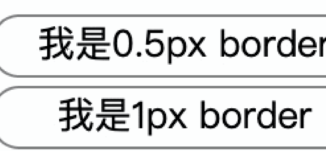
Two elements in the above figure width:200px;height:100px, Respectively border:0.5px、border:1px , When you examine the element, you can see that border=0.5px After calculating the size of the element and 1px The effect is the same , It's all width:202px;height:102px. It means that browsers are recognized as 1px 了 .
By the above gif You can also see the figure , Because of the equipment dpr=2, So zoom in 1px Indeed, it used 2 A physical pixel to render . Not what we want to achieve 0.5px.
Mobile
On the mobile phone end , The processing effect of different mobile browsers on decimal pixels is even more strange .
First, let's take a look at the adoption of REM Under layout mode , In code 0.01rem How much is it converted into ?
Here is a brief introduction REM Realization principle
rem(font size of the root element), That is, according to the root element of the web page (html) To set the font size . and em(font size of the element) Is the difference between the ,em Is set according to the font size of its parent element .
Simply speaking ,rem The idea of realizing mobile end adaptation by layout is , because rem The unit is based on the root element of the page fontSize Calculated , It will be fontSize Set to screen width clientWidth And the width of the design 750 The ratio of the , So when we reconstruct the page according to the size of the design draft , Use rem The unit is automatically multiplied by fontSize The sizes of different screens are calculated .
//  With 750 Take the design draft as an example , Calculation rem font-size
let clientWidth = document.documentElement.clientWidth || document.body.clientWidth;
let ft = (clientWidth / 7.5).toFixed(2);
//  Set the page root font size
document.documentElement.style.fontSize = ft + "px";
According to the above calculation method , Different screen widths are calculated differently fontSize , that 0.01rem How much is it converted into ? The following examples are used to calculate the “1 Pixels ” size

As can be seen from the table , Calculated by different mobile phones “1px” The sizes vary greatly , Moreover, the mobile phone itself has a big compatibility problem with the decimal point processing .
such as IOS8+ The series already supports 0.5px 了 , Media queries can be used to process , But Android phones have different representations of decimal pixels . There is little information about the processing of decimal points in different mobile browsers on the Internet , Only know that in some low version systems ,0.5px Will be displayed as 0px; Some can draw a half pixel edge , Some are larger than 0.55px As a 1px, Some are larger than 0.75px As a 1px, From the table calculation results, it is difficult to directly realize the adaptation .
such as HUAWAI P30 Of 0.01rem After calculation, it is 0.48px , This smaller decimal pixel has border It has been unable to display normally .

So how to do that 1px The effect of ?
After some research , It is found that the current implementation schemes are inseparable from the following three .
Use
Pseudo elements + CSS3`` The zoomThe wayUse
dynamic viewport + rem LayoutThe way ( namelyFlexibleImplementation scheme )New scheme : Use
vw CompanyAdaptation scheme ( A scheme recommended in the future , But there is no practical application in the current project , Therefore, this article will not discuss )
1. Pseudo elements + CSS3 The zoom
In fact, this scheme is often used in the project . The text mainly analyzes its implementation principle .
We have already discussed how to implement the 1px, In fact, the code should implement 0.5px . The way to zoom is to avoid the different compatibility processing of different mobile phones caused by directly writing decimal pixels . On the first code :
//  Through pseudo elements  0.5px border
.border::after {
    content: "";
    box-sizing: border-box; //  In order to be as big as the original element
    position: absolute;
    left: 0;
    top: 0;
    width: 200%;
    height: 200%;
    border: 1px solid gray;
    transform: scale(0.5);
    transform-origin: 0 0;
}

//  Through pseudo elements  0.5px  Fine thread
.line::after {
    content: '';
    position: absolute;
    top: 0;
    left: 0;
    width: 200%;
    height: 1px;
    background: #b3b4b8;
    transform: scale(0.5);
    transform-origin: 0 0;
}

// dpr Adaptations can be written like this
@media (-webkit-min-device-pixel-ratio: 2)  {
    .line::after {
     ...
      height: 1px;
        transform: scale(0.5);
        transform-origin: 0 0;
    }
}

@media (-webkit-min-device-pixel-ratio: 3)  {
    .line::after {
        ...
      height: 1px;
        transform: scale(0.333);
        transform-origin: 0 0;
    }
}
Why zoom in first 200% Shrink again 0.5?
To just zoom border 1px The thickness of , And guarantee border The size of the remains the same . If direct scale(0.5) Words border The overall size will also become one-half , So zoom in first 200%( When you zoom in border The thickness of is not magnified ) Zoom again , You can keep the original size unchanged .
Why zoom , It can solve the compatibility problem of the mobile phone for decimal point processing ?
Here I understand . First, the code deals with 1px , It avoids the problem of directly operating decimal pixels ; When dpr=2 when , Convert to physical pixels 2px, Zoom in and out scale(0.5)、 When dpr=3 when , Convert to physical pixels 3px, Now zoom scale(0.3) after , The phone will use the minimum physical pixel by default 1px To render . according to CSS3 transform Of scale Definition , The border can be as thin as you like , Theoretically, you can achieve any fine zoom effect .
The advantages of this scheme are , Using zoom for old projects can quickly achieve 1px The effect of .
It should be noted that , We are in 1px Zoom based on !
If... Is used in the project rem In terms of units , Here
1pxIt doesn't work rem The unit of , Otherwise, according to rem Scale after conversion , Will make the border thinner .If... Is used in the project
postcss-pxtoremIf the plug-in is compiled , Remember not to1pxCompile . Configuration document reference postcss-pxtorem[2] ..ignore {
border: 1Px solid; // ignored
border-width: 2PX; // ignored }
Px or PX is ignored by postcss-pxtorem but still accepted by browsers.
2. dynamic Viewport + REM The way
The second implementation is to use dynamic settings viewport + rem Layout , This solution actually refers to a mobile end adaptation solution that was open source in the early days of Alibaba flexible , This article makes some improvements . This scheme not only solves the problem of mobile terminal adaptation , At the same time, the problem of 1px The problem of .
Before you understand how it works , Let's start with a few key concepts viewport viewport And meta label And Page zoom initial-sacle.
viewport
On the browser ( Or a APP Medium webview ) The area used to display the web page , but viewport It's not limited to the size of the browser's visual area , It may be larger than the browser's visual area , It may also be smaller than the browser's viewing area .
About online viewport The classic introduction to Peter-Paul Koch[3] Of A tale of two viewports[4] . It describes three kinds of viewport, What we usually use most is layout viewport ( Browser default viewport). The default width is greater than the width of the viewable area of the browser , So the browser will display a horizontal scroll bar by default .
const clientWidth = document.documentElement.clientWidth || document.body.clientWidth
adopt meta Label settings
If not set meta Label words , because viewport The default width is greater than the viewable area of the browser , So you need to set viewport The width of is equal to the screen width width=device-width To avoid horizontal scrollbars .
<meta
  name="viewport"
  content="
    width=device-width,  //  Set up viewport The width of is equal to the screen width
    initial-scale=1.0,  //  The initial zoom is 1
    maximum-scale=1.0,
    user-scalable=no,  //  The user is not allowed to manually zoom
    viewport-fit=cover //  Zoom to fill the screen
    "
>
nameSet the name of metadata ,contentSet the value of metadata .nameThe property value isviewportwhen , Indicates setting the prompt about the initial size of the viewport , For mobile end use onlySimultaneous setting
width=device-width,initial-scale=1.0It's for compatibility iOS and IE browser
About page scaling
initial-scale The larger the zoom value , At present viewport The smaller the width of , vice versa .
For example, the screen width is 320px Words , If we set initial-scale=2 , here viewport The width of will change to just 160px 了 . It's understandable , It's doubled , It's the original 1px Things become 2px 了 , But not the original 320px Turn into 640px , But with the actual width unchanged ,1px Become the same as the original 2px It's the same length . So when zooming the page , It actually changed CSS Pixel size , And the quantity remains the same . So we need 320px The width that can be filled now only needs 160px That's it .
In the table at the beginning CSS The definition of a pixel is , Regardless of scaling ,1 individual CSS Pixels are equal to 1 Device independent pixels . Enlarge the page 200% when ,CSS The number of pixels remains unchanged , Twice the size , Equivalent to one CSS Pixels cover two device independent pixels horizontally and vertically . The number of device independent pixels that the browser window can hold is constant , So in the visible area CSS Fewer pixels .
Flexible Adaptation scheme and problems
With the above concepts , So let's talk about that flexible Implementation principle of the scheme and problems left over from history .
Flexible The general realization idea of is , First of all, according to the dpr To dynamically modify meta In the label viewport Medium initial-scale Value , To dynamically change viewport Size ; Then use it uniformly on the page rem Layout ,viewport Width changes can dynamically affect html Medium font-size value , So as to realize adaptation .
Why not directly quote flexible Library for mobile end adaptation ?
because lib-flexible This library is currently largely deprecated , Because this scheme was born earlier , Officials also believe that flexible It has accomplished its historic mission , For example, it only dealt with iOS Different dpr Scene , Android devices are set to by default dpr = 1 etc. , There's a problem . For detailed use of this aspect, you can read the articles sorted out earlier Use Flexible Realize hand washing H5 Terminal adaptation of page [5] .
In everyday business scenarios , Although we will not use flexible library , But in fact, most of them still use flexible Implement the principle of mobile terminal adaptation , And some improvements are made to achieve the purpose of adaptation .
The following is a simple implementation
<head>
    <meta
      name="viewport"
      content="width=device-width,user-scalable=no,initial-scale=1,
                minimum-scale=1,maximum-scale=1,viewport-fit=cover"
    />
    <script type="text/javascript">
      //  Dynamic setting  viewport  Of  initial-scale
      var viewport = document.querySelector("meta[name=viewport]");
      var dpr = window.devicePixelRatio || 1;
      var scale = 1 / dpr;
      viewport.setAttribute(
        "content",
        "width=device-width," +
          "initial-scale=" +
          scale +
          ", maximum-scale=" +
          scale +
          ", minimum-scale=" +
          scale +
          ", user-scalable=no"
      );
      //  Calculation  rem font-size
      var clientWidth =
        document.documentElement.clientWidth || document.body.clientWidth;
      clientWidth > 750 && (clientWidth = 750);
      var ft = (clientWidth / 7.5).toFixed(2); //  With 750 Take the design draft as an example
      document.documentElement.style.fontSize = ft + "px";

    </script>
  </head>
Why page scaling initial-scale Set to 1 / dpr ?
This is why the previous article described the device pixel ratio at a large length dpr、 Zoom and other concepts .
By setting the page zoom to 1/dpr, Can be viewport The width of dpr times . Or to iPhone6 Mobile phones, for example , When the page is not zoomed viewport Width 375px、dpr=2. because dpr The existence of makes a CSS Pixels require two physical pixels to render .
When setting initial-scale = 1 / dpr = 0.5 when , Acquired viewport Width clientWidth = 750px , It's expanded dpr times , It is exactly the width of the physical pixel of the device . A simple derivation is , When scale=0.5 when , because viewport Can be accommodated in CSS An increase in the number of pixels , It is equivalent to that an independent pixel of a device will cover two pixels in the horizontal and vertical directions CSS Pixels ,
CSS Number of pixels  =   Number of independent pixels of the device  /  scale   = (  Number of physical pixels  / dpr )/ scale
scale = 1 / dpr
//  therefore
CSS Number of pixels  =  Number of physical pixels
Here we write 1px In fact, it is exactly the size of a physical pixel , And can better draw 1px Border , So as to improve the display accuracy , From then on, we can write directly and happily 1px La ! At the same time, this scheme also solves the problem of using only rem When doing layout , There are various after calculation 0.5px、0.55px Other questions . perfect ~
Actual combat comparison
The following is border The comparison diagram of several implementation methods in different testing machines .
The test model is iPhone6、iPhone6Plus、iPhoneXR、HUAWEI P30, With 750 As an example , Set up fontSize = clientWidth / 7.5 + 'px'.
4.1 The first solution is Zoom form

Button 1: direct writing 1px, according to dpr The calculation shows that , The effect is always too thick .
Button 2:rem Under the layout , Don't change viewport The zoom ratio of , namely initial-scale= 1,fontSize The calculated range is 48px~55px Unequal ,0.01rem After calculation iPhone6 by 0.5px ,dpr=2, Display effect is better ; and Huawei P30 Of 0.01rem = 0.48px, At this point, the border is not clearly displayed . Overall, the effect display is too thin .
️ Button 3: It's also rem Under the layout ,initial-scale= 1, The first solution is used , The zoom 0.5 after , The overall effect is good .
4.2 Adopt the second solution , That is, dynamic setting Comparison diagram of layout mode

Set up rem Under the layout ,
️ Button 1: direct writing 1px
️ Button 4: Use 0.01rem, Different models fontSize stay 100px~144px Between ,0.01rem After calculation, it is basically greater than or equal to 1px.
Analyze the calculation process :
iPhone6Wide screen375px,dpr = 2、initial-scale= 0.5when ,clientWidthTurn into750px, Root elementfontSize = 100px, that0.01remIt's exactly the same as1px, And the size is consistent with the design , The display effect should be the best in theory .Huawei P30Wide screen360px,dpr = 3、initial-scale= 0.3when ,clientWidthTurn into1080px, Root elementfontSize = 144px, that0.01rem = 1.44px. In fact, at this time, we have achieved more than1px了 . Equivalent to greater than 1 A physical pixel to render .
The effect of the two methods is better , Explain that under this scheme , We can write directly 1px perhaps 0.01rem It's all right .
The screen resolution of some mobile phones
| Model of equipment | Screen resolution / Physical pixel px | Device pixel ratio dpr | Independent pixels /CSS Pixels | Screen size -inch | Pixel density ppi |
|---|---|---|---|---|---|
| iPhone4 | 640x960 | 2 | 320x480 | 3.5 | 326 |
| Iphone5s | 640x1136 | 2 | 320x568 | 4 | 326 |
| Iphone6 | 750x1334 | 2 | 375x667 | 4.7 | 326 |
| iphone6 Plus | 1080x1920 (1242x2208) | 3 | 414x736 | 5.5 | 401 |
| iphoneX | 1125x2436 | 3 | 375x812 | 5.8 | 458 |
| iphoneXR | 828x1792 | 2 | 414x896 | 6.1 | 326 |
| iphoneXs Max | 1242x2688 | 3 | 414x896?? | 6.5 | 458 |
| Huawei P30 | 1080x2340 | 3 | 360x780 | 6.1 | 422 |
| Huawei mate30 | 1080x2340 | 3 | 360x780 | 6.62 | 388 |
summary
Mobile end adaptation is mainly divided into two aspects , On the one hand, it is necessary to adapt to the screen size of different models , On the one hand, it is the processing of detail pixels . If you write directly in the project 1px , because dpr The presence of the display results in coarser rendering , In fact, it does not meet the requirements of the design draft . If you use rem The layout calculates the corresponding small value , Different mobile phones have obvious compatibility problems . At this time, the old project will be modified as a whole viewport High cost , The first implementation scheme can be adopted 1px To deal with ; Dynamic settings can be adopted for new projects viewport The way , One click solution to all adaptation problems .
In fact, the mobile terminal pair 1px The implementation of rendering adaptation is simple 、 The code is short , Be able to get started quickly . But the text through a lot of space to explain its principle , It aims to really understand and completely solve the puzzle , I hope it can help you .
Reference resources
Mobile front end development viewport In depth understanding of [6]
Use Flexible Realize hand washing H5 Terminal adaptation of page [7] (Git Address [8])
analyse iOS 11 Web adaptation problem [9]
viewports analyse [10]
Let's talk about the adaptation of mobile page [11]
We can talk Retina Next 1px Solutions for [12]
About this article
author :SDYZ
https://juejin.cn/post/6870691193353666568
Last

Official account : Front end talent
give the thumbs-up + Looking at Support Xiaobian
边栏推荐
- What are the steps and methods for PCB debugging?
- 关于CSP及其相关实现
- [buuctf.reverse] 115_[RCTF2019]DontEatMe
- P4580 [BJOI2014]路径
- [buuctf.reverse] 114_[MRCTF2020]VirtualTree
- U8g2图形库与STM32移植(I2C,软件与硬件)
- [buuctf.reverse] 111_[b01lers2020]chugga_chugga
- R语言caTools包进行数据划分、randomForest包构建随机森林模型、使用plot函数可视化训练好的随机森林模型的过程(随着树的个数的增加误差越来越稳定)
- Chapter II Application Layer
- Windows远程时提示CredSSP加密数据库修正
猜你喜欢

win10你的组织已关闭自动更新问题怎么解决?

版式设计三大原则

The most complete knowledge summary, which must be read by beginners

win10安装过程

CTF platform marsctf after graduation
如何解决存在的1px问题?

最新版,最新资料
![[buuctf.reverse] 109_[FlareOn6]FlareBear,110_[INSHack2018]Tricky-Part1](/img/94/324c1bf9e0bd27cdf391d700ec51ec.png)
[buuctf.reverse] 109_[FlareOn6]FlareBear,110_[INSHack2018]Tricky-Part1

Learning notes of segmentation, paging, page table and quick table

13、使用wpf开发usb检测工具
随机推荐
R语言party包ctree函数构建条件推理决策树(Conditional inference trees)、使用plot函数可视化训练好的条件推理决策树
[signalr complete series] Realization of signalr real-time communication in net core
【基础知识】~ 稳压二极管、三极管、放大电路、逻辑门晶体管数量、FPGA 器件结温范围、FPGA 加载方式、施密特触发器、C 语言结构化编程、中断向量地址、寄生效应、上拉电阻的作用
组件el-scrollbar的使用
IPv6 地址分配
iphone5s显示被停用了解决办法
Easyrecovery15 free data recovery software
win10安装过程
[buuctf.reverse] 104_[FlareOn1]Shellolololol
苹果称M2比intel i5强26倍 虚假营销的实情揭晓!
【SignalR全套系列】之在.Net Core 中实现SignalR实时通信
spark 寫入doris太慢方案解决
如何通过鸿蒙生态赚钱?
TemplateDoesNotExist at /users/register/
[buuctf.reverse] 114_ [MRCTF2020]VirtualTree
Possible causes of processing chain loading error -process chain loading error
[数据分析] RFM分析方法
RestTemplate使用详解及踩坑记录
版式设计三大原则
About XSS attack and its defense