当前位置:网站首页>Grid layout
Grid layout
2022-06-12 10:38:00 【dralexsanderl】
grid Layout
grid The layout is also called “ Grid layout ”, It can realize two-dimensional layout , And before form table Similar layout , However , This is the use of CSS The control of the , Instead of using HTML The control of the , At the same time, it can also rely on the media query to define the layout according to different contexts .
Containers ( Parent element )
Elemental display Property set to grid perhaps line-grid、subgrid that will do .
When the element has a grid layout ,column、float、clear、vertical-align attribute invalid .
When the element is set to grid after , You can also set the following properties :
<div class="grid">
  <div class="blue"></div>
  <div class="red"></div>
</div>
<style> .blue{
       background: blue; } .red{
       background: red; order: 1 } </style>
grid-template-columns: Define the column width of each column.grid{ height: 300px; display: grid; grid-template-columns: 100px 200px ; }

grid-template-rows: Define the height of each line.grid{ height: 300px; display: grid; grid-template-rows: 100px 200px ; }
Set up grid-template-columns Words , Set several parameters , Just a few columns ( No more than grid Number of child elements ), And then set up grid-template-rows The parameter is the height of each column ( The height beyond the number of columns is invalid )
stay grid-template-columns and grid-template-rows When setting the height and width, you can use fr This unit .
fr The unit is an adaptive unit ,fr Units are used to allocate the remaining space in a series of length values , If more than one part has been specified , Then the remaining space is allocated proportionally according to the respective numbers .
  .grid{

    height: 300px;
    display: grid;
    grid-template-rows: 1fr fr ;
  }
stay grid-template-columns and grid-template-rows You can also use functions when setting properties
minmax
Create the minimum or maximum size of a row or column , The first parameter defines the minimum value of the mesh orbit , The second parameter defines the maximum value of the mesh orbit . Any length value can be accepted , Also accept auto value .auto Value allows mesh tracks to stretch or squash based on the size of the content .
We set the height of the first row to minmax(100px,200px), The height of the second row is set to minmax(50px,200px), The total height of the container is set to 300px, At this time, how to calculate the height of each column ?
- First, judge whether the total height is less than the sum of the maximum height of the first column and the maximum height of the second column
- If greater than the sum of the maximum values , Then the height of the first column and the second column are both set to the maximum value
- If it is less than the sum of the minimum values , Then the height of the first column and the second column are both set to the minimum value .
Now comes the question , In this case, the total height is less than the sum of the maximum height of the first column and the maximum height of the second column
This is to use first
Total height 300px - Minimum height of the first column 100px - Minimum height of the second column 50px = 150px.
Height of the first column : Minimum height of the first column 100px + 150px/2 = 175px;
Second column height : Minimum height of the first column 50px + 150px/2 = 125px;
repeat
Create duplicate mesh tracks . This is suitable for creating grid projects of equal size and multiple grid projects .
Take two parameters : The first parameter defines the number of times the grid track should be repeated
Count , The second parameter defines the size of each track .
grid-column-gap: Create the distance between columnsgrid-row-gap: Create row to row distancegrid-gap: Abbreviations for the above two attributes
Subelement
adopt grid-row And so on
When the parent element is set grid After layout , Child elements can pass through grid-row and grid-column To position the element at the specified location .
such as
<div class="grid-container">
    <div class="item item1">1</div>
    <div class="item item2">2</div>
    <div class="item item3">3</div>
    <div class="item item4">4</div>
    <div class="item item5">5</div>
    <div class="item item6">6</div>
</div>
.grid-container{

  padding: 20px;
  display: grid;
  grid-template-columns: repeat(2,100px);
  grid-template-rows: repeat(3,100px);
  grid-column-gap: 50px;
  grid-row-gap: 15px;
}
.item{

  border: 2px solid palegoldenrod;
  color: #fff;
  text-align: center;
  color: #000;
  font-size: 20px;
}
.item1{

  grid-row-start: 2;
  grid-row-end: 3;
  grid-column-start: 2;
  grid-column-end: 3;
  background: #fffa90;
}
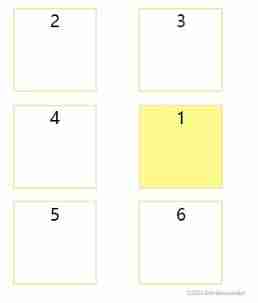
You can see the effect ,item1 Not in the first . This is because of the settings grid-row and grid-column attribute ,grid-row-start: 2 and grid-row-end: 3 Position the element on the second line , That is, the horizontal lines of the grid 2,3 middle ,grid-column-start: 2 and grid-column-end: 3 Position the element in the second column , That is, the vertical line of the grid 2,3 middle . The final effect is in the second column of the second row .
tips: Interested students try to change the above values at will , The effect may surprise you .
grid-row Namely grid-row-start and grid-row-end Abbreviation .grid-column yes grid-column-start and grid-column-end Abbreviation .
and grid-area abbreviation , They correspond to each other grid-row-start、grid-column-start、grid-row-end、grid-column-end
Merge cell rows or cell columns
Mentioned in the previous section grid-row And so on span + number, Means to merge number Column or row . and number + / The symbol starts from the row or column .
<div class="grid-container">
    <div class="item item1">1</div>
    <div class="item item2">2</div>
    <div class="item item3">3</div>
    <div class="item item4">4</div>
    <div class="item item5">5</div>
    <div class="item item6">6</div>
    <div class="item item7">7</div>
    <div class="item item8">8</div>
    <div class="item item9">9</div>
</div>
.grid-container{
padding: 20px;
display: grid;
grid-template-columns: repeat(3,100px);
grid-template-rows: repeat(4,100px);
grid-column-gap: 50px;
grid-row-gap: 15px;
}
.item{
border: 2px solid palegoldenrod;
color: #fff;
text-align: center;
color: #000;
font-size: 20px;
}
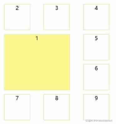
.item1{
grid-row: 2 / span 2;
grid-column: span 2;
background: #fffa90;
}
Custom gridline name
Use... In the parent element [] Name the gridlines , At the same time, the name in the child element must be consistent with that set in the parent element , But it doesn't need to be [] The parcel .
such as :
<div class="grid-container">
    <div class="item item1">1</div>
    <div class="item item2">2</div>
</div>
.grid-container{
padding: 20px;
display: grid;
grid-template-columns: [item1-col-start] 100px [item1-col-end] 10px [item2-col-start] 200px [item2-col-end];
grid-template-rows: [row-start] 200px [row-end];
}
.item{
border: 2px solid palegoldenrod;
color: #fff;
text-align: center;
color: #000;
font-size: 20px;
}
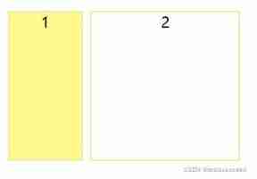
.item1{
grid-column: item1-col-start / item1-col-end;
grid-row: row-start / row-end;
background: #fffa90;
}
.item2{
grid-column: item2-col-start / item2-col-end;
grid-row: row-start / row-end;
}
Use grid-template-areas Define grid area
In the setting of child elements grid-area attribute , The parent element can be in grid-template-areas Layout child elements in .
such as :
<div class="grid-container">
    <div class="header ">header</div>
    <div class="content ">content</div>
    <div class="sidebar ">sidebar</div>
    <div class="footer ">footer</div>
</div>
.grid-container{

  display: grid;
  grid-row-gap: 10px;
  grid-row-gap: 5px;
  grid-template-areas: "header header header" "sidebar content content" "footer footer footer";
}
.header {

  grid-area: header;
  background: saddlebrown;
}
.sidebar{

  grid-area: sidebar;
  background: red;
}
.content{

  grid-area: content;
  background: violet;
}
.footer{

  grid-area: footer;
  background: yellow;
}

边栏推荐
- Bug easily ignored by recursion
- How to refund the pre-sale deposit of JD 618 in 2022? Can JD 618 deposit be refunded?
- MYSQL——内置函数
- Mqtt protocol Chinese version
- Create vite source code analysis
- PHP: Excel to get the letter header
- Chapter 3 search
- Download Notepad++
- Telecommuting with cpolar (2)
- Is the acceptance standard a test case?
猜你喜欢


随机推荐
2022淘宝618超级喵运会玩法来了 超级喵运会有哪些攻略方法
How to play the 2022 Taobao 618 Super Cat Games? Playing skills of 2022 Taobao 618 Cat Games
人脸识别pip 安装dlib库失败
How to upload the video on the computer to the mobile phone without network
Leetcdoe 2037. 使每位学生都有座位的最少移动次数(可以,一次过)
Common configuration commands for Cisco network device security management
Love and hate in the Jianghu
高通平台如何修改特殊电压
See if you fall into the trap of "labeling" customers and users?
Telecommuting with cpolar (2)
PHP: Excel to get the letter header
验收标准到底是不是测试用例?
PHP: seven cattle cloud upload file
QT custom window fillets
Malicious code analysis practice - lab03-03 Exe basic dynamic analysis
Wechat payment, wechat refund, Alibaba payment
Binassii module - converting between binary and ASCII
2022淘宝618超级喵运会怎么玩?2022淘宝618喵运会玩法技巧
浅谈三维形状上下文特征3DSC理论及应用
JS scale down the width and height of the picture