当前位置:网站首页>Flex layout --- detailed explanation [Blue Bridge Cup classic dice layout]
Flex layout --- detailed explanation [Blue Bridge Cup classic dice layout]
2022-06-21 14:19:00 【Yiyao Bingo】
Article title
One 、 Classic dice layout
1-1 Show pictures
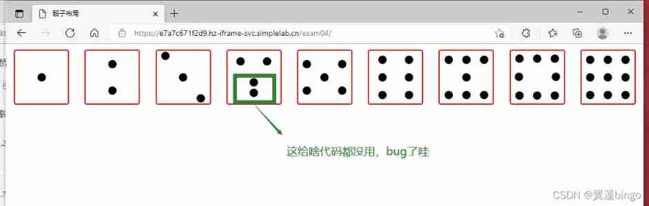
1-2 The code is as follows
<!DOCTYPE html>
<html lang="en">

<head>
    <meta charset="UTF-8" />
    <meta name="viewport" content="width=device-width, initial-scale=1.0" />
    <title> Dice layout </title>
    <style> body {
       margin: 10px 0 0 0; display: flex; justify-content: space-around; } body>div {
       display: flex; width: 100px; height: 100px; border-radius: 4px; border: 2px solid red; box-sizing: border-box; } p {
       width: 15px; height: 15px; background-color: black; border-radius: 50%; margin: 2px; } .div1 {
       justify-content: center; align-items: center; } /*todo: Please complete the remaining dice layout code */ div:nth-child(2){
       justify-content: space-around; flex-direction: column; align-items: center; } div:nth-child(3){
       justify-content: space-around; align-items: baseline; } .ppp1{
       align-self: center; } .ppp2{
       align-self: flex-end; } .div4{
       justify-content: space-around; flex-direction: column; } .div4 div{
       display: flex; justify-content: space-around; } .div5{
       justify-content: space-around;; } .div5 div{
       display: flex; flex-direction: column; justify-content:space-around; } .div6{
       flex-direction: column; justify-content: space-around; } .div6 div{
       display: flex; flex-direction: row; justify-content: space-around; } .div7{
       flex-direction: column; justify-content: space-around; } .div7 div{
       flex-direction: row; display: flex; justify-content: space-around; } .div8{
       flex-direction: column; justify-content: space-around; } .div8 div{
       flex-direction: row; display: flex; justify-content: space-around; } .div8 div:nth-child(2) {
       justify-content: space-between; margin: 5px; } .div9{
       flex-direction: column; justify-content: space-around; } .div9 div{
       flex-direction: row; display: flex; justify-content: space-around; } </style>
</head>

<body>
    <!-- dice 1-->
    <div class="div1">
        <p></p>
    </div>
    <!-- dice 2-->
    <div>
        <p></p>
        <p></p>
    </div>
    <!-- dice 3-->
    <div>

        <p></p>
        <p class="ppp1"></p>
        <p class="ppp2"></p>
    </div>
    <!-- dice 4-->
    <div class="div4">
        <div>
            <p></p>
            <p></p>
        </div>
        <div>
            <p></p>
            <p></p>
        </div>
    </div>
    <!-- dice 5-->
    <div class="div5">
        <div>
            <p></p>
            <p></p>
        </div>
        <div>
            <p></p>
        </div>
        <div>
            <p></p>
            <p></p>
        </div>
    </div>
    <!-- dice 6-->
    <div class="div6">
        <div>
            <p></p>
            <p></p>
        </div>
        <div>
            <p></p>
            <p></p>
        </div>
        <div>
            <p></p>
            <p></p>
        </div>
    </div>
    <!-- dice 7-->
    <div class="div7">
        <div>
            <p></p>
            <p></p>
            <p></p>
        </div>
        <div>
            <p></p>
        </div>
        <div>
            <p></p>
            <p></p>
            <p></p>
        </div>
    </div>
    <!-- dice 8-->
    <div class="div8">
        <div>
            <p></p>
            <p></p>
            <p></p>
        </div>
        <div>
            <p></p>
            <p></p>
        </div>
        <div>
            <p></p>
            <p></p>
            <p></p>
        </div>
    </div>
    <!-- dice 9-->
    <div class="div9">
        <div>
            <p></p>
            <p></p>
            <p></p>
        </div>
        <div>
            <p></p>
            <p></p>
            <p></p>
        </div>
        <div>
            <p></p>
            <p></p>
            <p></p>
        </div>
    </div>
</body>

</html>
Two 、 flex Explain the relevant knowledge points
2-1 Properties of the container
flex-direction : Determine the direction of the spindle ( That is, the arrangement direction of the project )
flex-wrap : Whether to wrap lines on the spindle
flex-flow:<flex-direction> <flex-wrap>
justify-content : Property defines the alignment of the item on the spindle .
align-items : Define how items align on the cross axis .
align-content : Defines the alignment of multiple axes . If the project has only one axis , This property does not work .
2-1-1 flex-direction attribute
flex-direction Property determines the direction of the spindle ( That is, the arrangement direction of the project ).
.box {

  flex-direction: row | row-reverse | column | column-reverse;
}
//   row( The default value is ): The principal axis is horizontal , The starting point is on the left .
//   row-reverse: The principal axis is horizontal , The starting point is on the right .
//   column: The principal axis is perpendicular , The starting point is at the top .
//   column-reverse: The principal axis is perpendicular , Starting edge .

2-1-2 flex-wrap attribute
By default , The projects are all in one line ( also called ” axis ”) On .flex-wrap Attribute definitions , If an axis doesn't line up , How to wrap .
.box{

  flex-wrap: nowrap | wrap | wrap-reverse;
}
//   nowrap( Default ): Don't wrap .
//   wrap: Line break , The first row is at the top .
//   wrap-reverse: Line break , The first row is at the bottom .


2-1-3 flex-flow
flex-flow The attribute is flex-direction Properties and flex-wrap Attribute shorthand , The default value is row nowrap.
.box {

  flex-flow: <flex-direction> <flex-wrap>;
}
2-1-4 justify-content attribute
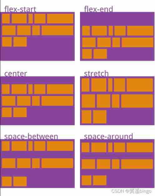
justify-content Property defines the alignment of the item on the spindle .
.box {

  justify-content: flex-start | flex-end | center | space-between | space-around;
}

<!-- Suppose the main axis is from left to right .-->
// flex-start( The default value is ): Align left
// flex-end: Right alignment
// center:  In the middle
// space-between: full-justified , The intervals between the items are all equal .
// space-around: The spacing between each item is equal . therefore , The spacing between items is twice as large as the spacing between items and the border .

2-1-5 align-items attribute
align-items Property defines how items are aligned on the cross axis .
.box {

  align-items: flex-start | flex-end | center | baseline | stretch;
}
<!-- Suppose the cross axis is from top to bottom .-->
// flex-start: Align the starting points of the intersecting axes .
// flex-end: The ends of the intersecting axes are aligned .
// center: Align the midpoint of the intersecting axis .
// baseline:  Baseline alignment of the first line of text for the project .
// stretch( The default value is ): If the project is not set to height or set to auto, Will fill the entire container .

2-1-6 align-content attribute
align-content Property defines the alignment of multiple axes . If the project has only one axis , This property does not work .
.box {

  align-content: flex-start | flex-end | center | space-between | space-around | stretch;
}
// flex-start: Align with the starting point of the intersecting axis .
// flex-end: Align with the end of the cross axis .
// center: Align with the midpoint of the intersecting axis .
// space-between: Align with both ends of the cross axis , The average distribution of spacing between axes .
// space-around: The spacing between each axis is equal . therefore , The spacing between the axes is twice as large as the spacing between the axes and the borders .
// stretch( The default value is ): The axis occupies the entire cross axis .
2-2 Project properties order
order: order Property defines the order in which items are arranged . The smaller the numerical , The further up the line , The default is 0
flex-grow :
flex-shrink
flex-basis
flex
align-self
2-2-1 order attribute
order Property defines the order in which items are arranged . The smaller the numerical , The further up the line , The default is 0.
.item {

  order: <integer>;
}
2-2-2 flex-grow attribute
flex-grow Attribute defines the magnification of the item , The default is 0, That is, if there is any remaining space , And don't zoom in .
.item {

  flex-grow: <number>; /* default 0 */
}
2-2-3 flex-shrink attribute
flex-shrink Attribute defines the reduction ratio of the project , The default is 1, That is, if there is not enough space , The project will shrink .
.item {

  flex-shrink: <number>; /* default 1 */
}
2-2-4 flex-basis attribute
flex-basis Property defines before allocating extra space , Spindle space occupied by the project (main size). Browser according to this property , Calculate if the spindle has extra space . Its default value is auto, The original size of the project .
.item {

  flex-basis: <length> | auto; /* default auto */
}
It can be set to follow width or height Property is the same value ( such as 350px), Then the project will occupy a fixed space .
2-2-5 flex attribute
flex The attribute is flex-grow, flex-shrink and flex-basis Abbreviation , The default value is 0 1 auto. The last two properties are optional .
.item {

  flex: none | [ <'flex-grow'> <'flex-shrink'>? || <'flex-basis'> ]
}
- This property has two shortcut values :auto (1 1 auto) and none (0 0 auto).
- It is recommended to use this property first , Instead of writing three separate attributes , Because the browser will calculate the relevant value .
2-2-6 align-self attribute
align-self Property allows a single item to have a different alignment than other items , covering align-items attribute . The default value is auto, Represents the... That inherits the parent element align-items attribute , If there is no parent element , Is equivalent to stretch.
.item {

  align-self: auto | flex-start | flex-end | center | baseline | stretch;
}
This attribute may take 6 It's worth , except auto, Everything else goes with align-items The attributes are exactly the same .
flex Explanation of knowledge points from http://www.ruanyifeng.com/blog/2015/07/flex-grammar.html, A slight change
3、 ... and 、 flex Examples
3-1 The display is shown in the picture

3-2 The code is as follows
<!DOCTYPE html>
<html lang="en">

<head>
    <meta charset="UTF-8">
    <meta http-equiv="X-UA-Compatible" content="IE=edge">
    <meta name="viewport" content="width=device-width, initial-scale=1.0">
    <title>Document</title>
    <style> .box {
       height: 40px; width: 400px; background-color: #ccc; display: flex; flex-direction: row; } .item {
       height: 20px; width: 30px; background-color: aqua; margin: 10px; } .item:nth-child(3) {
       order: 0; background-color: red; height: 40px; flex-grow: 2; align-self: flex-end; } .item:nth-child(4) {
       order: 0; background-color: pink; flex-shrink: 0; } </style>
</head>

<body>
    <div class="box">
        <p class="item">0</p>
        <p class="item">1</p>
        <p class="item">2</p>
        <p class="item">3</p>
        <p class="item">4</p>
        <p class="item">5</p>
    </div>
</body>

</html>
边栏推荐
- Add SSL security certificate to web site
- Understand the use of protobuf serialization protocol
- C language -- program compilation and linking
- Farewell to the endless summer
- map. Values() to copy list and ArrayList
- [test process and theory - Test Technology System]
- MySQL - data type
- C language elementary order (VI) function
- Promotion guide for large enterprises: material preparation, PPT writing and on-site defense
- Chapter 5 - application layer
猜你喜欢

What are the log files in MySQL?

Why is epoll efficient?

Pyqt5 learning notes of orange_ Basic structure of pyqt5 GUI program

Taobao secsha plug-in

Detailed explanation of dictionary source code in C #

Swift return button

Declare war on uncivilized code II

Open source FTP server FileZilla server

Qt-3-basic assembly 2

Pyqt environment in pycharm
随机推荐
Qt-6-file IO
给网站添加SSL安全证书
Farewell to the endless summer
Mr. Ali taught you how to use JMeter for pressure test (detailed drawing)
理财产品的赎回时间是怎么规定的?
"My" C code specification
Qt-3-basic components
Making my footprint map using API
Design and implementation of object system in redis
C2 hiding of traffic encryption
Chapter IX Cisco ASA application nat
Compile time annotation automatically generates dataholder
Reptile Foundation_ urllib
Some atom operations
Skills of assigning IP address by DHCP in secondary route after wireless bridge
How does JMeter implement interface association?
What are the log files in MySQL?
Tcp/ip FAQs
MySQL - user management
Pyqt5 learning notes of orange_ Basic structure of pyqt5 GUI program