当前位置:网站首页>【小程序开发】常用组件及基本使用详解
【小程序开发】常用组件及基本使用详解
2022-07-25 18:59:00 【华为云】
本节学习目标:
学会使用常用的组件
@[toc]
1.常用的容器类组件的使用
1.view组件的基本使用
view类似于HTML中的div,实现了普通的视图区域。
例如:使用flex实现横向布局。
wxml代码:
<view class="container1"><view>A</view><view>B</view><view>C</view></view>wxss代码:
.container1 view{ width:100px; height:100px; text-align: center; line-height: 100px;}.container1 view:nth-child(1){ background-color: aquamarine;}.container1 view:nth-child(2){ background-color: azure;}.container1 view:nth-child(3){ background-color: darkorange;}.container1 { display: flex; justify-content: space-around;}实现效果: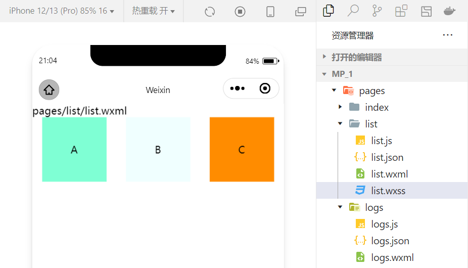
2.scroll-view组件的基本使用
利用scroll-view可以实现滚动的效果,这个效果可以是上下滚动,也可以是左右滚动。
wxml代码:
<scroll-view class="container1" scroll-y><view>A</view><view>B</view><view>C</view></scroll-view>修改的wxss代码:
.container1 { border:1px solid red; height:110px; /*使用scroll-view时设置固定的高度*/实现效果:
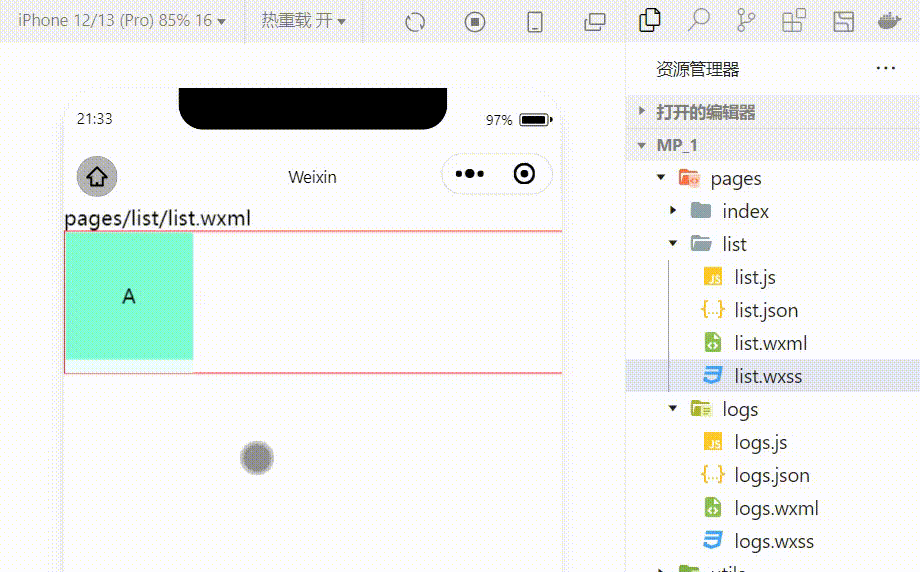
3.swiper和swiper-item组件的基本使用
利用这两个组件可以实现轮播图效果:
wxml代码:
<swiper class="swiper-container"><swiper-item><view class="item">A</view></swiper-item><swiper-item> <view class="item">B</view></swiper-item><swiper-item> <view class="item">C</view></swiper-item></swiper>wxss代码:
.swiper-container{ height:150px;}.item{ height:100%; line-height: 150px; text-align: center;}swiper-item:nth-child(1) .item{ background-color: aquamarine;}swiper-item:nth-child(2) .item{ background-color: azure;}swiper-item:nth-child(3) .item{ background-color: darkorange;}实现效果: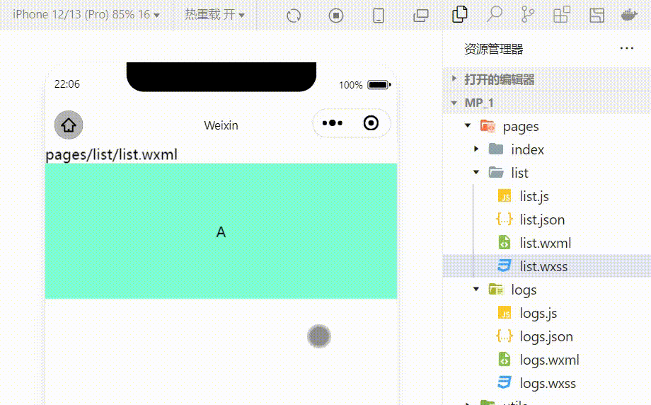
swiper组件的常用属性
| 属性 | 类型 | 默认值 | 说明 |
|---|---|---|---|
| indicator-dots | boolean | false | 是否显示面板指示色 |
| indicator-color | color | rgba(0,0,0,3) | 指示点颜色 |
| indicator-active-color | color | #000000 | 当前选中的指示点的颜色 |
| autoplay | boolean | false | 是否自动切换 |
| interval | number | 5000 | 自动切换时间间隔 |
| circular | boolean | false | 是否采用衔接滑动 |
例:显示面板指示色:
<swiper class="swiper-container" indicator-dots="true" >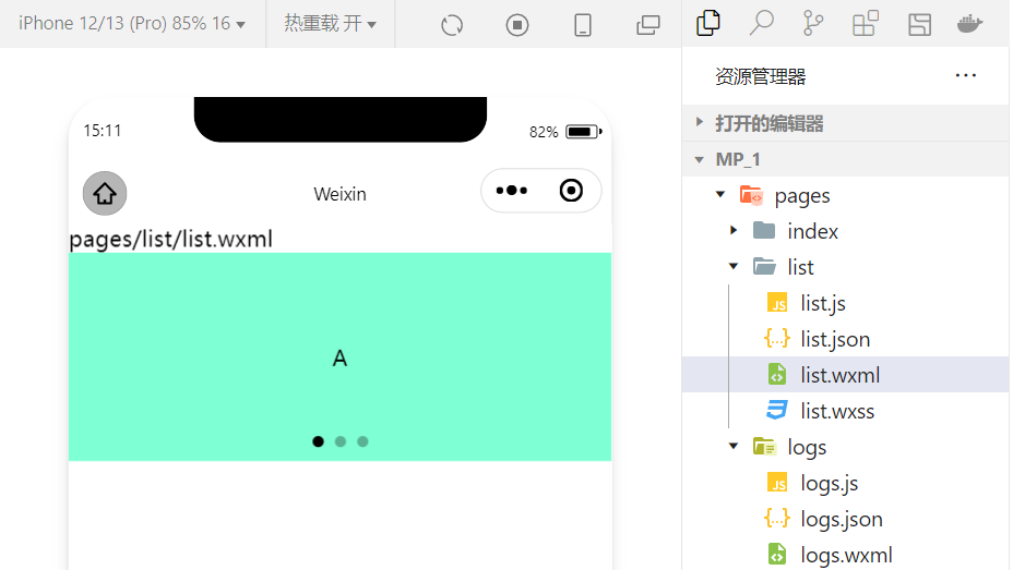
例:指定指示点颜色和当前选中知识点颜色:
<swiper class="swiper-container" indicator-dots="true" indicator-color="white" indicator-active-color="red">
例:设置自动切换,间隔设置为1s:
<swiper class="swiper-container" indicator-dots="true" indicator-color="white" indicator-active-color="red" autoplay="true" interval="1000">
采用衔接滑动:
<swiper class="swiper-container" indicator-dots="true" indicator-color="white" indicator-active-color="red" autoplay="true" interval="1000" circular>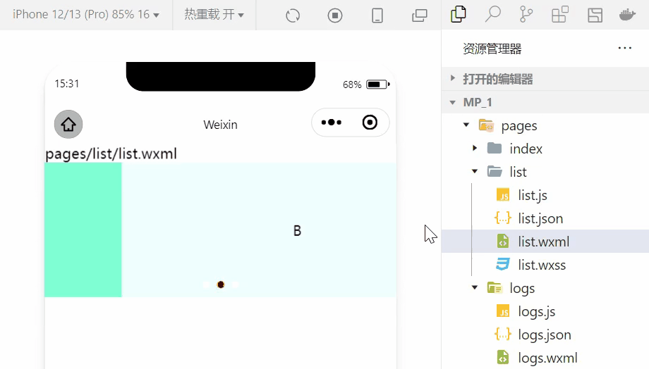
2.常用的基础内容组件的使用
1.text组件的基本使用
例:通过 text 组件的user-select 属性,可以实现长按选中文本内容的效果。(之前使用的selectable已经被废弃!)
<view>长按可以选中文本内容:<text user-select>HelloWorld!</text></view>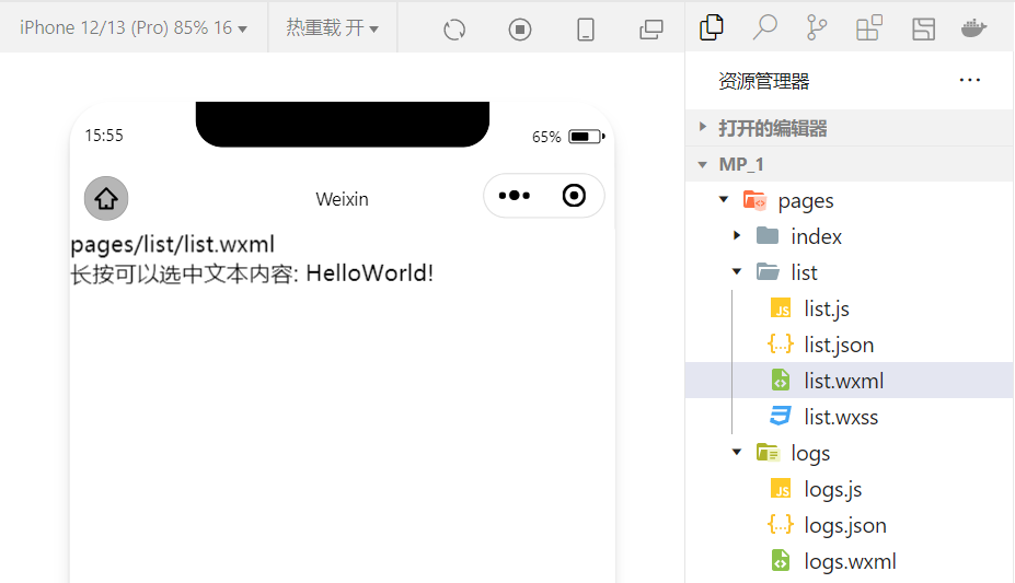
2.rich-text 组件的基本使用
例:通过 rich-text 组件的 nodes 属性节点,把 HTML 字符串渲染为对应的 UI 结构。
<rich-text nodes="<h1 style='color:red'>标题</h1>"> </rich-text>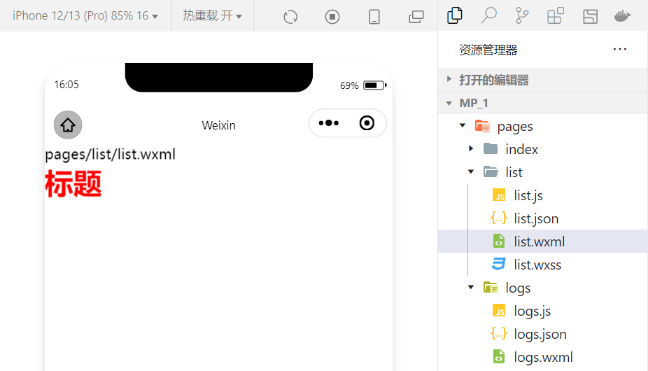
在想要把HTML文档渲染为相应的UI结构时使用该组件。
3.其他常用的组件
1.button组件的使用
小程序中的按钮组件类似于HTML中的按钮组件,同时可以调用微信提供的丰富的功能,例如:获取用户信息,获取用户授权,转发等。
例:使用type属性设置按钮的类型:
<button >默认按钮</button><button type="primary">主色调按钮</button><button type="warn">警告按钮</button>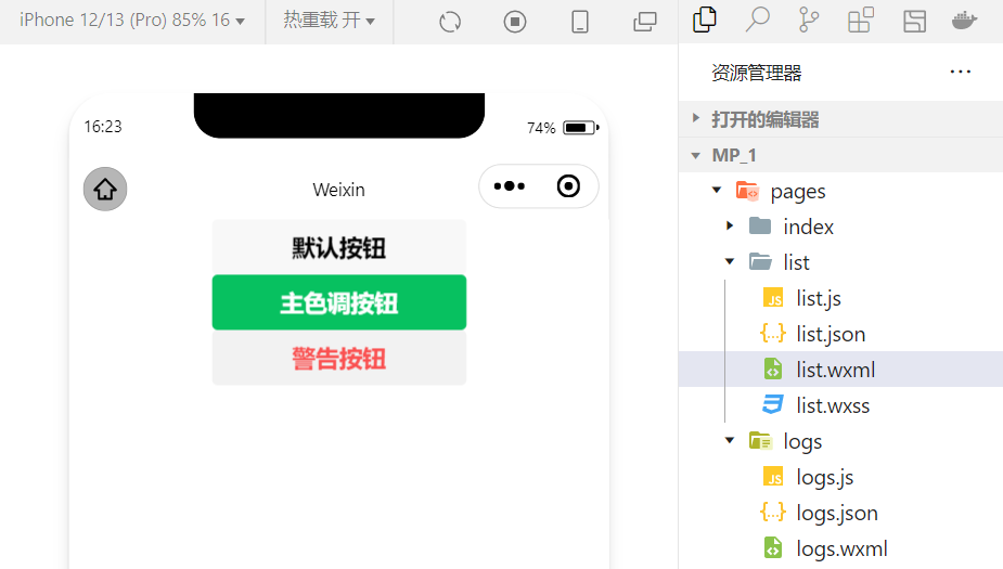
例:使用size属性设置按钮的大小:
<button size="mini">默认按钮</button><button type="primary" size="mini">主色调按钮</button><button type="warn" size="mini">警告按钮</button>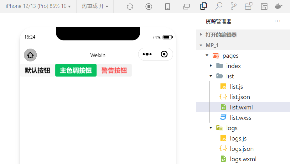
例:使用plain属性设置镂空按钮:
<button plain>默认按钮</button><button type="primary" plain>主色调按钮</button><button type="warn" plain>警告按钮</button>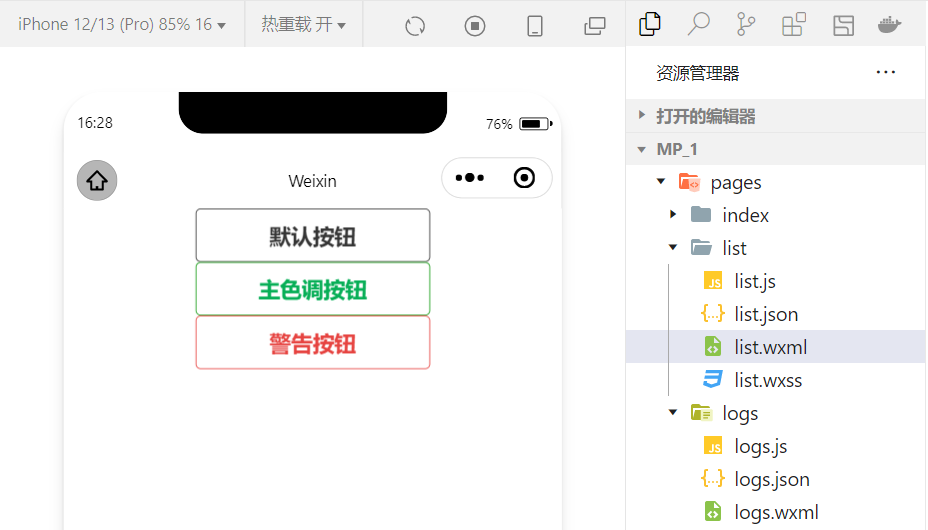
2.image组件的基本使用
wxml代码:
<image src="/images/1.jpg"></image>wxss代码:
image{ border: 5px solid black;}实现效果: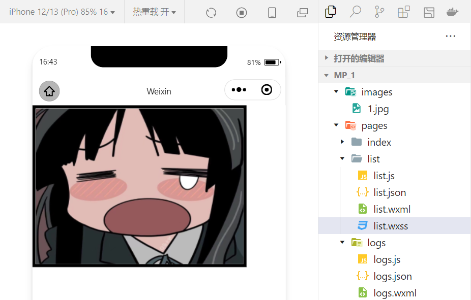
image 组件的 mode 属性用来指定图片的裁剪和缩放模式,常用的 mode 属性值如下:
| mode 值 | 说明 |
|---|---|
| scaleToFill | (默认值)缩放模式,不保持纵横比缩放图片,使图片的宽高完全拉伸至填满 image 元素 |
| aspectFit | 缩放模式,保持纵横比缩放图片,使图片的长边能完全显示出来。也就是说,可以完整地将图片显示出来。 |
| aspectFill | 缩放模式,保持纵横比缩放图片,只保证图片的短边能完全显示出来。也就是说,图片通常只在水平或垂直方向是完整的,另一个方向将会发生截取。 |
| widthFix | 缩放模式,宽度不变,高度自动变化,保持原图宽高比不变 |
| heightFix | 缩放模式,高度不变,宽度自动变化,保持原图宽高比不变 |
4.总结
本节对几个常用的组件做一个总结,实际上小程序拥有十分丰富的组件库,在学习的过程中,就会慢慢接触并熟练!同时,组件的学习和使用也是小程序宿主环境的一个重要部分。小程序开发中我们也体会到了技术更新迭代的速度很快,所以必须持续的学习新的技术!
边栏推荐
- 阿里云技术专家邓青琳:云上跨可用区容灾和异地多活最佳实践
- QT compiled successfully, but the program could not run
- 果链“围城”:傍上苹果,是一场甜蜜与苦楚交错的旅途
- 房企打响“保交战”
- Fruit chain "siege": it's a journey of sweetness and bitterness next to apples
- Youth, oh, youth
- How to design product help center? The following points cannot be ignored
- The difference between QT exec and show
- 接口自动化测试平台FasterRunner系列(四)- 持续集成、解决多域名
- 华为交换机系统软件升级和安全漏洞修复教程
猜你喜欢
![[open source project] stm32c8t6 + ADC signal acquisition + OLED waveform display](/img/5f/413f1324a8346d7bc4a9490702eef4.png)
[open source project] stm32c8t6 + ADC signal acquisition + OLED waveform display

从目标检测到图像分割简要发展史

终极套娃 2.0 | 云原生交付的封装

How to create an effective help document?

2022 IAA industry category development insight series report - phase II

With a financing of 200million yuan, the former online bookstore is now closed nationwide, with only 3 stores left in 60 stores
SQL realizes 10 common functions of Excel, with original interview questions attached

【加密周报】加密市场有所回温?寒冬仍未解冻!盘点上周加密市场发生的重大事件!
Ultimate doll 2.0 | cloud native delivery package

How to design product help center? The following points cannot be ignored
随机推荐
「Wdsr-3」蓬莱药局 题解
如何创建一个有效的帮助文档?
MES管理系统有什么应用价值
PHP等于==和恒等于===的区别
ES6通过代理器(Proxy)与反射(Reflect)实现观察者模式
Go code checking tool
有孚原力超算,为客户提供定制化高性能计算服务
Ultimate doll 2.0 | cloud native delivery package
How to prohibit the use of 360 browser (how to disable the built-in browser)
虚拟机vmware安装步骤(如何在虚拟机安装软件)
App test point (mind map)
弱网测试工具-QNET
C 调的满级和玄
Pixel2Mesh从单个RGB图像生成三维网格ECCV2018
Typescript object proxy use
【加密周报】加密市场有所回温?寒冬仍未解冻!盘点上周加密市场发生的重大事件!
Everyone can participate in the official launch of open source activities. We sincerely invite you to experience!
Deng Qinglin, a technical expert of Alibaba cloud: Best Practices for disaster recovery and remote multi activity across availability zones on cloud
信达证券是国企吗?在信达证券开户资金安全吗?
接口自动化测试平台FasterRunner系列(二)- 功能模块