当前位置:网站首页>Mobile web training -flex layout test question 1
Mobile web training -flex layout test question 1
2022-06-28 13:06:00 【HHppGo】
The first question is
The following options describe the effects of viewport attributes Incorrect Yes. ( D )
A: width=device-width: Set the width of the viewport to match the width of the current device
B: maximum-scale=1.0: The maximum allowed user scaling is 1.0
C: initial-scale=1.0: Sets the default zoom scale for viewports to 1.0
D: user-scalable=yes: Users are not allowed to zoom on their own
analysis :
content="width=device-widthExpress The width of the visible area of the page is the width of the device ( Logical pixel width )
initial-scale=1.0Represents the zoom ratio of the resolution ,1.0 == 100%, Don't zoom *
initial-scale
Initial scaling . That is, the initial scale of the page . This is a floating point value , Is a multiplier of page size . for example , If you set the initial zoom to “1.0”, that ,web The page will be displayed with target
density Resolution 1:1 To show . If you set it to “2.0”, Then the page will be enlarged to 2 times .
maximum-scale
Maximum zoom . That is, the maximum scale allowed . This is also a floating point value , The maximum multiplier used to indicate the page size compared to the screen size . for example , If you set this value to “2.0”, So this page is related to target
size comparison , You can zoom in at most 2 times .
user-scalable
The user adjusts the zoom . That is, whether users can change the degree of page zooming . If set to yes It allows users to change it , Instead of no. The default value is yes. If you set it to no, thatminimum-scaleandmaximum-scaleWill be ignored , Because it's impossible to scale at all .All scaling values must be in 0.01–10 Within the scope of .
The second question is
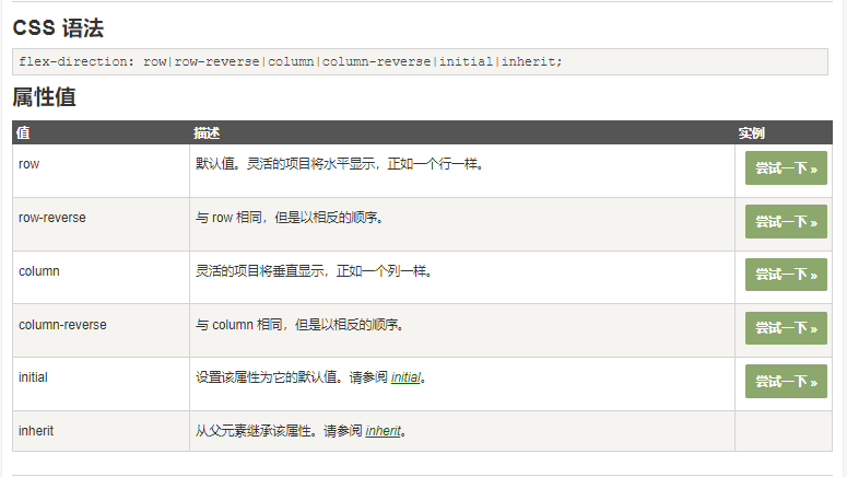
About flex Layout spindle description error Yes. ( D )
A: flex The default main axis of the layout is X Axis
B: flex-direction The value is row, The spindle can be set to X Axis
C: flex-direction The value is column, The spindle can be set to Y Axis
D: flex-direction The default value is column
analysis :
flex The layout is arranged horizontally by default , namely : flex-direction The default value is
row
Third question
How to integrate flex The main axis of the layout is set to Y Axis ( A )
A: flex-direction:column;
B: flex-direction:row;
C: flex-direction: row- reverse;
D: flex-direction:column- reverse;
analysis :
Change the spindle direction to the vertical direction :
flex-direction: column;
Fourth question
align-content How to realize the arrangement of the remaining space of the sub elements in the direction of the side axis ( C )
A: align-content:center;
B: align-content:flex-start;
C: align-content:space-around;
D: align-content:flex-end;
analysis :
Please click :
flex In the layout align-content attribute
Fifth question
align-items and align-content Description of the difference between error Yes. ( C )
A: For single line setting align-items
B: For multi line settings align-content
C: There is no difference between the two , Anyone can use it
D: It depends on whether it is a single line or multiple lines , Different use scenarios
analysis :
The most obvious difference is
align-contentApply to Multiple lines ,align-itemsIs applicable to A single .align-content( Invalid single line ) You can set the upper alignment 、 Lower alignment 、 In the middle 、 The tensile 、 Divide the remaining space equally ;align-items Top alignment 、 Lower alignment 、 In the middle 、 The tensile .
Sixth question
The following is about flex Description of relevant properties of the layout error Yes. ( D )
A: flex-direction Attribute can control the layout direction of sub elements in the elastic box
B: justify-content Property to control the spindle alignment
C: align-self Attribute can control the side axis alignment of a single child element
D: align-items Property to control the alignment of the side axes of multiple rows
analysis :
align-contentApply to Multiple lines ,align-itemIs applicable to A single .
Question seven
Use CSS Of flexbox Layout , Can't achieve Which of the following effects ( D )
A: Multi column layout , Elastic expansion and contraction with the same width of the container
B: Multi column layout , Average distribution width
C: Multi column layout , The left column width is determined by the number of pixels , in 、 The right column elastically expands and contracts with the width of the container
D: Multi column layout , Do not occupy a place
analysis :
Can't achieve : Implement multiple elements with different width and height , And realize seamless waterfall flow layout
Don't occupy a place ( De labeling ), but flex The layout is not off the mark
The eighth question
In a scalable layout , following Do not belong to flex-direction The value of the attribute is ( A )
A: flex-start
B: row
C: row-reverse
D: column
analysis :
Question 9
Parent element set to flex Layout time , The width and height of the child elements will ( C )
A: The width and height remain the same
B: The width becomes 100% , Height is supported by content
C: The width is spread by the content , The height becomes 100%
D: The width and height become 100%
analysis :
The parent element is flex Layout time : The child element without height setting is consistent with the parent element .
1, If the parent element is set to a fixed height , The element that has no height set in the child element will inherit the height of the parent element ; But if the parent element's align-items After setting, the height of the child element will be determined by its own content
2, If the parent element does not have a height set , Its height is determined by the highest sub element . In the code, you can put .father Note the height of the comparison .
Question 10
The following about Flex Description of layout principle error Yes. (D )
A: Add... To the parent box flex attribute (display:flex;), To control the position and arrangement of sub boxes
B: Open the flex The parent box of the layout is called a container , Sub box we become the project
C: The parent box is set to flex After the layout , The child element float、clear and vertical-align Property will fail
D: The parent box is set to flex After the layout , The child element float、clear and vertical-align Properties will take effect
analysis :
When we set the parent box to flex After the layout , The child element float、clear、vertical-align Property will fail
边栏推荐
- 在线JSON转PlainText工具
- Watermaker of the Flink core
- scratch旅行相册 电子学会图形化编程scratch等级考试一级真题和答案解析2022年6月
- Hisilicon 35xx realizes gt911 touch screen function "suggestions collection"
- ShareIt has outstanding strength and landed in the top 7 of the global IAP strength list
- flex布局中的align-content属性
- Continuous integration practice of Baidu app based on pipeline as code
- How to handle the safest account opening when downloading the mobile app of Huatai Securities
- Après avoir échoué à l'examen d'entrée à l'Université de technologie de Harbin, vous devez rester à l'Université en tant que « chercheur » après avoir obtenu votre diplôme.
- Mysql database literacy, do you really know what a database is
猜你喜欢

一文抄 10 篇!韩国发表的顶级会议论文被曝抄袭,第一作者是“原罪”?

Digital twin energy system, creating a "perspective" in the low-carbon era

Go语学习笔记 - gorm使用 - 数据库配置、表新增 | Web框架Gin(七)

中二青年付杰的逆袭故事:从二本生到 ICLR 杰出论文奖,我用了20年

ShareIt has outstanding strength and landed in the top 7 of the global IAP strength list

Arduino-ESP32闪存文件插件程序搭建和上传
![BUUCTF:[WUSTCTF2020]朴实无华](/img/0f/a7973d3f7593f2464e48609e27d7bd.png)
BUUCTF:[WUSTCTF2020]朴实无华
1015.摘花生

Manjaro easyconnecy error: libgtk-x11-2.0 so. 0: cannot open shared object file: No such file or directory
Shareit a une force exceptionnelle et se connecte au top 7 de la liste mondiale des forces IAP
随机推荐
ASP. NET CORE Study11
哈希竞猜游戏系统开发技术成熟案例及源码
移动Web实训DAY-2
5A synchronous rectifier chip 20V to 12v2a/5v4.5a high current 24W high power synchronous rectifier chip high current step-down IC fs2462
电子元器件分销10亿俱乐部[通俗易懂]
async-validator.js數據校驗器
You must configure either the server or JDBC driver (via the ‘serverTimezone‘ configuration property
FS7022方案系列FS4059A双节两节锂电池串联充电IC和保护IC
开源项目维权成功案例: Spug 开源运维平台成功维权
Copy 10 for one article! The top conference papers published in South Korea were exposed to be plagiarized, and the first author was "original sin"?
在线JSON转PlainText工具
$100000 AI competition: the task of finding "worse" big models
BUUCTF:[WUSTCTF2020]朴实无华
From jsonpath and XPath to spl
CodeBlocks MinGW installation configuration problem
go template with... End traversal usage
完全背包 初学篇「建议收藏」
FH511+TP4333组成一个户外移动电源照明野营灯方案。
中二青年付杰的逆袭故事:从二本生到 ICLR 杰出论文奖,我用了20年
Vscode如何设置代码保存后自动格式化