当前位置:网站首页>I drew several exquisite charts with plotly, which turned out to be beautiful!!
I drew several exquisite charts with plotly, which turned out to be beautiful!!
2022-06-10 20:01:00 【AI technology base camp】

author | Junxin
source | About data analysis and visualization
Speaking of Python The visualization module , I believe we use more matplotlib、seaborn Equal module , Today, Xiaobian will try to use Plotly The module draws visual charts for everyone , Compared with the first two , use Plotly The visual diagrams that the module will point out are highly interactive .

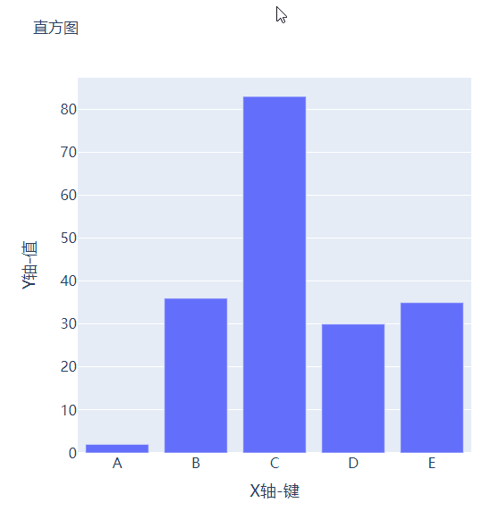
Histogram
We first import the modules to be used later and generate a batch of fake data ,
import numpy as np
import plotly.graph_objects as go

# create dummy data
vals = np.ceil(100 * np.random.rand(5)).astype(int)
keys = ["A", "B", "C", "D", "E"]
We plot the histogram based on the generated false data , The code is as follows :
fig = go.Figure()
fig.add_trace(
 go.Bar(x=keys, y=vals)
)
fig.update_layout(height=600, width=600)
fig.show()
output

Perhaps the reader will feel that the chart drawn is a little simple , Let's improve it , Add the title and comments , The code is as follows :
# create figure
fig = go.Figure()
#  Charting
fig.add_trace(
    go.Bar(x=keys, y=vals, hovertemplate="<b>Key:</b> %{x}<br><b>Value:</b> %{y}<extra></extra>")
)
#  Update and improve the chart
fig.update_layout(
    font_family="Averta",
    hoverlabel_font_family="Averta",
    title_text=" Histogram ",
    xaxis_title_text="X Axis - key ",
    xaxis_title_font_size=18,
    xaxis_tickfont_size=16,
    yaxis_title_text="Y Axis - value ",
    yaxis_title_font_size=18,
    yaxis_tickfont_size=16,
    hoverlabel_font_size=16,
    height=600,
    width=600
)
fig.show()
output

Group bar and stacked bar
For example, if we have multiple groups of data that we want to plot as a histogram , Let's create the data set first :
vals_2 = np.ceil(100 * np.random.rand(5)).astype(int)
vals_3 = np.ceil(100 * np.random.rand(5)).astype(int)

vals_array = [vals, vals_2, vals_3]
Then we iterate over the values in the list and draw a bar graph , The code is as follows :
#  Create canvas
fig = go.Figure()
#  Charting
for i, vals in enumerate(vals_array):
    fig.add_trace(
        go.Bar(x=keys, y=vals, name=f"Group {i+1}", hovertemplate=f"<b>Group {i+1}</b><br><b>Key:</b> %{
    {x}}<br><b>Value:</b> %{
    {y}}<extra></extra>")
    )
#  Perfect chart
fig.update_layout(
    barmode="group",
    ......
)
fig.show()
output
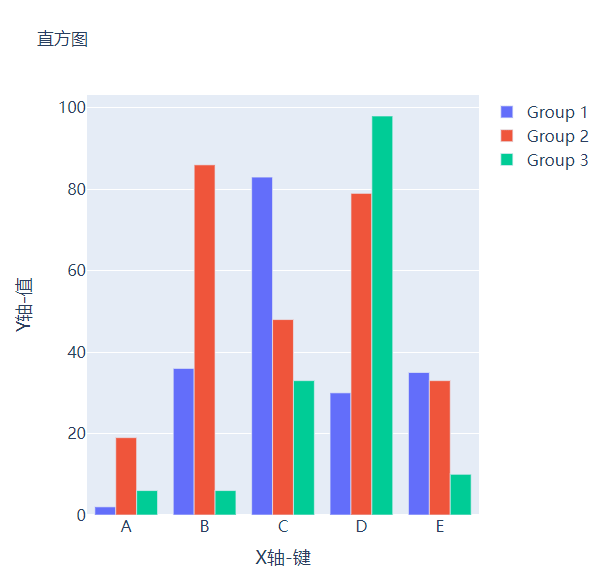
And we want to become a stacked bar chart , Just change one place in the code , take fig.update_layout(barmode="group") Modified into fig.update_layout(barmode="group") that will do , Let's see what it looks like .

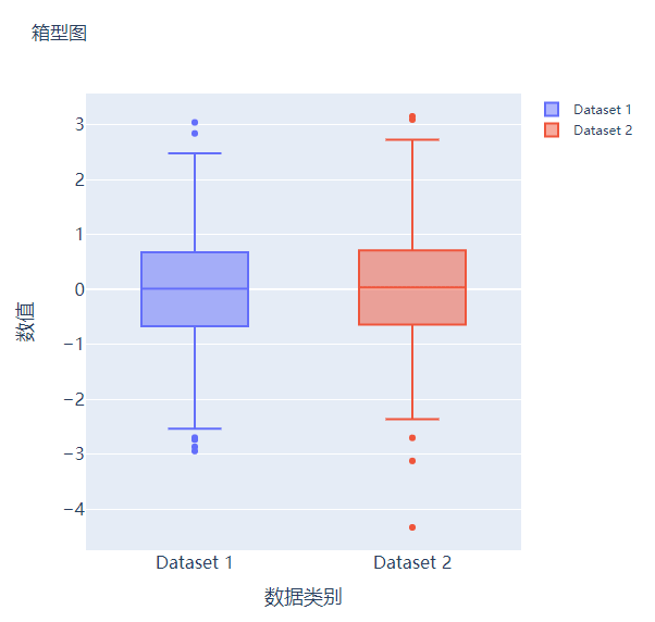
Box figure
Box chart is also widely used in data statistical analysis , Let's create two false data first :
# create dummy data for boxplots
y1 = np.random.normal(size=1000)
y2 = np.random.normal(size=1000)
We plot the data generated above as a box graph , The code is as follows :
#  Create canvas
fig = go.Figure()
#  Charting
fig.add_trace(
    go.Box(y=y1, name="Dataset 1"),
)
fig.add_trace(
    go.Box(y=y2, name="Dataset 2"),
)
fig.update_layout(
    ......
)
fig.show()
output

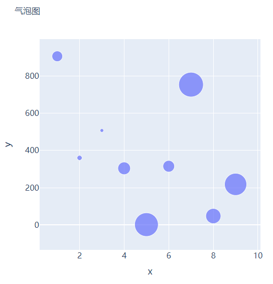
Scatter and bubble charts
Next, let's try to draw a scatter chart , It's the same step , We want to try to generate some false data , The code is as follows :
x = [i for i in range(1, 10)]
y = np.ceil(1000 * np.random.rand(10)).astype(int)
Then let's draw a scatter plot , It's called Scatter() Method , The code is as follows :
# create figure
fig = go.Figure()

fig.add_trace(
    go.Scatter(x=x, y=y, mode="markers", hovertemplate="<b>x:</b> %{x}<br><b>y:</b> %{y}<extra></extra>")
)

fig.update_layout(
    .......
)
fig.show()
output

So the bubble chart is based on the scatter chart , Set the size of the scatter point according to the value , Let's create some false data to set the size of the scatter , The code is as follows :
s = np.ceil(30 * np.random.rand(5)).astype(int) We have slightly modified the above code used to plot the scatter plot , adopt marker_size Parameter to set the size of the scatter , As shown below :
fig = go.Figure()

fig.add_trace(
    go.Scatter(x=x, y=y, mode="markers", marker_size=s, text=s, hovertemplate="<b>x:</b> %{x}<br><b>y:</b> %{y}<br><b>Size:</b> %{text}<extra></extra>")
)
fig.update_layout(
    ......
)
fig.show()
output

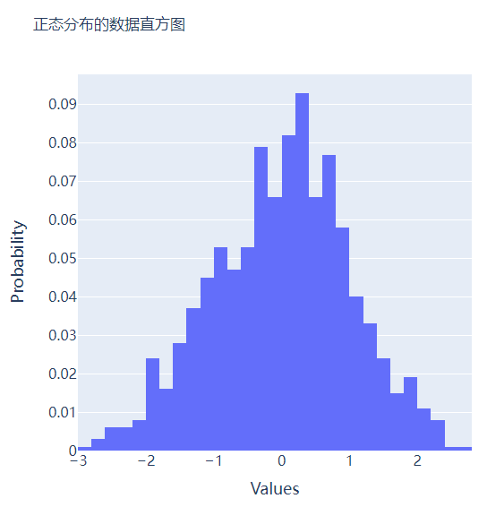
Histogram
The histogram is compared with several charts mentioned above , On the whole, it will be a little ugly , But through the histogram , Readers can feel the distribution of data more intuitively , Let's start by creating a set of fake data , The code is as follows :
##  Create fake data
data = np.random.normal(size=1000)
Then let's draw the histogram , It's called Histogram() Method , The code is as follows :
#  Create a canvas
fig = go.Figure()
#  Charting
fig.add_trace(
    go.Histogram(x=data, hovertemplate="<b>Bin Edges:</b> %{x}<br><b>Count:</b> %{y}<extra></extra>")
)
fig.update_layout(
    height=600,
    width=600
)
fig.show()
output

We will further optimize the format based on the above chart , The code is as follows :
#  Create canvas
fig = go.Figure()
#  Charting
fig.add_trace(
    go.Histogram(x=data, histnorm="probability", hovertemplate="<b>Bin Edges:</b> %{x}<br><b>Count:</b> %{y}<extra></extra>")
)
fig.update_layout(
    ......
)
fig.show()
output

Several subgraphs are put together
I believe you all know that matplotlib In the module subplots() Method can piece together multiple subgraphs , So in the same way plotly You can also piece together multiple subgraphs in the same way , It's called plotly Modules make_subplots function
from plotly.subplots import make_subplots
## 2 That's ok 2 Column chart
fig = make_subplots(rows=2, cols=2)
##  Generate a batch of false data for chart drawing
x = [i for i in range(1, 11)]
y = np.ceil(100 * np.random.rand(10)).astype(int)
s = np.ceil(30 * np.random.rand(10)).astype(int)
y1 = np.random.normal(size=5000)
y2 = np.random.normal(size=5000)
Next, we will add the chart to add_trace() Among the methods , The code is as follows :
#  Charting
fig.add_trace(
    go.Bar(x=x, y=y, hovertemplate="<b>x:</b> %{x}<br><b>y:</b> %{y}<extra></extra>"),
    row=1, col=1
)
fig.add_trace(
    go.Histogram(x=y1, hovertemplate="<b>Bin Edges:</b> %{x}<br><b>Count:</b> %{y}<extra></extra>"),
    row=1, col=2
)
fig.add_trace(
    go.Scatter(x=x, y=y, mode="markers", marker_size=s, text=s, hovertemplate="<b>x:</b> %{x}<br><b>y:</b> %{y}<br><b>Size:</b> %{text}<extra></extra>"),
    row=2, col=1
)
fig.add_trace(
    go.Box(y=y1, name="Dataset 1"),
    row=2, col=2
)
fig.add_trace(
    go.Box(y=y2, name="Dataset 2"),
    row=2, col=2
)
fig.update_xaxes(title_font_size=18, tickfont_size=16)
fig.update_yaxes(title_font_size=18, tickfont_size=16)
fig.update_layout(
    ......
)
fig.show()
output

CSDN The online survey of audio and video technology developers was officially launched !
Now we invite developers to scan the code for online research


Looking back
Gain Algorithm for missing value prediction
Crack the programmer's 5 Great myth ,《 New programmers 004》 list !
M2 The chip came out in a big way , Performance improvement 18%!
AI Candidates challenge college entrance examination composition , Average 1 second 1 piece
 Share
 Point collection
 A little bit of praise
Click to see 边栏推荐
- 2022.05.27 (lc_647_palindrome substring)
- Congratulations | Najie research group of Medical College revealed the function of junB in the process of differentiation of artificial blood progenitor cells in vitro through multi group analysis
- 性能测试方案(计划)模板
- FPGA状态机
- C pointer (interview classic topic exercise)
- 大厂是怎么写数据分析报告的?
- 云图说|每个成功的业务系统都离不开APIG的保驾护航
- Key and encryption mechanism in financial industry
- 2022 年 DevOps 路线图|Medium
- How to increase the monthly salary of software testing from 10K to 30K? Only automated testing can do it
猜你喜欢

掌握高性能计算前,我们先了解一下它的历史

基于改进SEIR模型分析上海疫情

软件测试月薪10K如何涨到30K,只有自动化测试能做到

China pufuteng hotels and resorts launched new spa products to celebrate the global health day on June 11

618大促将至,用AI挖掘差评,零代码实现亿级评论观点情感分析

详细解读TPH-YOLOv5 | 让目标检测任务中的小目标无处遁形

Trilogy to solve the problem of playing chess first and then

This article introduces you to j.u.c's futuretask, fork/join framework and BlockingQueue

2022.05.28 (lc_516_longest palindrome subsequence)
2022 software test interview strategy for the strongest version of fresh students to help you get directly to the big factory
随机推荐
ZABBIX server trapper Remote Code Execution Vulnerability (cve-2017-2824)
[advanced C language] data storage [part I] [ten thousand words summary]
马斯克称自己不喜欢做CEO,更想做技术和设计;吴恩达的《机器学习》课程即将关闭注册|极客头条
Flutter series: UI layout introduction
Rmarkdown easily input mathematical formula
大学生毕业季找房,VR全景看房帮你线上筛选
During the college entrance examination this year, all examination sites were in good order, and no sensitive cases affecting safety occurred
VR全景如何应用在家装中?体验真实的家装效果
改变世界的开发者丨玩转“俄罗斯方块”的瑶光少年
大厂是怎么写数据分析报告的?
恭喜 | 医学院那洁课题组通过多组学分析揭示JUNB在体外分化人造血祖细胞过程中的功能
mixin-- 混入
2022.05.23 (lc_300_longest increment subsequence)
frp reverse proxy
Logback排除指定包/类/方法日志输出
How to add independent hotspots in VR panoramic works?
DataScience&ML:金融科技领域之风控之风控指标/字段相关概念、口径逻辑之详细攻略
禁止摆烂,软件测试工程师从初级到高级进阶指南,助你一路晋升
2022.05.27 (lc_647_palindrome substring)
Source code analysis of Tencent libco collaboration open source library (III) -- Exploring collaboration switching process assembly register saving and efficient collaboration environment