当前位置:网站首页>[daily practice] realization of product card animation effect
[daily practice] realization of product card animation effect
2022-06-27 08:04:00 【Phil Arist】
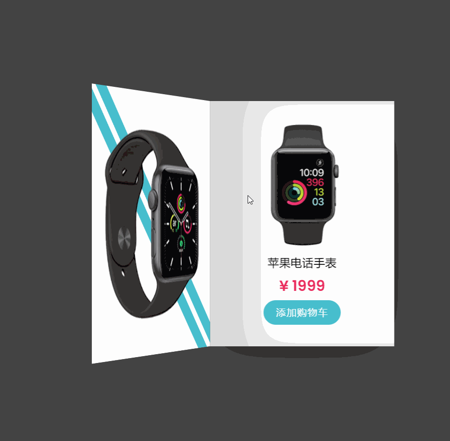
The following small item is still the effect of a product card , The specific effect is as follows :
HTML The code is as follows :
<!DOCTYPE html>
<html>
<head>
  <title>【 Practice every day 】CSS Realization of product card animation effect </title>
</head>
<body>
  <div class="card">
    <div class="cover">
      <img src="watch1.png">
    </div>
    <div class="details">
      <div>
        <img src="watch2.png">
        <h3> Apple phone watch </h3>
        <h2>¥ 1999</h2>
        <a href="https://www.webqdkf.com/" target="_blank"> Add cart </a>
      </div>
    </div>
  </div>
</body>
</html>
CSS Code :
*
{
  margin: 0;
  padding: 0;
  box-sizing: border-box;
  font-family: 'Poppins', sans-serif;
}
body
{
  display: flex;
  justify-content: center;
  align-items: center;
  min-height: 100vh;
  background: #09383e;
}
.card
{
  position: relative;
  margin: 20px 0;
  width: 300px;
  height: 400px;
  background: #fff;
  transform-style: preserve-3d;
  transform: perspective(2000px);
  box-shadow: inset 300px 0 50px rgba(0,0,0,.15),
  0 20px 20px rgba(0,0,0,.15);
  transition: 1s;
}
.card:hover
{
  transform: perspective(2000px) translateX(50%);
  box-shadow: inset 20px 0 50px rgba(0,0,0,.15), 0 10px 100px rgba(0,0,0,.15);
}

.card .cover
{
  position: relative;
  width: 100%;
  height: 100%;
  transform-origin: left;
  z-index: 2;
  transition: 1s ease-out;
  background: #fff;
  display: flex;
  justify-content: center;
  align-items: center;
  transform-style: preserve-3d;
  overflow: hidden;
}
.card .cover img
{
  max-width: 100%;
  z-index: 1;
}
.card:hover .cover
{
  transform: rotateY(-180deg);
}
.card .cover::before
{
  content: '';
  position: absolute;
  width: 10px;
  background: #fff;
  height: 150%;
  transform: rotate(36.5deg);
  box-shadow: 0 0 0 20px #47bfce;
  transition: 0.5s;
  transition-delay: 1s;
}
.card:hover .cover::before
{
  width: 0px;
  box-shadow: 0 0 0 250px #47bfce;
  transform: rotate(143.5deg);
}
.card .details
{
  position: absolute;
  top: 0;
  left: 0;
  width: 100%;
  height: 100%;
  padding: 20px;
  display: flex;
  justify-content: center;
  align-items: center;
  text-align: center;
  overflow: hidden;
}
.card .details h3
{
  font-weight: 500;
  margin: 5px 0;
}
.card .details h2
{
  font-size: 1.5em;
  color: #e82a5b;
  font-weight: 600;
}

.card .details a
{
  display: inline-block;
  padding: 8px 20px;
  margin-top: 5px;
  background: #47bfce;
  color: #fff;
  font-weight: 500;
  letter-spacing: 1px;
  border-radius: 25px;
  text-decoration: none;
}边栏推荐
- 八大误区,逐个击破(终篇):云难以扩展、定制性差,还会让管理员失去控制权?
- js输出形状
- lvgl 说明3关于lvgl guider的使用
- Set the address book function to database maintenance, and add user name and password
- The 6th Blue Bridge Cup
- 若xn>0,且x(n+1)/xn>1-1/n(n=1,2,...),证明级数∑xn发散
- 索引+sql练习优化
- js成绩奖惩例题
- Futures reverse Documentary - training for traders
- What is a flotation machine?
猜你喜欢
Win10 how to manage startup items?

win命令行中导入、导出数据库相关表

Online text digit recognition list summation tool

js用switch输出成绩是否合格
win10-如何管理开机启动项?

JS example print the number and sum of multiples of all 7 between 1-100
![[10. difference]](/img/15/ffd93da75858943fe887de1718e0f6.png)
[10. difference]

js用switch语句根据1-7输出对应英文星期几

js判断用户输入的数是否为质数(多种方法)

Error in idea connection database
随机推荐
What are the specialties of database system engineers?
Cookie encryption 7 fidder analysis phase
SQL attendance query interval: one hour
Zabbix部署说明(Server+Win客户端+交换机(H3C))
[batch dos-cmd command - summary and summary] - parameters%0,%1,%2,%[0-9],%0-9 in the batch command and batch command parameter position switching command shift, operator% usage in the DOS command
js成绩奖惩例题
野風藥業IPO被終止:曾擬募資5.4億 實控人俞蘠曾進行P2P投資
c的时间函数算效率
The 6th Blue Bridge Cup
Mapping of Taobao virtual product store opening tutorial
MSSQL how to export and delete multi table data using statements
爬一个网页的所有导师信息
Read datasets iteratively with xgboost
【批处理DOS-CMD命令-汇总和小结】-将文件夹映射成虚拟磁盘——subst
JS performance reward and punishment examples
1-4 decimal representation and conversion
野风药业IPO被终止:曾拟募资5.4亿 实控人俞蘠曾进行P2P投资
js判断用户输入的数是否为质数(多种方法)
Testing network connectivity with the blackbox exporter
js中判断成绩是否合格,范围在0-100,否则重新输入