当前位置:网站首页>机器学习【Matplotlib】
机器学习【Matplotlib】
2022-07-27 00:06:00 【hike76】
文章目录
一 Matplotlib
Matplotlib是专门用于开发2D图表(包括3D图表),以渐进、交互式方式实现数据可视化
可视化是在整个数据挖掘的关键辅助工具,可以清晰的理解数据,从而调整我们的分析方法。
能将数据进行可视化,更直观的呈现,使数据更加客观、更具说服力
1 简单实现
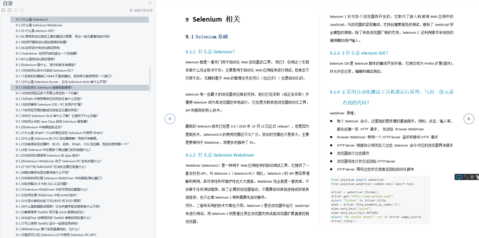
matplotlib.pytplot包含了一系列类似于matlab的画图函数。
#导入需要的库
import matplotlib.pyplot as plt
#创建画布
plt.figure(figsize=(10, 10), dpi=100)
#绘制折线图
plt.plot([1, 2, 3, 4, 5, 6 ,7], [17,17,18,15,11,11,13])
#显示图像
plt.show()
一些属性说明
figsize:指定图的长宽
dpi:图像的清晰度
返回fig对象
2 Matplotlib图像结构

3 基础绘图功能
需求:画出某城市11点到12点1小时内每5分钟的温度变化折线图,温度范围在15度~18度
(1)准备数据,画出初始折线图
import matplotlib.pyplot as plt
import random
# 0.准备数据
x = range(60)
y_shanghai = [random.uniform(15, 18) for i in x]
# 1.创建画布
plt.figure(figsize=(20, 8), dpi=80)
# 2.绘制折线图
plt.plot(x, y_shanghai)
# 3.显示图像
plt.show()
(2)添加自定义x,y刻度
plt.xticks(x, **kwargs) x:要显示的刻度值
plt.yticks(y, **kwargs) y:要显示的刻度值
# 构造x轴刻度标签
# 将i的值填入到大括号处
x_ticks_label = ["11点{}分".format(i) for i in x]
# 构造y轴刻度
y_ticks = range(40)

# 修改x,y轴坐标的刻度显示
# 从0到60,间隔为5,
plt.xticks(x[::5], x_ticks_label[::5])
#plt.xticks(x_ticks_label[::5]) #错误,第一个参数必须是数字
#从0开始40结束,间隔为5
plt.yticks(y_ticks[::5])
(3) 添加网格显示
true使函数生效,linestyle管理虚线(–)还是实线(-),alpha网格的透明度
plt.grid(True, linestyle='--', alpha=0.5)
(4)添加描述信息
添加x轴、y轴描述信息及标题
通过fontsize参数可以修改图像中字体的大小
plt.xlabel("时间")
plt.ylabel("温度")
plt.title("中午11点0分到12点之间的温度变化图示", fontsize=20)
(5)图像保存
保存图片到指定路径
plt.show()会释放figure资源,如果在显示图像之后保存图片将只能保存空图片。
plt.savefig("path")
4 在一个坐标系中绘制多个图像
需求:再添加一个城市的温度变化
收集到北京当天温度变化情况,温度在1度到3度。只需要再次plot即可,但是需要区分线条,
# 增加北京的温度数据
y_beijing = [random.uniform(1, 3) for i in x]
# 绘制折线图
plt.plot(x, y_shanghai,label="上海")
# 使用多次plot可以画多个折线
plt.plot(x, y_beijing, color='r', linestyle='--',label="北京")
# 显示图例,描述信息,哪种颜色的线代表哪一个城市
plt.legend(loc="best")
使用plt.legend()将图例显示出来,但是需要在plt.plot()中设置label值
(1)图形风格
| 颜色字符(color) | 风格字符(linestyle) |
|---|---|
| r 红色 | - 实线 |
| g 绿色 | - - 虚线 |
| b 蓝色 | -. 点划线 |
| w 白色 | : 点虚线 |
| c 青色 | ’ ’ 留空、空格 |
| m 洋红 | |
| y 黄色 | |
| k 黑色 |
(2)loc代码
| Location String | Location Code |
|---|---|
| ‘best’ | 0 |
| ‘upper right’ | 1 |
| ‘upper left’ | 2 |
| ‘lower left’ | 3 |
| ‘lower right’ | 4 |
| ‘right’ | 5 |
| ‘center left’ | 6 |
| ‘center right’ | 7 |
| ‘lower center’ | 8 |
| ‘upper center’ | 9 |
| ‘center’ | 10 |
(3)完整代码
# 0.准备数据
x = range(60)
y_shanghai = [random.uniform(15, 18) for i in x]
y_beijing = [random.uniform(1,3) for i in x]

# 1.创建画布
plt.figure(figsize=(20, 8), dpi=100)

# 2.绘制图像
plt.plot(x, y_shanghai, label="上海")
plt.plot(x, y_beijing, color="r", linestyle="--", label="北京")

# 2.1 添加x,y轴刻度
# 构造x,y轴刻度标签
x_ticks_label = ["11点{}分".format(i) for i in x]
y_ticks = range(40)

# 刻度显示
plt.xticks(x[::5], x_ticks_label[::5])
plt.yticks(y_ticks[::5])

# 2.2 添加网格显示
plt.grid(True, linestyle="--", alpha=0.5)

# 2.3 添加描述信息
plt.xlabel("时间")
plt.ylabel("温度")
plt.title("中午11点--12点某城市温度变化图", fontsize=20)

# 2.4 图像保存
plt.savefig("./test.png")

# 2.5 添加图例
plt.legend(loc=0)


# 3.图像显示
plt.show()
5 在多个坐标系下显示图像
matplotlib.pyplot.subplots(nrows=1, ncols=1, **fig_kw) 创建一个带有多个axes(坐标系/绘图区)的图
Parameters:

nrows, ncols : 设置有几行几列坐标系
    int, optional, default: 1, Number of rows/columns of the subplot grid.

Returns:
fig : 图对象
axes : 返回相应数量的坐标系,使用axes进行图像的绘制

设置标题等方法不同:
    set_xticks
    set_yticks
    set_xlabel
    set_ylabel
# 0.准备数据
x = range(60)
y_shanghai = [random.uniform(15, 18) for i in x]
y_beijing = [random.uniform(1, 5) for i in x]
# 1.创建画布
fig, axes = plt.subplots(nrows=1, ncols=2, figsize=(20, 8), dpi=100)
# 2.绘制图像
axes[0].plot(x, y_shanghai, label="上海")
axes[1].plot(x, y_beijing, color="r", linestyle="--", label="北京")
# 2.1 添加x,y轴刻度
x_ticks_label = ["11点{}分".format(i) for i in x]
y_ticks = range(40)
# 刻度显示
axes[0].set_xticks(x[::5])
axes[0].set_yticks(y_ticks[::5])
axes[0].set_xticklabels(x_ticks_label[::5])  # 使用字符串替换
axes[1].set_xticks(x[::5])
axes[1].set_yticks(y_ticks[::5])
axes[1].set_xticklabels(x_ticks_label[::5])  # 使用字符串替换
# 2.2 添加网格显示
axes[0].grid(True, linestyle="--", alpha=0.5)
axes[1].grid(True, linestyle="--", alpha=0.5)
# 2.3 添加描述信息
axes[0].set_xlabel("时间")
axes[0].set_ylabel("温度")
axes[0].set_title("中午11点--12点北京温度变化图", fontsize=20)
axes[1].set_xlabel("时间")
axes[1].set_ylabel("温度")
axes[1].set_title("中午11点--12点上海温度变化图", fontsize=20)
# # 2.4 图像保存
plt.savefig("./test.png")
# # 2.5 添加图例
axes[0].legend(loc=0)
axes[1].legend(loc=0)
# 3.图像显示
plt.show()
6 折线图的应用场景
- 呈现公司产品(不同区域)每天活跃用户数
- 呈现app每天下载数量
- 呈现产品新功能上线后,用户点击次数随时间的变化
使用plt.plot()画sin图像
import numpy as np
# 0.准备数据
x = np.linspace(-10, 10, 1000)  #从-10到10生成1000个数据
y = np.sin(x)
# y = x * x * x
# 1.创建画布
plt.figure(figsize=(20, 8), dpi=100)
# 2.绘制函数图像
plt.plot(x, y)
# 2.1 添加网格显示
plt.grid()
# 3.显示图像
plt.show()
7 常见图形绘制
(1)折线图
以折线的上升或下降来表示统计数量的增减变化的统计图
特点:能够显示数据的变化趋势,反映事物的变化情况。(变化)
api:plt.plot(x, y)
(2)散点图
用两组数据构成多个坐标点,考察坐标点的分布,判断两变量之间是否存在某种关联或总结坐标点的分布模式。
特点:判断变量之间是否存在数量关联趋势,展示离群点(分布规律)
api:plt.scatter(x, y)
(3)柱状图
排列在工作表的列或行中的数据可以绘制到柱状图中。
特点:绘制连离散的数据,能够一眼看出各个数据的大小,比较数据之间的差别。(统计/对比)
api:plt.bar(x, width, align='center', **kwargs)
Parameters:
x : 需要传递的数据

width : 柱状图的宽度

align : 每个柱状图的位置对齐方式
    {‘center’, ‘edge’}, optional, default: ‘center’

**kwargs :
color:选择柱状图的颜色
(4)直方图
由一系列高度不等的纵向条纹或线段表示数据分布的情况。 一般用横轴表示数据范围,纵轴表示分布情况。
特点:绘制连续性的数据展示一组或者多组数据的分布状况(统计)
api:matplotlib.pyplot.hist(x, bins=None)
Parameters:
x : 需要传递的数据
bins : 组距
(5)饼图
用于表示不同分类的占比情况,通过弧度大小来对比各种分类。
特点:分类数据的占比情况(占比)
api:plt.pie(x, labels=,autopct=,colors)
Parameters:
x:数量,自动算百分比
labels:每部分名称
autopct:占比显示指定%1.2f%%
colors:每部分颜色
(6)散点图绘制
# 0.准备数据
x = [225.98, 247.07, 253.14, 457.85, 241.58, 301.01,  20.67, 288.64,
       163.56, 120.06, 207.83, 342.75, 147.9 ,  53.06, 224.72,  29.51,
        21.61, 483.21, 245.25, 399.25, 343.35]
y = [196.63, 203.88, 210.75, 372.74, 202.41, 247.61,  24.9 , 239.34,
       140.32, 104.15, 176.84, 288.23, 128.79,  49.64, 191.74,  33.1 ,
        30.74, 400.02, 205.35, 330.64, 283.45]
# 1.创建画布
plt.figure(figsize=(20, 8), dpi=100)
# 2.绘制散点图
plt.scatter(x, y)
# 3.显示图像
plt.show()
(7)柱状图绘制
需求:对比每部电影的票房收入
# 0.准备数据
# 电影名字
movie_name = ['雷神3:诸神黄昏','正义联盟','东方快车谋杀案','寻梦环游记','全球风暴','降魔传','追捕','七十七天','密战','狂兽','其它']
# 横坐标
x = range(len(movie_name))
# 票房数据
y = [73853,57767,22354,15969,14839,8725,8716,8318,7916,6764,52222]
# 1.创建画布
plt.figure(figsize=(20, 8), dpi=100)
# 2.绘制柱状图
plt.bar(x, y, width=0.5, color=['b','r','g','y','c','m','y','k','c','g','b'])
# 2.1 修改x轴的刻度显示
plt.xticks(x, movie_name)
# 2.2 添加网格显示
plt.grid(linestyle="--", alpha=0.5)
# 2.3 添加标题
plt.title("电影票房收入对比")
# 3.显示图像
plt.show()
[参考链接]:https://matplotlib.org/index.html
边栏推荐
- Database read-write separation and database and table segmentation
- Play a parallel multithreaded mcu-mc3172
- [nisactf 2022] upper
- 数据库读写分离和分库分表
- time模块: 时间戳、结构化时间、格式化时间的获取与相互转化
- bp 插件临时代码记录
- 对象创建的流程分析
- Kubernetes dashboard deployment application and access
- [redis] quick start
- Debezium系列之:基于debezium offset拉取历史数据,确保数据没有丢失
猜你喜欢

Plato farm is expected to further expand its ecosystem through elephant swap

Goatgui invites you to attend a machine learning seminar
「软件测试」包装简历从这几点出发,直接提升通过率

LeetCode刷题——NO.238——除自身以外数组的乘积

人们为什么热衷于给事物排序

Swiperjs custom width

iNFTnews | “流量+体验”白衬e数字时装节引领数字时装新变迁

Arduinouno drive RGB module full color effect example
Graduated and entered HW, from test engineer to project manager. Now I earn millions in goose factory every year. My suggestions to you

Blog competition dare to try BAC for beginners
随机推荐
测试人需要的数据库知识:MySQL常用语法
Database knowledge required by testers: MySQL common syntax
If you want to thoroughly optimize the performance, you must first understand the underlying logic~
系统安全测试要怎么做,详细来说说
C language program compilation
ansible系列之:不收集主机信息 gather_facts: False
Cloud development sleeping alarm clock wechat applet source code
Swiperjs custom width
人们为什么热衷于给事物排序
Which securities firm is safer to open an account and buy REITs funds?
【无标题】
平成千字文(へいせいせんじもん) (平成12年9月10日 石渡 明 作) 宇宙広遠 銀河永久 日月運行 不乱無休 地球公転 季節変移 黄道星座 太陽年周 故郷群島 南熱北冷 海洋温暖 気候順良 青空飛雲 諸野深緑 湖泉静息 谷川清流 春桜一面 新芽
数据库读写分离和分库分表
C language: deep learning recursion
F8 catch traffic, F9 catch rabbits, f10turttle
Kubernetes dashboard deployment application and access
数据资产管理的概念
银河证券基金低佣金开户靠谱吗,可靠安全吗
手动从0搭建ABP框架-ABP官方完整解决方案和手动搭建简化解决方案实践
Scheduling of processes