当前位置:网站首页>用 Plotly 绘制了几张精湛的图表,美翻了!!
用 Plotly 绘制了几张精湛的图表,美翻了!!
2022-06-10 18:49:00 【AI科技大本营】

作者 | 俊欣
来源 | 关于数据分析与可视化
说到Python当中的可视化模块,相信大家用的比较多的还是matplotlib、seaborn等模块,今天小编来尝试用Plotly模块为大家绘制可视化图表,和前两者相比,用Plotly模块会指出来的可视化图表有着很强的交互性。

柱状图
我们先导入后面需要用到的模块并且生成一批假数据,
import numpy as np
import plotly.graph_objects as go

# create dummy data
vals = np.ceil(100 * np.random.rand(5)).astype(int)
keys = ["A", "B", "C", "D", "E"]
我们基于所生成的假数据来绘制柱状图,代码如下:
fig = go.Figure()
fig.add_trace(
 go.Bar(x=keys, y=vals)
)
fig.update_layout(height=600, width=600)
fig.show()
output

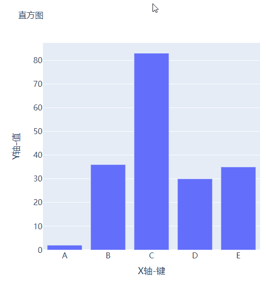
可能读者会感觉到绘制出来的图表略显简单,我们再来完善一下,添加上标题和注解,代码如下:
# create figure
fig = go.Figure()
# 绘制图表
fig.add_trace(
    go.Bar(x=keys, y=vals, hovertemplate="<b>Key:</b> %{x}<br><b>Value:</b> %{y}<extra></extra>")
)
# 更新完善图表
fig.update_layout(
    font_family="Averta",
    hoverlabel_font_family="Averta",
    title_text="直方图",
    xaxis_title_text="X轴-键",
    xaxis_title_font_size=18,
    xaxis_tickfont_size=16,
    yaxis_title_text="Y轴-值",
    yaxis_title_font_size=18,
    yaxis_tickfont_size=16,
    hoverlabel_font_size=16,
    height=600,
    width=600
)
fig.show()
output

分组条形图和堆积条形图
例如我们有多组数据想要绘制成柱状图的话,我们先来创建好数据集:
vals_2 = np.ceil(100 * np.random.rand(5)).astype(int)
vals_3 = np.ceil(100 * np.random.rand(5)).astype(int)

vals_array = [vals, vals_2, vals_3]
然后我们遍历获取列表中的数值并且绘制成条形图,代码如下:
# 生成画布
fig = go.Figure()
# 绘制图表
for i, vals in enumerate(vals_array):
    fig.add_trace(
        go.Bar(x=keys, y=vals, name=f"Group {i+1}", hovertemplate=f"<b>Group {i+1}</b><br><b>Key:</b> %{
    {x}}<br><b>Value:</b> %{
    {y}}<extra></extra>")
    )
# 完善图表
fig.update_layout(
    barmode="group",
    ......
)
fig.show()
output
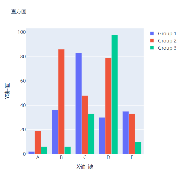
而我们想要变成堆积状的条形图,只需要修改代码中的一处即可,将fig.update_layout(barmode="group")修改成fig.update_layout(barmode="group")即可,我们来看一下出来的样子。

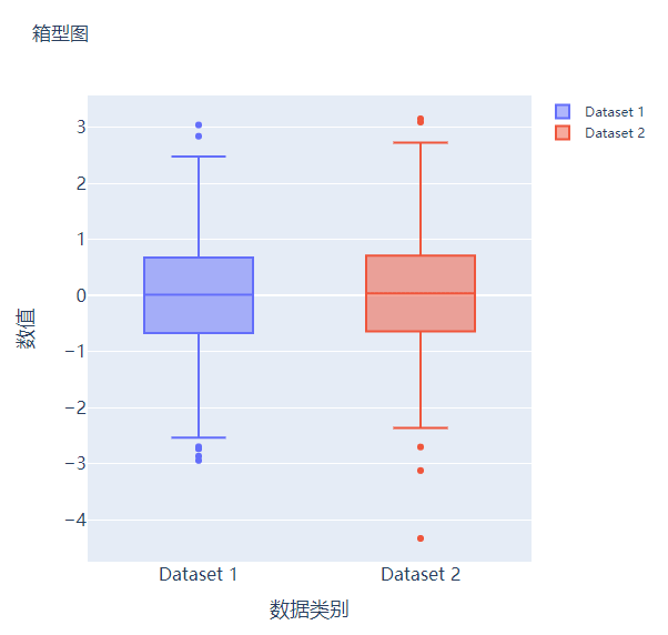
箱型图
箱型图在数据统计分析当中也是应用相当广泛的,我们先来创建两个假数据:
# create dummy data for boxplots
y1 = np.random.normal(size=1000)
y2 = np.random.normal(size=1000)
我们将上面生成的数据绘制成箱型图,代码如下:
# 生成画布
fig = go.Figure()
# 绘制图表
fig.add_trace(
    go.Box(y=y1, name="Dataset 1"),
)
fig.add_trace(
    go.Box(y=y2, name="Dataset 2"),
)
fig.update_layout(
    ......
)
fig.show()
output

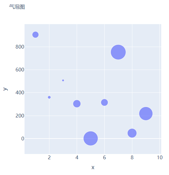
散点图和气泡图
接下来我们尝试来绘制一张散点图,也是一样的步骤,我们想尝试生成一些假数据,代码如下:
x = [i for i in range(1, 10)]
y = np.ceil(1000 * np.random.rand(10)).astype(int)然后我们来绘制散点图,调用的是Scatter()方法,代码如下:
# create figure
fig = go.Figure()

fig.add_trace(
    go.Scatter(x=x, y=y, mode="markers", hovertemplate="<b>x:</b> %{x}<br><b>y:</b> %{y}<extra></extra>")
)

fig.update_layout(
    .......
)
fig.show()
output

那么气泡图的话就是在散点图的基础上,根据数值的大小来设定散点的大小,我们再来创建一些假数据用来设定散点的大小,代码如下:
s = np.ceil(30 * np.random.rand(5)).astype(int)我们将上面用作绘制散点图的代码稍作修改,通过marker_size参数来设定散点的大小,如下所示:
fig = go.Figure()

fig.add_trace(
    go.Scatter(x=x, y=y, mode="markers", marker_size=s, text=s, hovertemplate="<b>x:</b> %{x}<br><b>y:</b> %{y}<br><b>Size:</b> %{text}<extra></extra>")
)
fig.update_layout(
    ......
)
fig.show()
output

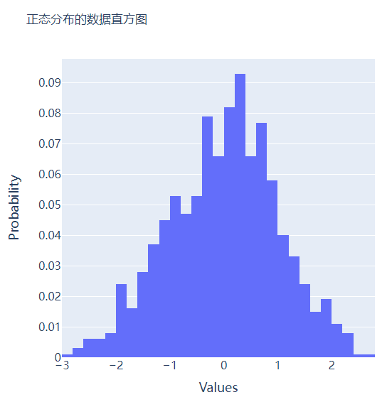
直方图
直方图相比较于上面提到的几种图表,总体上来说会稍微有点丑,但是通过直方图,读者可以更加直观地感受到数据的分布,我们先来创建一组假数据,代码如下:
## 创建假数据
data = np.random.normal(size=1000)然后我们来绘制直方图,调用的是Histogram()方法,代码如下:
# 创建画布
fig = go.Figure()
# 绘制图表
fig.add_trace(
    go.Histogram(x=data, hovertemplate="<b>Bin Edges:</b> %{x}<br><b>Count:</b> %{y}<extra></extra>")
)
fig.update_layout(
    height=600,
    width=600
)
fig.show()
output

我们再在上述图表的基础之上再进行进一步的格式优化,代码如下:
# 生成画布
fig = go.Figure()
# 绘制图表
fig.add_trace(
    go.Histogram(x=data, histnorm="probability", hovertemplate="<b>Bin Edges:</b> %{x}<br><b>Count:</b> %{y}<extra></extra>")
)
fig.update_layout(
    ......
)
fig.show()
output

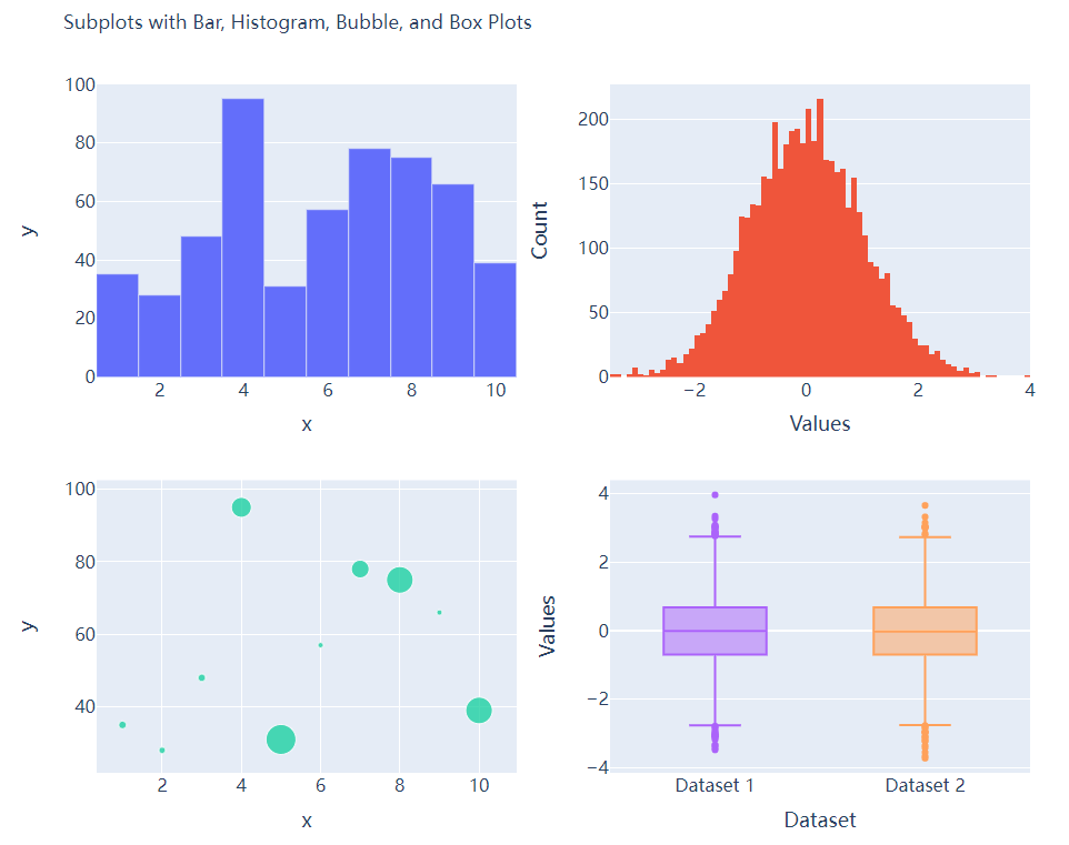
多个子图拼凑到一块儿
相信大家都知道在matplotlib模块当中的subplots()方法可以将多个子图拼凑到一块儿,那么同样地在plotly当中也可以同样地将多个子图拼凑到一块儿,调用的是plotly模块当中make_subplots函数
from plotly.subplots import make_subplots
## 2行2列的图表
fig = make_subplots(rows=2, cols=2)
## 生成一批假数据用于图表的绘制
x = [i for i in range(1, 11)]
y = np.ceil(100 * np.random.rand(10)).astype(int)
s = np.ceil(30 * np.random.rand(10)).astype(int)
y1 = np.random.normal(size=5000)
y2 = np.random.normal(size=5000)接下来我们将所要绘制的图表添加到add_trace()方法当中,代码如下:
# 绘制图表
fig.add_trace(
    go.Bar(x=x, y=y, hovertemplate="<b>x:</b> %{x}<br><b>y:</b> %{y}<extra></extra>"),
    row=1, col=1
)
fig.add_trace(
    go.Histogram(x=y1, hovertemplate="<b>Bin Edges:</b> %{x}<br><b>Count:</b> %{y}<extra></extra>"),
    row=1, col=2
)
fig.add_trace(
    go.Scatter(x=x, y=y, mode="markers", marker_size=s, text=s, hovertemplate="<b>x:</b> %{x}<br><b>y:</b> %{y}<br><b>Size:</b> %{text}<extra></extra>"),
    row=2, col=1
)
fig.add_trace(
    go.Box(y=y1, name="Dataset 1"),
    row=2, col=2
)
fig.add_trace(
    go.Box(y=y2, name="Dataset 2"),
    row=2, col=2
)
fig.update_xaxes(title_font_size=18, tickfont_size=16)
fig.update_yaxes(title_font_size=18, tickfont_size=16)
fig.update_layout(
    ......
)
fig.show()
output

CSDN音视频技术开发者在线调研正式上线!
现邀开发者们扫码在线调研


往期回顾
分享
点收藏
点点赞
点在看边栏推荐
- 618 great promotion is coming, mining bad reviews with AI and realizing emotional analysis of 100 million comments with zero code
- 马斯克称自己不喜欢做CEO,更想做技术和设计;吴恩达的《机器学习》课程即将关闭注册|极客头条
- Go语学习笔记 - 跨域配置、全局异常捕获 | Web框架Gin(四)
- [advanced C language] advanced pointer [Part 2]
- 高考开启,VR全景可以这样看考点
- Rmarkdown 轻松录入数学公式
- 领域驱动设计(六) - 架构设计浅谈
- 【C语言进阶】指针的进阶【上篇】
- 深入理解LightGBM
- This article introduces you to j.u.c's futuretask, fork/join framework and BlockingQueue
猜你喜欢

2022.05.24 (lc_674_longest continuous increasing sequence)

APICloud可视化开发新手图文教程

Detailed interpretation of tph-yolov5 | making small targets in target detection tasks invisible

My first work: tensorflow2 x
2022最强版应届生软件测试面试攻略,助你直通大厂

Only three steps are needed to learn how to use low code thingjs to connect with Sen data Dix data
2022 software test interview strategy for the strongest version of fresh students to help you get directly to the big factory

C (pointer 02)

DDD落地实践复盘 - 记理论培训&事件风暴

大厂是怎么写数据分析报告的?
随机推荐
Rmarkdown 轻松录入数学公式
Congratulations | Najie research group of Medical College revealed the function of junB in the process of differentiation of artificial blood progenitor cells in vitro through multi group analysis
叮咚抢菜-派送时段监听及推送工具
Analyse du code source de Tencent libco CO CO - Process open source library
How do various embedded functions in VR panoramic works be achieved?
大厂测试员年薪30万到月薪8K,吐槽工资太低,反被网友群嘲?
This article introduces you to j.u.c's futuretask, fork/join framework and BlockingQueue
Only three steps are needed to learn how to use low code thingjs to connect with Sen data Dix data
如何在VR全景作品中添加独立热点?
首批!青藤通过信通院CWPP能力评估检验
Writing technical articles is a fortune for the future
Deep understanding of lightgbm
一文详解EventMesh落地华为云的探索及实践
领域驱动设计(六) - 架构设计浅谈
掌握高性能计算前,我们先了解一下它的历史
VR全景如何应用在家装中?体验真实的家装效果
Trilogy to solve the problem of playing chess first and then
TiDB - 快速入门,集群搭建
Logback排除指定包/类/方法日志输出
騰訊Libco協程開源庫 源碼分析(二)---- 柿子先從軟的捏 入手示例代碼 正式開始探究源碼