当前位置:网站首页>Mobile web training day-1
Mobile web training day-1
2022-06-28 13:06:00 【HHppGo】
1. Characteristics of mobile terminal
1.1 Mobile and PC There are some differences between end pages
- Different sizes :
- PC The screen Big , Mobile terminal screen Small
- Different content locations :
- PC The end content is in Forum
- The mobile terminal is full of content , Of the screen width 100%
- summary :
- By comparing the differences , We realized that , Different mobile terminals , Different screen widths
- Need to do in the future Mobile Web Page adaptation ( The core )

1.2 Google simulator
- effect : It can easily simulate different mobile devices , Conduct code and effect debugging
1.3 The resolution of the
I.e. number of pixel cells 
Why understand device resolution ?
- Different devices have different resolutions , In order to know what resolution to write code for future development , Need to know the resolution
Screen size :
- The screen Diagonal distance , In inches
Screen resolution :
- Physical resolution
- Factory resolution of the equipment , At the hardware level , Can't change
- Logical resolution
- Zoom the resolution through the driver of the system , You can modify
- When developing , Refer to that resolution ?
- Logical resolution
- Physical resolution
1.4 viewport
Concept :
- The visual area of a web page

- The visual area of a web page
In development , The width of the web page should be consistent with the logical pixel width of the device , How to achieve ?
<head>
  <meta charset="UTF-8">
  <meta http-equiv="X-UA-Compatible" content="IE=edge">
  <!--  Viewport label : Make sure the page width is the same as the logical pixels of the device  -->
  <!-- name="viewport"  Express   viewport , Visual area of the page  -->
  <!-- content="width=device-width  Express   The width of the visible area of the page is the width of the device ( Logical pixel width ) -->
  <!-- initial-scale=1.0"  Represents the zoom ratio of the resolution ,1.0 == 100%, Don't zoom  -->
  <meta name="viewport" content="width=device-width, initial-scale=1.0">
  <title> Test viewport width </title>
</head>
1.5 Double
Why should a designer design a double ?
- Make sure that pictures are placed on different screens , It won't blur
Front end developers , Which resolution does the code refer to ?
- Logical resolution ( The corresponding graph is a one fold graph )
2. Percentage layout ( understand )
effect :
Width adaptation , Fixed height
The width is adaptive in percentage
.toolbar li {

  float: left;
  /*  Percentage layout : Width adaptation   Let five li label , Every li The tag occupies one fifth of the parent  20% */
  width: 20%;
  /*  Percentage layout : Fixed height  */
  height: 50px;
}
3. Flex Layout
3.1 Part of the
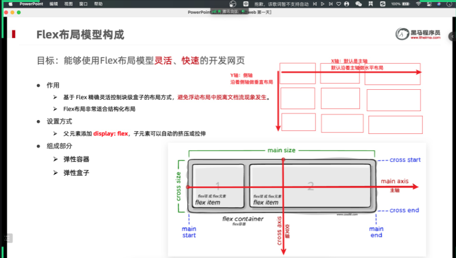
- effect :
- be based on Flex Accurately and flexibly control the layout of block level boxes , Avoid separation from document flow in floating layout .
- Flex Layout Very suitable for structured layout
- Setting mode :
- The parent element adds display: flex;
- Part of the :
- Elastic container
- Elastic box
- Spindle
- Side axle
3.2 Spindle alignment
/* flex Layout  */
display: flex;

/*  Adjust the horizontal spacing  */

/*  The default value is , From left to right , No spacing  */
justify-content: flex-start;

/*  The default value is , From right to left , No spacing  */
justify-content: flex-end;

/*  Center along the main axis , No spacing  */
 justify-content: center;

/*  In the direction of the spindle , Each box has the same left-right spacing  */
 justify-content: space-around;

/*  In the direction of the spindle , The leftmost and rightmost boxes are close to the left and right of the parent , Space draw allocated to other boxes  */
 justify-content: space-between;

/*  In the direction of the spindle , Each elastic box has the same spacing  */
justify-content: space-evenly;
effect :
justify-content: center;Center along the main axis , No spacing

justify-content: space-around;In the direction of the spindle , Each box has the same left-right spacing
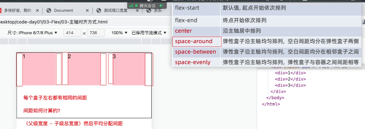
justify-content: space-between;In the direction of the spindle , The leftmost and rightmost boxes are close to the left and right of the parent , Space draw allocated to other boxes

justify-content: space-evenly;In the direction of the spindle , Each elastic box has the same spacing

边栏推荐
- [today in history] June 28: musk was born; Microsoft launches office 365; The inventor of Chua's circuit was born
- Centos7——安装mysql5.7
- Google Earth engine (GEE) - Global organic soil area of FAO (1992-2018)
- Understand leveldb write operation
- 专业英语历年题
- 从pdb源码到frame帧对象
- 同花顺上怎么进行开户啊, 安全吗
- PHP根据年月获取月初月末时间
- Deep understanding of Bayes theorem
- 在线JSON转PlainText工具
猜你喜欢

Wi-Fi 7 来啦,它到底有多强?

scratch旅行相册 电子学会图形化编程scratch等级考试一级真题和答案解析2022年6月
Stm32f1 and stm32cubeide programming example - matrix keyboard driver

词云的可视化设计教程

中二青年付杰的逆袭故事:从二本生到 ICLR 杰出论文奖,我用了20年
ASP. NET CORE Study09
![[MySQL from introduction to mastery] [advanced part] (III) creation of MySQL users_ Modification_ Delete and password settings](/img/9c/2a0eb8f5ec03aebbe231dbdb388eca.png)
[MySQL from introduction to mastery] [advanced part] (III) creation of MySQL users_ Modification_ Delete and password settings

MySQ 8.0 推出直方图,性能大大提升!

SHAREit实力出众,登陆全球 IAP 实力榜 Top7
![BUUCTF:[WUSTCTF2020]朴实无华](/img/0f/a7973d3f7593f2464e48609e27d7bd.png)
BUUCTF:[WUSTCTF2020]朴实无华
随机推荐
align-items 与 align-content 的区别
1015.摘花生
Arduino-ESP32闪存文件插件程序搭建和上传
List set to array
Go language learning notes - Gorm usage - database configuration, table addition | web framework gin (VII)
Wi-Fi 7 来啦,它到底有多强?
Implementation of fruit and vegetable mall management system based on SSM
Centos6.5 php+mysql MySQL library not found
Validateur async. Vérificateur de données JS
[cloud native] can self-service reports and Bi do so many things?
数字孪生能源系统,打造低碳时代“透视”眼
The $980000 SaaS project failed
全志V853芯片 如何在Tina V85x平台切换sensor?
高考失利进哈工大,毕业却留校要当“探索者”,丁效:科研就是厚积薄发
【MySQL从入门到精通】【高级篇】(三)MySQL用户的创建_修改_删除以及密码的设置
I²C、SMBus、PMBus关系
Flutter series part: detailed explanation of GridView layout commonly used in flutter
ASP. NET CORE Study09
Watermaker of the Flink core
腾讯汤道生:面向数实融合新世界,开发者是最重要的“建筑师”