当前位置:网站首页>Global configuration and page configuration of wechat applet development
Global configuration and page configuration of wechat applet development
2022-07-25 19:26:00 【Aricl.】
Catalog
(1) Components of applet window
(3) Drop down to refresh the page
(4) Pull up the distance to the bottom
(5) Bottom navigation bar tabBar
(2) The relationship between page configuration and global configuration
(3) Common configuration items
3、 ... and 、 Comprehensive case
(2) Effect drawing of real machine debugging
One 、 Global configuration
app.json File is the global configuration file of the project

(1) Components of applet window

(2) The navigation bar navigationBar
1)window Common configuration items of nodes

2) Set up the navigation bar
- Set navigation bar title text
app.json-->window-->navigationBarTitleText
- Set the background color of the navigation bar
app.json-->window-->navigationBarBackgroundColor
- Set the title color of the navigation bar
app.json-->window-->navigationBarTextStyle
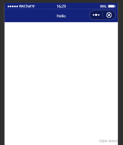
app.json In file window Node code
 "window":{
    "backgroundTextStyle":"light",
    "navigationBarBackgroundColor": "#13227a",
    "navigationBarTitleText": "Hello",
    "navigationBarTextStyle":"white"
}, 
(3) Drop down to refresh the page
1) Concept
Pull down refresh is a noun of the mobile terminal , It refers to the pull-down and sliding operation of your finger on the screen , To reload page data
2) Set dropdown refresh
- Turn on pull-down refresh
app.json-->window-->enablePullDownRefresh-->true
- Set the background color of the window when the drop-down is refreshed
app.json-->window-->backgroundColor--> Specify the hexadecimal color value #efefef
- When setting the pull-down refresh loading style
app.json-->window-->backgroundTextStyle-->dark
"window":{
    "navigationBarBackgroundColor": "#13227a",
    "navigationBarTitleText": "Hello",
    "navigationBarTextStyle":"white",
    "enablePullDownRefresh": true,
    "backgroundColor": "#efefef",
    "backgroundTextStyle":"dark"
}, 
(4) Pull up the distance to the bottom
1) Concept
Pull up to touch the bottom is a proper term for mobile terminal , Pull up and slide the screen with your fingers , So as to load more data
2) Set up
app.json-->window-->onReachBottomDistance--> Set new value
Be careful : The default bottom touch distance of the applet is 50px, If there are no special needs , Then use the default value directly
(5) Bottom navigation bar tabBar
1) Concept
tabBar It is a common page effect in mobile applications , For realizing multi page Fast switch
Small program tabBar There are two kinds of
- Bottom tabBat( Commonly used )
- Top tabBar
Be careful
- tabBar You can only configure least 2 individual 、 most 5 individual tab Tab
- When rendering top tabBar when , No display icon Icon , Show only text
tabBar Of 6 Components

2)tabBar Node configuration item

3) Every tab Configuration options for item

4) Example

app.json In file tabBar Node code
"tabBar": {
    "list": [{
      "pagePath": "pages/index/index",
      "text": " home page ",
      "iconPath": "images/home.png",
      "selectedIconPath": "images/home-active.png"
    },
    {
      "pagePath": "pages/message/message",
      "text": " news ",
      "iconPath": "images/message.png",
      "selectedIconPath": "images/message-active.png"
    },
    {
      "pagePath": "pages/contract/contract",
      "text": " Contact us ",
      "iconPath": "images/contract.png",
      "selectedIconPath": "images/contract-active.png"
    }
  ]
}, 
matters needing attention
- You can create a new one under the root directory of the project image Folder , To specifically store what the project needs to use icon Icon
- As tabBar Your page must be placed in app.json In file Pages Node front , otherwise Unable to jump normally ( Bear in mind )
(5) Icon acquisition
Bloggers strongly recommend Alibaba library vector network , free , And the icons are rich , A really conscientious practical website !

Two 、 Configuration page
(1) Concept
Small program , Every page has its own .json Page profile , Used to the window appearance of the current page 、 Page effects, etc. for specific configuration
(2) The relationship between page configuration and global configuration
- app.json Medium window node , You can globally configure the window performance of each page in the applet
- If a page wants a special window appearance , You can use page level .json Configure text to configure
- When the global configuration conflicts with the page configuration , according to “ Nearby principle ”, It will override the global configuration based on the page configuration
(3) Common configuration items

The configuration method is the same as the global configuration , Don't show .
3、 ... and 、 Comprehensive case
This case is the initial implementation of the home page interface of the local life applet
(1) step
- First configure the navigation bar effect
- Configure the bottom tabBar effect
- Implement the top rotation chart
- Realize the Jiugongge function box
- Realize the bottom picture layout
(2) Effect drawing of real machine debugging

(3) Complete code
- js file
// index.js
Page({
  data: {
        image: [{path:"/images/food.png",name:" Eat delicious food "},{path:"/images/wash.png",name:" About taking a bath "},{path:"/images/marry.png",name:" Married "},{path:"/images/KTV.png",name:" To sing "},{path:"/images/work.png",name:" job-hunting "},{path:"/images/teacher.png",name:" Apply for counseling "},{path:"/images/car.png",name:" Keep a car "},{path:"/images/hotel.png",name:" Book a hotel "},{path:"/images/fush.png",name:" Looking for decoration "}],
  },
  onLoad:function(options) {
     console.log(options)
  }
})
( The image path needs to be customized )
- json file
{
  "usingComponents": {
    "mt-test1":"/components/test/test1"
  },
  "enablePullDownRefresh": true,
  "backgroundColor": "#efefef",
  "backgroundTextStyle": "dark"
}
- wxml file
<!--  The effect of the rotation picture at the top of the home page  -->
<swiper indicator-dots indicator-color="white" circular autoplay >
        <swiper-item>
           <image src="/images/locallife.png" ></image>
        </swiper-item>
        <swiper-item>
           <image src="/images/locallife2.png"></image>
        </swiper-item>
        <swiper-item>
            <image src="/images/locallife3.png"></image>
        </swiper-item>
</swiper>

<!--  Jiugongge functional area  -->
<!--  Outer container  -->
<view class="gridList">
      <!--  Inner container  -->
      <navigator class="gridItem" wx:for="{
   {image}}" url="/pages/shoplist/shoplist?title={
   {item.name}}">
            <image src="{
   {item.path}}"></image>
            <text>{
   {item.name}}</text>
      </navigator>
</view>

<!--  Bottom picture function block  -->
<view class="img-box">
     <image src="/images/tuijian.png" mode="widthFix"></image>
     <image src="/images/pingjia.png" mode="widthFix"></image>
</view>
- wxss file
swiper {
  height: 400rpx;
}
swiper image{
  width: 100%;
  height: 100%;
}

.gridList{
  /* flex Layout format  */
  display: flex;
  /*  Allow word wrap  */
  flex-wrap: wrap;
  /*  Add border lines to the left and top of the outer container  */
  border-left: 1rpx solid #efefef;
  border-top:  1rpx solid #efefef;
}

.gridItem{
  width: 33.33%;
  /*  Fixed height of each picture  */
  height: 200rpx;
  display: flex;
  flex-direction: column;
  align-items: center;
  justify-content: center;
  /*  Add the right and bottom border lines to each item in the inner container  */
  border-right: 1rpx solid #efefef;
  border-bottom: 1rpx solid #efefef;
  /*  Change the way of the box to border-box */
  box-sizing: border-box;

}

.gridItem image{
  width: 60rpx;
  height: 60rpx;
}

.gridItem text{
  font-size: 24rpx;
  /*  Set the distance between the text and the top of the picture  */
  margin-top: 10rpx;
}

.img-box{
  display: flex;
  padding: 20rpx 10rpx;
  justify-content: space-around;
}
.img-box image{
  width: 45%;
}
You can see it here , You might as well like it and then slip away (doge)
边栏推荐
- Basic mode of music theory
- Nezha d1-h test microbench
- 鸿蒙-大喵计算画板-简介
- 高并发下如何保证数据库和缓存双写一致性?
- Pymoo learning (5): convergence analysis
- Wechat campus maintenance and repair applet graduation design finished product (7) Interim inspection report
- 房地产行业大洗牌
- 阿姆利塔工程学院|用于情感分析的方面术语提取中优化采样的强化主动学习方法
- Dynamic implementation of wechat applet 27 progress bar and static construction of search box and hot search list
- Have you ever seen this kind of dynamic programming -- the stock problem of state machine dynamic programming (Part 1)
猜你喜欢

How to change the chords after the tune of the song is changed

Youth, oh, youth

小程序毕设作品之微信校园维修报修小程序毕业设计成品(3)后台功能

modelsim和quartus联合仿真PLL FIFO等IP核

Wechat campus maintenance and repair applet graduation design finished product of applet completion work (4) opening report

Basic mode of music theory
由一个蓝桥杯基础题报时助手而引出的常见误区

Pymoo learning (6): termination conditions
balanced binary tree

Intouch高级报警(报警筛选)

随机推荐
Talk about 15 tips of SQL optimization
i3-status 配置
Real estate industry reshuffle
ERROR: role “admin“ cannot be dropped because some objects depend on itDETAIL:
[applet development] do you know about applet development?
基于PHP的中非南南合作信息交流平台网站建设
Hongmeng - Damiao computing Sketchpad - Introduction
Modelsim and quartus jointly simulate PLL FIFO and other IP cores
The degree of interval of basic music theory
Flutter tips: optimizing the buildcontext you use
北航等《深度学习事件抽取》文献综述论文,27页pdf阐述当前趋势
Telnet installation and telnet (correct password) cannot log in!
高并发下如何保证数据库和缓存双写一致性?
Hash undirected graph visualization
Scala基础【集合01】
Basic mode of music theory
【iniparser】项目配置工具iniparser的简单使用
Flutter 小技巧之优化你使用的 BuildContext
基于FPGA的1080P 60Hz BT1120接口调试过程记录
安全基础6 ---漏洞复现