当前位置:网站首页>Daughter love: frequency spectrum analysis of a piece of music
Daughter love: frequency spectrum analysis of a piece of music
2022-07-04 09:21:00 【Zhuoqing】

Jane Medium : For a section with chopsticks 、 Lunch box 、 Analyze the music played by the instrument composed of rubber bands . Discuss the accuracy of its syllables . It can be seen that , The frequency node corresponding to the high pitch of the instrument is still relatively accurate , But in the bass (6,7,1) The relative deviation is relatively large . it is a wonder that , Actually accompanied by sound 7,4 The frequency is just right , What kind of magic is this ?
key word: Spectrum analysis , Syllables
§ The sound Music spectrum
1.1 Source of music
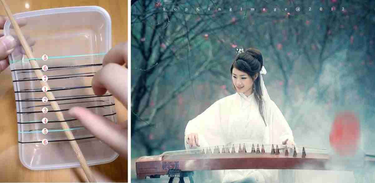
Today, in wechat, my friend sent me an interesting video . This video demonstrates that the fresh and elegant plucking music comes from the nine rubber bands on the lunch box , It makes people feel **: Flying flowers and picking leaves can hurt people , Grass, wood, bamboo and stone are all swords , I will not deceive you .**

▲ chart 1.1.1 Romantic music 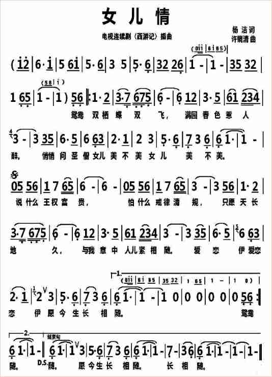
▲ chart 1.1.2 Theme song of journey to the West : Daughter love The remaining problem is to analyze this romantic music .
stay How to go from MP4 Extract from video files MP3 Audio ? utilize Format Engineering 、 ffmpeg The software is downloaded from the circle of friends MP4 The corresponding audio is extracted from the video . Because the volume in the original video is relatively small , Use Audacity The software has preliminarily processed the audio , Increased audio data volume .
1.2 Read and display sound waveform
1.2.1 Read waveform code
Use the following code to read the waveform file , And display .
import sys,os,math,time
import matplotlib.pyplot as plt
from numpy import *
from scipy.io import wavfile

wavefile = '/home/aistudio/work/wave.wav'
sample_rate,sig = wavfile.read(wavefile)

print("sig.shape: {}".format(sig.shape), "sample_rate: {}".format(sample_rate))

plt.clf()
plt.figure(figsize=(10,6))
plt.plot(sig[:,0])
plt.xlabel("n")
plt.ylabel("wave")
plt.grid(True)
plt.tight_layout()
plt.savefig('/home/aistudio/stdout.jpg')
plt.show()
1.2.2 Waveform file parameters
You can see the sampling rate of the waveform file and the length of the dual channel data .
sig.shape: (1012608, 2)
sample_rate: 44100
1.3 Waveform time-frequency joint distribution
1.3.1 Processing code
from scipy import signal

f,t,Sxx = signal.spectrogram(sig[:, 0],
                             fs=sample_rate,
                             nperseg=8192,
                             noverlap=8000,
                             nfft=8192)

thread = 150000
Sxx[where(Sxx >thread)] = thread
startf = 25
endf = 200

plt.clf()
plt.figure(figsize=(15,7))
plt.pcolormesh(t, f[startf:endf], Sxx[startf:endf,:])
plt.xlabel('Time(s)')
plt.ylabel('Frequency(Hz)')
plt.grid(True)
plt.tight_layout()
plt.savefig('/home/aistudio/stdout.jpg')
plt.show()
1.3.2 Display processing results
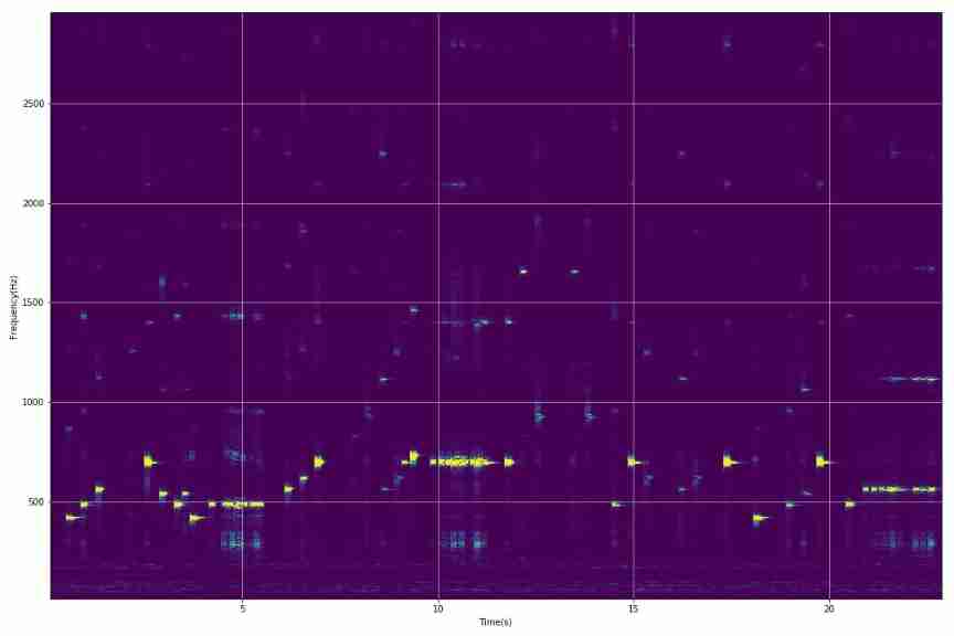
▲ chart 1.3.1 Music is a time-frequency joint distribution thread = 50000
Sxx[where(Sxx >thread)] = thread
startf = 0
endf = 350
▲ chart 1.3.2 Music is a time-frequency joint distribution 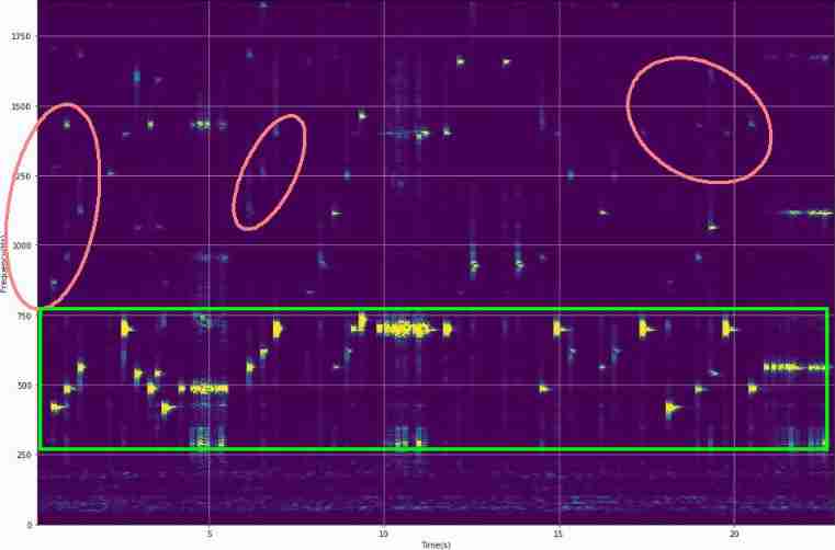
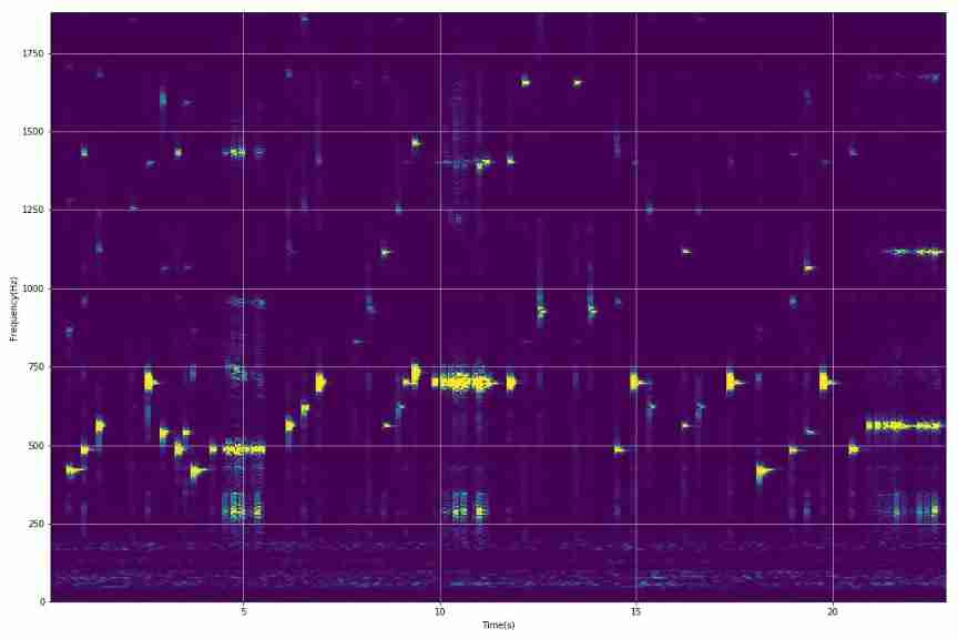
▲ chart 1.3.3 Fundamental frequency and harmonics in audio 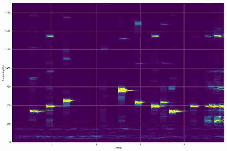
▲ Before sound 5 Second time-frequency joint distribution 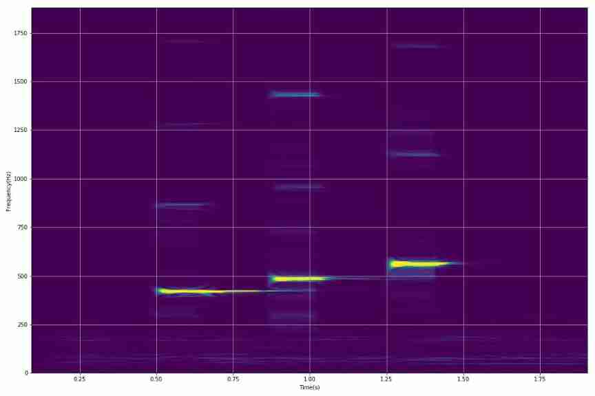
▲ chart 1.3.5 The spectrum in the first two seconds (1) Complete display program
from headm import * # =
from scipy.io import wavfile
wavefile = '/home/aistudio/work/wave.wav'
sample_rate,sig = wavfile.read(wavefile)
printt(sig.shape:, sample_rate:)
plt.clf()
plt.figure(figsize=(10,6))
plt.plot(sig[:,0])
plt.xlabel("n")
plt.ylabel("wave")
plt.grid(True)
plt.tight_layout()
plt.savefig('/home/aistudio/stdout.jpg')
plt.show()
from scipy import signal
f,t,Sxx = signal.spectrogram(sig[:sample_rate*5, 0],
fs=sample_rate,
nperseg=8192,
noverlap=8000,
nfft=8192)
thread = 50000
Sxx[where(Sxx >thread)] = thread
startf = 0
endf = 350
plt.clf()
plt.figure(figsize=(15,10))
plt.pcolormesh(t, f[startf:endf], Sxx[startf:endf,:])
plt.xlabel('Time(s)')
plt.ylabel('Frequency(Hz)')
plt.grid(True)
plt.tight_layout()
plt.savefig('/home/aistudio/stdout.jpg')
plt.show()
1.4 Dynamic display of waveform and spectrum
1.4.1 Music data waveform
The following is the data waveform of music . It can be seen that the amplitude of the background noise is relatively large .

▲ chart 1.4.1 Music data waveform step_length = sample_rate//10
page_number = 300
overlap_length = step_length // 10
gifpath = '/home/aistudio/GIF'
if not os.path.isdir(gifpath):
os.makedirs(gifpath)
gifdim = os.listdir(gifpath)
for f in gifdim:
fn = os.path.join(gifpath, f)
if os.path.isfile(fn):
os.remove(fn)
from tqdm import tqdm
for id,i in tqdm(enumerate(range(page_number))):
startid = i * overlap_length
endid = startid + step_length
musicdata = sig[startid:endid,0]
plt.clf()
plt.figure(figsize=(10,6))
plt.plot(musicdata, label='Start:%d'%startid)
plt.xlabel("Samples")
plt.ylabel("Value")
plt.axis([0,step_length, -15000, 15000])
plt.grid(True)
plt.legend(loc='upper right')
plt.tight_layout()
savefile = os.path.join(gifpath, '%03d.jpg'%id)
plt.savefig(savefile)
plt.close()
1.4.2 Music spectrum changes
The following shows the spectrum changes of music data .
- short-term FFT Parameters :
Display frequency:10~2000HzTime:100msZero length:400ms

▲ chart 1.4.2 Spectrum change data of audio startf = 10
endf = 2000
startfid = int(step_length * startf / sample_rate*5)
endfid = int(step_length * endf / sample_rate*5)
from tqdm import tqdm
for id,i in tqdm(enumerate(range(page_number))):
startid = i * overlap_length
endid = startid + step_length
musicdata = list(sig[startid:endid,0])
zerodata = [0]*(step_length*4)
musicdata = musicdata + zerodata
mdfft = abs(fft.fft(musicdata))/step_length
fdim = linspace(startf, endf, endfid-startfid)
plt.clf()
plt.figure(figsize=(10,6))
plt.plot(fdim, mdfft[startfid:endfid], linewidth=3, label='Start:%d'%startid)
plt.xlabel("Frequency(Hz)")
plt.ylabel("Spectrum")
plt.axis([startf,endf, 0, 2000])
plt.grid(True)
plt.legend(loc='upper right')
plt.tight_layout()
savefile = os.path.join(gifpath, '%03d.jpg'%id)
plt.savefig(savefile)
plt.close()
§02 peak Value frequency
2.1 Data frequency peak frequency
Calculate the change of spectrum peak frequency in the data .
2.1.1 Plot all spectrum peaks
step_length = sample_rate//10
page_number = 500
overlap_length = step_length//5

startf = 10
endf = 2000
startfid = int(step_length * startf / sample_rate*5)
endfid = int(step_length * endf / sample_rate*5)

maxfdim = []
maxadim = []
maxtdim = []

for id,i in tqdm(enumerate(range(page_number))):
    startid = i * overlap_length
    endid = startid + step_length
    if endid > sig.shape[0]: break

    musicdata = list(sig[startid:endid,0])
    zerodata = [0]*(step_length*4)
    musicdata = musicdata + zerodata

    mdfft = abs(fft.fft(musicdata))/step_length
    fdim = linspace(startf, endf, endfid-startfid)
    videofft = mdfft[startfid:endfid]

    maxid = argmax(videofft)
    maxfreq = fdim[maxid]
    maxampl = videofft[maxid]

    starttime = startid / sample_rate
    maxfdim.append(maxfreq)
    maxadim.append(maxampl)
    maxtdim.append(starttime)

col1 = 'steelblue'
col2 = 'red'
plt.figure(figsize=(12,6))
plt.plot(maxtdim, maxfdim, color=col1, linewidth=3)
plt.xlabel('Time', fontsize=14)
plt.ylabel('Max Frequency(Hz)', color=col1, fontsize=14)
plt.grid(True)
ax2 = plt.twinx()
ax2.plot(maxtdim, maxadim, color=col2, linewidth=1)
ax2.set_ylabel('Pick Value', color=col2, fontsize=16)
plt.tight_layout()

plt.savefig('/home/aistudio/stdout.jpg')
plt.show()
The following figure shows the changes of peak frequency and peak amplitude in the spectrum
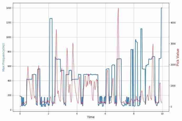
▲ chart 2.1.1 Music data frequency peak 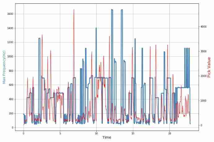
▲ chart 2.1.2 Music data frequency peak 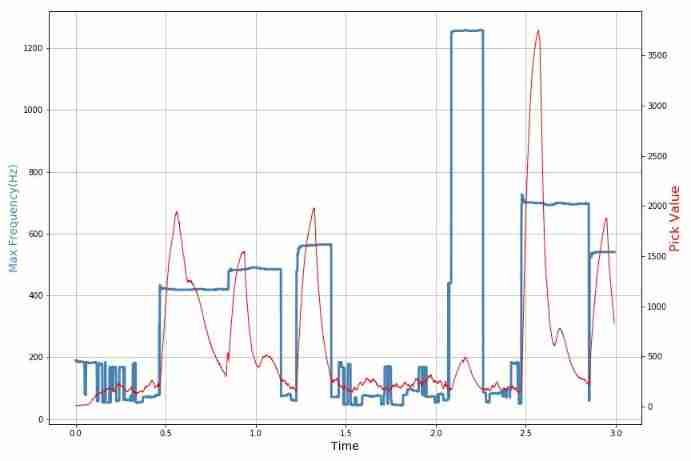
▲ chart 2.1.3 Music data frequency peak 2.1.2 Browse the spectrum

▲ chart 2.1.4 Changes in peak frequency and amplitude of data spectrum from headm import * # =
datafile = '/home/aistudio/maxdata.npz'
data = load(datafile)
printt(data.files)
maxfdim = data['maxf']
maxadim = data['maxa']
maxtdim = data['maxtdim']
gifpath = '/home/aistudio/GIF'
if not os.path.isdir(gifpath):
os.makedirs(gifpath)
gifdim = os.listdir(gifpath)
for f in gifdim:
fn = os.path.join(gifpath, f)
if os.path.isfile(fn):
os.remove(fn)
page_number = 200
data_length = len(maxfdim)
step_length = data_length // 10
for i in tqdm(range(page_number)):
startid = int(i * (data_length - step_length) / page_number)
endid = startid + step_length
if endid >= data_length: endid = data_length
plt.clf()
col1 = 'steelblue'
col2 = 'red'
plt.figure(figsize=(12,8))
plt.plot(maxtdim[startid:endid], maxfdim[startid:endid], color=col1, linewidth=3)
plt.axis([maxtdim[startid], maxtdim[endid-1], 0, 2000])
plt.xlabel('Time', fontsize=14)
plt.ylabel('Max Frequency(Hz)', color=col1, fontsize=14)
plt.grid(True)
ax2 = plt.twinx()
ax2.plot(maxtdim[startid:endid], maxadim[startid:endid], color=col2, linewidth=1)
plt.axis([maxtdim[startid], maxtdim[endid-1], 0, 5000])
ax2.set_ylabel('Pick Value', color=col2, fontsize=16)
plt.tight_layout()
savefile = os.path.join(gifpath, '%03d.jpg'%i)
plt.savefig(savefile)
plt.close()
2.2 Frequency histogram
The following gives the statistics of frequency peaks in music .
plt.clf()
plt.figure(figsize=(12,8))
plt.hist(maxfdim, bins=500)
plt.xlabel('Frequency')
plt.ylabel('Histogram')
plt.grid(True)
plt.savefig('/home/aistudio/stdout.jpg')
plt.show()
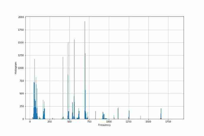
▲ chart 2.2.1 Statistics of frequency peak 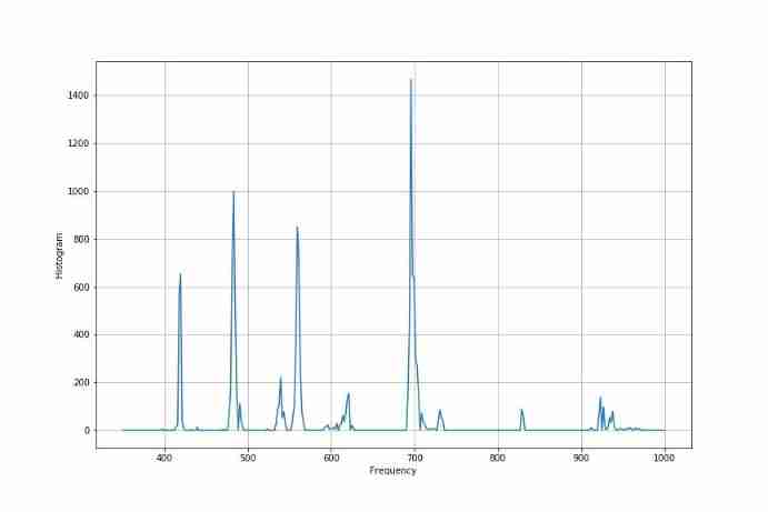
▲ stay 350Hz ~ 1000Hz Histogram statistics between 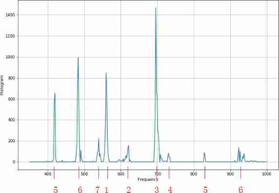
▲ chart 2.2.3 Get the frequency point according to the score 2.3 All syllable frequencies
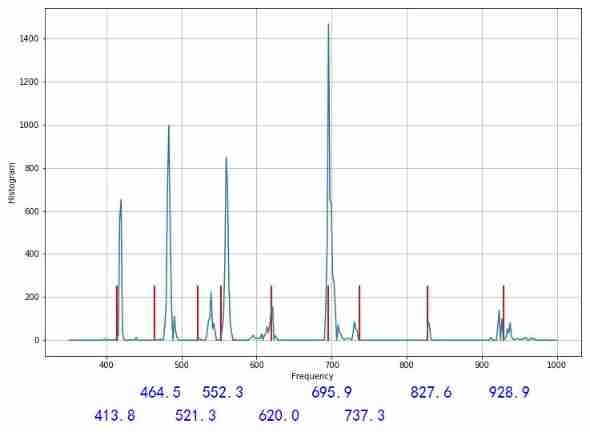
With note 3 The frequency corresponding to f 3 = 695.9 H z f_3 = 695.9Hz f3=695.9Hz , As the standard , Calculate the position frequency of all syllables :
bw = where((bins > 350) & (bins < 1000))
fdim = frequency[bw]
bdim = bins[bw]
fmaxid = argmax(fdim)
print(bdim[fmaxid])
step12 = [-9, -7, -5, -4,-2,0,1,3,5]
stepnum = [5,6,7,1,2,3,4,5,6]
freq3 = 695.9

for id,s in enumerate(step12):
    freq = 2**(s/12)*freq3
    print('%d : %.2fHz'%(stepnum[id], freq))
5 : 413.78Hz
6 : 464.46Hz
7 : 521.34Hz
1 : 552.34Hz
2 : 619.98Hz
3 : 695.90Hz
4 : 737.28Hz
5 : 827.57Hz
6 : 928.92Hz
▲ chart 2.3.1 Syllable frequency value step12 = [-9, -7, -5, -4,-2,0,1,3,5]
stepnum = [5,6,7,1,2,3,4,5,6]
freq3 = 695.9
plt.clf()
plt.figure(figsize=(12,8))
for id,s in enumerate(step12):
freq = 2**(s/12)*freq3
print('%d : %.2fHz'%(stepnum[id], freq))
plt.plot([freq,freq],[0, 250], linewidth=2, c='red')
plt.plot(bins[bw], frequency[bw])
plt.xlabel('Frequency')
plt.ylabel('Histogram')
plt.grid(True)
plt.savefig('/home/aistudio/stdout.jpg')
plt.show()
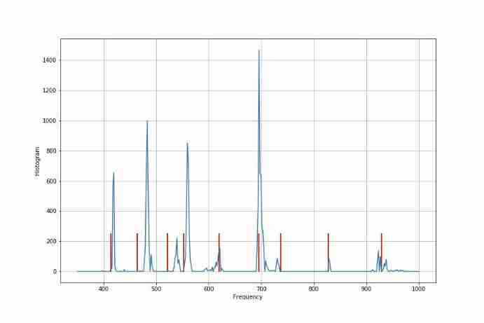
▲ chart 2.3.2 Get the frequency point according to the score
※ total junction ※
Yes Yu yiduan has chopsticks 、 Lunch box 、 Analyze the music played by the instrument composed of rubber bands . Discuss the accuracy of its syllables . It can be seen that , The frequency node corresponding to the high pitch of the instrument is still relatively accurate , But in the bass (6,7,1) The relative deviation is relatively large .
it is a wonder that , Actually accompanied by sound 7,4 The frequency is just right , What kind of magic is this ?
■ Links to related literature :
● Related chart Links :
- chart 1.1.1 Romantic music
- chart 1.1.2 Theme song of journey to the West : Daughter love
- chart 1.3.1 Music is a time-frequency joint distribution
- chart 1.3.2 Music is a time-frequency joint distribution
- chart 1.3.3 Fundamental frequency and harmonics in audio
- Before sound 5 Second time-frequency joint distribution
- chart 1.3.5 The spectrum in the first two seconds
- chart 1.4.1 Music data waveform
- chart 1.4.2 Spectrum change data of audio
- chart 2.1.1 Music data frequency peak
- chart 2.1.2 Music data frequency peak
- chart 2.1.3 Music data frequency peak
- chart 2.1.4 Changes in peak frequency and amplitude of data spectrum
- chart 2.2.1 Statistics of frequency peak
- stay 350Hz ~ 1000Hz Histogram statistics between
- chart 2.2.3 Get the frequency point according to the score
- chart 2.3.1 Syllable frequency value
- chart 2.3.2 Get the frequency point according to the score
边栏推荐
- Analysis report on the development status and investment planning of China's modular power supply industry Ⓠ 2022 ~ 2028
- Global and Chinese market of bipolar generators 2022-2028: Research Report on technology, participants, trends, market size and share
- 上周热点回顾(6.27-7.3)
- UML sequence diagram [easy to understand]
- C语言-入门-基础-语法-[变量,常亮,作用域](五)
- C语言-入门-基础-语法-数据类型(四)
- Global and Chinese markets for laser assisted liposuction (LAL) devices 2022-2028: Research Report on technology, participants, trends, market size and share
- Report on the development trend and prospect trend of high purity zinc antimonide market in the world and China Ⓕ 2022 ~ 2027
- UML 时序图[通俗易懂]
- Codeforces Round #793 (Div. 2)(A-D)
猜你喜欢

2022-2028 global special starch industry research and trend analysis report

You can see the employment prospects of PMP project management
Mantis creates users without password options
![[C Advanced] file operation (2)](/img/50/e3f09d7025c14ee6c633732aa73cbf.jpg)
[C Advanced] file operation (2)
保姆级JDEC增删改查练习

Opencv environment construction (I)
2022-2028 global edible probiotic raw material industry research and trend analysis report
Industry depression has the advantages of industry depression
![C language - Introduction - Foundation - syntax - [main function, header file] (II)](/img/5a/c6a3c5cd8038d17c5b0ead2ad52764.png)
C language - Introduction - Foundation - syntax - [main function, header file] (II)
How does idea withdraw code from remote push
随机推荐
Explanation of for loop in golang
Markdown syntax
Talk about single case mode
How to ensure the uniqueness of ID in distributed environment
2022-2028 global gasket plate heat exchanger industry research and trend analysis report
A subclass must use the super keyword to call the methods of its parent class
2022-2028 global intelligent interactive tablet industry research and trend analysis report
Codeforces Round #803 (Div. 2)(A-D)
Ehrlich sieve + Euler sieve + interval sieve
C语言-入门-基础-语法-[运算符,类型转换](六)
什么是权限?什么是角色?什么是用户?
Mantis creates users without password options
Analysis report on the development status and investment planning of China's modular power supply industry Ⓠ 2022 ~ 2028
26. Delete duplicates in the ordered array (fast and slow pointer de duplication)
地平线 旭日X3 PI (一)首次开机细节
Educational Codeforces Round 115 (Rated for Div. 2)
MySQL foundation 02 - installing MySQL in non docker version
After unplugging the network cable, does the original TCP connection still exist?
Solve the problem of "Chinese garbled MySQL fields"
Global and Chinese trisodium bicarbonate operation mode and future development forecast report Ⓢ 2022 ~ 2027