当前位置:网站首页>响应式布局与px/em/rem的比对
响应式布局与px/em/rem的比对
2022-07-31 00:38:00 【百里狂生】
概要
文章目录
1. 响应式布局
1.1 自适应的目的
自适应的目的是在不同分辨率的不同设备上显示相同的画面
手机屏幕比较小,宽度通常在600px以下,PC端一般在1000px以上,部分高配的笔记本在2000px也有,同样的页面要显示在不同的设备上,还要呈现出满意的效果,不是一件容易的事情。
响应式的概念应该是覆盖了自适应,但是包括的东西太多了。
响应式布局可以根据屏幕的大小自动的调整页面的展现方式,以及布局
1.2 响应式布局的一些技术记录
- 1、允许网页的宽度自动的调整
- 2、尽量少使用绝对的宽度,多点百分比
- 3、相对大小的字体:字体不要使用px写死,最好使用相对大小的em,或者高清方案rem,这个不限制与字体,别的属性也可以这么设置。
- 4、流式布局,float等float的好处是,如果宽度太小,放不下两个元素,后面的元素会自动滚动到前面元素的下方,不会在水平方向overflow(溢出),避免了水平滚动条的出现。
- 5、选择加载css
<!-- 这个意思是如果屏幕宽度小于400px就加载rinyScreen.css文件 -->
<link rel="stylesheet" type="text/css" media="screen and (max-device-width: 400px)" href="tinyScreen.css">
2. px / em / rem 的比对
2.1 px
px 是你屏幕设备物理上能显示的最小的一个点,这个点不是固定宽度的,不同设备上的长宽比例有可能会不同
div {

    font-size: 16px;
    width: 50px;
    height: 50px;
    background-color: #f8f8f8;
}
<div>物理像素点文本大小</div>
2.1.1 px 的兼容性
兼容所有浏览器
2.2 em
em 相对于父元素的font-size大小的相对单位
所有现代浏览器下默认字体尺寸是16px,这时1em = 16px,然后你人为把body里面定义font-size: 12px;(把浏览器默认16px改小),此时1em = 12px;
如果0.8em实际上就等于12px*0.8,
em的用处是你要整个网页字体统一变大变小,你只要改body里面的font-size的值就行了。
另外:
em 会继承父元素的字体大小
.parent {

    font-size: 10px;
    background-color: #f8f8f8;
}
.parent-2 {

    font-size: 1em; /* font-size: 10px */
    width: 1em;     /* width: 10px */
    height: 1em;    /* height: 10px */
    background-color: #777;
}
.child {

    font-size: 5em; /* font-size: 50px */
    width: 5em;     /* width: 50px */
    height: 5em;    /* height: 50px */
    background-color: #52ccba;
}
<div class="parent">
    <div class="parent-2">
        父元素文本大小1em
        <div class="child">子元素文本大小5em</div>
    </div>
</div>
2.2.1 em 的兼容性

2.3 rem
相对于HTML文档的font-size大小的相对单位
rem是相对于html元素的font-size大小的相对单位,所以在使用rem 的时候,只需要设置html元素的font-size大小即可,而且html的font-size是rem 的基准。
html {

    font-size: 10px;
}
.rem-1 {

    width: 1rem;        /* width: 10px */
    height: 1rem;       /* height: 10px */
    font-size: 1rem;    /* font-size: 10px */
    background-color: #f8f8f8;
}
.rem-2 {

    width: 5rem;        /* width: 50px */
    height: 5rem;       /* height: 50px */
    font-size: 5rem;    /* font-size: 50px */
    background-color: #52ccba;
}
<!DOCTYPE html>
<html>
    <head>
        <meta charset="uft-8">
        <title>rem</title>
    </head>
    <body>
        <div class="rem-1">文本大小为1rem</div>
        <div class="rem-2">文本大小为5rem</div>
    </body>
</html>
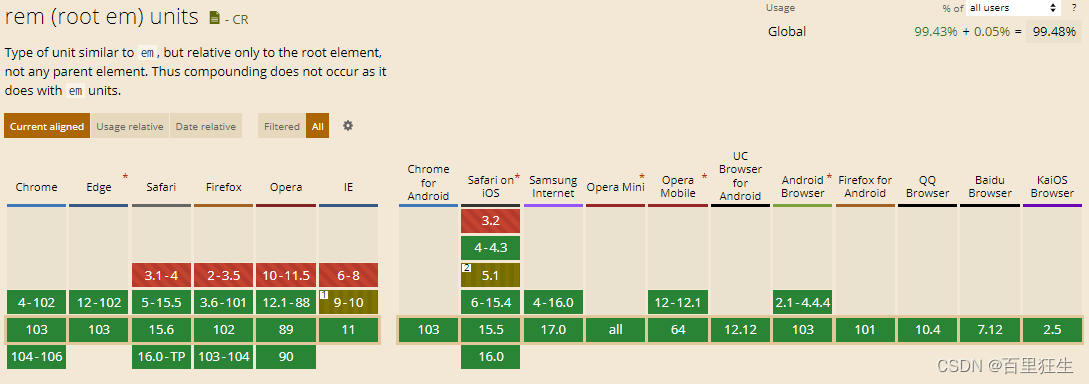
2.3.1 rem 的兼容性
边栏推荐
- ES 中时间日期类型 “yyyy-MM-dd HHmmss” 的完全避坑指南
- Bypass of xss
- Summary of MySQL database interview questions (2022 latest version)
- SereTOD2022 Track2代码剖析-面向半监督和强化学习的任务型对话系统挑战赛
- Kotlin协程:协程上下文与上下文元素
- Error occurred while trying to proxy request The project suddenly can't get up
- firewalld
- MySQL Series 1: Account Management and Engine
- web漏洞之需要准备的工作
- MySQL database (basic)
猜你喜欢

IOT跨平台组件设计方案

(5) fastai application
![[In-depth and easy-to-follow FPGA learning 15---------- Timing analysis basics]](/img/a9/4c7a703a36a244394b586bfb42ab6b.png)
[In-depth and easy-to-follow FPGA learning 15---------- Timing analysis basics]

Mini Program - Global Data Sharing
【深入浅出玩转FPGA学习15----------时序分析基础】

Shell programming of conditional statements
WEB Security Basics - - - Vulnerability Scanner

Gabor滤波器学习笔记
不用Swagger,那我用啥?

How to solve types joiplay simulator does not support this game
随机推荐
MySQL数据库(基础)
Mini Program - Global Data Sharing
【愚公系列】2022年07月 Go教学课程 016-运算符之逻辑运算符和其他运算符
encrypted transmission process
IOT cross-platform component design scheme
How to Add a Navigation Menu on Your WordPress Site
Shell programming of conditional statements
ABC 261 F - Sorting Color Balls (reverse pair)
Method for deduplication of object collection
Understand from the 11 common examples of judging equality of packaging types in the written test: packaging types, the principle of automatic boxing and unboxing, the timing of boxing and unboxing, a
How to solve the error of joiplay simulator
【ABAP】MFBF过账到质量检验库存类型Demo
WMware Tools installation failed segmentation fault solution
MySQL Series 1: Account Management and Engine
【多线程】
什么是Promise?Promise的原理是什么?Promise怎么用?
牛客网刷题训练(四)
GO GOPROXY proxy Settings
分布式系统的一致性与共识(1)-综述
【愚公系列】2022年07月 Go教学课程 013-常量、指针