当前位置:网站首页>Shutter 007 input field from zero
Shutter 007 input field from zero
2022-06-30 12:03:00 【Hua Weiyun】
Material The input box component is provided in the component library TextField And form components Form. Let's talk about .
1、TextField
TextField For text input , It provides a lot of properties , Let's briefly introduce the main attributes first , Then several examples are given to demonstrate the key attributes
const TextField({ Key? key, this.controller, this.focusNode, this.decoration = const InputDecoration(), TextInputType? keyboardType, this.textInputAction, this.textCapitalization = TextCapitalization.none, this.style, this.strutStyle, this.textAlign = TextAlign.start, this.textAlignVertical, this.textDirection, this.readOnly = false, ToolbarOptions? toolbarOptions, this.showCursor, this.autofocus = false, this.obscuringCharacter = '•', this.obscureText = false, this.autocorrect = true, SmartDashesType? smartDashesType, SmartQuotesType? smartQuotesType, this.enableSuggestions = true, this.maxLines = 1, this.minLines, this.expands = false, this.maxLength, @Deprecated( 'Use maxLengthEnforcement parameter which provides more specific ' 'behavior related to the maxLength limit. ' 'This feature was deprecated after v1.25.0-5.0.pre.', ) this.maxLengthEnforced = true, this.maxLengthEnforcement, this.onChanged, this.onEditingComplete, this.onSubmitted, this.onAppPrivateCommand, this.inputFormatters, this.enabled, this.cursorWidth = 2.0, this.cursorHeight, this.cursorRadius, this.cursorColor, this.selectionHeightStyle = ui.BoxHeightStyle.tight, this.selectionWidthStyle = ui.BoxWidthStyle.tight, this.keyboardAppearance, this.scrollPadding = const EdgeInsets.all(20.0), this.dragStartBehavior = DragStartBehavior.start, this.enableInteractiveSelection = true, this.selectionControls, this.onTap, this.mouseCursor, this.buildCounter, this.scrollController, this.scrollPhysics, this.autofillHints = const <String>[], this.clipBehavior = Clip.hardEdge, this.restorationId, this.enableIMEPersonalizedLearning = true, })controller: The controller of the edit box , It allows you to set / Get the contents of the edit box 、 Choose Edit content 、 Listen to edit text change events . In most cases, we need to explicitly provide a controller To interact with a text box . If not provided controller, be TextField The interior will automatically create a .
focusNode: Used to control the TextField Whether it has the input focus of the current keyboard . It's a handle that we interact with the keyboard (handle).
InputDecoration: Used to control the TextField The appearance of , Such as prompt text 、 The background color 、 Borders, etc .
keyboardType: It is used to set the default keyboard input type of this input box , The values are as follows :
| TextInputType Enumerated values | meaning |
|---|---|
| text | Text input keyboard |
| multiline | Multiline text , To be and maxLines In combination with ( Set to null Or greater than 1) |
| number | Numbers ; It will pop up the number pad |
| phone | Optimized phone number input keyboard ; The number pad will pop up and show “* #” |
| datetime | Optimized date input keyboard ;Android Upper display “: -” |
| emailAddress | Optimized email address ; Will be displayed “@ .” |
| url | The optimized url Input keyboard ; Will be displayed “/ .” |
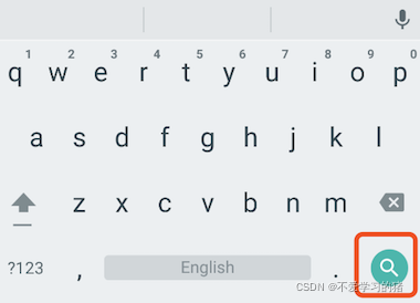
textInputAction: Keyboard action button icon ( That is, the Enter key icon ), It is an enumeration value , There are multiple options , Readers can view the list of all values API file , The following is on duty for TextInputAction.search when , Native Android The keyboard style of the system is shown in the figure
style: Text style being edited .
textAlign: Edit the horizontal alignment of text in the input box .
autofocus: Get focus automatically .
obscureText: Whether to hide the text being edited , For example, scenarios for entering passwords , The text will use “•” Replace .
maxLines: The maximum number of lines in the input box , The default is 1; If null, There is no limit to the number of lines .
maxLength and maxLengthEnforcement :maxLength Represents the maximum length of text in the input box , After setting, the bottom right corner of the input box will display the input text count .maxLengthEnforcement Decide when the length of the input text exceeds maxLength How to deal with , Such as truncation 、 Beyond, etc .
toolbarOptions: A menu that appears when you press and hold or right-click , Include copy、cut、paste as well as selectAll.
onChange: Callback function when the content of input box changes ; notes : Content change events can also be achieved through controller To listen to .
onEditingComplete and onSubmitted: Both callbacks are triggered when the input box is complete , For example, press the finish key on the keyboard ( Check mark icon ) Or search key ( Icon ). The difference is that the two callbacks are signed differently ,onSubmitted The callback is ValueChanged<String> type , It receives the current input as a parameter , and onEditingComplete Do not receive parameters .
inputFormatters: Used to specify the input format ; When user input changes , Will check according to the specified format .
enable: If false, The input box will be disabled , The disabled state does not receive input and events , The disabled style is also displayed ( In its decoration In the definition of ).
cursorWidth、cursorRadius and cursorColor: These three properties are used to customize the cursor width of the input box 、 Round corners and colors .
Example : Login input box
TextField( autofocus: true, decoration: InputDecoration( labelText: " user name ", hintText: " The user account ", prefixIcon: Icon(Icons.person), ), ), TextField( decoration: InputDecoration( labelText: " password ", hintText: " The login password ", prefixIcon: Icon(Icons.lock), ), obscureText: true, ),Running results

Get input
There are two ways to get the input :
- Define two variables , Used to save user name and password , And then in onChange When triggered , Save the input separately
- adopt controller Direct access to
The first method is relatively simple , Let's introduce the second method
Define a controller
TextEditingController userController = TextEditingController(); // User name controllerThen set the input box controller:
TextField( autofocus: true, controller: userController, // Set up controller decoration: InputDecoration( labelText: " user name ", hintText: " The user account ", prefixIcon: Icon(Icons.person), ), ),By clicking events , Display the obtained value on the button
TextButton( onPressed: () { setState(() { userLabel = userController.text; }); }, child: Text(userLabel), ),Monitor text changes
There are also two ways to monitor text changes
1、 Set up onChange Callback , Such as :
TextField( autofocus: true, onChanged: (value){ print(value); }, ),2、 adopt controller monitor , Such as :
@override void initState() { // TODO: implement initState super.initState(); userController.addListener(() { print(userController.text); }); }onChange Is designed to listen for text changes , and controller But you can also set default values 、 Select text .
Set the default value , And start with the third character and select the next character
userController.text = " I'm Zhang San "; userController.selection = TextSelection(baseOffset: 2, extentOffset: userController.text.length); Run the following 
Control the focus
The focus can be through FocusNode and FocusScopeNode To control , By default , Focus by FocusScope To manage , It represents the focus control area , You can go through... In this range FocusScopeNode Move focus between input boxes 、 Set default focus etc . We can go through FocusScope.of(context) To get Widget The default in the tree is FocusScopeNode. Here's an example , In this example, two TextField, The first auto focus , Then create two buttons :
Click the first button to focus from the first TextField Move to the second TextField.
Click the second button to turn off the keyboard .
The effect we want to achieve is shown in the figure :

The code is as follows
class _MyHomePageState extends State<MyHomePage> { FocusNode focusNode1 = FocusNode(); FocusNode focusNode2 = FocusNode(); FocusScopeNode? focusScopeNode; @override Widget build(BuildContext context) { return Scaffold( appBar: AppBar( title: Text(widget.title), ), body: Column( mainAxisAlignment: MainAxisAlignment.start, crossAxisAlignment: CrossAxisAlignment.center, children: [ TextField( focusNode: focusNode1, decoration: InputDecoration(labelText: " first input"), ), SizedBox( height: 30, ), TextField( focusNode: focusNode2, decoration: InputDecoration(labelText: " the second input"), ), SizedBox( height: 30, ), ElevatedButton( onPressed: () { FocusScope.of(context).requestFocus(focusNode2); }, child: Text(" Moving the focus "), ), SizedBox( height: 30, ), ElevatedButton( onPressed: () { setState(() { focusNode1.unfocus(); focusNode2.unfocus(); }); }, child: Text(" Retract the keyboard "), ), ], )); }}FocusNode and FocusScopeNode There are other ways , Details can be found at API file .
We can also monitor changes in focus
// Monitor focus changes focusNode.addListener((){ print(focusNode.hasFocus);});Automatic semantic style
In the development process , We often need to customize the text input box style we need , Let's take a brief look at
Container( child: TextField( keyboardType: TextInputType.emailAddress, decoration: InputDecoration( labelText: "Email", hintText: " email ", prefixIcon: Icon(Icons.email), border: InputBorder.none, // Hide underscores ), ), decoration: BoxDecoration( // Custom slide line border: Border( bottom: BorderSide( color: Colors.red, width: 1, ) ) ), ), The operation results are as follows 
In the next section, let's learn Forms
边栏推荐
- R语言ggplot2可视化:使用ggplot2可视化散点图、aes函数中的size参数指定数据点的大小(point size)
- A High-Precision Positioning Approach for Catenary Support Components With Multiscale Difference阅读笔记
- A quietly rising domestic software, low-key and powerful!
- R语言ggplot2可视化:gganimate包基于transition_time函数创建动态散点图动画(gif)
- “\“id\“ contains an invalid value“
- 论文解读(AGC)《Attributed Graph Clustering via Adaptive Graph Convolution》
- Another miserable day by kotlin grammar
- 60 个神级 VS Code 插件!!
- R语言ggplot2可视化:使用ggplot2可视化散点图、在geom_point参数中设置alpha参数指定数据点的透明度级别(points transparent、从0到1)
- Typescript readonlyarray (read only array type) details
猜你喜欢

聊聊怎么做硬件兼容性检测,快速迁移到openEuler?

The first batch in China! Alibaba cloud native data Lake products have passed the evaluation and certification of the ICT Institute

Evaluation of IP location query interface Ⅲ
深入解析 Apache BookKeeper 系列:第四篇—背压

这些电影中的科幻构想,已经用AI实现了

It is said that with this, the boss opened the test overnight

Multiparty cardinality testing for threshold private set-2021: Interpretation

Summer vacation study record

线下门店为什么要做新零售?

led背光板的作用是什麼呢?
随机推荐
Openmldb meetup No.4 meeting minutes
R language ggplot2 visualization: gganimate package is based on Transition_ Time function to create dynamic scatter animation (GIF)
MySQL 内置函数
Automatic database growth
Goto statement jump uninitialized variable: c2362
go-zero微服务实战系列(八、如何处理每秒上万次的下单请求)
基于视觉的机器人抓取:从物体定位、物体姿态估计到平行抓取器抓取估计
Boost study: boost log
网络营销之四大误解
Speech recognition - Fundamentals (I): introduction [speech to text]
Typescript readonlyarray (read only array type) details
Go zero micro Service Practice Series (VIII. How to handle tens of thousands of order requests per second)
如何使用插件化机制优雅的封装你的请求hook
Paper interpretation (AGC) attributed graph clustering via adaptive graph revolution
R language ggplot2 visualization: use ggplot2 visualization scatter diagram and the color parameter in AES function to specify that data points in different groups are displayed in different colors
wallys/3 × 3 MIMO 802.11ac Mini PCIe Wi-Fi Module, QCA9880, 2,4GHz / 5GHzDesigned for Enterprise
QT embeds the sub QT program window into the current program
智慧法院新征程,无纸化办公,护航智慧法院绿色庭审
1175. 质数排列
来聊聊怎么做硬件兼容性检测,快速迁移到openEuler?