当前位置:网站首页>Scientific Computing Library -- Matplotlib
Scientific Computing Library -- Matplotlib
2022-07-27 05:16:00 【Xia Muxi】
Matplotlib
1 know Matplotlib
What is? Matplotlib?
- Dedicated to the development of 2D Chart ( Include 3D Chart )
- Gradually 、 Interactive way to realize data visualization
Why study Matplotlib?
Visualization is a key auxiliary tool in data mining , Can clearly understand the data , To adjust our analytical methods .
- Can visualize data , More intuitive presentation
- Make the data more objective 、 More persuasive
2 Matplotlib Image structure

Matplotlib It can be divided into three layers , Container layer 、 Auxiliary display layer 、 Image layer .
- Container layer : Mainly by Canvas、Figure、Axes form .
- Canvas( Drawing board ) At the bottom , Users generally do not have access to .
- Figure( canvas ) Based on the Canvas above , It refers to the whole figure .
- Axes( Drawing area ) Based on the Figure above , One Figure It can contain more than one Axes, One Axes It can contain more than one Axis( Axis ), contain 2 One is 2d Coordinate system ,3 One is 3d Coordinate system .
- Auxiliary display layer : by Axes( Drawing area ) In addition to the image drawn according to the data , It mainly includes Axes appearance (facecolor)、 Border line (spines)、 Axis (axis)、 Axis name (axis label)、 Coordinate scale (tick)、 Axis scale label (tick label)、 Gridlines (grid)、 legend (legend)、 title (title) The content such as .
- Image layer :Axes Pass inside plot、scatter、bar、histogram、pie The image drawn by the equal function according to the data .
3 Common graphic drawing
3.1 Broken line diagram
Concept : A statistical chart showing the increase or decrease of statistical quantity by the rise or fall of a broken line
characteristic : It can show the trend of data change , Reflect the change of things .( change )
plt.plot(x, y)
demand : Draw Shanghai 11 Point to 12 spot 1 A line chart of temperature change per minute in an hour , The temperature range is 15 degree ~18 degree
import matplotlib.pyplot as plt
import random
from pylab import mpl

#  Set display Chinese font
mpl.rcParams["font.sans-serif"] = ["SimHei"]
#  Set the normal display symbol
mpl.rcParams["axes.unicode_minus"] = False

#  Get ready x,y Coordinate data
x = range(60)
# random.uniform(x,y) Method will randomly generate a 【 The set of real Numbers 】, It's in  [x,y]  Within the scope of .
# random.randint(x,y) Then take 【 Integers 】, And x,y They are all integers
y = [random.uniform(15, 18) for i in x]
#  demand : Add another temperature change in Beijing , Just need to do it again plot that will do , But you need to distinguish between lines
y1 = [random.uniform(0, 8) for i in x]

#  Create a canvas 【figsize: Specify the length and width of the graph ,dpi: The clarity of the image , return figure object 】
plt.figure(figsize=(20, 8), dpi=100)

#  Draw line chart
plt.plot(x, y, label=" Shanghai ")
plt.plot(x, y1, color='r', linestyle=':', label=" Beijing ")

#  structure x,y Axis scale
x_ticks = ["11 spot {} branch ".format(i) for i in x]
y_ticks = range(40)

#  modify x,y The scale display of axis coordinates
plt.xticks(x[::5], x_ticks[::5])
plt.yticks(y_ticks[::5])

#  Add grid display 【alpha: transparency 】
plt.grid(True, linestyle='--', alpha=0.5)

#  add to x Axis 、y Axis description information and title
plt.xlabel(" Time ")
plt.ylabel(" temperature ")
plt.title(" At noon, 11 spot 0 be assigned to 12 Diagram of temperature change between points ", fontsize=20)

#  Show Legend
plt.legend(loc="best")

#  Save the image to the specified path
plt.savefig("plot.png")

#  Display images 【 Be careful :plt.show() Will release figure resources , If you save an image after it is displayed, you can only save an empty image .】
plt.show()

Graphic style 
The location of the legend 
Multiple coordinate systems display — plt.subplots( Object oriented drawing method )
The weather maps of Shanghai and Beijing are displayed in different coordinate systems of the same map , The effect is as follows :

Be careful :
plt. Function name ()It is equivalent to process oriented drawing method ,axes.set_ Method name ()Equivalent to object-oriented drawing method .
Create a canvas
'''  Parameters  nrows, ncols :  There are several rows and columns of coordinate system   return  fig :  Picture object ,axes :  Corresponding number of coordinate systems  '''
fig, axes = plt.subplots(nrows=1, ncols=2, figsize=(20, 8), dpi=100)
The plot
axes[0].plot(x, y, label=" Shanghai ")
axes[1].plot(x, y1, color="r", linestyle=":", label=" Beijing ")
Scale display
axes[0].set_xticks(x[::5])
axes[0].set_yticks(y_ticks[::5])
axes[0].set_xticklabels(x_ticks_label[::5])
axes[1].set_xticks(x[::5])
axes[1].set_yticks(y_ticks[::5])
axes[1].set_xticklabels(x_ticks_label[::5])
Add grid display
axes[0].grid(True, linestyle="--", alpha=0.5)
axes[1].grid(True, linestyle="--", alpha=0.5)
Add a description
axes[0].set_xlabel(" Time ")
axes[0].set_ylabel(" temperature ")
axes[0].set_title(" At noon in Shanghai 11 spot --12 Point temperature change diagram ", fontsize=20)
axes[1].set_xlabel(" Time ")
axes[1].set_ylabel(" temperature ")
axes[1].set_title(" Beijing noon 11 spot --12 Point temperature change diagram ", fontsize=20)
Add legend
axes[0].legend(loc=0)
axes[1].legend(loc=0)
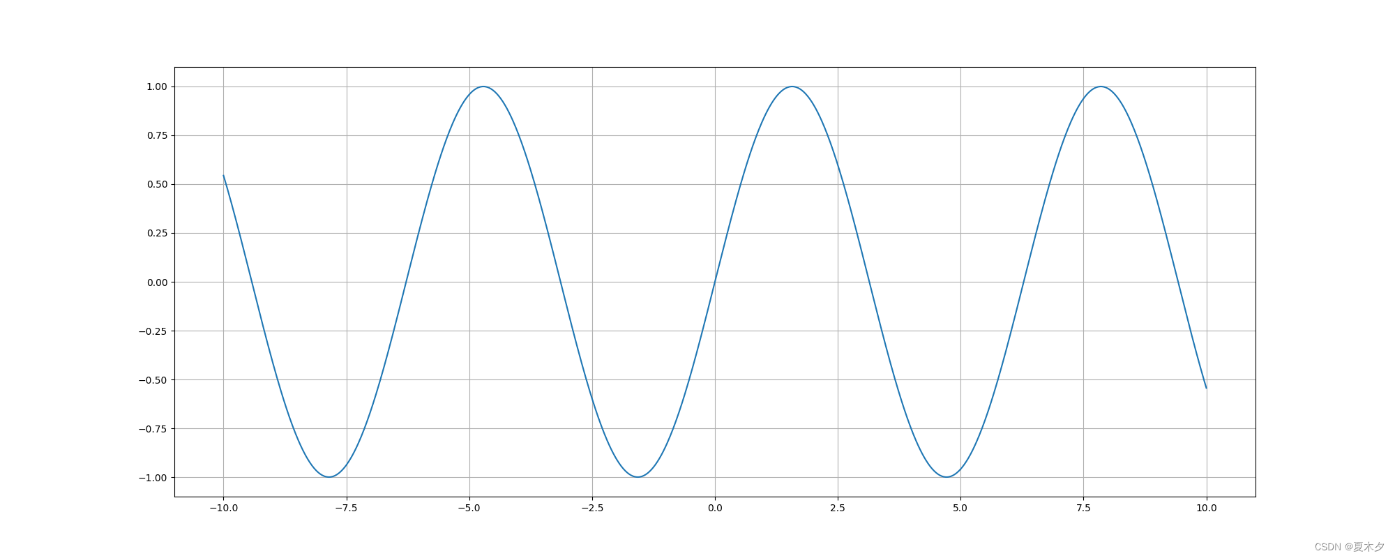
plt.plot() In addition to drawing lines , It can also be used to draw various mathematical function images
import matplotlib.pyplot as plt
import numpy as np

# numpy.linspace  It is used to create a one-dimensional array composed of an arithmetic sequence .【 Starting number 、 End number 、 Number 】
x = np.linspace(-10, 10, 1000)
y = np.sin(x)

plt.figure(figsize=(20, 8), dpi=100)
plt.plot(x, y)
plt.grid()

plt.show()
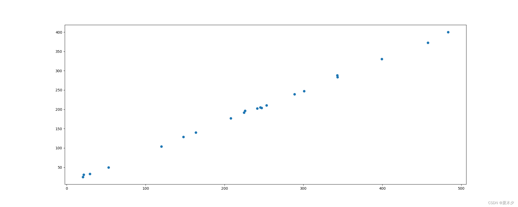
3.2 Scatter plot
Concept : Two sets of data are used to form multiple coordinate points , Look at the distribution of coordinate points , Judge whether there is some association between two variables or summarize the distribution pattern of coordinate points .
characteristic : Determine whether there is a quantitative correlation trend between variables , Show outliers ( The law of distribution )
plt.scatter(x, y)
demand : Explore the relationship between housing area and housing price
import matplotlib.pyplot as plt


x = [225.98, 247.07, 253.14, 457.85, 241.58, 301.01, 20.67, 288.64,
     163.56, 120.06, 207.83, 342.75, 147.9, 53.06, 224.72, 29.51,
     21.61, 483.21, 245.25, 399.25, 343.35]
y = [196.63, 203.88, 210.75, 372.74, 202.41, 247.61, 24.9, 239.34,
     140.32, 104.15, 176.84, 288.23, 128.79, 49.64, 191.74, 33.1,
     30.74, 400.02, 205.35, 330.64, 283.45]


plt.figure(figsize=(20, 8), dpi=100)
plt.scatter(x, y)

plt.show()
3.3 Histogram
Concept : Data arranged in columns or rows of a worksheet can be drawn into a histogram .
characteristic : Draw even discrete data , Can see the size of each data at a glance , Compare the differences between the data .( Statistics / contrast )
plt.bar(x, width, align='center', **kwargs)
""" Parameters: x :  Data to be passed  width :  The width of the histogram  align :  The position alignment of each histogram  {‘center’, ‘edge’},  Default : ‘center’ **kwargs : color: Choose the color of the histogram  """
demand : Compare the box office receipts of each movie 
import matplotlib.pyplot as plt

movie_name = [' The thor 3: The gods at dusk ', ' Justice League: Injustice for All ', ' Murder on the Orient express ', ' Dream seeking travel notes ', ' Global storms ', ' Legend of conquering the devil ', ' chase ', ' Seventy-seven days ', ' Secret War ', ' Wild beast ', ' Other ']
#  Abscissa
x = range(len(movie_name))
#  Box office data
y = [73853, 57767, 22354, 15969, 14839, 8725, 8716, 8318, 7916, 6764, 52222]

plt.figure(figsize=(20, 8), dpi=100)
plt.bar(x, y, width=0.5, color=['b', 'r', 'g', 'y', 'c', 'm', 'y', 'k', 'c', 'g', 'b'])

#  modify x The scale of the axis shows
plt.xticks(x, movie_name)
plt.grid(linestyle="--", alpha=0.5)
plt.title(" Movie box office revenue comparison ")

plt.show()

Be careful : The vertical column chart can use
barh()Method to set
3.4 Histogram
Concept : Data distribution is represented by a series of vertical stripes or line segments with different heights . Generally, the horizontal axis is used to represent the data range , The vertical axis shows the distribution .
characteristic : Draw continuous data to show the distribution of one or more groups of data ( Statistics )
matplotlib.pyplot.hist(x, bins=None)
""" x :  Data to be passed  bins :  Group spacing  """
3.5 The pie chart
Concept : Used to indicate the proportion of different classifications , Compare various classifications by radian size .
characteristic : The proportion of classified data ( Proportion )
plt.pie(x, labels=,explode=,autopct=,colors)
''' x: Number , Automatically calculate percentage  labels: The name of each part  explode: Spacing between sectors , The default value is 0 autopct: Set the display format of each sector percentage in the pie chart ,%d%%  Integer percentage ,%0.1f  One decimal place , %0.1f%%  One decimal percent , %0.2f%%  Percentage to two decimal places .( for example m.n:m Indicates the number of characters occupied by the corresponding output item on the output device n Representation precision , That is, keep several digits after the decimal point ) colors: Color of each part  shadow: Boolean value  True  or  False, Set the shadow of the pie chart , The default is  False, No shadows  '''
import matplotlib.pyplot as plt

labels = ['Frogs', 'Hogs', 'Dogs', 'Logs']
x = [15, 30, 45, 10]
explode = (0, 0.1, 0, 0)  #  only “ decompose ” The second slice

plt.pie(x, explode=explode, labels=labels, autopct='%1.1f%%',
        shadow=True, startangle=90)
plt.show()

边栏推荐
- Translation of robot and precise vehicle localization based on multi sensor fusion in diverse city scenes
- Complete Binary Tree
- There is no need to install CUDA and cudnn manually. You can install tensorflow GPU through a one-line program. Take tensorflow gpu2.0.0, cuda10.0, cudnn7.6.5 as examples
- 事件过滤器
- Sub database and sub table
- QT menu bar, toolbar and status bar
- Use of collection framework
- Row, table, page, share, exclusive, pessimistic, optimistic, deadlock
- Detailed description of polymorphism
- 使用ngrok做内网穿透
猜你喜欢

ERROR! MySQL is not running, but PID file exists

《Robust and Precise Vehicle Localization based on Multi-sensor Fusionin Diverse City Scenes》翻译
JVM上篇:内存与垃圾回收篇--运行时数据区四-程序计数器

Introduction to MySQL optimization

Could not autowire.No beans of ‘userMapper‘ type found.
Another skill is to earn 30000 yuan a month+

Standard dialog qmessagebox

JVM上篇:内存与垃圾回收篇五--运行时数据区-虚拟机栈
Could not autowire. No beans of ‘userMapper‘ type found.

JVM上篇:内存与垃圾回收篇九--运行时数据区-对象的实例化,内存布局与访问定位
随机推荐
Sunset red warm tone tinting filter LUTS preset sunset LUTS 1
Basic operation of vim
Quoted popular explanation
Complete Binary Tree
C中文件I/O的使用
Row, table, page, share, exclusive, pessimistic, optimistic, deadlock
Use ngrok for intranet penetration
使用Druid连接池创建DataSource(数据源)
Transaction database and its four characteristics, principle, isolation level, dirty read, unreal read, non repeatable read?
Introduction to Web Framework
对话框简介
Dialog data transfer
Tcp server是如何一个端口处理多个客户端连接的(一对一还是一对多)
一、MySQL基础
Use of collection framework
Mysql表的约束
JVM上篇:内存与垃圾回收篇九--运行时数据区-对象的实例化,内存布局与访问定位
TypeScript 详解
"Photoshop2021 tutorial" adjust the picture to different aspect ratio
Typescript details