author : aven
original text :https://aotu.io/notes/2020/10...
This article will focus on animation Make a summary of the use of .
introduction
stay web Application , Front end students in the realization of animation effects are often used in several programs :
- css3 transition / animation - Achieve transition animation
- setInterval / setTimeout - By setting an interval to constantly change the position of the image
- requestAnimationFrame - Through a callback function to change the image position , It is up to the system to decide the timing of the callback function , Better performance than timing modification , There is no frame loss
In most requirements ,css3 Of transition / animation Can meet our needs , And relative to js Realization , Can greatly improve our development efficiency , Reduce development costs .
This article will focus on animation Make a summary of the use of , If you need more animation in your job , I believe this article can make you gain something :
- Animation Common animation properties
- Animation Realize uninterrupted broadcasting
- Animation Achieve rebound effect
- Animation Achieve live like effect ️
Animation And Svg What kind of sparks will be produced ?
- Loading Components
- Progress bar component
Animation steps() Application
- To achieve the effect of typing
- Draw frame animation
Animation Common animation properties

Introduction after animation Common properties , In order to better understand and use these attributes , Now let's do something with the hands DEMO Tell me more about
Animation Realize uninterrupted broadcasting

Realize uninterrupted broadcasting DEMO
By modifying the content in the parent element y Axis position to achieve broadcast effect
@keyframes scroll {
 0%{
 transform: translate(0, 0);
 }
 100%{
 transform: translate(0, -$height);
 }
}

.ul {
 animation-name: scroll;
 animation-duration: 5s;
 animation-timing-function: linear;
 animation-iteration-count: infinite;
 /\* animation: scroll 5s linear infinite;  Animation attribute abbreviation  */
}
Here to preserve the continuity of the broadcast scrolling effect , Prevent scrolling to the last frame without content , You need to add one more duplicate data to fill in
<div class="ul">
 <div class="li"> Liu joined the bump lab </div>
 <div class="li"> Xiao Deng joined the bump lab </div>
 <div class="li"> Xiao Li joined the bump lab </div>
 <div class="li"> Xiao Wang joined the bump lab </div>
 <!\-\-    Insert data for padding  -->
 <div class="li"> Liu joined the bump lab </div>
</div>
Animation Achieve rebound effect
By splitting the transition animation into multiple phases , At every stage top Properties stay in different places to implement

/\*  Define animation , change top,opacity */
@keyframes animate {
 0% {
 top: -100%;
 opacity: 0;
 }
 25% {
 top: 60;
 opacity: 1;
 }
 50% {
 top: 48%;
 opacity: 1;
 }
 75% {
 top: 52%;
 opacity: 1;
 }
 100%{
 top: 50%;
 opacity: 1;
 }
}
To make the transition more natural , Through here cubic-bezier() Function defines a Bezier curve to control the animation playback speed
After the transition animation is executed , To let the element apply the attribute value of the last frame of the animation , We need to use animation-fill-mode: forwards
.popup {
 animation-name: animate;
 animation-duration: 0.5s;
 animation-timing-function: cubic-bezier(0.21, 0.85, 1, 1);
 animation-iteration-count: 1;
 animation-fill-mode: forwards;
 /\* animation: animate 0.5s cubic-bezier(0.21, 0.85, 1, 1) 1 forwards;  Animation attribute abbreviation  */
}
Animation To achieve the like effect Online Code

To achieve the like effect DEMO
I believe that most students know the effect of praise , This article will achieve a simple version of the like effect , Mainly about the realization of ideas :
- In order for the bubble to move up , We need to implement a y Moving in the axial direction @keyframes Animation
/\*  Define animation , change y Axis offset distance */
@keyframes animation-y {
 0%{
 transform:  translate(-50%, 100px) scale(0);
 }
 50%{
 transform:  translate(-50%, -100px) scale(1.5);
 }
 100%{
 transform:  translate(-50%, -300px) scale(1.5);
 }
} - In order to make the bubble appear less monotonous when it moves upward , We can implement another x Moving in the axial direction @keyframes Animation
/\*  Define animation , change x Axis offset distance  */
@keyframes animation-x {
 0%{
 margin-left: 0px;
 }
 25%{
 margin-left: 25px;
 }
 75%{
 margin-left: -25px;
 }
 100%{
 margin-left: 0px;
 }
}
Here I understand :
- Although it is
modify marginTo change x Axis offset distance , But actually withmodify transformThere's not much difference in performance - Because by
@keyframes animation-yMediumtransformA new one has been builtRender layer ( PaintLayers ) animationattribute You can upgrade the render layer toComposite layer (Compositing Layers)Have a separateGraphics layer ( GraphicsLayer ), That is to turn on hardware acceleration , Does not affect other render layerspaint、layout- about
Composite layer (Compositing Layers)Students who don't know much about it , You can read this article From the browser rendering level analysis css3 Principle of dynamic optimization - As shown in the figure below :

If the author misunderstands here , Please point out that , Be deeply grateful ~
- For bubble application, we have implemented two @keyframes Animation
.bubble {
 animation: animation-x 3s -2s linear infinite,animation-y 4s 0s linear 1;
/\*   to  bubble  Turn on hardware acceleration  */
} - In the liking event , adopt js Operation dynamic add / Remove the bubble element
function like() {
const likeDom = document.createElement('div');
likeDom.className = 'bubble'; // Add the style
document.body.appendChild(likeDom); // Additive elements
setTimeout( () => {
document.body.removeChild(likeDom); // Remove elements
}, 4000)
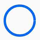
} Animation And Svg draw loading/ Progress bar Components Online Code
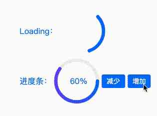
Animation And Svg draw loading/ Progress bar Components DEMO
- First , We use svg Draw a circle with a circumference of
2 * 25 * PI = 157The circle of
<svg with='200' height='200' viewBox="0 0 100 100"  >
 <circle cx="50" cy="50" r="25"  fill="transparent" stroke-width="4" stroke="#0079f5" ></circie>
</svg> 
- Draw a solid line circle into a dotted line circle , You need to use
stoke-dasharray:50, 50 ( It can be abbreviated as 50)Property to draw the dotted line , stoke-dasharray Reference material
- Its value is a sequence , Numbers are separated by commas or spaces , Appoint
Dash (50px)andThe gap (50px)The length of . - because
50( Dash ) + 50( The gap ) + 50( Paragraph line ) = 150, 150 < 157, Can't draw a complete circle , So there's going to be... On the rightThe gap (7px)
<svg with='200' height='200' viewBox="0 0 100 100"  >
 <circle cx="50" cy="50" r="25"  fill="transparent" stroke-width="4" stroke-dasharray="50" stroke="#0079f5" ></circie>
</svg> 
stroke-dashoffsetAttributes can offset the dash and notch of a circle , add to @keyframes Animation can achieve the effect from nothing ,stoke-dashoffset Reference material
- Set up
stroke-dasharray="157 157“, AppointDash (157px)andThe gap (157px)The length of . - add to @keyframes Animation
modify stroke-dashoffset value, The value isPositive numberswhenCounter clockwise offset,, The value isnegativewhen ,Clockwise offset
@keyframes loading {
 0%{
 stroke-dashoffset: 0;
 }
 100%{
 stroke-dashoffset: -157; /\*  Line offset clockwise  */
 }
}
circle{
 animation: loading 1s 0s ease-out infinite;
} 
- Modify dash and notch values
- In order to make loading Component lines are visible , We need a
50pxThe dash of , Set upstroke-dasharray="50" - In order to make the dash completely disappear after offset ,
The gap needs to be greater than or equal to the circumference of the circle 157, Set upstroke-dasharray="50 157" - add to @keyframes Animation , In order to make
At the end of the animation, the starting position of the animation is still processed, needmodify stroke-dashoffset:-207( Dash + Notch length ) - The progress bar is similar , Help you understand
stroke-dashoffsetattribute , Please check Example
@keyframes loading {
 0%{
 stroke-dashoffset: 0;
 }
 100%{
 stroke-dashoffset: -207; /\*  Ensure that the animation start position is still processed at the end of the animation  */
 }
}
circle{
 animation: loading 1s 0s ease-out infinite;
}
Animation steps() Application
steps() yes animation-timing-function The attribute value
animation-timing-function : steps(number\[, end | start\]) - steps Function specifies a step function , It accepts
Two parameters The first parameter takes an integer value, Indicates that two keyframes are completed in several stepsThe second parameter has two values start or end. The default value is end- step-start Equate to step(1, start).step-end Equate to step(1, end)
steps For keyframe animation , The first parameter will be Two keyframes Subdivided into N frame , The second parameter determines the interval between frames Start frame still End frame To fill in .
Look at the picture below and you can see :
steps(N, start)Divide the animation intoN paragraph, Animation in each paragraph ofThe starting pointA step occurs ( That is, the hollow circle in the figure → Solid round ), At the end of the animation, it stops at the N framesteps(N, end)Divide the animation intoN paragraph, Animation in each paragraph ofEndA step occurs ( That is, the hollow circle in the figure → Solid round ), At the end of the animation N Frame has been skipped ( That is, the hollow circle in the figure → Solid round ), Stay here N+1 frame .

True knowledge comes from practice !
Animation To achieve the effect of typing
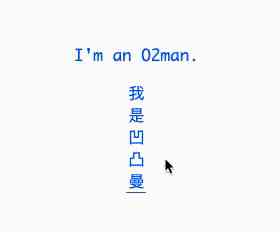
Animation To achieve the effect of typing DEMO
- The English letters are used here (I’m an O2man.) give an example , Altogether
13Characters .\[ After testing , Most Chinese fonts have the same width and height of each character \] steps(13)Can be @keyframes Animation is divided into13 Stagefunction , AndThe running distance of each stage is equal.
The effect is as follows :

/\*  Change the width of the container  */
@keyframes animate-x {
 0%{
 width: 0;
 }
}

p {
 width: 125px;
 overflow: hidden;
 border-right: 1px solid transparent;
 animation: animate-x 3s 0s steps(13) 1 forwards;
} - It can be found that this is not enough , The character is truncated during the animation , In order to ensure that the characters of the current stage can be displayed accurately after each stage is running , We also need to make sure
For each character width It's the same distance from each stage of the animation - Set up
MonacoFont properties , To guaranteeFor each character width identical, Specific pixels are affected byfontSizeAttribute influence , The font width in the example is about 9.6px,9.6px * 13( Number of segments ) = 124.8px (125px), So when we set the container width to 125px, You can achieve your goal :For each character width It's the same distance from each stage of the animation ( about 9.6px ).
p {
 /\*  Set up  Monaco  Font properties , Font size: 16px, To ensure that each character is  width  identical ,width  about 9.6p */
 font-family: Monaco;
 /\* 9.6px * 13 = 124.8px (125px) */
 width: 125px ;
 font-size: 16px;
 overflow: hidden;
 border-right: 1px solid transparent;
 /\*  Apply animation at the same time  animate-x、cursor-x */
 animation: animate-x 3s 0s steps(13) 1 forwards,cursor-x 0.4s 0s linear infinite;
}
Animation Achieve frame animation

Animation Achieve frame animation DEMO
- Here we have a picture of
47 frameOf Sprite (css spirit), Setting the background
.main {
 width: 260px;
 height: 200px;
 background: url(url) no-repeat;
 background-size: 100%;
 background-position: 0 0;
} - add to @keyframes
modify background-position, Let the background image move
@keyframes animate {
 0% {
 background-position: 0 0;
 }

 100% {
 background-position: 0 100%;
 }
}
.main{
 width: 260px;
 height: 200px;
 background: url(url) no-repeat;
 background-size: 100%;
 background-position: 0 0;
 animation: animate 2s 1s steps(47) infinite alternate;
} - meanwhile , css It also provides
animation-play-stateUsed to control whether animation pauses
input:checked+.main{
 animation-play-state: paused;
}
The length of the article is long , Thanks for reading , I hope you can gain something ~ ~ ~
Reference material
Animation Common animation properties
CSS Reference manual
steps() Reference material
SVG learning stroke-dasharray and stroke-dashoffset Detailed explanation
understand CSS3 Animation Medium steps()
【 translate 】css In the animation steps() Usage details
CSS Will Change
Related articles
- 104 Avenue CSS Interview questions , Help you find out what's missing
- 20 One that makes you more efficient CSS Code tricks
Last , Welcome to my official account. : Front end development blog , reply Add group , Learn together .


