当前位置:网站首页>QML control type: drawer
QML control type: drawer
2022-06-21 07:21:00 【Friendly, friend】
One 、 describe
Drawer Provide a side panel that can be opened and closed using a sliding gesture . Inherited from Popup.
Drawer It can be opened from up, down, left and right .
import QtQuick
import QtQuick.Controls

ApplicationWindow {
    id: window
    visible: true

    Drawer {
        id: drawer
        width: 0.66 * window.width
        height: window.height

        Label {
            text: "Content goes here!"
            anchors.centerIn: parent
        }
    }
}
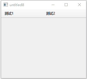
take Drawer Navigate to display below the window title :
import QtQuick
import QtQuick.Controls
import QtQuick.Layouts 1.12

ApplicationWindow {
    id: window
    visible: true

    header: ToolBar
    {
        RowLayout {
          anchors.fill: parent
          ToolButton {
              text: " test 1"
          }
          ToolButton {
              text: " test 2"
          }
        }
    }

    Drawer {
        y: header.height
        width: window.width * 0.6
        height: window.height - header.height

        Label {
            text: "Content goes here!"
            anchors.centerIn: parent
        }
    }
}
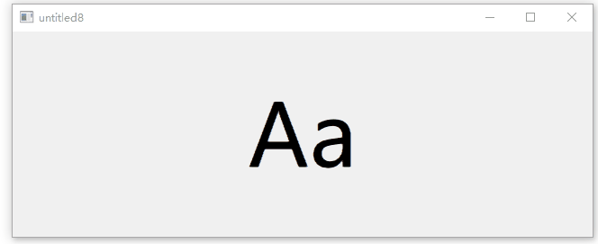
position Attribute determination Drawer Visibility of , The value is between 0.0 and 1.0 Between . The following code uses an and Drawer Of the same rank Label To demonstrate “Label By Drawer Push ” The effect of :
import QtQuick
import QtQuick.Controls

ApplicationWindow {
    id: window
    width: 200
    height: 228
    visible: true

    Drawer {
        id: drawer
        width: 0.66 * window.width
        height: window.height
    }

    Label {
        id: content

        text: "Aa"
        font.pixelSize: 96
        anchors.fill: parent
        verticalAlignment: Label.AlignVCenter
        horizontalAlignment: Label.AlignHCenter

        transform: Translate {    //x The law of attribute change
            x: drawer.position * content.width * 0.33
        }
    }
} 
Two 、 Customize Drawer Example
import QtQuick
import QtQuick.Controls

ApplicationWindow {
    id: window
    visible: true

    Drawer {
        id: drawer
        width: 0.66 * window.width
        height: window.height

        background: Rectangle {
            color: "#128bf1"
            Rectangle {
                x: parent.width - 3
                width: 3
                height: parent.height
                color: "#ff0000"
            }
        }

        Label {
            text: "Content goes here!"
            anchors.centerIn: parent
        }
    }
}
3、 ... and 、 Attribute members
1、dragMargin : real
Distance from the edge of the screen , Dragging within this distance will open Drawer. Set to Less than or equal to 0 Opening by dragging... Can be disabled Drawer.
The default value is Qt.styleHints.startDragDistance.
2、edge : enumeration
open Drawer Window edge of .
- Qt.TopEdge: The upper edge .
- Qt.LeftEdge: Left edge ( Default ).
- Qt.RightEdge: Right edge .
- Qt.BottomEdge: Bottom edge .
3、interactive : bool
Drawer Is it interactive . Non interactive does not react to sliding . The default is true.
4、position : real
Drawer Position relative to its final destination . When fully closed, the position is 0.0, When fully opened, the position is 1.0.
边栏推荐
- 微信小程序_5,页面配置
- Four necessary steps for building a digital factory
- Web3 in 2022 - define concepts and develop innovative paradigms
- Onnx to tensorrt learning notes
- Necessary free artifact for remote assistance todesk remote control software (defense, remote, debugging, office) necessary remote tools
- Do you know all the extension racks of ThinkPHP?
- Bol Bohr's original dual currency driving model leads the new hotspot of dfi+nft+web3.0
- Digital twin smart server: information security monitoring platform
- 数据库与缓存数据一致性问题
- SQL advanced challenge (26 - 30)
猜你喜欢

Root cause analysis | inventory of nine scenarios with abnormal status of kubernetes pod

Mathematics is a tool for solving problems

Introduction to exceptions

Weather forecast applet source code / weather wechat applet source code

建设数字化工厂的四个必要步骤

Necessary free artifact for remote assistance todesk remote control software (defense, remote, debugging, office) necessary remote tools

【Qt】一文总结QtCreator中MSVC编译套件

Two column set (map set)
Bloom filter

Wechat applet_ 6. Network data request
随机推荐
Onnx to tensorrt learning notes
Detailed method and process of APP security penetration test
怎么看小程序是谁开发的(查看小程序开发公司方法)
Yield Guild Games 与 Walken 达成合作
SQL 进阶挑战(26 - 30)
Easyexcel introduction-01
C # basic knowledge series 8 (const and readonly keywords)
Best practice | how to use Tencent cloud micro build to develop enterprise portal applications from 0 to 1
How to solve the problem of MySQL?
2022年6月13日面试被问到面试题目
How to use MES management system to realize error prevention and early warning
AdEx 治理投票:质押奖励减半
Four necessary steps for building a digital factory
Analysis of source code encryption products
Kubernetes pod的生命周期
[mapbox] 基础
Integrating eslint in old projects [02]
Unittest use
【毕业季-进击的技术er】:即将大四在校生的技术分享,未来共勉
Eigen common operations