当前位置:网站首页>Pyechart drawing multiple Y-axis line graphs
Pyechart drawing multiple Y-axis line graphs
2022-06-28 20:43:00 【Enter into self pleasure】
pyechart Draw multiple lines y Axonometric chart
Draw three polylines , And use different y Axis : Use the following data to draw a line chart , And set according to the unit y Axis
data :
x_data=['06-24 21:00','06-24 20:00','06-24 19:00','06-24 18:00',            #x Axis
    '06-24 17:00','06-24 16:00','06-24 15:00','06-24 14:00','06-24 13:00',
    '06-24 12:00','06-24 11:00','06-24 10:00','06-24 09:00','06-24 08:00',
    '06-24 07:00','06-24 06:00','06-24 05:00','06-24 04:00','06-24 03:00',
    '06-24 02:00','06-24 01:00','06-24 00:00','06-23 23:00','06-23 22:00']
pm25=[20.0,24.0,26.0,24.0,21.0,19.0,19.0,18.0,17.0,16.0,19.0,21.0,23.0,     #y0 Axis   Company ug/m³
    26.0,28.0,26.0,26.0,26.0,26.0,25.0,25.0,26.0,25.0,24.0,]
aqi=[52.0,94.0,116.0,138.0,139.0,133.0,128.0,120.0,112.0,110.0,105.0,       #y1 Axis   No unit
    70.0,58.0,57.0,52.0,51.0,49.0,48.0,51.0,53.0,51.0,53.0,54.0,73.0,]
co=[0.434,0.444,0.52,0.519,0.495,0.49,0.508,0.503,0.498,0.499,0.55,0.642,  #y2 Axis   Company mg/m³
    0.727,0.8,0.819,0.767,0.752,0.729,0.72,0.743,0.755,0.753,0.767,0.748,]
Adding y Use... For axis data yaxis_index Appoint y The index of the axis ,`
line.add_yaxis(         # The first curve
    series_name='PM2.5',
    y_axis=pm25,
    label_opts=opts.LabelOpts(is_show=False),
    yaxis_index=0,      # Set up y Index axis
    is_smooth=True,
)
line.add_yaxis(         # Add the second curve
    series_name='AQI',
    y_axis=aqi,
    label_opts=opts.LabelOpts(is_show=False),
    yaxis_index=1,      # Set up y Index axis
    is_smooth=True,
)
line.add_yaxis(         # Add a third curve
    series_name='CO',
    y_axis=co,
    label_opts=opts.LabelOpts(is_show=False),
    yaxis_index=2,      # Set up y Axis
    is_smooth=True,
)
Use extend_axis Method add y Axis and specify format ,position Parameter settings add y Axis position ,position='left' For the left ,position='right' For the right ;offset Parameter settings y Distance between axes . Added y Axis index from yaxis_index=1 Start .yaxis_index=0 Mainly y Axis , stay set_global_opts Set its specific format in .
line.extend_axis(
    yaxis=opts.AxisOpts(type_='value', position='right'))
line.extend_axis(
    yaxis=opts.AxisOpts(
        name='mg/m³',
        type_='value',
        position='left', offset=40))
design sketch :
All the code :
import pyecharts.options as opts
from pyecharts.charts import Line

x_data=['06-24 21:00','06-24 20:00','06-24 19:00','06-24 18:00',            #x Axis
    '06-24 17:00','06-24 16:00','06-24 15:00','06-24 14:00','06-24 13:00',
    '06-24 12:00','06-24 11:00','06-24 10:00','06-24 09:00','06-24 08:00',
    '06-24 07:00','06-24 06:00','06-24 05:00','06-24 04:00','06-24 03:00',
    '06-24 02:00','06-24 01:00','06-24 00:00','06-23 23:00','06-23 22:00']
pm25=[20.0,24.0,26.0,24.0,21.0,19.0,19.0,18.0,17.0,16.0,19.0,21.0,23.0,     #y0 Axis   Company ug/m³
    26.0,28.0,26.0,26.0,26.0,26.0,25.0,25.0,26.0,25.0,24.0,]
aqi=[52.0,94.0,116.0,138.0,139.0,133.0,128.0,120.0,112.0,110.0,105.0,       #y1 Axis   No unit
    70.0,58.0,57.0,52.0,51.0,49.0,48.0,51.0,53.0,51.0,53.0,54.0,73.0,]
co=[0.434,0.444,0.52,0.519,0.495,0.49,0.508,0.503,0.498,0.499,0.55,0.642,  #y2 Axis   Company mg/m³
    0.727,0.8,0.819,0.767,0.752,0.729,0.72,0.743,0.755,0.753,0.767,0.748,]

x_data=x_data[::-1]     # In chronological order
pm25=pm25[::-1]
aqi=aqi[::-1]
co=co[::-1]
line=Line().add_xaxis(xaxis_data=x_data)    # add to x Axis
line.add_yaxis(         # The first curve
    series_name='PM2.5',
    y_axis=pm25,
    label_opts=opts.LabelOpts(is_show=False),
    yaxis_index=0,      # Set up y Axis
    is_smooth=True,
)
line.add_yaxis(         # Add the second curve
    series_name='AQI',
    y_axis=aqi,
    label_opts=opts.LabelOpts(is_show=False),
    yaxis_index=1,      # Set up y Axis
    is_smooth=True,
)
line.add_yaxis(         # Add a third curve
    series_name='CO',
    y_axis=co,
    label_opts=opts.LabelOpts(is_show=False),
    yaxis_index=2,      # Set up y Axis
    is_smooth=True,
)

line.extend_axis(
    yaxis=opts.AxisOpts(type_='value', position='right'))
line.extend_axis(
    yaxis=opts.AxisOpts(
        name='mg/m³',
        type_='value',
        position='left', offset=40))
line.set_global_opts(
    title_opts=opts.TitleOpts(title='24 Hourly air quality trend chart ',pos_top='top', pos_left='center'),
    tooltip_opts=opts.TooltipOpts(trigger="axis"),
    yaxis_opts=opts.AxisOpts(
        name='ug/m³',
        type_="value",
        axistick_opts=opts.AxisTickOpts(is_show=True),
        splitline_opts=opts.SplitLineOpts(is_show=True),
    ),
    legend_opts=opts.LegendOpts(pos_top='40'),
    xaxis_opts=opts.AxisOpts(type_="category", boundary_gap=False),)
line.render('li.html')
边栏推荐
- ThreadLocal principle
- Various types of long
- 数据资产为王,如何解析企业数字化转型与数据资产管理的关系?
- 开通挖财账号安全吗?是靠谱的吗?
- Explanation of memory dump triggered by software watchdog and anr
- Anr no response introduction
- UESTC (shenhengtao team) & JD AI (Mei Tao team) proposed a structured dual stream attention network for video Q & A, with performance SOTA! Better than the method based on dual video representation
- 题解 Andy s First Dictionary(UVa10815)紫书P112set的应用
- No module named ‘PyEMD‘ ;使用plt.figure()TypeError: ‘module‘ object is not callable
- Bitbucket 使用 SSH 拉取仓库失败的问题
猜你喜欢

【毕业季·进击的技术er】努力只能及格,拼命才能优秀!

with torch.no_grad():的使用原因

阿里云 MSE 基于 Apache APISIX 的全链路灰度方案实践
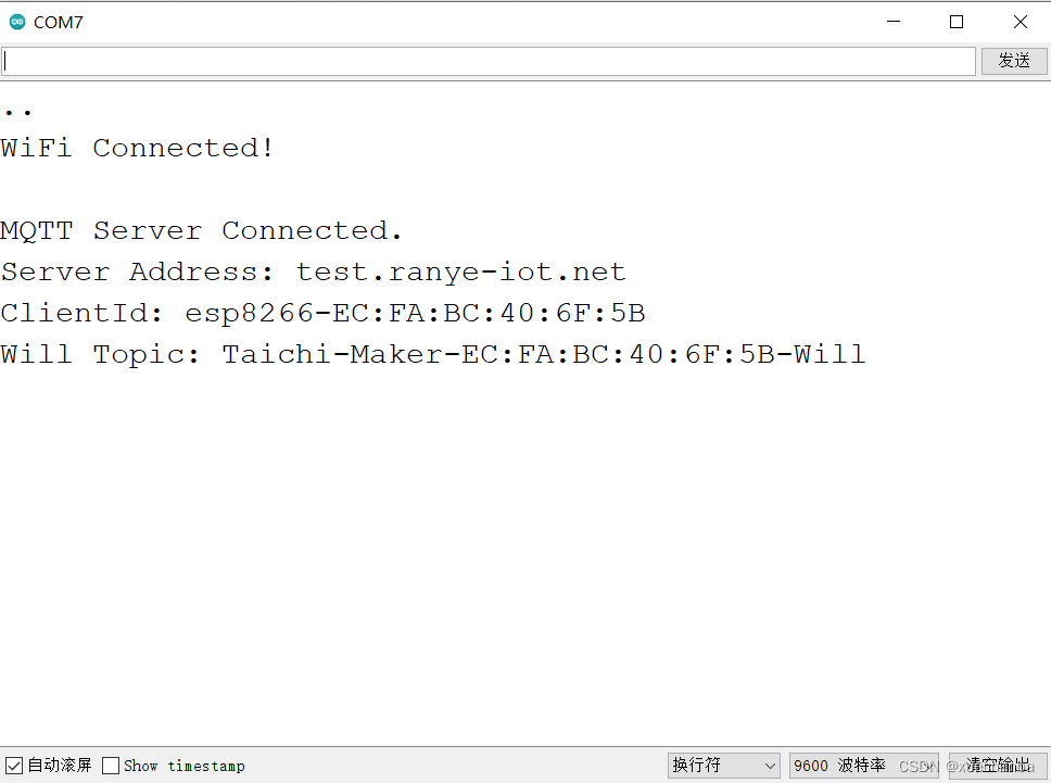
学习太极创客 — MQTT 第二章(七)ESP8266 MQTT 遗嘱应用

ref属性,props配置,mixin混入,插件,scoped样式
with torch. no_ Grad(): reason for using

Figure neural network can also be used as CV backbone model. Huawei Noah Vig architecture is comparable to CNN and transformer

Learn Tai Chi maker mqtt Chapter 2 (VIII) esp8266 mqtt user password authentication

Analysis of variance

2022 tea master (intermediate) examination simulated 100 questions and simulated examination
随机推荐
No module named ‘PyEMD‘ ;使用plt.figure()TypeError: ‘module‘ object is not callable
软件watchdog和ANR触发memory dump讲解
市值1200亿美金,老牌财税巨头Intuit是如何做到的?
数据标准化处理
Jenkins pipeline's handling of job parameters
The blocks problem (uva101) Purple Book p110vector application
Lecture 30 linear algebra Lecture 4 linear equations
Is the inter-bank certificate of deposit reliable and safe
Embedded dynamic Arabic string conversion LCD display string [thanks for Jianguo ambition]
Racher add / delete node
RT thread thread synchronization and thread communication
学习太极创客 — MQTT 第二章(八)ESP8266 MQTT 用户密码认证
Application of the purple book p113map of ananagrams (uva156)
LeetCode每日一题——515. 在每个树行中找最大值
MongoDB——副本集与分片
[learning notes] factor analysis
Is it safe to open a dig money account? Is it reliable?
ThreadLocal principle
Is it safe for CICC fortune to open an account? Let's talk about CICC fortune
酷学院华少:如何在SaaS赛道里做成一家头部公司