当前位置:网站首页>GGPlot Examples Best Reference
GGPlot Examples Best Reference
2022-07-02 09:38:00 【小宇2022】
library(tidyverse)
library(ggpubr)
theme_set(
theme_bw() +
theme(legend.position = "top")
)
library("ggpubr")
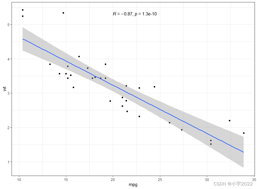
p <- ggplot(mtcars, aes(mpg, wt)) +
geom_point() +
geom_smooth(method = lm) +
stat_cor(method = "pearson", label.x = 20)
p
library(tidyverse)
library(ggpubr)
theme_set(
theme_bw() +
theme(legend.position = "top")
)
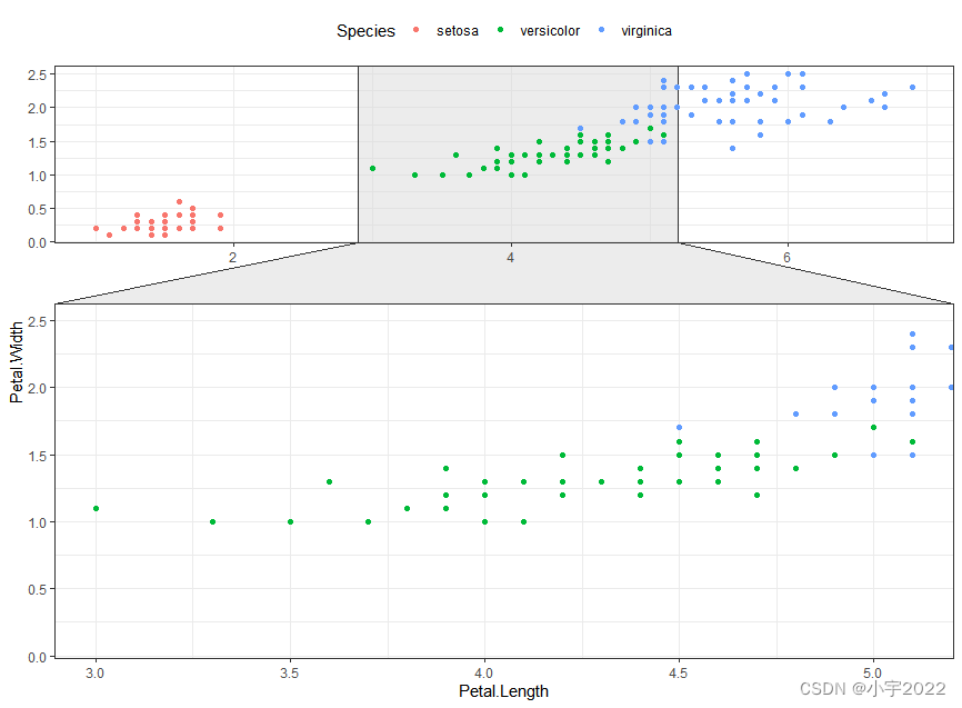
library(ggforce)
ggplot(iris, aes(Petal.Length, Petal.Width, colour = Species)) +
geom_point() +
facet_zoom(x = Species == "versicolor")
library(tidyverse)
library(ggpubr)
theme_set(
  theme_bw() +
    theme(legend.position = "top")
)
# Encircle setosa group
library("ggalt")
circle.df <- iris %>% filter(Species == "setosa")
ggplot(iris, aes(Petal.Length, Petal.Width)) +
  geom_point(aes(colour = Species)) +
  geom_encircle(data = circle.df, linetype = 2)

library(tidyverse)
library(ggpubr)
theme_set(
theme_bw() +
theme(legend.position = "top")
)
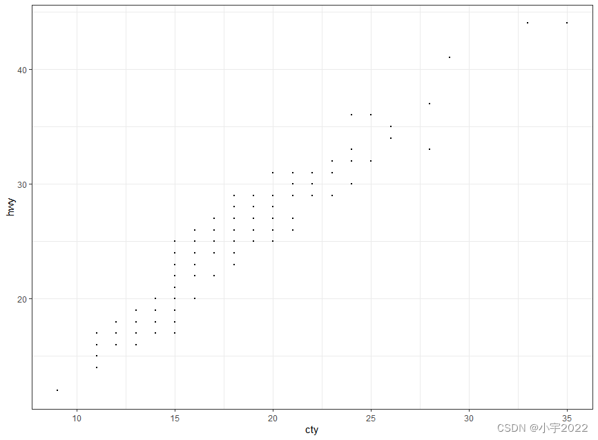
# Basic scatter plot
ggplot(mpg, aes(cty, hwy)) +
geom_point(size = 0.5)
library(tidyverse)
library(ggpubr)
theme_set(
  theme_bw() +
    theme(legend.position = "top")
)

# Jittered points
ggplot(mpg, aes(cty, hwy)) +
  geom_jitter(size = 0.5, width = 0.5)

library(tidyverse)
library(ggpubr)
theme_set(
theme_bw() +
theme(legend.position = "top")
)
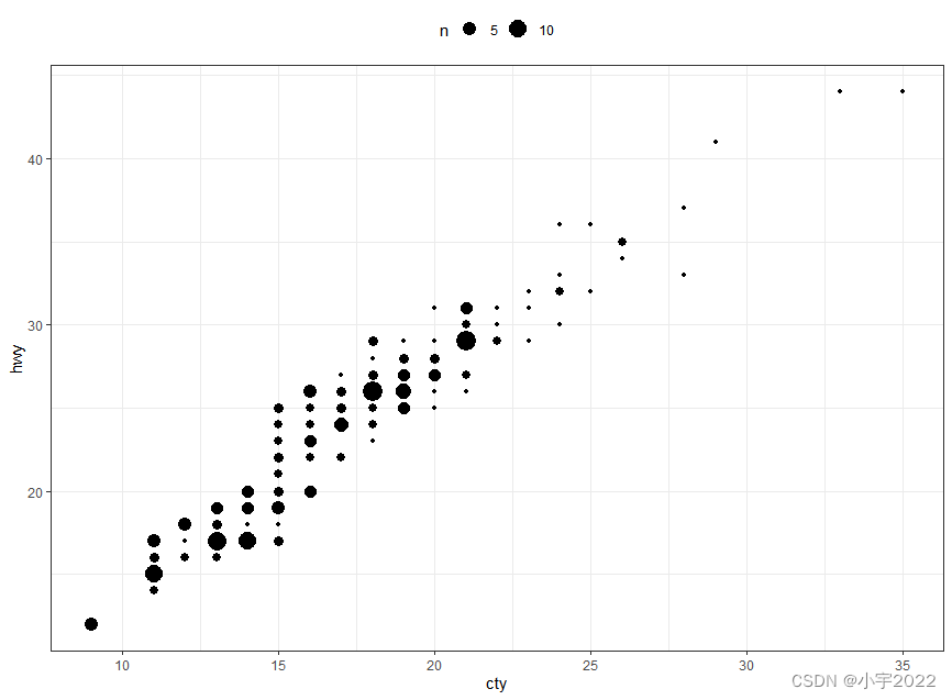
ggplot(mpg, aes(cty, hwy)) +
geom_count()
library(tidyverse)
library(ggpubr)
theme_set(
theme_bw() +
theme(legend.position = "top")
)
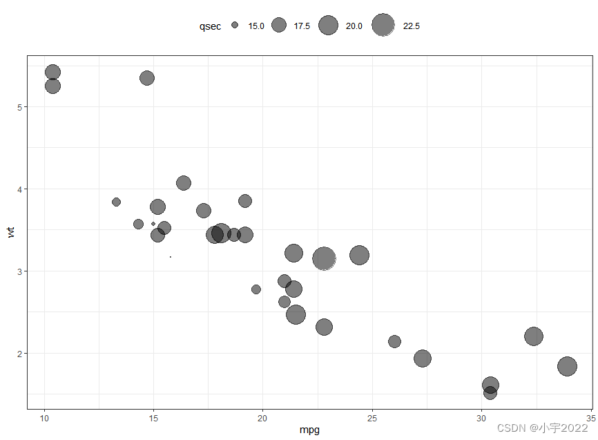
ggplot(mtcars, aes(mpg, wt)) +
geom_point(aes(size = qsec), alpha = 0.5) +
scale_size(range = c(0.5, 12)) # Adjust the range of points size
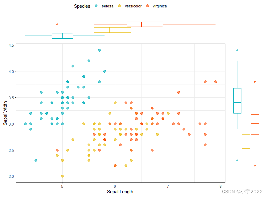
library(ggpubr)
# Grouped Scatter plot with marginal density plots
ggscatterhist(
  iris, x = "Sepal.Length", y = "Sepal.Width",
  color = "Species", size = 3, alpha = 0.6,
  palette = c("#00AFBB", "#E7B800", "#FC4E07"),
  margin.params = list(fill = "Species", color = "black", size = 0.2)
)

library(ggpubr)
# Use box plot as marginal plots
ggscatterhist(
  iris, x = "Sepal.Length", y = "Sepal.Width",
  color = "Species", size = 3, alpha = 0.6,
  palette = c("#00AFBB", "#E7B800", "#FC4E07"),
  margin.plot = "boxplot",
  ggtheme = theme_bw()
)
# Basic density plot
ggplot(iris, aes(Sepal.Length)) +
  geom_density()

# Add mean line
ggplot(iris, aes(Sepal.Length)) +
  geom_density(fill = "lightgray") +
  geom_vline(aes(xintercept = mean(Sepal.Length)), linetype = 2)

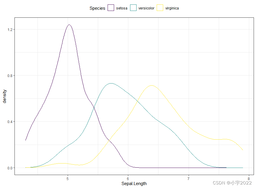
# Change line color by groups
ggplot(iris, aes(Sepal.Length, color = Species)) +
  geom_density() +
  scale_color_viridis_d()
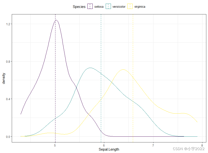
# Add mean line by groups
mu <- iris %>%
  group_by(Species) %>%
  summarise(grp.mean = mean(Sepal.Length))

ggplot(iris, aes(Sepal.Length, color = Species)) +
  geom_density() +
  geom_vline(aes(xintercept = grp.mean, color = Species),
             data = mu, linetype = 2) +
  scale_color_viridis_d()
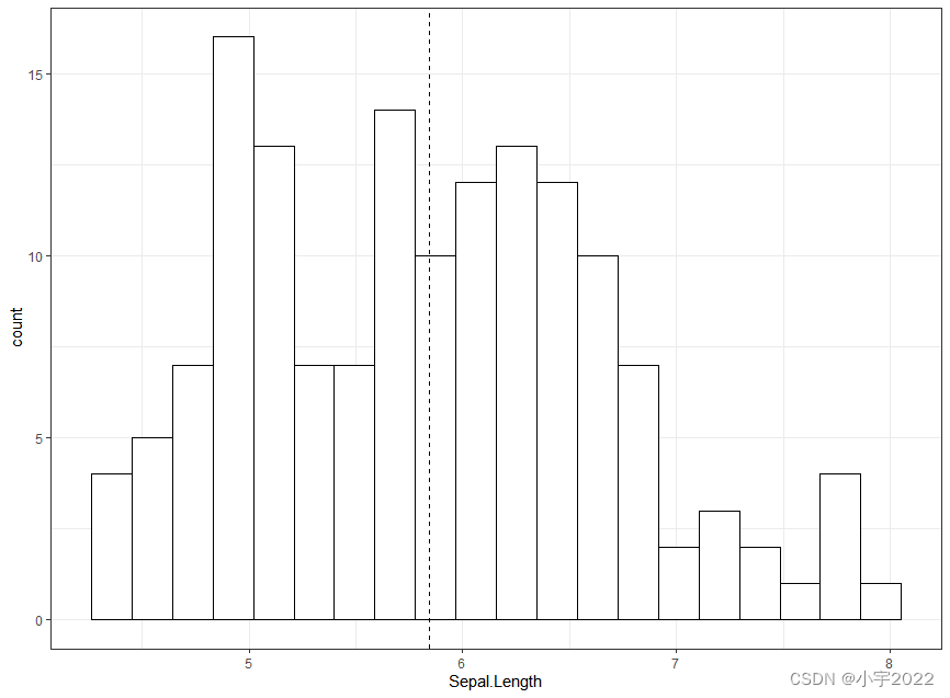
# Basic histogram with mean line
ggplot(iris, aes(Sepal.Length)) +
  geom_histogram(bins = 20, fill = "white", color = "black")  +
  geom_vline(aes(xintercept = mean(Sepal.Length)), linetype = 2)
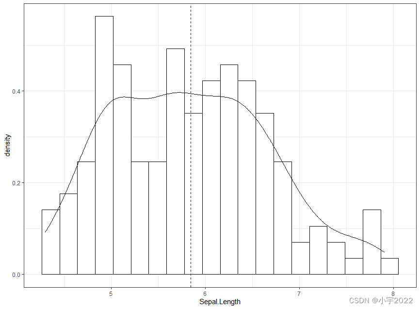
# Add density curves
ggplot(iris, aes(Sepal.Length, stat(density))) +
  geom_histogram(bins = 20, fill = "white", color = "black")  +
  geom_density() +
  geom_vline(aes(xintercept = mean(Sepal.Length)), linetype = 2)
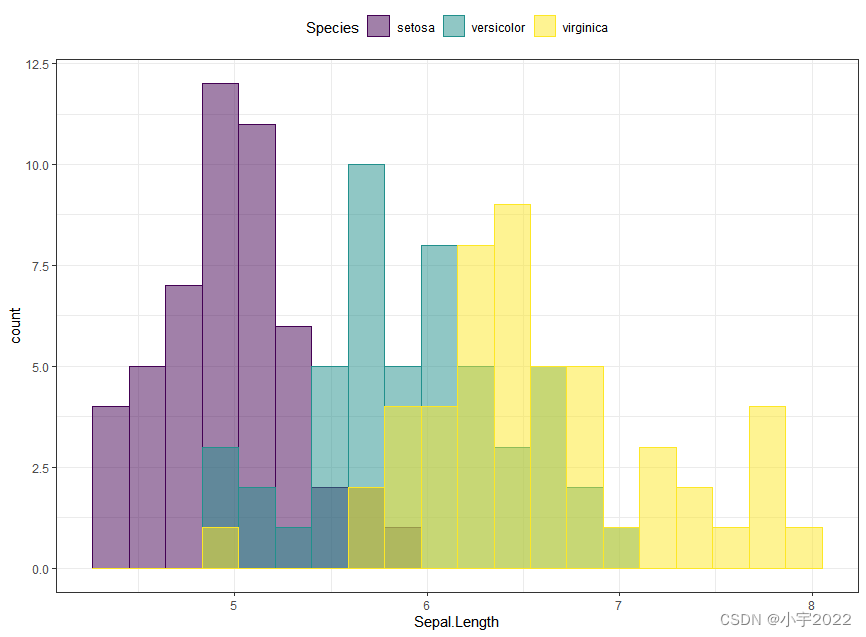
ggplot(iris, aes(Sepal.Length)) +
  geom_histogram(aes(fill = Species, color = Species), bins = 20,
                 position = "identity", alpha = 0.5) +
  scale_fill_viridis_d() +
  scale_color_viridis_d()
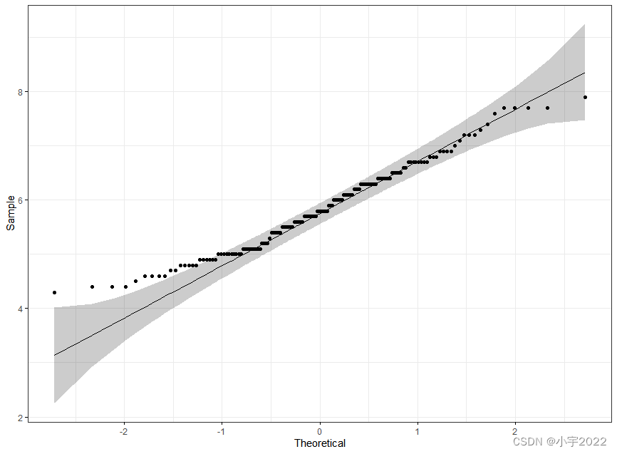
library(ggpubr)
ggqqplot(iris, x = "Sepal.Length",
         ggtheme = theme_bw())
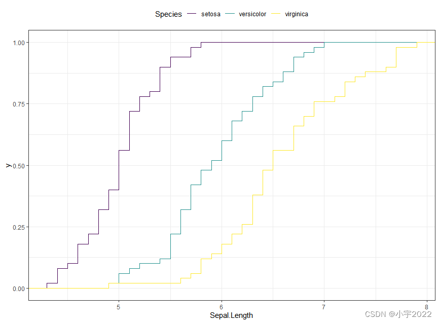
ggplot(iris, aes(Sepal.Length)) +
  stat_ecdf(aes(color = Species)) +
  scale_color_viridis_d()
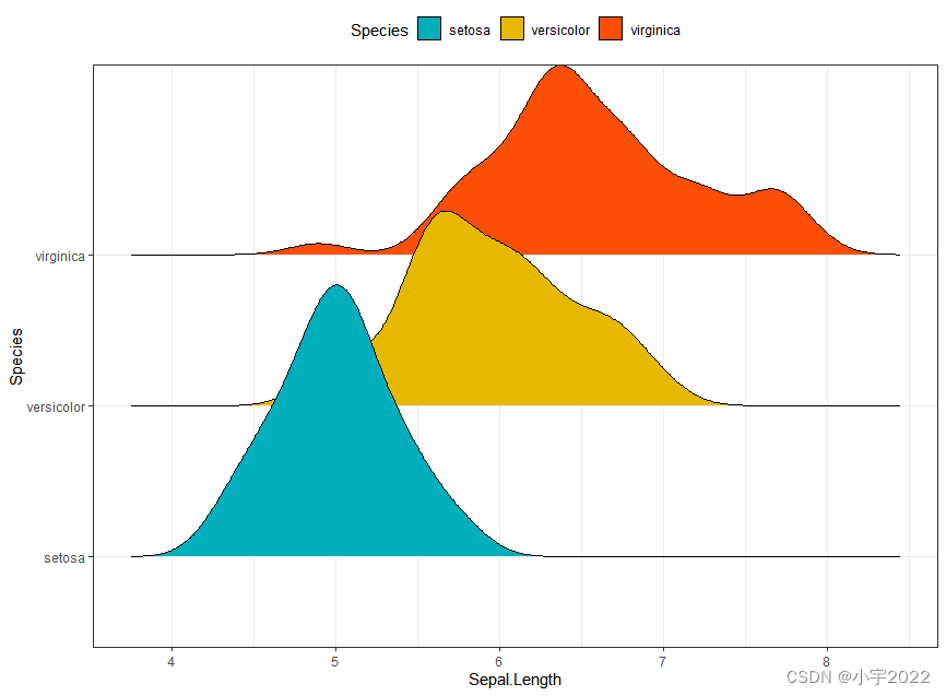
library(ggridges)
ggplot(iris, aes(x = Sepal.Length, y = Species)) +
  geom_density_ridges(aes(fill = Species)) +
  scale_fill_manual(values = c("#00AFBB", "#E7B800", "#FC4E07"))
df <- mtcars %>%
  rownames_to_column() %>%
  as_data_frame() %>%
  mutate(cyl = as.factor(cyl)) %>%
  select(rowname, wt, mpg, cyl)
# Basic bar plots
ggplot(df, aes(x = rowname, y = mpg)) +
  geom_col() +
  rotate_x_text(angle = 45)

df <- mtcars %>%
  rownames_to_column() %>%
  as_data_frame() %>%
  mutate(cyl = as.factor(cyl)) %>%
  select(rowname, wt, mpg, cyl)
# Reorder row names by mpg values
ggplot(df, aes(x = reorder(rowname, mpg), y = mpg)) +
  geom_col()  +
  rotate_x_text(angle = 45)

df <- mtcars %>%
rownames_to_column() %>%
as_data_frame() %>%
mutate(cyl = as.factor(cyl)) %>%
select(rowname, wt, mpg, cyl)
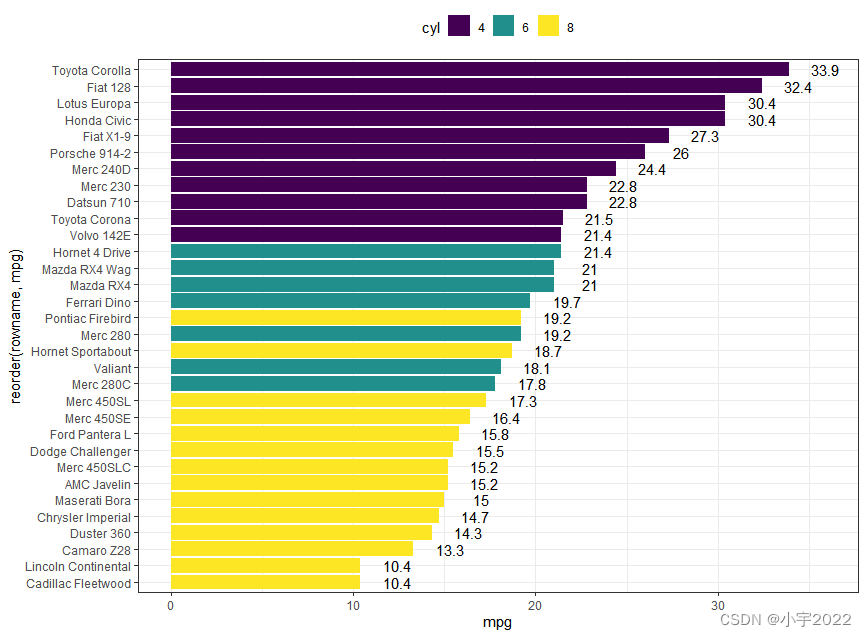
# Horizontal bar plots,
# change fill color by groups and add text labels
ggplot(df, aes(x = reorder(rowname, mpg), y = mpg)) +
geom_col( aes(fill = cyl)) +
geom_text(aes(label = mpg), nudge_y = 2) +
coord_flip() +
scale_fill_viridis_d()
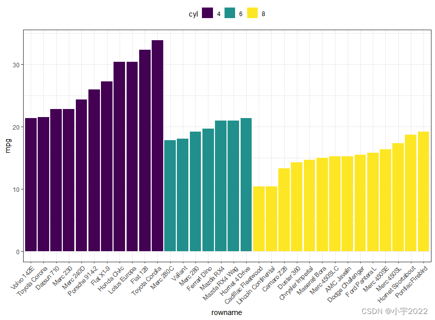
df <- mtcars %>%
  rownames_to_column() %>%
  as_data_frame() %>%
  mutate(cyl = as.factor(cyl)) %>%
  select(rowname, wt, mpg, cyl)
df2 <- df %>%
  arrange(cyl, mpg) %>%
  mutate(rowname = factor(rowname, levels = rowname))

ggplot(df2, aes(x = rowname, y = mpg)) +
  geom_col( aes(fill = cyl)) +
  scale_fill_viridis_d() +
  rotate_x_text(45)
df <- mtcars %>%
  rownames_to_column() %>%
  as_data_frame() %>%
  mutate(cyl = as.factor(cyl)) %>%
  select(rowname, wt, mpg, cyl)
df2 <- df %>%
  arrange(cyl, mpg) %>%
  mutate(rowname = factor(rowname, levels = rowname))

ggplot(df2, aes(x = rowname, y = mpg)) +
  geom_segment(
    aes(x = rowname, xend = rowname, y = 0, yend = mpg),
    color = "lightgray"
  ) +
  geom_point(aes(color = cyl), size = 3) +
  scale_color_viridis_d() +
  theme_pubclean() +
  rotate_x_text(45)

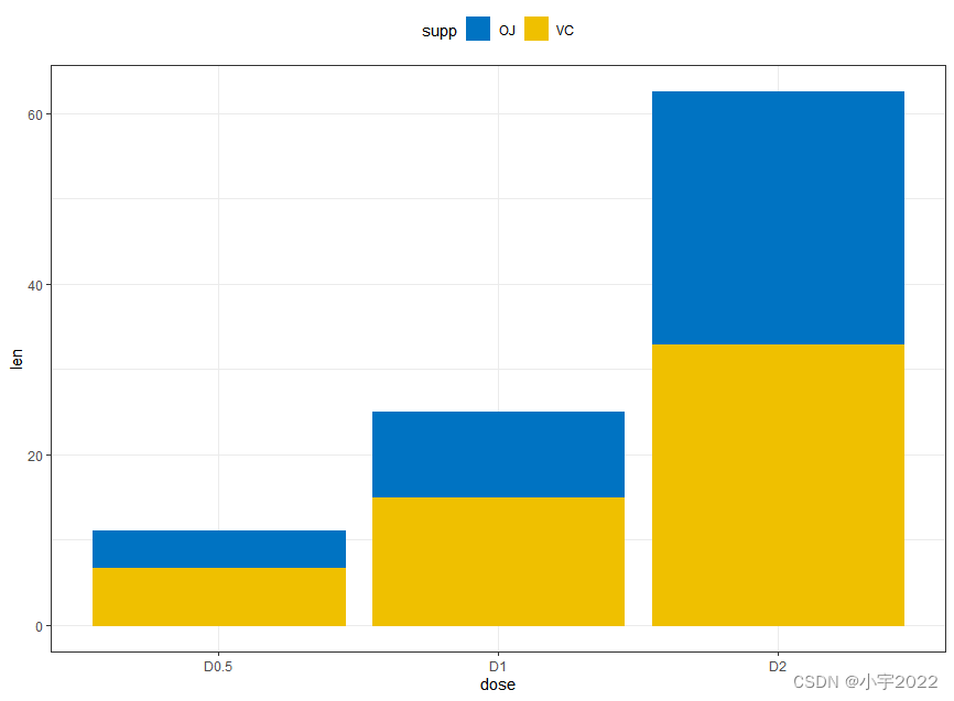
# Data
df3 <- data.frame(supp=rep(c("VC", "OJ"), each=3),
                  dose=rep(c("D0.5", "D1", "D2"),2),
                  len=c(6.8, 15, 33, 4.2, 10, 29.5))


# Stacked bar plots of y = counts by x = cut,
# colored by the variable color
ggplot(df3, aes(x = dose, y = len)) +
  geom_col(aes(color = supp, fill = supp), position = position_stack()) +
  scale_color_manual(values = c("#0073C2FF", "#EFC000FF"))+
  scale_fill_manual(values = c("#0073C2FF", "#EFC000FF"))
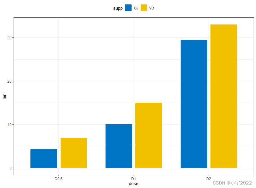
# Data
df3 <- data.frame(supp=rep(c("VC", "OJ"), each=3),
                  dose=rep(c("D0.5", "D1", "D2"),2),
                  len=c(6.8, 15, 33, 4.2, 10, 29.5))

# Use position = position_dodge()
ggplot(df3, aes(x = dose, y = len)) +
  geom_col(aes(color = supp, fill = supp), position = position_dodge(0.8), width = 0.7) +
  scale_color_manual(values = c("#0073C2FF", "#EFC000FF"))+
  scale_fill_manual(values = c("#0073C2FF", "#EFC000FF"))
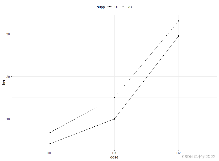
# Data
df3 <- data.frame(supp=rep(c("VC", "OJ"), each=3),
                  dose=rep(c("D0.5", "D1", "D2"),2),
                  len=c(6.8, 15, 33, 4.2, 10, 29.5))

# Line plot
ggplot(df3, aes(x = dose, y = len, group = supp)) +
  geom_line(aes(linetype = supp)) +
  geom_point(aes(shape = supp))
# Raw data
df <- ToothGrowth %>% mutate(dose = as.factor(dose))
head(df, 3)
# Summary statistics
df.summary <- df %>%
  group_by(dose) %>%
  summarise(sd = sd(len, na.rm = TRUE), len = mean(len))
df.summary
# (1) Line plot
ggplot(df.summary, aes(dose, len)) +
  geom_line(aes(group = 1)) +
  geom_errorbar( aes(ymin = len-sd, ymax = len+sd),width = 0.2) +
  geom_point(size = 2)

# Raw data
df <- ToothGrowth %>% mutate(dose = as.factor(dose))
head(df, 3)
# Summary statistics
df.summary <- df %>%
  group_by(dose) %>%
  summarise(sd = sd(len, na.rm = TRUE), len = mean(len))
df.summary

# (2) Bar plot
ggplot(df.summary, aes(dose, len)) +
  geom_bar(stat = "identity", fill = "lightgray", color = "black") +
  geom_errorbar(aes(ymin = len, ymax = len+sd), width = 0.2)

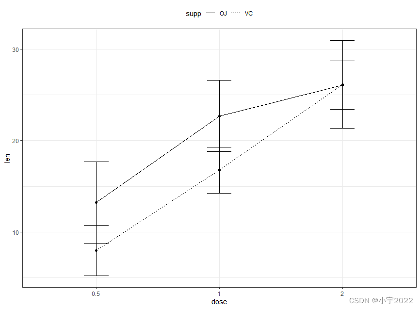
# Data preparation
df.summary2 <- df %>%
  group_by(dose, supp) %>%
  summarise( sd = sd(len), len = mean(len))
df.summary2
# (1) Line plot + error bars
ggplot(df.summary2, aes(dose, len)) +
  geom_line(aes(linetype = supp, group = supp))+
  geom_point()+
  geom_errorbar(
    aes(ymin = len-sd, ymax = len+sd, group = supp),
    width = 0.2
  )
# Data preparation
df.summary2 <- df %>%
group_by(dose, supp) %>%
summarise( sd = sd(len), len = mean(len))
df.summary2
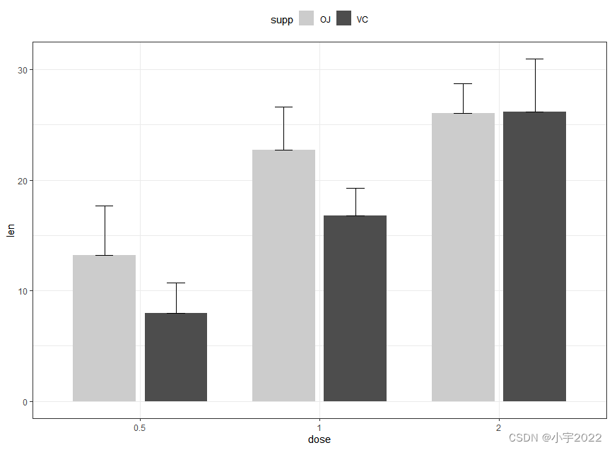
# (2) Bar plots + upper error bars.
ggplot(df.summary2, aes(dose, len)) +
geom_bar(aes(fill = supp), stat = "identity",
position = position_dodge(0.8), width = 0.7)+
geom_errorbar(
aes(ymin = len, ymax = len+sd, group = supp),
width = 0.2, position = position_dodge(0.8)
)+
scale_fill_manual(values = c("grey80", "grey30"))
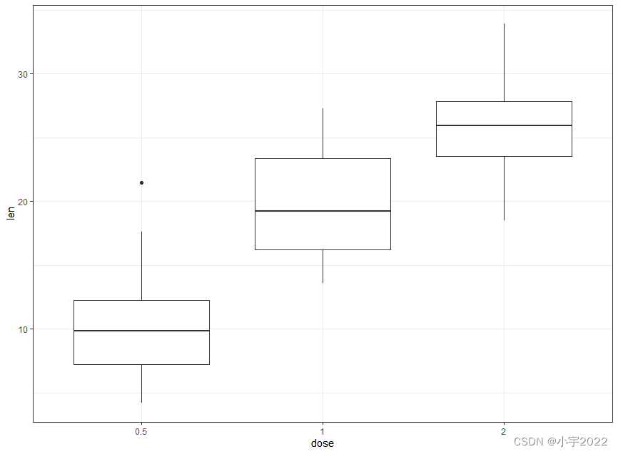
ToothGrowth$dose <- as.factor(ToothGrowth$dose)
# Basic
ggplot(ToothGrowth, aes(dose, len)) +
  geom_boxplot()
ToothGrowth$dose <- as.factor(ToothGrowth$dose)

# Box plot + violin plot
ggplot(ToothGrowth, aes(dose, len)) +
  geom_violin(trim = FALSE) +
  geom_boxplot(width = 0.2)

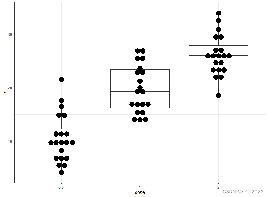
ToothGrowth$dose <- as.factor(ToothGrowth$dose)

# Add jittered points
ggplot(ToothGrowth, aes(dose, len)) +
  geom_boxplot() +
  geom_jitter(width = 0.2)
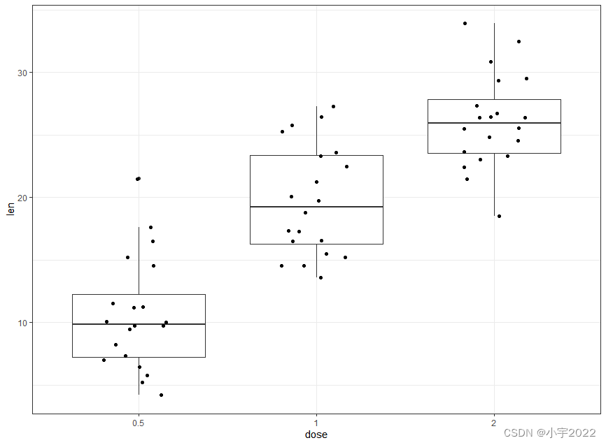
ToothGrowth$dose <- as.factor(ToothGrowth$dose)

# Dot plot + box plot
ggplot(ToothGrowth, aes(dose, len)) +
  geom_boxplot() +
  geom_dotplot(binaxis = "y", stackdir = "center")
ToothGrowth$dose <- as.factor(ToothGrowth$dose)
# Box plots
ggplot(ToothGrowth, aes(dose, len)) +
  geom_boxplot(aes(color = supp)) +
  scale_color_viridis_d()

ToothGrowth$dose <- as.factor(ToothGrowth$dose)
# Add jittered points
ggplot(ToothGrowth, aes(dose, len, color = supp)) +
  geom_boxplot() +
  geom_jitter(position = position_jitterdodge(jitter.width = 0.2)) +
  scale_color_viridis_d()

# Data preparation
df <- economics %>%
  select(date, psavert, uempmed) %>%
  gather(key = "variable", value = "value", -date)
head(df, 3)
# Multiple line plot
ggplot(df, aes(x = date, y = value)) +
  geom_line(aes(color = variable), size = 1) +
  scale_color_manual(values = c("#00AFBB", "#E7B800")) +
  theme_minimal()

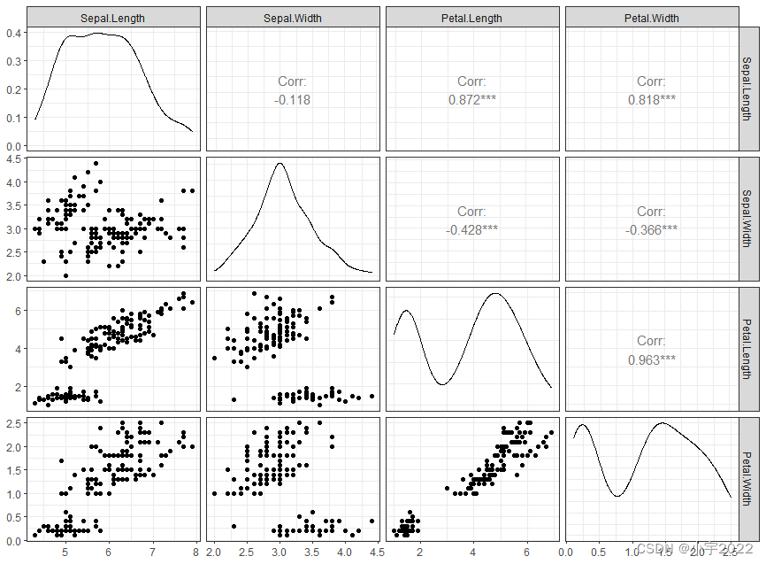
library(GGally)
ggpairs(iris[,-5])+ theme_bw()
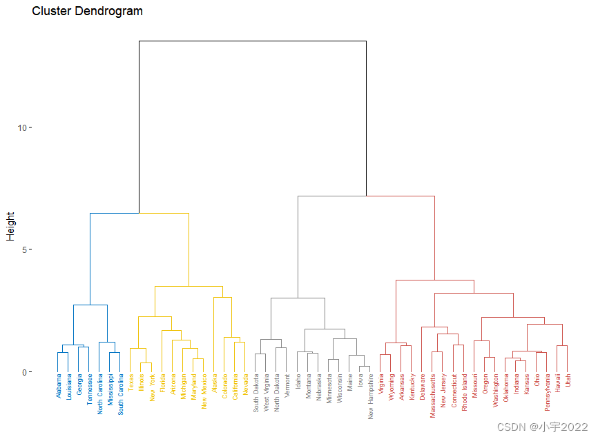
library(factoextra)
USArrests %>%
  scale() %>%                           # Scale the data
  dist() %>%                            # Compute distance matrix
  hclust(method = "ward.D2") %>%        # Hierarchical clustering
  fviz_dend(cex = 0.5, k = 4, palette = "jco") # Visualize and cut
# into 4 groups
library(ggpubr)
# Data preparation
housetasks <- read.delim(
  system.file("demo-data/housetasks.txt", package = "ggpubr"),
  row.names = 1
)
head(housetasks, 4)
# Visualization
ggballoonplot(housetasks, fill = "value")+
  scale_fill_viridis_c(option = "C")

边栏推荐
- The working day of the month is calculated from the 1st day of each month
- Why does LabVIEW lose precision in floating point numbers
- Summary of data export methods in powerbi
- [cloud native] 2.5 kubernetes core practice (Part 2)
- Tdsql | difficult employment? Tencent cloud database micro authentication to help you
- ROS lacks catkin_ pkg
- PKG package manager usage instance in FreeBSD
- VS2019代码中包含中文内容导致的编译错误和打印输出乱码问题
- Some things configured from ros1 to ros2
- 高德根据轨迹画线
猜你喜欢

PYQT5+openCV项目实战:微循环仪图片、视频记录和人工对比软件(附源码)

TIPC Cluster5

MySQL比较运算符IN问题求解

Wechat applet uses Baidu API to achieve plant recognition

Tick Data and Resampling

Importerror: impossible d'importer le nom « graph» de « graphviz»

Amazon cloud technology community builder application window opens

RPA进阶(二)Uipath应用实践

Jinshanyun - 2023 Summer Internship

MTK full dump抓取
随机推荐
Mmrotate rotation target detection framework usage record
spritejs
揭露数据不一致的利器 —— 实时核对系统
sqlite 修改列类型
Is it safe to open a stock account through the QR code of the securities manager? Or is it safe to open an account in a securities company?
原生方法合并word
Why does LabVIEW lose precision in floating point numbers
Homer预测motif
C#多维数组的属性获取方法及操作注意
vant tabs组件选中第一个下划线位置异常
程序员成长第六篇:如何选择公司?
I STM32 development environment, keil5/mdk5.14 installation tutorial (with download link)
Principle of scalable contract delegatecall
CTF record
MTK full dump抓取
ctf 记录
STM32 single chip microcomputer programming learning
sql left join 主表限制条件写在on后面和写在where后面的区别
Is it safe to open a stock account online? I'm a novice, please guide me
webauthn——官方开发文档