当前位置:网站首页>Flutter 从零开始 007 输入框
Flutter 从零开始 007 输入框
2022-06-30 11:42:00 【华为云】
Material 组件库中提供了输入框组件TextField和表单组件Form。下面我们分别介绍一下。
1、TextField
TextField 用于文本输入,它提供了很多属性,我们先简单的介绍一下主要属性,然后通过几个实例来演示一下关键的属性
const TextField({ Key? key, this.controller, this.focusNode, this.decoration = const InputDecoration(), TextInputType? keyboardType, this.textInputAction, this.textCapitalization = TextCapitalization.none, this.style, this.strutStyle, this.textAlign = TextAlign.start, this.textAlignVertical, this.textDirection, this.readOnly = false, ToolbarOptions? toolbarOptions, this.showCursor, this.autofocus = false, this.obscuringCharacter = '•', this.obscureText = false, this.autocorrect = true, SmartDashesType? smartDashesType, SmartQuotesType? smartQuotesType, this.enableSuggestions = true, this.maxLines = 1, this.minLines, this.expands = false, this.maxLength, @Deprecated( 'Use maxLengthEnforcement parameter which provides more specific ' 'behavior related to the maxLength limit. ' 'This feature was deprecated after v1.25.0-5.0.pre.', ) this.maxLengthEnforced = true, this.maxLengthEnforcement, this.onChanged, this.onEditingComplete, this.onSubmitted, this.onAppPrivateCommand, this.inputFormatters, this.enabled, this.cursorWidth = 2.0, this.cursorHeight, this.cursorRadius, this.cursorColor, this.selectionHeightStyle = ui.BoxHeightStyle.tight, this.selectionWidthStyle = ui.BoxWidthStyle.tight, this.keyboardAppearance, this.scrollPadding = const EdgeInsets.all(20.0), this.dragStartBehavior = DragStartBehavior.start, this.enableInteractiveSelection = true, this.selectionControls, this.onTap, this.mouseCursor, this.buildCounter, this.scrollController, this.scrollPhysics, this.autofillHints = const <String>[], this.clipBehavior = Clip.hardEdge, this.restorationId, this.enableIMEPersonalizedLearning = true, })controller:编辑框的控制器,通过它可以设置/获取编辑框的内容、选择编辑内容、监听编辑文本改变事件。大多数情况下我们都需要显式提供一个controller来与文本框交互。如果没有提供controller,则TextField内部会自动创建一个。
focusNode:用于控制TextField是否占有当前键盘的输入焦点。它是我们和键盘交互的一个句柄(handle)。
InputDecoration:用于控制TextField的外观显示,如提示文本、背景颜色、边框等。
keyboardType:用于设置该输入框默认的键盘输入类型,取值如下:
| TextInputType枚举值 | 含义 |
|---|---|
| text | 文本输入键盘 |
| multiline | 多行文本,需和maxLines配合使用(设为null或大于1) |
| number | 数字;会弹出数字键盘 |
| phone | 优化后的电话号码输入键盘;会弹出数字键盘并显示“* #” |
| datetime | 优化后的日期输入键盘;Android上会显示“: -” |
| emailAddress | 优化后的电子邮件地址;会显示“@ .” |
| url | 优化后的url输入键盘; 会显示“/ .” |
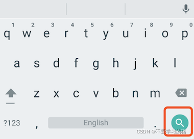
textInputAction:键盘动作按钮图标(即回车键位图标),它是一个枚举值,有多个可选值,全部的取值列表读者可以查看API文档,下面是当值为TextInputAction.search时,原生Android系统下键盘样式如图
style:正在编辑的文本样式。
textAlign: 输入框内编辑文本在水平方向的对齐方式。
autofocus: 是否自动获取焦点。
obscureText:是否隐藏正在编辑的文本,如用于输入密码的场景等,文本内容会用“•”替换。
maxLines:输入框的最大行数,默认为1;如果为null,则无行数限制。
maxLength和maxLengthEnforcement :maxLength代表输入框文本的最大长度,设置后输入框右下角会显示输入的文本计数。maxLengthEnforcement决定当输入文本长度超过maxLength时如何处理,如截断、超出等。
toolbarOptions:长按或鼠标右击时出现的菜单,包括 copy、cut、paste 以及 selectAll。
onChange:输入框内容改变时的回调函数;注:内容改变事件也可以通过controller来监听。
onEditingComplete和onSubmitted:这两个回调都是在输入框输入完成时触发,比如按了键盘的完成键(对号图标)或搜索键(图标)。不同的是两个回调签名不同,onSubmitted回调是ValueChanged<String>类型,它接收当前输入内容做为参数,而onEditingComplete不接收参数。
inputFormatters:用于指定输入格式;当用户输入内容改变时,会根据指定的格式来校验。
enable:如果为false,则输入框会被禁用,禁用状态不接收输入和事件,同时显示禁用态样式(在其decoration中定义)。
cursorWidth、cursorRadius和cursorColor:这三个属性是用于自定义输入框光标宽度、圆角和颜色的。
示例:登录输入框
TextField( autofocus: true, decoration: InputDecoration( labelText: "用户名", hintText: "用户账号", prefixIcon: Icon(Icons.person), ), ), TextField( decoration: InputDecoration( labelText: "密码", hintText: "登录密码", prefixIcon: Icon(Icons.lock), ), obscureText: true, ),运行结果

获取输入内容
获取输入的内容有两种方法:
- 定义两个变量,用于保存用户名和密码,然后在onChange触发时,各自保存一下输入内容
- 通过controller 直接获取
第一种方法比较简单,我们介绍一下第二种方法
定义一个controller
TextEditingController userController = TextEditingController(); // 用户名的controller然后设置输入框controller:
TextField( autofocus: true, controller: userController, // 设置controller decoration: InputDecoration( labelText: "用户名", hintText: "用户账号", prefixIcon: Icon(Icons.person), ), ),通过点击事件,将获取的到值展示在按钮上面
TextButton( onPressed: () { setState(() { userLabel = userController.text; }); }, child: Text(userLabel), ),监听文本变化
监听文本变化也有两种
1、设置onChange 回调,如:
TextField( autofocus: true, onChanged: (value){ print(value); }, ),2、通过controller 监听,如:
@override void initState() { // TODO: implement initState super.initState(); userController.addListener(() { print(userController.text); }); }onChange 是专门用于监听文本变化的,而controller 却还可以设置默认值、选择文本。
设置默认值,并从第三个字符开始选中后面的字符
userController.text = "我是张三啊"; userController.selection = TextSelection(baseOffset: 2, extentOffset: userController.text.length);运行如下
控制焦点
焦点可以通过FocusNode和FocusScopeNode来控制,默认情况下,焦点由FocusScope来管理,它代表焦点控制范围,可以在这个范围内可以通过FocusScopeNode在输入框之间移动焦点、设置默认焦点等。我们可以通过FocusScope.of(context) 来获取Widget树中默认的FocusScopeNode。下面看一个示例,在此示例中创建两个TextField,第一个自动获取焦点,然后创建两个按钮:
点击第一个按钮可以将焦点从第一个TextField挪到第二个TextField。
点击第二个按钮可以关闭键盘。
我们要实现的效果如图:

代码如下
class _MyHomePageState extends State<MyHomePage> { FocusNode focusNode1 = FocusNode(); FocusNode focusNode2 = FocusNode(); FocusScopeNode? focusScopeNode; @override Widget build(BuildContext context) { return Scaffold( appBar: AppBar( title: Text(widget.title), ), body: Column( mainAxisAlignment: MainAxisAlignment.start, crossAxisAlignment: CrossAxisAlignment.center, children: [ TextField( focusNode: focusNode1, decoration: InputDecoration(labelText: "第一个input"), ), SizedBox( height: 30, ), TextField( focusNode: focusNode2, decoration: InputDecoration(labelText: "第二个input"), ), SizedBox( height: 30, ), ElevatedButton( onPressed: () { FocusScope.of(context).requestFocus(focusNode2); }, child: Text("移动焦点"), ), SizedBox( height: 30, ), ElevatedButton( onPressed: () { setState(() { focusNode1.unfocus(); focusNode2.unfocus(); }); }, child: Text("收回键盘"), ), ], )); }}FocusNode和FocusScopeNode还有一些其它的方法,详情可以查看API文档。
我们还可以监听焦点的变化
// 监听焦点变化 focusNode.addListener((){ print(focusNode.hasFocus);});自动义样式
在开发过程中,我们经常需要自定义自己需要的文本输入框样式,下面我们一起来简单的了解一下
Container( child: TextField( keyboardType: TextInputType.emailAddress, decoration: InputDecoration( labelText: "Email", hintText: "电子邮箱", prefixIcon: Icon(Icons.email), border: InputBorder.none, //隐藏下划线 ), ), decoration: BoxDecoration( // 自定义下滑线 border: Border( bottom: BorderSide( color: Colors.red, width: 1, ) ) ), ),运行结果如下
下一节我们学习一下 表单
边栏推荐
- Go 语言入门很简单:Go 处理 XML 文件
- redis在项目中的使用
- “\“id\“ contains an invalid value“
- R语言ggplot2可视化:使用ggplot2可视化散点图、在geom_point参数中设置alpha参数指定数据点的透明度级别(points transparent、从0到1)
- led背光板的作用是什么呢?
- VScode选中多个单词
- HMS core audio editing service 3D audio technology helps create an immersive auditory feast
- 使用深度学习进行生物网络分析
- MySQL 表的内连和外连
- STM32 移植 RT-Thread 标准版的 FinSH 组件
猜你喜欢

OpenMLDB Meetup No.4 会议纪要

Summer vacation study record

Review the writing software with characteristics

这些电影中的科幻构想,已经用AI实现了

wallys/600VX – 2 × 2 MIMO 802.11ac Mini PCIe Wi-Fi Module, Dual Band, 2,4GHz / 5GHz QCA 9880

MySQL 复合查询

EMC surge

Our company has used this set of general solutions for 7 years, and has opened up dozens of systems, a stable batch!

Summer vacation study record

redis在项目中的使用
随机推荐
R language ggplot2 visualization: use ggplot2 to visualize the scatter diagram and use scale_ The size function configures the measurement adjustment range of the size of the data point
c# 怎样能写个sql的解析器
R language ggplot2 visual Facet: gganimate package is based on Transition_ The time function creates a dynamic scatter graph animation (GIF) and uses the labs function to add a dynamic time title to t
谁还记得「张同学」?
NoSQL——Redis的配置与优化
"New digital technology" completed tens of millions of yuan of a + round financing and built an integrated intelligent database cloud management platform
MySQL 表的内连和外连
Global Capital Market 101:国内高净值人群最好的投资标的之一BREIT
服务器常用的一些硬件信息(不断更新)
ClipboardJS——开发学习总结1
Another miserable day by kotlin grammar
Re understand oauth2.0 protocol for joint login
Lucene full text search toolkit learning notes summary
wallys/3 × 3 MIMO 802.11ac Mini PCIe Wi-Fi Module, QCA9880, 2,4GHz / 5GHzDesigned for Enterprise
zabbix监控TCP连接个数
Who still remembers "classmate Zhang"?
VScode选中多个单词
time 函数和 clock_gettime()函数的区别
Installing onnx is very slow. Use Tsinghua image
【重温经典C语言】~c语言中%x、%c、%d、%x等等等、c语言取地址符&的作用、C语言中的 联合体