当前位置:网站首页>骨架效果 之高级渐变,适用图片等待时
骨架效果 之高级渐变,适用图片等待时
2022-08-02 03:22:00 【suzhiwei_boke】

大致步骤:
- 需要一个组件,做占位使用。这个占位组件有个专业术语:骨架屏组件。
- 暴露一些属性:高,宽,背景,是否有闪动画。
- 这是一个公用组件,需要全局注册,将来这样的组件建议再vue插件中定义。
- 使用组件完成左侧分类骨架效果。
<template>
  <div class="xtx-skeleton" :style="{width,height}" :class="{shan:animated}">
    <!-- 1 盒子-->
    <div class="block" :style="{backgroundColor:bg}"></div>
    <!-- 2 闪效果 xtx-skeleton 伪元素 --->
  </div>
</template>
<script>
export default {
  name: 'XtxSkeleton',
  // 使用的时候需要动态设置 高度,宽度,背景颜色,是否闪下
  props: {
    bg: {
      type: String,
      default: '#eee'
    },
    width: {
      type: String,
      default: '100px'
    },
    height: {
      type: String,
      default: '30px'
    },
    animated: {
      type: Boolean,
      default: true
    }
  }
}
</script>
<style scoped lang="less">
.xtx-skeleton {
  display: inline-block;
  position: relative;
  overflow: hidden;
  vertical-align: middle;//该元素所在行的基线的垂直对齐
  .block {
    width: 100%;
    height: 100%;
    border-radius: 2px;
  }
}
.shan {
  &::after {
    content: "";
    position: absolute;
    animation: shan 1.5s ease 0s infinite; //动画 keyframe名称 动画所花费的时间 速度曲线(linear 匀速 ease加速度) 之前的延迟
    top: 0;
    width: 50%;
    height: 100%;
    background: linear-gradient(
      to left,
      rgba(255, 255, 255, 0) 0,
      rgba(255, 255, 255, 0.3) 50%,
      rgba(255, 255, 255, 0) 100%
    );//渐变
    transform: skewX(-45deg);//倾斜
  }
}
// 关键帧
@keyframes shan {
  0% {
    left: -100%;
  }
  100% {
    left: 120%;
  }
}
</style>
边栏推荐
- Redis简单学习笔记
- MySQL占用CPU过高,排查原因及解决的多种方式法
- MySQL分页查询的5种方法
- require模块化语法
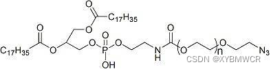
- Phospholipid-Polyethylene Glycol-Aldehyde DSPE-PEG-Aldehyde DSPE-PEG-CHO MW: 5000
- C语言的变长数组
- ssm各类配置模板
- STM32 触发HardFault_Handler如何查找原因
- subprocess.CalledProcessError: Command ‘pip install ‘thop‘‘ returned non-zero exit status 1.
- String comparison size in MySQL (date string comparison problem)
猜你喜欢


随机推荐
MySQL中字符串比较大小(日期字符串比较问题)
Phospholipid-Polyethylene Glycol-Aldehyde DSPE-PEG-Aldehyde DSPE-PEG-CHO MW: 5000
ThunderBirde无法登录问题、pycharm调试一直收集数据、RuntimeError: CUDA error: device-side assert triggered等疑难杂症解决
STM32 map文件解析
SSM整合
网站与服务器维护怎么做?
化学试剂磷脂-聚乙二醇-羟基,DSPE-PEG-OH,DSPE-PEG-Hydroxyl,MW:5000
Week 7 Review
The difference between the knowledge question and answer session with the knowledge
MySQL中JOIN的用法
js 数组去重的常用方法
磷脂-聚乙二醇-醛基 DSPE-PEG-Aldehyde DSPE-PEG-CHO MW:5000
DSPE-PEG-PDP, DSPE-PEG-OPSS, phospholipid-polyethylene glycol-mercaptopyridine supply, MW: 5000
【我的创作纪念日】 3周年
oracle inner join and outer join
[Basic Tutorial of Remote Control Development 1] Crazy Shell Open Source Formation Drone-GPIO (Remote Control Indicator Light Control)
Deveco studio 鸿蒙app访问网络详细过程(js)
__dirname
MySQL分页查询的5种方法
知识问答与知识会话的区别