当前位置:网站首页>Basic line chart: the most intuitive presentation of data trends and changes
Basic line chart: the most intuitive presentation of data trends and changes
2022-07-26 03:47:00 【Desai smart number visual interactive platform】
Line charts are suitable for displaying two-dimensional data sets , It can be used to identify trends and changes over time , Emphasize the trend of data fluctuation , Time series that can represent continuity , Some data with large fluctuations can be better displayed .
The trend of data increase or decrease can be intuitively displayed in the line chart 、 The rate of increase and decrease 、 Increase or decrease some characteristics of the periodic law . Line charts are usually used to analyze the trend of data changes over time , It can also be used to analyze the interaction and interaction of multiple groups of time-varying data . In a line chart, the horizontal axis is usually used to express the time span , The vertical axis represents the size of data values at different times at different times . So the line chart is very suitable Do data report analysis Of .
The following figure is created by the platform Internet data visualization platform Example large screen in “ The food thing ”, The large screen has repeatedly used various types of line charts to express the trend of a data .
Basic line graph belongs to the classification of line graph , This time, we will mainly focus on the basic line chart , We can find the basic line chart by expanding the line chart , Click or drag to add components to the large screen .

The default effect of the basic line chart is shown in the following figure , You can see that the layer parameters in the basic line chart support a lot of personalized settings .
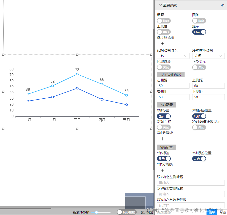
Click the switch to open the prompt , You can place the mouse in the chart and the specific data will be displayed .
If you want every legend to be obvious , Then you can set the graphic color group , Because there are two legends in the default effect, which are “ income ” and “ spending ” It can be divided into two kinds of legends, and different colors can be added to express different types of legends .
Set chart x,y Axis split line , It can make each time period and the data of each period more obvious , More intuitive , This style is generally used by many sales companies Sales data report Performance charts will x, The line is marked .

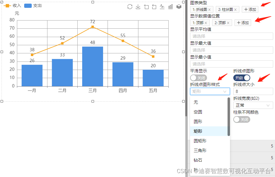
The basic line chart can also be switched to the combination of line chart and histogram , However, if it is used in combination, at least two legends are required before it can be used in combination ; Click Add and select the legend type according to the legend order ;
The position where the data is displayed in the legend can also be selected , Altogether 6 There are locations to choose from , Select the displayed position according to the legend sequence .

The style of polyline points is the same , The size of points can also be modified , Default empty circle , Rectangle is selected here , The effect is shown below .
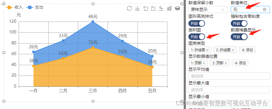
The numerical units in the legend can also be entered by yourself , Including the legend can also be displayed as an area map , You can also open the data stack display , In the following figure, the numerical unit is added “ element ”. At the same time, the effect of area map and data stack display is turned on .
If the position of the ladder line graph is selected in the layer attribute, the corresponding basic line graph will also become a ladder line graph .

Rich components , Rich functions , Here you can give full play to your design ability , To design the large screen you want , Of course, the components of the platform 、 It's a lot more than that . Of course, there are also some template screens for everyone to use , Let you “ Data visualization ”.
边栏推荐
- 安装VMware报错failed to install the hcmon driver
- Asemi rectifier bridge gbu1510 parameters, gbu1510 specifications, gbu1510 package
- 微信小程序实现音乐播放器(4)(使用pubsubjs实现页面间通信)
- DDD landing is called an advanced
- Save the image with gaussdb (for redis), and the recommended business can easily reduce the cost by 60%
- c语言指针基本知识要点总结(一)
- MPLS basic experiment configuration
- FPS game reverse - box Perspective (matrix)
- 第十八章:2位a~b进制中均位奇观探索,指定整数的 3x+1 转化过程,指定区间验证角谷猜想,探求4份黑洞数,验证3位黑洞数
- 【程序员必备】七夕表白攻略:”月遇从云,花遇和风,晚上的夜空很美“。(附源码合集)
猜你喜欢

Asemi rectifier bridge gbu1510 parameters, gbu1510 specifications, gbu1510 package

研发了 5 年的时序数据库,到底要解决什么问题?

IDEA2020.3.1不能打开(双击不能打开),但可以通过idea.bat打开。

HCIP第十四天

c语言指针基本知识要点总结(一)
Offline data warehouse from 0 to 1-stage II software installation

涂鸦幻彩产品开发包如何使用
![[create interactive dice roller application]](/img/38/7bb0499bb70c4469428e841fa9c725.png)
[create interactive dice roller application]

Realization of online shopping mall system based on JSP

The convolution kernel is expanded to 51x51, and the new CNN architecture slak counterattacks the transformer
随机推荐
FPS game reverse - box Perspective (matrix)
PHP connects to MySQL database, and database connects to static tool classes to simplify the connection.
The convolution kernel is expanded to 51x51, and the new CNN architecture slak counterattacks the transformer
Easyexcel sets row hiding to solve the problem of sethidden (true) invalidation
中国数据库 OceanBase 入选 Forrester Translytical 数据平台报告
A large factory developed and tested one, and strangled its neck with a mouse line
tf.truncated_ Normal() usage
LDP相关知识点
What are you interviewing for in a big factory? It's worth watching (I)
ELS window settings, WM_ CREATE、WM_ PAINT
Visio: how do Gantt charts merge cells? Solution: overwrite cells
Leetcode-169. most elements
Navicat connects to MySQL database on Cloud Server
Uncaught TypeError: $(...).onmouseenter is not a function js错误,解决办法:
zkEVM:MINA的CEO对zkEVM和L1相关内容的总结
全校软硬件基础设施一站式监控 ,苏州大学以时序数据库替换 PostgreSQL
【单片机仿真项目】外部中断0和1控制两位数码管进行计数
MySQL index failure scenarios and Solutions
通用测试用例写作规范
Data elements