当前位置:网站首页>数据分析(一)——matplotlib
数据分析(一)——matplotlib
2022-07-31 22:14:00 【flag:卷王!】
什么是数据分析?
数据分析是用适当的方法对收集来的大量数据进行分析,帮助人们做出判断,以便采取适当行动。
数据分析的流程:
matplotlib :
- 能将数据进行可视化,更直观的呈现
- 使数据更加客观、更具说服力
matplotlib:最流行的Python底层绘图库,主要做数据可视化图表,名字取材于MATLAB,模仿MATLAB构建。
一、matplotlib折线图
示例:
from matplotlib import pyplot as plt

x=range(2,26,2)
#数据在X轴的位置,是一个可迭代对象
y=[15,13,14,5,17,20,35,26,26,27,22,18]
#数据在Y轴的位置,也是一个可迭代对象

#绘图
plt.plot(x,y)  #传入X,Y形成对应坐标,通过plot绘制出折线图

#展示图形
plt.show()
结果:
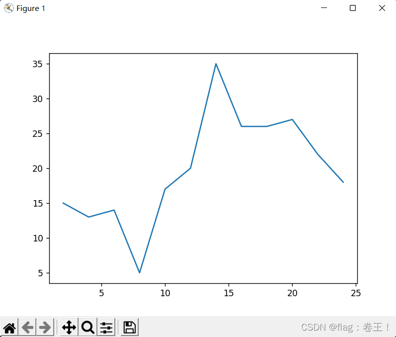 但是根据图可以发现一些问题:
- 描述信息,比如X轴与Y轴表示什么,这个图表示什么
- 调整刻度的间距
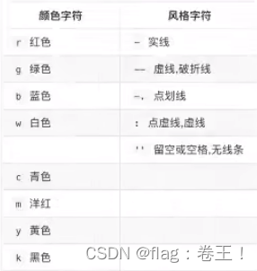
- 线条的样式(比如颜色,透明度等)
- 标记特殊点(比如最低点、最高点)
- 添加水印(防止被盗用)
改良(1)------图片大小与刻度
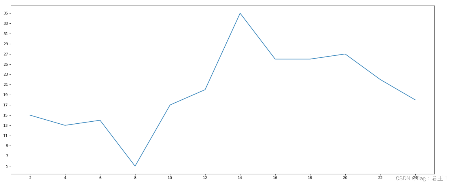
from matplotlib import pyplot as plt

fig=plt.figure(figsize=(20,8),dpi=80)
#figure图形图标的意思,在这里指的是我们的图,通过figure传递参数
#在图像模糊可以传入dpi参数,让图片清晰

x=range(2,26,2)
y=[15,13,14,5,17,20,35,26,26,27,22,18]

#绘图
plt.plot(x,y)

#设置x、y轴的刻度
plt.xticks(range(2,26,2))
plt.yticks(range(min(y),max(y)+1,2))

plt.savefig("./sig_size.png")  #保存图片,保存为svg这种矢量图格式,放大不会有锯齿

#展示图形
plt.show()
结果:
示例:
如果列表表示10点到12点的每一分钟的气温,如何绘制折线图观察每分钟气温的变化情况?
from matplotlib import pyplot as plt
import random
import matplotlib
from matplotlib import font_manager

my_font=font_manager.FontProperties(fname="C:\Windows\Fonts\simkai.ttf")
x=range(0,120)
y=[random.randint(20,35) for i in range(120)]

plt.figure(figsize=(20,8),dpi=80)

plt.plot(x,y)

#调整x轴的刻度
_xtick_labels=["10点{}分".format(i) for i in range(60)]
_xtick_labels+=["11点{}分".format(i) for i in range(60)]
#取步长,数字和字符串一一对应,数据的长度一样
plt.xticks(list(x)[::3],_xtick_labels[::3],rotation=45,fontproperties=my_font) #rotation旋转的度数

plt.show()
结果:

发现中文没有显示,因为matplotlib默认不支持中文字符
那么如何修改matplotlib的默认字体?
fc-list :lang=zh -->查看支持中文(冒号前面有个空格)
from matplotlib import pyplot as plt
import random
import matplotlib
from matplotlib import font_manager

my_font=font_manager.FontProperties(fname="/System/Library/Fonts/PingFang.ttc")
x=range(0,120)
y=[random.randint(20,35) for i in range(120)]

plt.figure(figsize=(20,8),dpi=80)

plt.plot(x,y)

#调整x轴的刻度
_xtick_labels=["10点{}分".format(i) for i in range(60)]
_xtick_labels+=["11点{}分".format(i) for i in range(60)]
#取步长,数字和字符串一一对应,数据的长度一样
plt.xticks(list(x)[::3],_xtick_labels[::3],rotation=45) #rotation旋转的度数

plt.show()
结果:
改良(2)---中文显示(字体+大小)、绘制网格、添加图例以及多条绘图
from matplotlib import pyplot as plt
import matplotlib
from matplotlib import font_manager

my_font=font_manager.FontProperties(fname="C:\Windows\Fonts\simkai.ttf",size=25)  #中文显示以及字体大小
fig=plt.figure(figsize=(20,8),dpi=80)
#figure图形图标的意思,在这里指的是我们的图,通过figure传递参数
#在图像模糊可以传入dpi参数,让图片清晰

x=range(2,26,2)
y_1=[15,13,14,5,17,20,35,26,26,27,22,18]
y_2=[12,15,12,15,16,20,21,23,19,30,12,17]
#绘图(多条)
plt.plot(x,y_1,label="今天",linestyle='--') #linestyle决定线的形况
plt.plot(x,y_2,label="昨天",linestyle='-.')

#设置x、y轴的刻度
plt.xticks(range(2,26,2))
plt.yticks(range(min(y_1),max(y_1)+1,2),fontproperties=my_font)
plt.yticks(range(min(y_2),max(y_2)+1,2),fontproperties=my_font)

#添加描述信息
plt.xlabel("时间",fontproperties=my_font)
plt.ylabel("温度 单位(℃)",fontproperties=my_font)
plt.title("一天内温度变化",fontproperties=my_font)

plt.savefig("./sig_size.png")  #保存图片,保存为svg这种矢量图格式,放大不会有锯齿

#绘制网格
plt.grid(alpha=0.4)  #alpha设置透明度

#添加图例
plt.legend(prop=my_font,loc="upper right") #注意此时中文显示用prop,loc来决定图例的方向

#展示图形
plt.show()
结果:
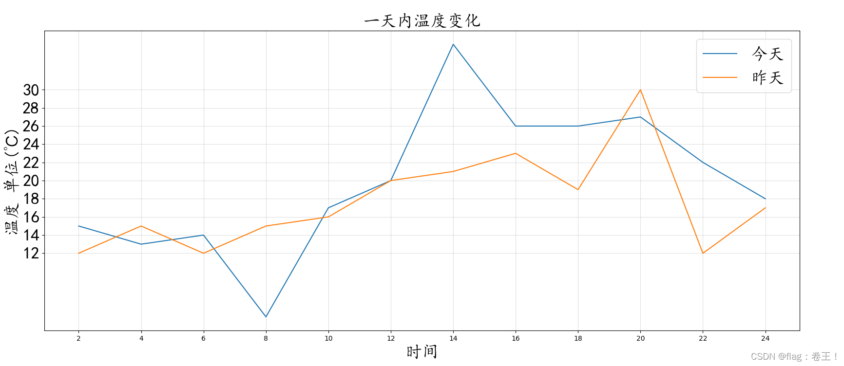
相关线的性质:
二、matplotlib常用统计图
1)绘制散点图
from matplotlib import pyplot as plt
from matplotlib import font_manager

my_font=font_manager.FontProperties(fname="C:\Windows\Fonts\simkai.ttf",size=15)

y_1=[11,17,16,11,12,11,12,6,6,7,8,9,12,15,14,17,18,21,16,17,20,14,15,15,15,19,21,22,22,22,23]
y_2=[26,26,28,19,21,17,16,19,18,20,20,19,22,23,17,20,21,20,22,15,11,15,5,13,17,10,11,13,12,13,6]

x_1=range(1,32)
x_2=range(51,82)
#设置图形大小
plt.figure(figsize=(20,8),dpi=80)

#使用scatter方法绘制散点图,和之前绘制折线图的唯一区别
plt.scatter(x_1,y_1,label="3月份")
plt.scatter(x_2,y_2,label="10月份")

#调整x轴刻度
_x=list(x_1)+list(x_2)
_xtick_labels=["3月{}日".format(i) for i in x_1]
_xtick_labels+=["10月{}日".format(i-50) for i in x_2]
plt.xticks(_x[::3],_xtick_labels[::3],fontproperties=my_font,rotation=45)

#添加图例
plt.legend(loc="upper right",prop=my_font)

#添加描述信息
plt.xlabel("时间",fontproperties=my_font)
plt.ylabel("温度",fontproperties=my_font)
plt.title("标题",fontproperties=my_font)
#展示
plt.show()
结果:

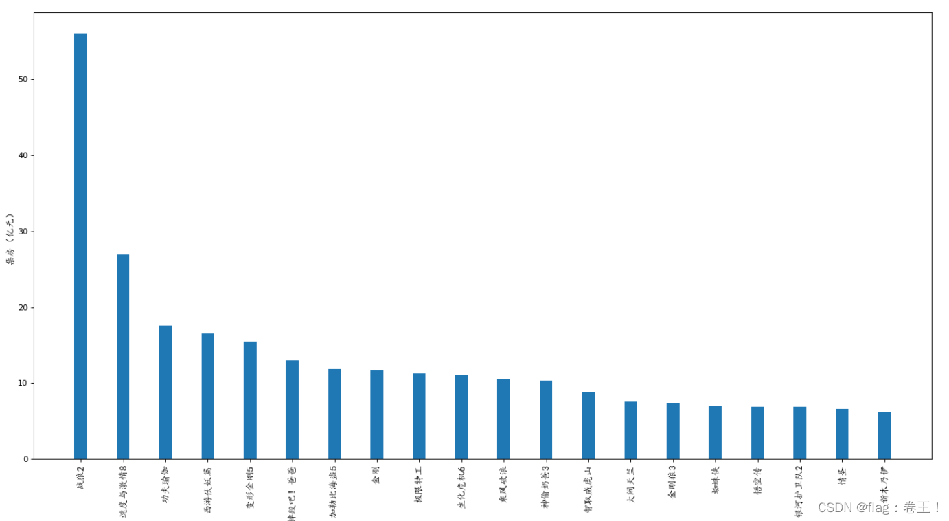
2)绘制条形图
#纵向
from matplotlib import pyplot as plt
from matplotlib import font_manager

my_font=font_manager.FontProperties(fname="C:\Windows\Fonts\simkai.ttf",size=12)

a=["战狼2","速度与激情8","功夫瑜伽","西游伏妖篇","变形金刚5","摔跤吧!爸爸","加勒比海盗5","金刚","极限特工","生化危机6","乘风破浪","神偷奶爸3","智取威虎山","大闹天竺","金刚狼3","蜘蛛侠","悟空传","银河护卫队2","情圣","新木乃伊"]
b=[56.01,26.94,17.53,16.49,15.45,12.96,11.8,11.61,11.28,11.12,10.49,10.3,8.75,7.55,7.32,6.99,6.88,6.86,6.58,6.23]

#设置图形大小
plt.figure(figsize=(20,10),dpi=80)
#绘制条形图
plt.bar(range(len(a)),b,width=0.3)
#设置字符串到x轴
plt.xticks(range(len(a)),a,fontproperties=my_font,rotation=90)

plt.xlabel("影片",fontproperties=my_font)
plt.ylabel("票房(亿元)",fontproperties=my_font)
plt.savefig("./movie.png")

#展示
plt.show()

#横向
from matplotlib import pyplot as plt
from matplotlib import font_manager

my_font=font_manager.FontProperties(fname="C:\Windows\Fonts\simkai.ttf",size=12)

a=["战狼2","速度与激情8","功夫瑜伽","西游伏妖篇","变形金刚5","摔跤吧!爸爸","加勒比海盗5","金刚","极限特工","生化危机6","乘风破浪","神偷奶爸3","智取威虎山","大闹天竺","金刚狼3","蜘蛛侠","悟空传","银河护卫队2","情圣","新木乃伊"]
b=[56.01,26.94,17.53,16.49,15.45,12.96,11.8,11.61,11.28,11.12,10.49,10.3,8.75,7.55,7.32,6.99,6.88,6.86,6.58,6.23]

#设置图形大小
plt.figure(figsize=(20,10),dpi=80)
#绘制条形图
plt.barh(range(len(a)),b,height=0.3,color="red")
#设置字符串到y轴
plt.yticks(range(len(a)),a,fontproperties=my_font)

plt.ylabel("影片",fontproperties=my_font)
plt.xlabel("票房(亿元)",fontproperties=my_font)
plt.savefig("./movie.png")

#展示
plt.show()
结果:

3)绘制直方图
from matplotlib import pyplot as plt
from matplotlib import font_manager
import random
my_font=font_manager.FontProperties(fname="C:\Windows\Fonts\simkai.ttf",size=12)

a=[random.randint(70,121) for i in range(250)]

#计算组数
d=2  #组距
num_bins =(max(a)-min(a))//d

#设置图形的大小
plt.figure(figsize=(20,8),dpi=80)

plt.hist(a,num_bins,density=True)
#设置x轴的刻度
plt.xticks(range(min(a),max(a)+d,d))

plt.grid(alpha=0.3)
#展示
plt.show()
结果:

边栏推荐
- What's wrong with the sql syntax in my sql
- Flex layout in detail
- [QNX Hypervisor 2.2用户手册]9.14 set
- [Open class preview]: Research and application of super-resolution technology in the field of video image quality enhancement
- ReentrantLock原理(未完待续)
- 登录业务实现(单点登录+微信扫码+短信服务)
- How to identify fake reptiles?
- Socket回顾与I/0模型
- server certificate verification failed. CAfile: /etc/ssl/certs/ca-certificates.crt CRLfile: none failed
- Memblaze发布首款基于长存颗粒的企业级SSD,背后有何新价值?
猜你喜欢

【论文精读】iNeRF

The latest masterpiece!Alibaba just released the interview reference guide (Taishan version), I just brushed it for 29 days
架构实战营模块 8 作业

Socket回顾与I/0模型

The whole network is on the verge of triggering, and the all-round assistant for content distribution from media people - Rongmeibao
How to identify fake reptiles?

高效并发:Synchornized的锁优化详解

Structure of the actual combat battalion module eight operations

角色妆容的实现

focus on!Haitai Fangyuan joins the "Personal Information Protection Self-discipline Convention"
随机推荐
VOT2021比赛简介
BM5 合并k个已排序的链表
iNeuOS industrial Internet operating system, equipment operation and maintenance business and "low-code" form development tools
BM3 将链表中的节点每k个一组翻转
hboot与recovery、boot.img、system.img
STM32 full series development firmware installation guide under Arduino framework
C language parsing json string (json object is converted to string)
PCB stackup design
C#中引用类型的变量做为参数在方法调用时加不加 ref 关键字的不同之处
全网一触即发,自媒体人的内容分发全能助手——融媒宝
有一说一,外包公司到底值不值得去?
[QNX Hypervisor 2.2 User Manual]9.14 set
一款国外开发的高质量WordPress下载站模板主题
In Golang go-redis cluster mode, new connections are constantly created, and the problem of decreased efficiency is solved
求n以内的素数
Several methods for deleting specified elements in Golang slices
【AcWing】The 62nd Weekly Match 【2022.07.30】
Redis综述篇:与面试官彻夜长谈Redis缓存、持久化、淘汰机制、哨兵、集群底层原理!...
基于RT1052 Aworks nanopb string 类型固定长度使用方式(二十七)
Recognize anomalies (you will understand after reading this)