当前位置:网站首页>Flex layout in detail
Flex layout in detail
2022-07-31 21:13:00 【m0_67394006】
Flex 布局详解
一、入门
1. flex 是什么?
- flex 是 Flexible Box 的缩写,就是弹性盒子布局的意思
2. 为什么我们需要 flex
Fix element centering issues
自动弹性伸缩,合适适配不同大小的屏幕,和移动端
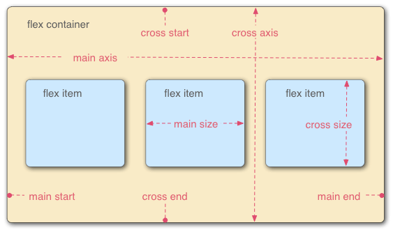
3.flex 常见术语 三个2
序号
简记
术语
1
二成员
容器和项目(container / item)
2
二根轴
主轴与交叉轴(main-axis / cross-axis)
3
二根线
起始线(main/cross-start)与结束线(main/cross-end)
二、容器 container 的属性
The setting of the properties of the outer large container
1. flex-direction   主轴方向
2. flex-wrap        主轴一行满了换行
3. flex-flow        1和2的组合
4. justify-content  主轴元素对齐方式
5. align-items      交叉轴元素对齐方式//单行
6. align-content    交叉轴行对齐方式//多行
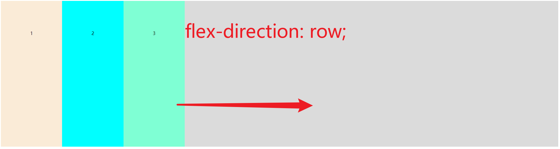
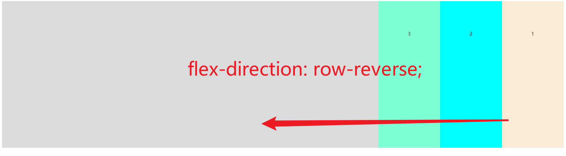
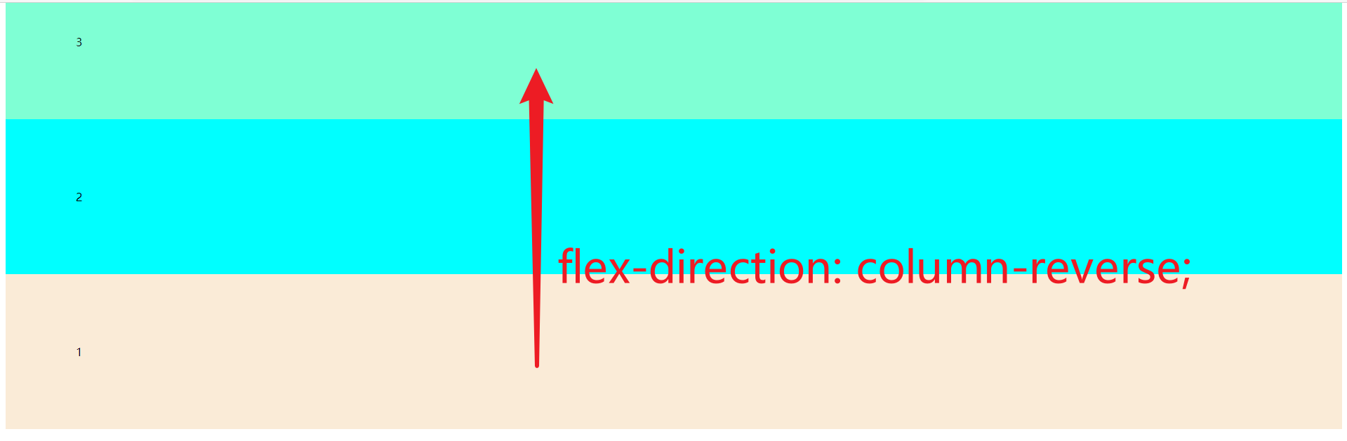
1.flex-direction 主轴方向
row(默认值):主轴为水平方向,起点在左端.
row-reverse:主轴为水平方向,起点在右端.
column:主轴为垂直方向,起点在上沿.
column-reverse:主轴为垂直方向,起点在下沿.

code
<!DOCTYPE html>
<html lang="en">
<head>
    <meta charset="UTF-8">
    <meta name="viewport" content="width=device-width, initial-scale=1.0">
    <title>Document</title>
</head>
<style>
.container{
    display: flex;
    height: 600px;
    background-color: rgb(219, 219, 219);
}
.container{
    flex-direction: row;
    /* flex-direction: row-reverse; */
    /* flex-direction: column; */
    /* flex-direction: column-reverse; */
}
.item{
    padding: 100px;
}
</style>
<body>
    <div class="container">
        <div class="item" style="background-color: antiquewhite;">1</div>
        <div class="item" style="background-color: aqua;">2</div>
        <div class="item" style="background-color: aquamarine;">3</div>
    </div>
</body>
</html>
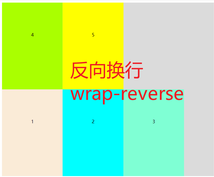
2. flex-wrap 主轴一行满了换行
nowrap (默认值) Do not wrap to compress the width
wrap    换行
wrap-reverses 反向换行


code
<!DOCTYPE html>
<html lang="en">
<head>
    <meta charset="UTF-8">
    <meta name="viewport" content="width=device-width, initial-scale=1.0">
    <title>Document</title>
</head>
<style>
.container{
    display: flex;
    height: 600px;
    background-color: rgb(219, 219, 219);
}
.container{
    /* flex-wrap: nowrap; */
    flex-wrap: wrap;
    /* flex-wrap: wrap-reverse; */
}
.item{
    padding: 100px;
}
</style>
<body>
    <div class="container">
        <div class="item" style="background-color: antiquewhite;">1</div>
        <div class="item" style="background-color: aqua;">2</div>
        <div class="item" style="background-color: aquamarine;">3</div>
        <div class="item" style="background-color: #aaff00;">4</div>
        <div class="item" style="background-color: #ffff00;">5</div>
    </div>
</body>
</html>
3. flex-flow 1和2的组合
flex-low: [flex-direction] [flex-wrap]
就是 1 和 2 的组合,简写,同上,这里不赘述.
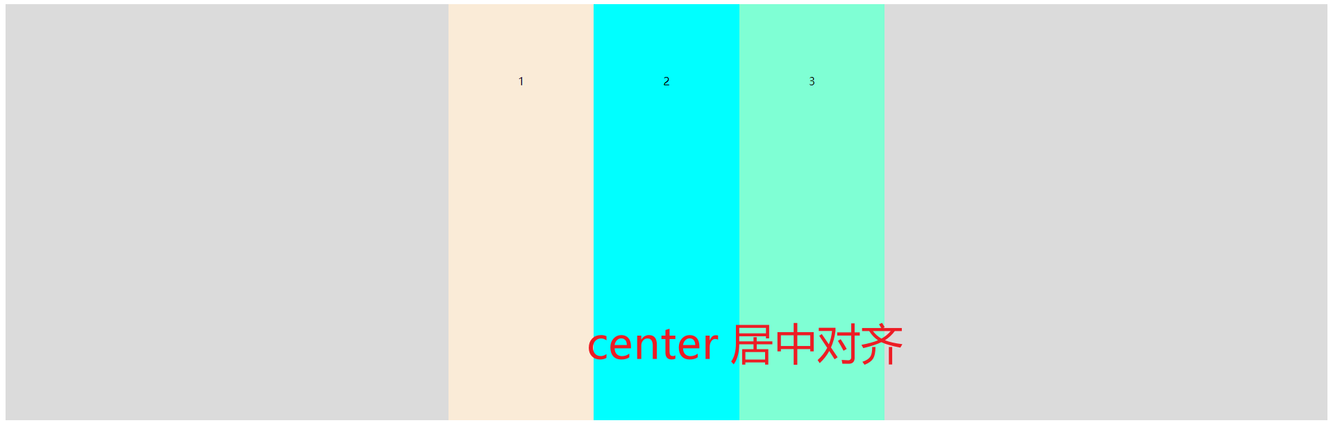
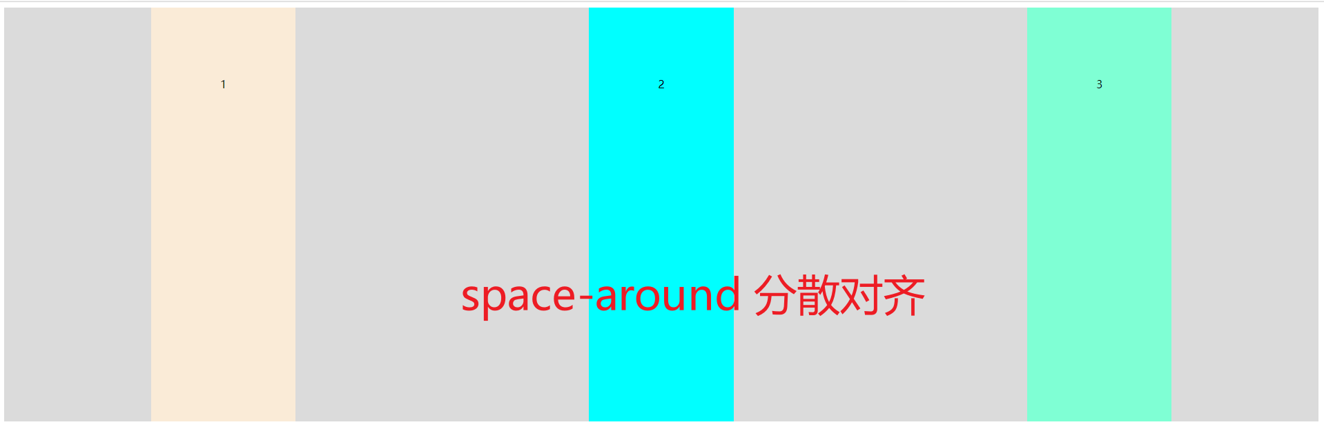
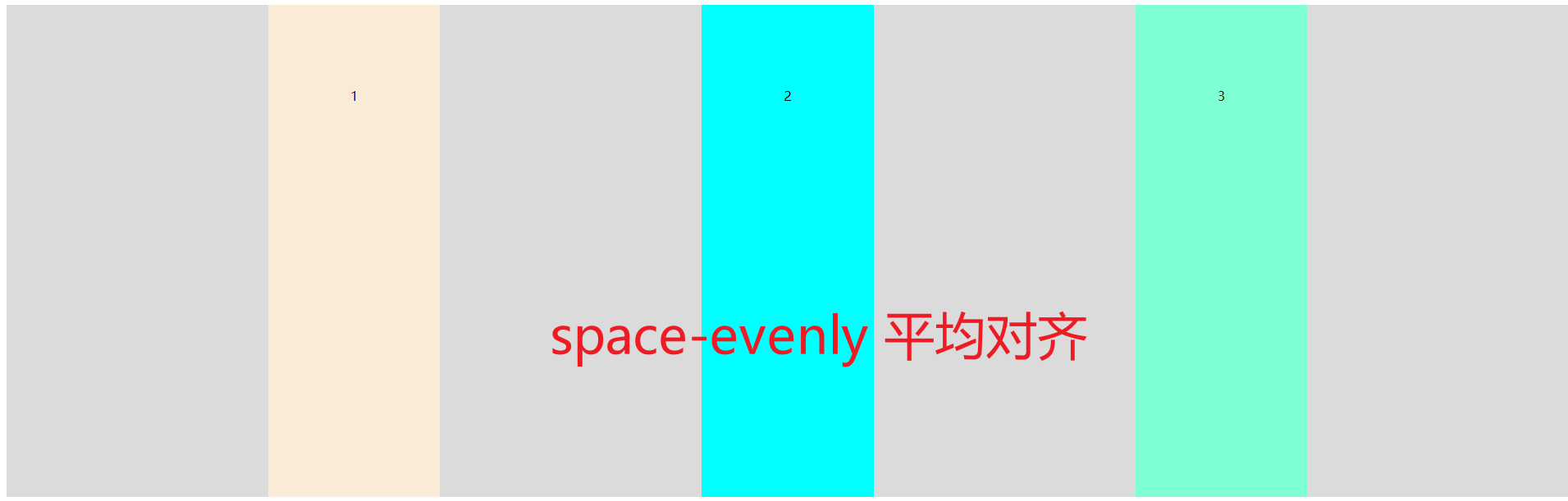
4.justify-content 主轴元素对齐方式
这里是元素的对齐,different from just now「方向」
flex-start (默认)靠着main-start对齐//Refer to common terms(Usually left)
flex-end   靠着main-end对齐//Refer to common terms(Usually the right direction)
center     Center aligned against the main axis//Usually it's centered
space-between 两端对齐,against the container wall,剩余空间平分
space-around  分散对齐,不against the container wall,剩余空间在每个项目二侧平均分配
space-evenly  平均对齐,不against the container wall,剩余空间平分


code
<!DOCTYPE html>
<html lang="en">
<head>
    <meta charset="UTF-8">
    <meta name="viewport" content="width=device-width, initial-scale=1.0">
    <title>Document</title>
</head>
<style>
.container{
    display: flex;
    height: 600px;
    background-color: rgb(219, 219, 219);
}
.container{
    /* justify-content: flex-start; */
    /* justify-content: flex-end; */
    /* justify-content: center; */
    /* justify-content: space-between; */
    /* justify-content: space-around; */
    justify-content: space-evenly;
}
.item{
    padding: 100px;
}
</style>
<body>
    <div class="container">
        <div class="item" style="background-color: antiquewhite;">1</div>
        <div class="item" style="background-color: aqua;">2</div>
        <div class="item" style="background-color: aquamarine;">3</div>
    </div>
</body>
</html>
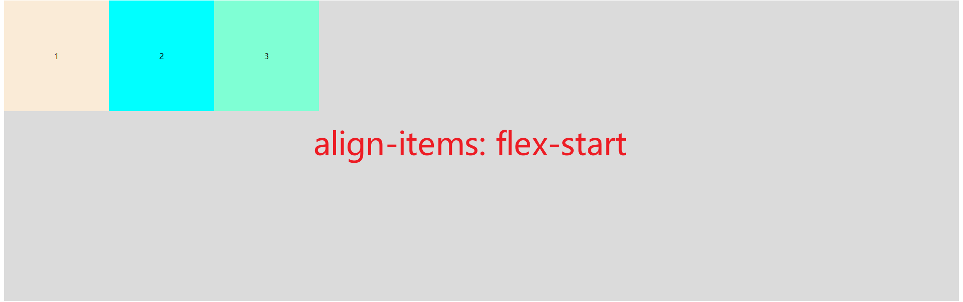
5.align-items item「项目」在交叉轴上对齐方式「单轴」
这个是 container 容器的属性,设置的是 items Item elements align styles on the cross axis
flex-start:交叉轴的起点对齐.
flex-end:交叉轴的终点对齐.
center:交叉轴的中点对齐.
baseline: 项目的第一行文字的基线对齐.
stretch(默认值)伸展:如果项目未设置高度或设为auto,将占满整个容器的高度.


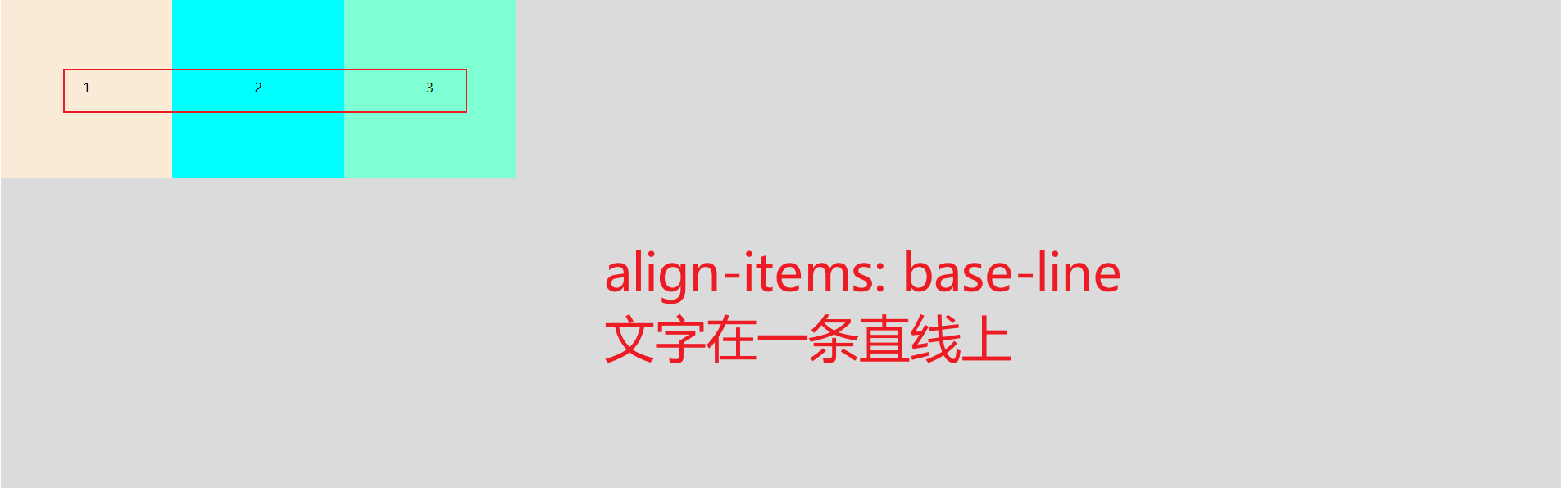
(一般用不着,It was in a straight line)

伸展,It just fills the width
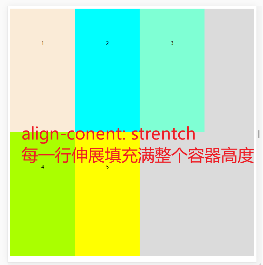
6. align-content 交叉轴行对齐方式 多行
这个和 justify-content 属性一模一样,
justify-conent,align-items,align-content are extremely similar.
flex-start (每一行)(默认)靠着cross-start对齐//Refer to common terms(Usually left)
flex-end   (每一行)靠着cross-end对齐//Refer to common terms(Usually the right direction)
center     (每一行)靠着crossLines are centered//Usually it's centered
space-between (每一行)两端对齐,靠着容器上下壁,剩余空间平分
space-around  (每一行)分散对齐,不against the container wall,剩余空间在每个项目二侧平均分配
strentch      (每一行)伸缩,占满整个高度


code
<!DOCTYPE html>
<html lang="en">
<head>
    <meta charset="UTF-8">
    <meta name="viewport" content="width=device-width, initial-scale=1.0">
    <title>Document</title>
</head>
<style>
.container{
    display: flex;
    height: 800px;
    background-color: rgb(219, 219, 219);
    /* Because multiple lines are required,所以要换行 */
    flex-wrap: wrap;
}
.container{
    align-content: flex-start;
    /* align-content: flex-end; */
    /* align-content: center; */
    /* align-content: space-between; */
    /* align-content: space-around; */
    /* align-content: stretch; */

}
.item{
    padding: 100px;
}
</style>
<body>
    <div class="container">
        <div class="item" style="background-color: antiquewhite;">1</div>
        <div class="item" style="background-color: aqua;">2</div>
        <div class="item" style="background-color: aquamarine;">3</div>
        <div class="item" style="background-color: #aaff00;">4</div>
        <div class="item" style="background-color: #ffff00;">5</div>
    </div>
</body>
</html>
三、项目元素 item 的属性
child elements inside the containeritem「项目」的属性
flex-grow:长大
flex-shrinik: 缩小
align-self: 覆盖container align-items 属性
order 排序
flex-basis: 有效宽度
1.flex-grow 长大
在容器主轴上存在剩余空间时,
flex-grow才有意义该属性的值,称为放大因子, Common property values are as follows:
序号
属性值
描述
1
0默认值
不放大,保持初始值
2
initial
设置默认值,与0等效
3
n
放大因子: 正数
放大后的效果

<!DOCTYPE html>
<html lang="en">
<head>
    <meta charset="UTF-8">
    <meta name="viewport" content="width=device-width, initial-scale=1.0">
    <title>Document</title>
</head>
<style>
.container{
    display: flex;
    height: 800px;
    background-color: rgb(219, 219, 219);
}
.item{
    padding: 100px;
}
.item1{
    /* 其他的都是0,这一个是1,So can all the remaining space isitem1的 */
    flex-grow: 1;
}

</style>
<body>
    <div class="container">
        <div class="item item1" style="background-color: antiquewhite;">1</div>
        <div class="item" style="background-color: aqua;">2</div>
        <div class="item" style="background-color: aquamarine;">3</div>
    </div>
</body>
</html>
2. flex-shrinik: 缩小
- 当容器主轴 “空间不足” 且 “禁止换行” 时,
flex-shrink才有意义 - 该属性的值,称为收缩因子, Common property values are as follows:
序号
属性值
描述
1
1默认值
允许项目收缩
2
initial
设置初始默认值,与 1 等效
3
0
禁止收缩,保持原始尺寸
4
n
收缩因子: 正数
示例:

<!DOCTYPE html>
<html lang="en">
<head>
    <meta charset="UTF-8">
    <meta name="viewport" content="width=device-width, initial-scale=1.0">
    <title>Document</title>
</head>
<style>
.container{
    display: flex;
    height: 800px;
    width: 400px;
    background-color: rgb(219, 219, 219);
    flex-direction: row;
    flex-wrap: nowrap;
    align-content: flex-start;
}
.item{
    width: 200px;
    height: 200px;
    font-size: 1.5rem;
    /* 禁止收缩 */
    flex-shrink: 0;
}
.item1{
    flex-shrink: 1;
}
.item2{
    flex-shrink: 0;
}
.item3{
    flex-shrink: 3;
}
/*  container 容器的宽度是 400,3The total width of word elements is  600 超过了 200
    Then scale down to those elements 200/4 = 50
    item1 缩小 50 * 1 = 50,还剩 150
    item2 不缩小
    item3 缩小 50 * 3 = 150 还剩 50
 */

</style>
<body>
    <div class="container">
        <div class="item item1" style="background-color: antiquewhite;">1</div>
        <div class="item item2" style="background-color: aqua;">2</div>
        <div class="item item3" style="background-color: aquamarine;">3</div>
    </div>
</body>
</html>
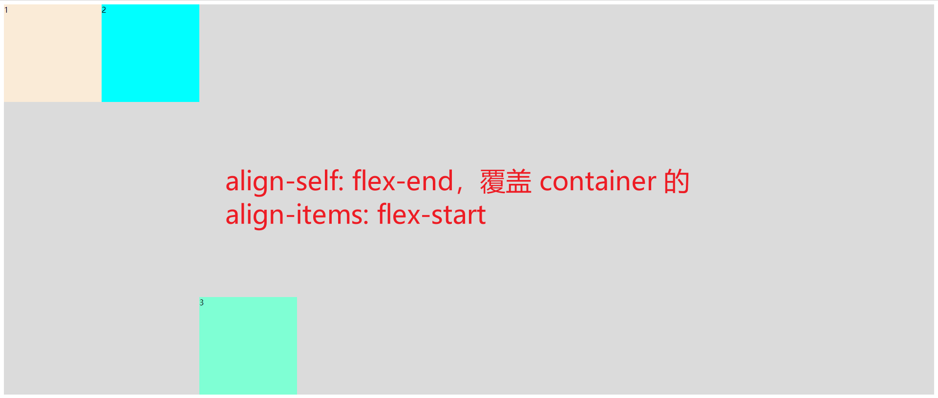
3. align-self: 覆盖container align-items 属性
- 该属性可覆盖容器的
align-items, 用以自定义某个项目的对齐方式
序号
属性值
描述
1
auto默认值
继承 align-items 属性值
2
flex-start
与交叉轴起始线对齐
3
flex-end
与交叉轴终止线对齐
4
center
与交叉轴中间线对齐: 居中对齐
5
stretch
在交叉轴方向上拉伸
6
baseline
与基线对齐(与内容相关用得极少)
例子:
html
<!DOCTYPE html>
<html lang="en">
<head>
    <meta charset="UTF-8">
    <meta name="viewport" content="width=device-width, initial-scale=1.0">
    <title>Document</title>
</head>
<style>
.container{
    display: flex;
    height: 800px;
    background-color: rgb(219, 219, 219);
    flex-direction: row;
    flex-wrap: nowrap;
}
.container{
    /* containerSpecifies the alignment of the container flex-start */
    align-items: flex-start;
}
.item{
    width: 200px;
    height: 200px;
}
.item3{
    /* 元素3 item3 覆盖container的设置,flex-end */
    align-self: flex-end;
}

</style>
<body>
    <div class="container">
        <div class="item item1" style="background-color: antiquewhite;">1</div>
        <div class="item item2" style="background-color: aqua;">2</div>
        <div class="item item3" style="background-color: aquamarine;">3</div>
    </div>
</body>
</html>
4. order 排序

is to reorder the elements
code
<!DOCTYPE html>
<html lang="en">
<head>
    <meta charset="UTF-8">
    <meta name="viewport" content="width=device-width, initial-scale=1.0">
    <title>Document</title>
</head>
<style>
.container{
    display: flex;
    height: 800px;
    background-color: rgb(219, 219, 219);
}

.item{
    width: 200px;
    height: 200px;
    order: 0;
}
.item1{
    order: 3;
}

</style>
<body>
    <div class="container">
        <div class="item item1" style="background-color: antiquewhite;">1</div>
        <div class="item item2" style="background-color: aqua;">2</div>
        <div class="item item3" style="background-color: aquamarine;">3</div>
    </div>
</body>
</html>
5. flex-basis属性
flex-basis属性定义了在分配多余空间之前,项目占据的主轴空间(main size).浏览器根据这个属性,计算主轴是否有多余空间.它的默认值为auto,即项目的本来大小.
.item {
  flex-basis: <length> | auto; /* default auto */
}
它可以设为跟width或height属性一样的值(比如350px),则项目将占据固定空间.
参考:
)
先自我介绍一下,小编13年上师交大毕业,曾经在小公司待过,去过华为OPPO等大厂,18年进入阿里,直到现在.深知大多数初中级java工程师,想要升技能,往往是需要自己摸索成长或是报班学习,但对于培训机构动则近万元的学费,着实压力不小.自己不成体系的自学效率很低又漫长,而且容易碰到天花板技术停止不前.因此我收集了一份《java开发全套学习资料》送给大家,初衷也很简单,就是希望帮助到想自学又不知道该从何学起的朋友,同时减轻大家的负担.添加下方名片,即可获取全套学习资料哦
边栏推荐
- 高效并发:Synchornized的锁优化详解
- linux查看redis版本命令(linux查看mysql版本号)
- leetcode 665. Non-decreasing Array 非递减数列(中等)
- Given an ip address, how does the subnet mask calculate the network number (how to get the ip address and subnet mask)
- Cache and Database Consistency Solutions
- 顺序表的实现
- Book of the Month (202207): The Definitive Guide to Swift Programming
- 手把手教你学会部署Nestjs项目
- 【AcWing】The 62nd Weekly Match 【2022.07.30】
- Realization of character makeup
猜你喜欢

财务盈利、偿债能力指标

Count characters in UTF-8 string function

Qualcomm cDSP simple programming example (to query Qualcomm cDSP usage, signature), RK3588 npu usage query
利用反射实现一个管理对象信息的简单框架
1161. Maximum Sum of Elements in Layer: Hierarchical Traversal Application Problems

ResNet的基础:残差块的原理

Realization of character makeup

Teach you how to deploy Nestjs projects

架构实战营模块八作业
PCB叠层设计
随机推荐
BM5 合并k个已排序的链表
Redis Overview: Talk to the interviewer all night long about Redis caching, persistence, elimination mechanism, sentinel, and the underlying principles of clusters!...
Thymeleaf是什么?该如何使用。
Chapter VII
BOW/DOM (top)
Qualcomm cDSP simple programming example (to query Qualcomm cDSP usage, signature), RK3588 npu usage query
[Code Hoof Set Novice Village 600 Questions] Merge two numbers without passing a character array
renderjs usage in uni-app
Basics of ResNet: Principles of Residual Blocks
sqlite3简单操作
Socket Review and I/0 Model
leetcode 665. Non-decreasing Array
【核心概念】图像分类和目标检测中的正负样本划分以及架构理解
STM32 full series development firmware installation guide under Arduino framework
GateWay implements load balancing
使用 Flutter 和 Firebase 制作!计数器应用程序
Made with Flutter and Firebase!counter application
NVIDIA has begun testing graphics products with AD106 and AD107 GPU cores
Given an ip address, how does the subnet mask calculate the network number (how to get the ip address and subnet mask)
find prime numbers up to n