当前位置:网站首页>15、wpf之button样式小记
15、wpf之button样式小记
2022-06-25 11:55:00 【komla168】
前言:Button算是开发中用到的比较多的控件了,最开始使用原生的样式,长方形的样子,然后设置下Button的Content属性。随着学习的深入,需要去设置下Button的背景色,再往后就需要改下Button的模板来满足更高的需求设计。
一、简介

可以看到,Button继承至ContentControl控件, Button有个Content属性而这个Content可以是多种控件形式,查看Button的模板可以看到,用来承载这个内容的是一个ContentPresenter控件。

通过官网可以看到这个ContentPresenter类的继承关系

二、Background
简单的如下
<Button Background="AliceBlue"/>可以看到,这个Background属性类型是Brush,因此我们可以通过应用不同的Brush来改变Button的Background,从而使Background更加丰富。

官网中对Brush的注解,Brush有多个继承者,都可以用

2.1 LinearGradientBrush
<Button Width="60" Height="60">
    <Button.Background>
        <LinearGradientBrush EndPoint="0.851,0.838" StartPoint="0.115,0.169">
            <GradientStop Color="#FFA21212" Offset="0"/>
            <GradientStop Color="#FFF8C906" Offset="1"/>
        </LinearGradientBrush>
    </Button.Background>
</Button>
2.2 RadialGradientBrush
<Button Width="60" Height="60">
    <Button.Background>
        <RadialGradientBrush>
            <GradientStop Color="#FFA21212" Offset="1"/>
            <GradientStop Color="#FFF8C906" Offset="0"/>
        </RadialGradientBrush>
    </Button.Background>
</Button>
2.3 ImageBrush
            <Button Width="60" Height="60">
                <Button.Background>
                    <ImageBrush ImageSource="/项目.png"/>
                </Button.Background>
            </Button>
2.4 DrawingBrush
            <Button Width="60" Height="60">
                <Button.Background>
                    <DrawingBrush Viewport="0,0,0.5,0.5" TileMode="Tile">
                        <DrawingBrush.Drawing>
                            <GeometryDrawing Brush="Red">
                                <GeometryDrawing.Geometry>
                                    <GeometryGroup>
                                        <EllipseGeometry RadiusX="20" RadiusY="45" Center="50,50" />
                                        <EllipseGeometry RadiusX="45" RadiusY="20" Center="50,50" />
                                    </GeometryGroup>
                                </GeometryDrawing.Geometry>
                                <GeometryDrawing.Pen>
                                    <Pen Thickness="10">
                                        <Pen.Brush>
                                            <LinearGradientBrush>
                                                <GradientStop Offset="0.0" Color="Black" />
                                                <GradientStop Offset="1.0" Color="Gray" />
                                            </LinearGradientBrush>
                                        </Pen.Brush>
                                    </Pen>
                                </GeometryDrawing.Pen>
                            </GeometryDrawing>
                        </DrawingBrush.Drawing>
                    </DrawingBrush>
                </Button.Background>
            </Button>
2.5 VisualBrush
            <Button Width="60" Height="60">
                <Button.Background>
                    <VisualBrush>
                        <VisualBrush.Visual>
                            <StackPanel Background="White">
                                <Rectangle Width="25" Height="25" Fill="Orange" Margin="6" />
                                <TextBlock FontSize="10pt" Margin="2">BrawDraw</TextBlock>
                                <Button Margin="10">Button</Button>
                            </StackPanel>
                        </VisualBrush.Visual>
                    </VisualBrush>
                </Button.Background>
            </Button>
二、Content


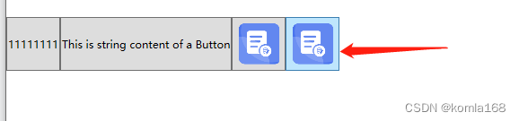
2.1 字符串
<!--Create a Button with a string as its content.-->
<Button Content="1111111111" Height="60" Width="60"/>
<Button>This is string content of a Button</Button>
2.2 DateTime object
<!--Create a Button with a DateTime object as its content.-->
<Button xmlns:sys="clr-namespace:System;assembly=mscorlib">
  <sys:DateTime>2004/3/4 13:6:55</sys:DateTime>
</Button>
2.3 UIElement
<!--Create a Button with a single UIElement as its content.-->
<Button>
  <Rectangle Height="40" Width="40" Fill="Blue"/>
</Button>
2.4 panel
<!--Create a Button with a panel that contains multiple objects
as its content.-->
<Button>
  <StackPanel>
    <Ellipse Height="40" Width="40" Fill="Blue"/>
    <TextBlock TextAlignment="Center">Button</TextBlock>
  </StackPanel>
</Button>
2.5 说明
Because the Content property is of type Object, there are no restrictions on what you can put in a ContentControl. The Content is displayed by a ContentPresenter, which is in the ControlTemplate of the ContentControl. Every ContentControl type in WPF has a ContentPresenter in its default ControlTemplate.
由于Content属性的类型是Object,因此对可以放入的内容ContentControl没有限制。该Content属性通过ContentPresenter显示,而这个ContentPresenter存在于ContentControl的ControlTemplate属性中。WPF中的每一个ContentControl类型控件都有一个ContentPresenter属性,默认存在ControlTemplate中。

三、外观
The ContentPresenter uses the following logic to display the Content (ContentPresenter就是用来显示Content的,下面是显示逻辑):
If the ContentTemplate property on the ContentPresenter is set, the ContentPresenter applies that DataTemplate to the Content property and the resulting UIElement and its child elements, if any, are displayed. For more information about DataTemplate objects, see Data Templating Overview.(如果ContentTemplate设置了ContentPresenter属性,那么ContentPresenter就应用DataTemplate作为Content属性和UIElement及其子元素的结果。)
If the ContentTemplateSelector property on the ContentPresenter is set, the ContentPresenter applies the appropriate DataTemplate to the Content property and the resulting UIElement and its child elements, if any, are displayed.(和上一个差不多,就是把ContentTemplate换成了ContentTemplateSelector)
If there is a DataTemplate associated with the type of Content, the ContentPresenterapplies that DataTemplate to the Content property and the resulting UIElement and its child elements, if any, are displayed.(如果有DataTemplate与类型Content相关联的类型,则ContentPresenter就用DataTemplate作为其Content)
If Content is a UIElement object, the UIElement is displayed. If the UIElement already has a parent, an exception occurs.(如果Content是一个UIElement对象,就显示这个UIElement对象)
If there is a TypeConverter that converts the type of Content to a UIElement, the ContentPresenter uses that TypeConverter and the resulting UIElement is displayed.(转换器的应用,Content和UIElement转换)
If there is a TypeConverter that converts the type of Content to a string, the ContentPresenter uses that TypeConverter and creates a TextBlock to contain that string. The TextBlock is displayed.(转换器的应用,Content和string转换,并创建一个TextBlock控件去承载这个sting)
If the content is an XmlElement, the value of the InnerText property is displayed in a TextBlock.(Content是XmlElement)
The ContentPresenter calls the ToString method on the Content and creates a TextBlock to contain the string returned by ToString. The TextBlock is displayed.(ContentPresenter会在Content上调用Tosting方法并创建一个TextBlock去承载这个string)
3.1 原生样式
        <Style x:Key="ButtonStyle2" TargetType="{x:Type Button}">
            <Setter Property="FocusVisualStyle" Value="{StaticResource FocusVisual1}"/>
            <Setter Property="Background" Value="{StaticResource Button.Static.Background1}"/>
            <Setter Property="BorderBrush" Value="{StaticResource Button.Static.Border1}"/>
            <Setter Property="Foreground" Value="{DynamicResource {x:Static SystemColors.ControlTextBrushKey}}"/>
            <Setter Property="BorderThickness" Value="1"/>
            <Setter Property="HorizontalContentAlignment" Value="Center"/>
            <Setter Property="VerticalContentAlignment" Value="Center"/>
            <Setter Property="Padding" Value="1"/>
            <Setter Property="Template">
                <Setter.Value>
                    <ControlTemplate TargetType="{x:Type Button}">
                        <Border x:Name="border" Background="{TemplateBinding Background}" BorderBrush="{TemplateBinding BorderBrush}" BorderThickness="{TemplateBinding BorderThickness}" SnapsToDevicePixels="true">
                            <ContentPresenter x:Name="contentPresenter" Focusable="False" HorizontalAlignment="{TemplateBinding HorizontalContentAlignment}" Margin="{TemplateBinding Padding}" RecognizesAccessKey="True" SnapsToDevicePixels="{TemplateBinding SnapsToDevicePixels}" VerticalAlignment="{TemplateBinding VerticalContentAlignment}"/>
                        </Border>
                        <ControlTemplate.Triggers>
                            <Trigger Property="IsDefaulted" Value="true">
                                <Setter Property="BorderBrush" TargetName="border" Value="{DynamicResource {x:Static SystemColors.HighlightBrushKey}}"/>
                            </Trigger>
                            <Trigger Property="IsMouseOver" Value="true">
                                <Setter Property="Background" TargetName="border" Value="{StaticResource Button.MouseOver.Background1}"/>
                                <Setter Property="BorderBrush" TargetName="border" Value="{StaticResource Button.MouseOver.Border1}"/>
                            </Trigger>
                            <Trigger Property="IsPressed" Value="true">
                                <Setter Property="Background" TargetName="border" Value="{StaticResource Button.Pressed.Background1}"/>
                                <Setter Property="BorderBrush" TargetName="border" Value="{StaticResource Button.Pressed.Border1}"/>
                            </Trigger>
                            <Trigger Property="IsEnabled" Value="false">
                                <Setter Property="Background" TargetName="border" Value="{StaticResource Button.Disabled.Background1}"/>
                                <Setter Property="BorderBrush" TargetName="border" Value="{StaticResource Button.Disabled.Border1}"/>
                                <Setter Property="TextElement.Foreground" TargetName="contentPresenter" Value="{StaticResource Button.Disabled.Foreground1}"/>
                            </Trigger>
                        </ControlTemplate.Triggers>
                    </ControlTemplate>
                </Setter.Value>
            </Setter>
        </Style>
有关外观的设计就在ControlTemplate属性上,这个原生的没做什么改变,如果设置Content为string,就会像上面最后一条一样,Content调用ToString去转换并创建个TextBlock去承载这个转换后的string。
3.2 UIElement
使用image作为Content的元素,上面第四条所说的。
<Button Height="60" Width="60">
    <Image Source="/项目.png"/>
</Button>
3.2 修改ControlTemplate
原生的样式,边框很明显,这时就需要修改下ControlTemplate了
<Style x:Key="ButtonStyle1" TargetType="{x:Type Button}">
            <Setter Property="FocusVisualStyle" Value="{StaticResource FocusVisual}"/>
            <Setter Property="Background" Value="{StaticResource Button.Static.Background}"/>
            <Setter Property="BorderBrush" Value="{StaticResource Button.Static.Border}"/>
            <Setter Property="Foreground" Value="{DynamicResource {x:Static SystemColors.ControlTextBrushKey}}"/>
            <Setter Property="BorderThickness" Value="1"/>
            <Setter Property="HorizontalContentAlignment" Value="Center"/>
            <Setter Property="VerticalContentAlignment" Value="Center"/>
            <Setter Property="Padding" Value="1"/>
            <Setter Property="Template">
                <Setter.Value>
                    <ControlTemplate TargetType="{x:Type Button}">
                        <Grid>
                            <Grid.RowDefinitions>
                                <RowDefinition Height="0"/>
                                <RowDefinition Height="*"/>
                            </Grid.RowDefinitions>
                            <Image Source="/Resource/send.png" Margin="0 10 0 0"/>
                            <Border x:Name="border"  BorderThickness="1" SnapsToDevicePixels="true" Grid.Row="1">
                                <ContentPresenter x:Name="contentPresenter" Focusable="False" HorizontalAlignment="{TemplateBinding HorizontalContentAlignment}" Margin="{TemplateBinding Padding}" RecognizesAccessKey="True" SnapsToDevicePixels="{TemplateBinding SnapsToDevicePixels}" VerticalAlignment="{TemplateBinding VerticalContentAlignment}"/>
                            </Border>
                        </Grid>
                        <ControlTemplate.Triggers>
                            <Trigger Property="IsDefaulted" Value="true">
                                <Setter Property="BorderBrush" TargetName="border" Value="{DynamicResource {x:Static SystemColors.HighlightBrushKey}}"/>
                            </Trigger>
                            <Trigger Property="IsMouseOver" Value="true">
                                <Setter Property="Background" TargetName="border" Value="{StaticResource Button.MouseOver.Background}"/>
                                <Setter Property="BorderBrush" TargetName="border" Value="{StaticResource Button.MouseOver.Border}"/>
                            </Trigger>
                            <Trigger Property="IsPressed" Value="true">
                                <Setter Property="Background" TargetName="border" Value="{StaticResource Button.Pressed.Background}"/>
                                <Setter Property="BorderBrush" TargetName="border" Value="{StaticResource Button.Pressed.Border}"/>
                            </Trigger>
                            <Trigger Property="IsEnabled" Value="false">
                                <Setter Property="Background" TargetName="border" Value="{StaticResource Button.Disabled.Background}"/>
                                <Setter Property="BorderBrush" TargetName="border" Value="{StaticResource Button.Disabled.Border}"/>
                                <Setter Property="TextElement.Foreground" TargetName="contentPresenter" Value="{StaticResource Button.Disabled.Foreground}"/>
                            </Trigger>
                        </ControlTemplate.Triggers>
                    </ControlTemplate>
                </Setter.Value>
            </Setter>
        </Style>
我们把ControlTemplate摘出来看看,原样式中使用一个Border包裹一个ContentPrensenter。

修改后使用了Grid作为ContentPresenter的父容器。其实这里分了两层,一层高度是0,其实就一层。

这里还有个问题,就是鼠标移动上去后,会有个背景,不好看
这个背景是在 ControlTemplate.Triggers中设置的,设置的属性是IsMouseOver。想去掉这个背景,暴力点的做法直接注释掉那段代码。

3.3 升级
鼠标移上去会放大这个Content,笔者代码中Content设置为Image类型的。
        <Style x:Key="ButtonStyle" TargetType="{x:Type Button}">
            <Setter Property="VerticalAlignment" Value="Center"/>
            <Setter Property="HorizontalAlignment" Value="Center"/>
            <Setter Property="VerticalContentAlignment" Value="Center"/>
            <Setter Property="HorizontalContentAlignment" Value="Center"/>
            <Setter Property="Template">
                <Setter.Value>
                    <ControlTemplate  TargetType="{x:Type Button}">
                        <ControlTemplate.Resources>
                            <Storyboard x:Key="Storyboard1">
                                <DoubleAnimationUsingKeyFrames Storyboard.TargetProperty="(UIElement.RenderTransform).(TransformGroup.Children)[0].(ScaleTransform.ScaleX)" Storyboard.TargetName="grid">
                                    <SplineDoubleKeyFrame KeyTime="0:0:0.5" Value="1.25"/>
                                </DoubleAnimationUsingKeyFrames>
                                <DoubleAnimationUsingKeyFrames Storyboard.TargetProperty="(UIElement.RenderTransform).(TransformGroup.Children)[0].(ScaleTransform.ScaleY)" Storyboard.TargetName="grid">
                                    <SplineDoubleKeyFrame KeyTime="0:0:0.5" Value="1.25"/>
                                </DoubleAnimationUsingKeyFrames>
                            </Storyboard>
                            <Storyboard x:Key="Storyboard2">
                                <DoubleAnimationUsingKeyFrames Storyboard.TargetProperty="(UIElement.RenderTransform).(TransformGroup.Children)[0].(ScaleTransform.ScaleX)" Storyboard.TargetName="grid">
                                    <SplineDoubleKeyFrame KeyTime="0:0:0.5" Value="1"/>
                                </DoubleAnimationUsingKeyFrames>
                                <DoubleAnimationUsingKeyFrames Storyboard.TargetProperty="(UIElement.RenderTransform).(TransformGroup.Children)[0].(ScaleTransform.ScaleY)" Storyboard.TargetName="grid">
                                    <SplineDoubleKeyFrame KeyTime="0:0:0.5" Value="1"/>
                                </DoubleAnimationUsingKeyFrames>
                            </Storyboard>
                        </ControlTemplate.Resources>
                        <Grid x:Name="grid" RenderTransformOrigin="0.5,0.5">
                            <Grid.RenderTransform>
                                <TransformGroup>
                                    <ScaleTransform/>
                                    <SkewTransform/>
                                    <RotateTransform/>
                                    <TranslateTransform/>
                                </TransformGroup>
                            </Grid.RenderTransform>
                            <Label Name="lbl" Content="{TemplateBinding Content}" Background="Transparent" Height="{TemplateBinding Height}"
                           Width="{TemplateBinding Width}" VerticalAlignment="Center" HorizontalAlignment="Center"/>
                        </Grid>
                        <ControlTemplate.Triggers>
                            <Trigger Property="IsFocused" Value="True"/>
                            <Trigger Property="IsDefaulted" Value="True"/>
                            <Trigger Property="IsMouseOver" Value="True">
                                <!--<Setter Property="Background" TargetName="lbl" Value="red"/>-->
                                <Trigger.ExitActions>
                                    <BeginStoryboard x:Name="Storyboard_Copy1_BeginStoryboard" Storyboard="{StaticResource Storyboard2}"/>
                                </Trigger.ExitActions>
                                <Trigger.EnterActions>
                                    <BeginStoryboard Storyboard="{StaticResource Storyboard1}"/>
                                </Trigger.EnterActions>
                            </Trigger>
                            <Trigger Property="IsPressed" Value="True">
                                <Setter Property="Background" TargetName="lbl" Value="#000000FF"/>
                            </Trigger>
                            <Trigger Property="IsEnabled" Value="False"/>
                        </ControlTemplate.Triggers>
                    </ControlTemplate>
                </Setter.Value>
            </Setter>
        </Style>
加了个动画,然后在 IsMouseOver事件中进行操作。
四、引用文献
4.1 Button 类 (System.Windows.Controls) | Microsoft Docs
4.2 ContentPresenter 类 (System.Windows.Controls) | Microsoft Docs
4.3 Brush 类 (System.Windows.Media) | Microsoft Docs
4.4 简述WPF中的画刷(Brush)_Andrewniu的博客-CSDN博客_brush wpf
4.5 ContentControl.Content 属性 (System.Windows.Controls) | Microsoft Docs
边栏推荐
- Comment TCP gère - t - il les exceptions lors de trois poignées de main et de quatre vagues?
- Continue to cut the picture after the ArcGIS Server is disconnected
- A detour taken by a hardware engineer
- RecyclerView滚动到指定位置
- R语言dplyr包summarise_at函数计算dataframe数据中多个数据列(通过向量指定)的计数个数、均值和中位数、在每个函数内部指定na.rm参数、通过list指定函数列表
- How to open an account for trading futures Shanghai nickel products online
- TCP如何處理三次握手和四次揮手期間的异常
- Solution to the timeout scenario of Flink streaming computing (official live broadcast)
- VFP serial port communication is difficult for 9527. Maomao just showed his skill and was defeated by kiss
- 黑马畅购商城---6.品牌、规格统计、条件筛选、分页排序、高亮显示
猜你喜欢

Translation of meisai C topic in 2022 + sharing of ideas

Spark runs wordcount (case 2)

SQL injection vulnerability (type chapter)
ThingsPanel 发布物联网手机客户端(多图)
Whole process of web page request

Nacos installation and use

为什么ping不通网站 但是却可以访问该网站?

What are redis avalanche, penetration and breakdown?

Two ways of redis persistence -- detailed explanation of RDB and AOF
按钮多次点击造成结果
随机推荐
Detailed explanation of Flink checkpoint specific operation process and summary of error reporting and debugging methods
How far is it from the DBF of VFP to the web salary query system?
Two ways of redis persistence -- detailed explanation of RDB and AOF
JSON format processing
Translation of meisai C topic in 2022 + sharing of ideas
VFP serial port communication is difficult for 9527. Maomao just showed his skill and was defeated by kiss
Which securities company's account is better and safer to open
What are redis avalanche, penetration and breakdown?
ROS notes (06) - definition and use of topic messages
Why can't you Ping the website but you can access it?
Semaphore source code analysis
元素定位不到的 9 种情况
VFP calls the command line image processing program, and adding watermark is also available
Old ou, a fox friend, has had a headache all day. The VFP format is always wrong when it is converted to JSON format. It is actually caused by disordered code
Develop two modes of BS mode verification code with VFP to make your website more secure
A detour taken by a hardware engineer
JS to realize the calculation of discrete aggregation points
.Net Core 中使用工厂模式
Use of JSP sessionscope domain
Startups must survive