当前位置:网站首页>Detailed description of drawing ridge plot, overlapping densities of overlapping kernel density estimation curve, facetgrid object and function sns Kdeplot, function facetgrid map
Detailed description of drawing ridge plot, overlapping densities of overlapping kernel density estimation curve, facetgrid object and function sns Kdeplot, function facetgrid map
2022-06-13 06:59:00 【Bear danger】
I don't know where to go , Peach blossom still smile spring breeze . —— Cui Hu
List of articles
introduction
- This paper mainly focuses on seaborn The legend provided on the official website : Overlapping kernel density estimation curve (overlapping densities) Description and implementation
- This picture will look very advanced when drawn 、 Different variables correspond to different curves 、 Like a hill after Hill [ Crying and laughing ]、 Therefore, it can also be called the hill and ridge map (ridge plot)
- It includes seaborn More profound use of logic 、 There are many benefits to realize
example
The data generated
- Libraries required for general import
%matplotlib inline
import numpy as np
import pandas as pd
import matplotlib.pyplot as plt
import seaborn as sns
sns.set_theme(style='white', rc={
    'axes.facecolor': (0, 0, 0, 0)})  #  Parameters axes.facecolor Adjust the color of the canvas

sns.__version__
'0.11.2'
- emphasize seaborn It must be the latest version
0.11.2、 Use Anaconda Medium seaborn It should be updated - If you are directly in cmd Use the command line
pip install --upgrade seabornAfter the update is complete 、 Check seaborn Still old version
You can try to enter the current environment first :conda activate envname、 Update again :pip instasll -U seaborn - There will be a little trouble 、 But the problem won't be too big
rs = np.random.RandomState(1979)
x = rs.randn(500)                                   #  Generate 500 A random number 、 To obey the mean is 0、 The standard deviation is 1 Is a normal distribution
g = np.tile(list('ABCDEFGHIJ'), 50)                 #  Cycle generation ABCDEFGHIJ this 10 Letters in total 50 Time 、g[: 20]
df = pd.DataFrame(dict(x=x, g=g))                   #  Put the variable x and g Put together a data frame
m = df.g.map(ord)                                   #  In the data frame g The letters in this column follow ASCII Code corresponds to decimal 、A->65、B->66、C->67、D->68、...
df.x += m                                           #  It is equivalent to translating the original random number 、g by A Of x Values are translated to about 65 symmetry 、g by B Of x Values are translated to about 66 symmetry 、...
- Draw randomly generated variables x Histogram
- As you can see from the diagram 、 A random variable x About 0 Symmetric and satisfying 3 σ \sigma σ principle 、 Obviously, it obeys the normal distribution
plt.hist(x)
(array([ 8., 30., 62., 88., 96., 82., 71., 37., 23.,  3.]),
 array([-2.54389589, -2.00311021, -1.46232454, -0.92153886, -0.38075318,
         0.16003249,  0.70081817,  1.24160384,  1.78238952,  2.3231752 ,
         2.86396087]),
 <a list of 10 Patch objects>)

- View the generated data frame df In front of 20 Data
df.iloc[: 20]
| x | g | |
|---|---|---|
| 0 | 64.038123 | A |
| 1 | 66.147050 | B |
| 2 | 66.370011 | C |
| 3 | 68.791019 | D |
| 4 | 70.583534 | E |
| 5 | 69.135114 | F |
| 6 | 72.390092 | G |
| 7 | 73.822191 | H |
| 8 | 73.868785 | I |
| 9 | 72.938377 | J |
| 10 | 65.723433 | A |
| 11 | 66.580572 | B |
| 12 | 68.631715 | C |
| 13 | 68.175267 | D |
| 14 | 68.772384 | E |
| 15 | 70.369829 | F |
| 16 | 72.296533 | G |
| 17 | 70.704948 | H |
| 18 | 73.755082 | I |
| 19 | 75.130836 | J |
- For the generated letter distribution data 、 Often you can only draw the following image
- Although such images are arranged neatly 、 It can also be more beautiful after careful adjustment
- But it's definitely not new 、 And the comparison between variables is not particularly convenient 、 intuitive
sns.set(font_scale=2)
sns.displot(data=df, x='x', col='g', col_wrap=5, kind='hist', hue='g', kde=True,
            palette="ch:r=-.2,d=.3_r", legend=False)#, palette="light:m_r")

Start drawing
- The whole drawing process can be divided into 6 Step 、 On the whole, it is clear
- Although I wrote a lot of comments 、 But it is still very difficult to cover all aspects 、 So it is emphasized to do more 、 Think more 、 It will be better to try more by yourself
initialization FacetGrid object
- Yes
Palette functions sns.cubehelix_paletteYou can refer to By function seaborn.cubehelix_palette Generate order palette
YesSemantic mapping parameters hueWe can refer to seaborn Visualize statistical relationships / Scatter plot / Broken line diagram
#  Generation has 10 A palette of color blocks
pal = sns.cubehelix_palette(n_colors=10, rot=-.25, light=.7)
#  towards FacetGrid Object df、 And according to g This column is used to branch (row) And semantic mapping (hue)
g = sns.FacetGrid(df, row='g', hue='g', height=.5, aspect=15, palette=pal)
Draw density on the subgraph
function FacetGrid.map()yes FacetGrid A good helper of the object 、 It is used to apply the drawing function to the data subset corresponding to each facet 、 It mainly introduces the following three parts
1. Plot function : Need to be able to be passed indataandKey parameters color、 If you useSemantic mapping parameters hue、 It also needs to be able to be passed inKey parameters label
2. Column name of the data frame : For instance FacetGrid Object, the data frame passed in 、 Which column of data do you want the plot function to plot 、 The column name of this column of data is passed in
3. Other keyword parameters : To the drawing function 、 It is equivalent to adjusting it- Here is a function FacetGrid.map() Afferent kernel density estimation (kernel density estimate) Function as a drawing function 、 Pass in the column name ’x’ Represents the nuclear density curve for plotting this column of data
- in addition 、
The key parameters bw_adjustUsed to adjust bandwidth 、Parameters clip_onSet to not crop the curve 、Parameters fillSet to fill the part below the curve - The white edges are drawn so that when the hills overlap 、 The boundary of intersection is more obvious
#  Draw one hill after another
g.map(sns.kdeplot, 'x', bw_adjust=.5, clip_on=False, fill=True, alpha=1, linewidth=1.5)
#  Only the kernel density estimation curve is drawn 、 No fill 、 The color of the thread has to be white 、 Equivalent to stroke
g.map(sns.kdeplot, 'x', clip_on=False, color='w', lw=2, bw_adjust=.5)
Parameters bw_adjustEquivalent to bandwidth (bandwidth) The control of 、 The larger the size, the smoother the nuclear density curve will be drawn 、 The smaller the size, the more chaotic the nuclear density curve will be- Select the corresponding letter A The random number 、 Set different parameter values to plot the following kernel density estimation curve
fig, ax = plt.subplots(nrows=1, ncols=3, figsize=(12, 4))
#  Loop drawing more gracefully
for i, bw_adjust in enumerate([0.2, 0.5, 0.9]):
    #  Set the corresponding sub graph and bandwidth
    sns.kdeplot(x='x', data=df[df.g == 'A'], bw_adjust=bw_adjust, ax=ax[i])
    #  Set the title of each subgraph
    ax[i].set_title('bw_adjust=' + str(bw_adjust))
fig.subplots_adjust(wspace=0.5)

Draw a horizontal line
- actually 、 If the coordinate axis can be the same as the density estimation curve and filling 、 It can correspond to different colors according to semantic mapping 、 This will undoubtedly make the whole picture more perfect
- In particular 、 Through the first
function FacetGrid.refline()Draw horizontal lines that follow semantic mapping 、 Again byfunction FacetGrid.despine()Remove the border of the subgraph 、 It is equivalent to erasing the original black coordinate axis
#  The parameter color Set to None To make the color of the line from FacetGrid Object to determine
g.refline(y=0, linewidth=2, linestyle='-', color=None, clip_on=False)
#  Remove borders 、 Only the bottom and left borders of each sub graph are preserved 、 There are no top and right borders
g.despine(bottom=True, left=True)
Set the name of each subgraph
- Define a simple 、 Can be introduced into
function FacetGrid.map()In order to act on the drawing function of each subgraph label - actually 、 function label Parameters of x Not used
- And in
function FacetGrid.map()in 、 Parameters color Based on theSemantic mapping parameters hue、 Parameters label Based on theBranch parameters rawAutomatically assigned 、 It should be like this …
#  Parameters color and label Is essential
def label(x, color, label):
    #  Gets the current axis (get current axes)
    ax = plt.gca()
    #  Parameters ha and va Indicates horizontal and vertical alignment, respectively 、 Parameters transform Set to give the text coordinates relative to the perimeter
    ax.text(0, .2, label, fontweight='bold', color=color,
           ha='left', va='center', transform=ax.transAxes)

g.map(label, 'x')          #  Passing in functions label And data frames df Variable name in 'x'
Adjust the spacing of subgraphs
- In order to facilitate the comparison between density estimation curves 、 We need to reduce the distance between subgraphs 、 Create a kind of artistic conception that one mountain is higher than another
- Controls the spacing of subgraphs
Parameters hspaceThe size of the can be arbitrary
g.figure.subplots_adjust(hspace=-.25)
Delete details
- Refine the image 、 Make it more beautiful on the whole
- From this we can see that 、FacetGrid Objects contain commonly used matplotlib Set function 、 When called, it directly acts on all subgraphs
g.set_titles('')                          #  Delete title
g.set(yticks=[], ylabel='')               #  Delete y The scale on the axis 、 as well as y The label of the shaft
Complete code
# 1. Generating a palette 、 And instantiate FacetGrid object
pal = sns.cubehelix_palette(n_colors=10, rot=-.25, light=.7)
g = sns.FacetGrid(df, row='g', hue='g', height=.5, aspect=15, palette=pal)

# 2. Draw density on the subgraph
g.map(sns.kdeplot, 'x', bw_adjust=.5, clip_on=False, fill=True, alpha=1, linewidth=1.5)
g.map(sns.kdeplot, 'x', clip_on=False, color='w', lw=2, bw_adjust=.5)                   #  Stroke

# 3. By function refline To draw a horizontal line 、 This horizontal line will replace the abscissa axis
g.refline(y=0, linewidth=2, linestyle='-', color=None, clip_on=False)

# 4. Define and use a simple function to set label names for each subgraph
def label(x, color, label):
    ax = plt.gca()
    ax.text(0, .2, label, fontweight='bold', color=color,
           ha='left', va='center', transform=ax.transAxes)

g.map(label, 'x')                                                                        #  Passing in functions label And data frames df Variable name in 'x'

# 5. Adjust the spacing between subgraphs 、 Make them overlap
g.figure.subplots_adjust(hspace=-.25)

# 6. Delete some details on the shaft 、 Make the image more beautiful on the whole
g.set_titles('')
g.set(yticks=[], ylabel='')
g.despine(bottom=True, left=True)
g.figure

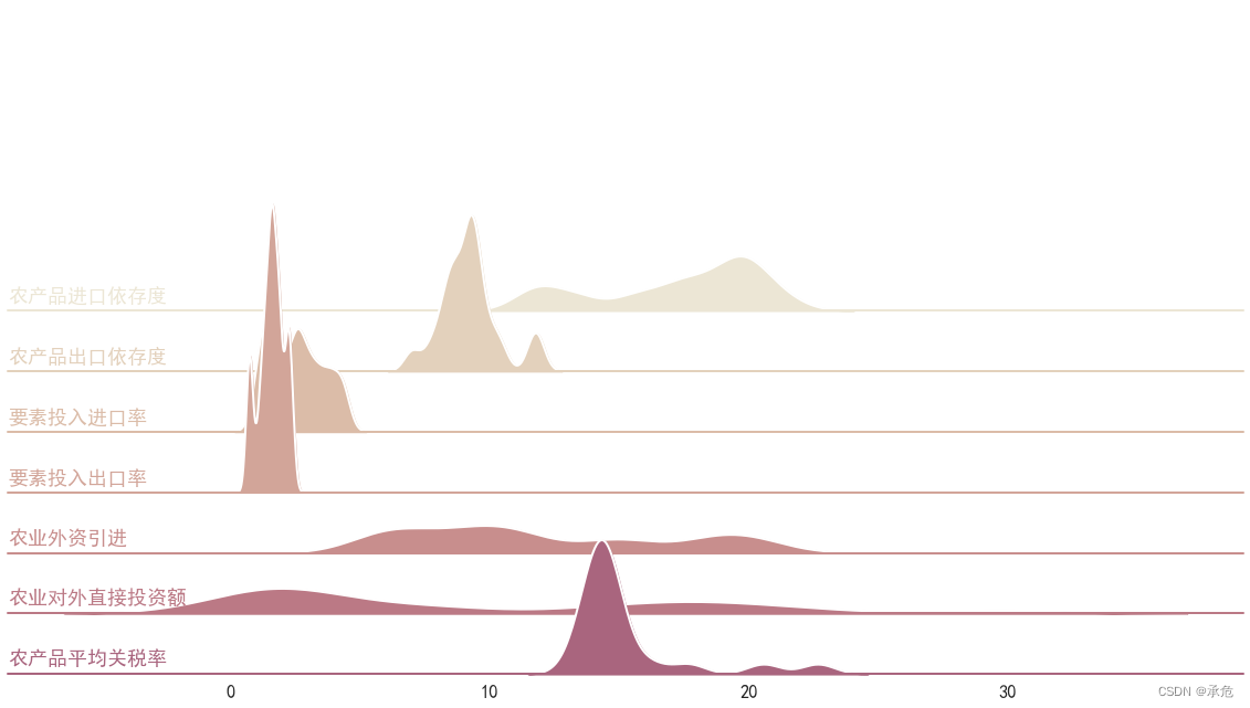
Plot Hill density maps for general data
Change the data form
- The data obtained in practice is often in the following form 、 This is obviously different from the letter distribution data generated above —— Each piece of data has a corresponding category
- call
function DataFrame.stack()To change the data form 、 This may be the use of seaborn For the processing that is often used in drawing 、seaborn The convenience is worth it - You can copy the following data to Excel in 、 There will be no more reading 、
Variable dataIs the corresponding data frame
| year | Dependence on imports of agricultural products (%) | Dependence on agricultural exports (%) | Factor input import rate (%) | Factor input and export rate (%) | Introduction of foreign investment in agriculture ( Billion dollars ) | Foreign direct investment in agriculture ( Billion dollars ) | Average tariff rate of agricultural products (%) |
| 2000 | 11.66 | 9.77 | 2.47 | 0.75 | 6.76 | 0.94 | 20.6 |
| 2001 | 11.70 | 9.52 | 2.64 | 0.74 | 8.99 | 1.15 | 22.7 |
| 2002 | 12.16 | 9.25 | 3.44 | 0.78 | 10.28 | 1.69 | 17.7 |
| 2003 | 13.05 | 9.40 | 3.79 | 1.24 | 10.01 | 0.81 | 16.2 |
| 2004 | 17.25 | 9.09 | 4.27 | 1.42 | 11.14 | 2.89 | 14.9 |
| 2005 | 18.66 | 11.86 | 4.39 | 1.43 | 7.18 | 1.06 | 14.6 |
| 2006 | 13.73 | 8.14 | 3.90 | 1.62 | 5.99 | 1.9 | 14.5 |
| 2007 | 19.75 | 11.74 | 3.32 | 2.39 | 9.24 | 2.72 | 14.5 |
| 2008 | 21.48 | 10.46 | 3.00 | 2.22 | 11.91 | 1.72 | 14.5 |
| 2009 | 18.15 | 9.28 | 2.01 | 1.34 | 14.29 | 3.43 | 13.4 |
| 2010 | 19.93 | 9.52 | 2.42 | 1.87 | 19.12 | 5.34 | 14.5 |
| 2011 | 20.19 | 10.11 | 2.94 | 2.28 | 20.09 | 7.98 | 14.4 |
| 2012 | 20.06 | 9.18 | 2.62 | 1.88 | 20.62 | 7.98 | 14 |
| 2013 | 20.83 | 8.68 | 1.81 | 1.61 | 18.00 | 18.1 | 14 |
| 2014 | 19.85 | 8.69 | 1.79 | 1.97 | 15.22 | 17.4 | 14 |
| 2015 | 19.12 | 8.68 | 1.62 | 2.20 | 15.34 | 20.5 | 14 |
| 2016 | 19.24 | 9.37 | 1.35 | 1.71 | 18.98 | 29.7 | 14.2 |
| 2017 | 17.61 | 8.33 | 1.38 | 1.60 | 10.75 | 22 | 13.6 |
| 2018 | 17.12 | 8.46 | 1.52 | 1.81 | 8.01 | 18 | 14.7 |
| 2019 | 15.65 | 7.74 | 1.23 | 1.60 | 5.62 | 15.4 | 14.4 |
| 2020 | 15.79 | 7.03 | 1.03 | 1.11 | 5.76 | 13.9 | 15.2 |
- Next 、 First select other variables except the year 、 Call again
function DataFrame.stack()To see what it does
data = data.loc[: , ' Dependence on imports of agricultural products (%)': ]
data.columns = [' Dependence on imports of agricultural products ', ' Dependence on agricultural exports ', ' Factor input import rate ', ' Factor input and export rate ',
                ' Introduction of foreign investment in agriculture ', ' Foreign direct investment in agriculture ', ' Average tariff rate of agricultural products ']                  #  Remove all units from the column name
#  View the front... After changing the form 21 Data
data.stack()[: 21]
0   Dependence on imports of agricultural products      11.659965
    Dependence on agricultural exports       9.774706
    Factor input import rate        2.469175
    Factor input and export rate        0.751264
    Introduction of foreign investment in agriculture         6.760000
    Foreign direct investment in agriculture      0.940000
    Average tariff rate of agricultural products      20.600000
1   Dependence on imports of agricultural products      11.703450
    Dependence on agricultural exports       9.517280
    Factor input import rate        2.640029
    Factor input and export rate        0.735898
    Introduction of foreign investment in agriculture         8.990000
    Foreign direct investment in agriculture      1.150000
    Average tariff rate of agricultural products      22.700000
2   Dependence on imports of agricultural products      12.156457
    Dependence on agricultural exports       9.251768
    Factor input import rate        3.440643
    Factor input and export rate        0.781500
    Introduction of foreign investment in agriculture        10.280000
    Foreign direct investment in agriculture      1.690000
    Average tariff rate of agricultural products      17.700000
dtype: float64
- The first column shown here is the original sample index 、 The second column is all the column names of each sample 、 Equivalent to variable 、 The third column is the index 、 The sample value under this variable
- actually 、
function DataFrame.stack()The originalpd.DataFrameChange it topd.Series
type(data.stack())
pandas.core.series.Series
- You can convert an array into a data frame in the following ways 、 This is consistent with the form of the letter distribution data generated above
- Thus our goal has been achieved
data = data.stack().reset_index(name='value').rename(columns={
    'level_0': 'index', 'level_1': 'feature'})
#  See the former 21 Data
data.iloc[: 21]
| index | feature | value | |
|---|---|---|---|
| 0 | 0 | Dependence on imports of agricultural products | 11.659965 |
| 1 | 0 | Dependence on agricultural exports | 9.774706 |
| 2 | 0 | Factor input import rate | 2.469175 |
| 3 | 0 | Factor input and export rate | 0.751264 |
| 4 | 0 | Introduction of foreign investment in agriculture | 6.760000 |
| 5 | 0 | Foreign direct investment in agriculture | 0.940000 |
| 6 | 0 | Average tariff rate of agricultural products | 20.600000 |
| 7 | 1 | Dependence on imports of agricultural products | 11.703450 |
| 8 | 1 | Dependence on agricultural exports | 9.517280 |
| 9 | 1 | Factor input import rate | 2.640029 |
| 10 | 1 | Factor input and export rate | 0.735898 |
| 11 | 1 | Introduction of foreign investment in agriculture | 8.990000 |
| 12 | 1 | Foreign direct investment in agriculture | 1.150000 |
| 13 | 1 | Average tariff rate of agricultural products | 22.700000 |
| 14 | 2 | Dependence on imports of agricultural products | 12.156457 |
| 15 | 2 | Dependence on agricultural exports | 9.251768 |
| 16 | 2 | Factor input import rate | 3.440643 |
| 17 | 2 | Factor input and export rate | 0.781500 |
| 18 | 2 | Introduction of foreign investment in agriculture | 10.280000 |
| 19 | 2 | Foreign direct investment in agriculture | 1.690000 |
| 20 | 2 | Average tariff rate of agricultural products | 17.700000 |
Start drawing
- The following process is not much different from the previous one
- Just modify some variables 、 The original ’g’ Change it to ’feature’、 The original ’x’ Change it to ’value’、 And changed the palette and the size of the graph
#  Basic settings
sns.set_theme(style='white', font_scale=1.5, rc={
    'axes.facecolor': (0, 0, 0, 0)})
plt.rcParams['font.sans-serif'] = ['SimHei']  # Normal display of Chinese
plt.rcParams['axes.unicode_minus'] = False    # Negative numbers are normally displayed

#  Instantiate FacetGrid object
pal = sns.cubehelix_palette(n_colors=10, rot=.5, light=.9, dark=.28)
g = sns.FacetGrid(data, row='feature', hue='feature', height=1.4, aspect=12, palette=pal)

#  Draw density on the subgraph
g.map(sns.kdeplot, 'value', bw_adjust=.5, clip_on=False,
     fill=True, alpha=1, linewidth=1.5)
g.map(sns.kdeplot, 'value', clip_on=False, color='w', lw=2, bw_adjust=.5)

#  The parameter pass Set to None To use semantic mapping
g.refline(y=0, linewidth=2, linestyle='-', color=None, clip_on=False)

#  Define and use a simple function to set label names for each subgraph
def label(x, color, label):
    ax = plt.gca()
    ax.text(0, .05, label, fontweight='bold', color=color,
           ha='left', va='center', transform=ax.transAxes)

g.map(label, 'value')

#  Let the subgraphs overlap
g.figure.subplots_adjust(hspace=-.8)

#  Delete some details on the shaft 、 Make them more beautiful when they are overlapped
g.set_titles('')
g.set(yticks=[], ylabel='', xlabel='')
g.despine(bottom=True, left=True)
- Integrate the large piece of code above into a function 、 I don't feel much need
Original reading
- In writing this blog 、 In order to be more accurate 、 Maybe it is also a kind of laziness 、 Read some content on the official website 、 You might as well put it here 、 For your reference
- The recent discovery 、 Microsoft's translation is very good …
function seaborn.kdeplot Notes given in
- ( Description of bandwidth )
- The bandwidth, or standard deviation of the smoothing kernel, is an important parameter.
bandwidth (bandwidth)、 Or the standard deviation of smoothing kernel is an important parameter - Misspecification of the bandwidth can produce a distorted representation of the data.
Incorrectly specifying bandwidth can cause data distortion 、 Or the data represented will be distorted - Much like the choice of bin width in a histogram, an over-smoothed curve can erase true features of a distribution, while an under-smoothed curve can create false features out of random variability.
And select the width of the column in the histogram (bin) Very similar 、 Excessively smooth curves will eliminate the true features of the distribution 、 The curve with insufficient smoothness will produce false features caused by randomness - The rule-of-thumb that sets the default bandwidth works best when the true distribution is smooth, unimodal, and roughly bell-shaped.
When the real distribution is smooth 、 Single peak and roughly bell shaped ( Both ends are low 、 The middle is high and symmetrical ) when , A rule of thumb for setting the default bandwidth gives the best results - It is always a good idea to check the default behavior by using bw_adjust to increase or decrease the amount of smoothing.
By usingParameters bw_adjustTo increase or decrease smoothness 、 Then it would be a good idea to check whether the default settings are appropriate
- ( The necessity of tailoring )
- Because the smoothing algorithm uses a Gaussian kernel, the estimated density curve can extend to values that do not make sense for a particular dataset.
Because the smoothing algorithm uses Gaussian kernel 、 Therefore, the estimated density curve can be extended to values that are not meaningful for a particular data set - For example, the curve may be drawn over negative values when smoothing data that are naturally positive.
for example 、 When smoothing data that can only be positive in nature 、 The curve may be drawn on a negative value - The cut and clip parameters can be used to control the extent of the curve, but datasets that have many observations close to a natural boundary may be better served by a different visualization method.
shear (cut) And clipping (clip) Parameters can be used to control the range of the curve 、 However, when there are more observations in the data set near the natural boundary 、 Maybe other visualization methods will get better results
- ( Misleading estimation of nuclear density )
- Similar considerations apply when a dataset is naturally discrete or “spiky” (containing many repeated observations of the same value).
When the data set is naturally discrete (discrete) Or appear “ peak ”(spiky)( It contains many repeated observations of the same size ) when 、 Similar considerations apply - Kernel density estimation will always produce a smooth curve, which would be misleading in these situations.
Kernel density estimation will always produce a smooth curve 、 But in these cases it would be misleading
- ( Explanation of the kernel density estimation curve )
- The units on the density axis are a common source of confusion.
Units on the density axis are a common source of confusion - While kernel density estimation produces a probability distribution, the height of the curve at each point gives a density, not a probability.
Although kernel density estimates produce probability distributions 、 But the height of each point on the curve represents the density 、 Not probability - A probability can be obtained only by integrating the density across a range.
Only by integrating the density curve in a certain range can the probability be obtained - The curve is normalized so that the integral over all possible values is 1, meaning that the scale of the density axis depends on the data values.
Normalize the curve 、 So that the integral value on the whole coordinate axis is 1、 This means that the scaling of the density axis will depend on the size of the data value
function FacetGrid.map Parameter description of
- ( function FacetGrid.map The role of )Apply a plotting function to each facet’s subset of the data.
Apply the drawing function to the data subset of each facet
- (func)A plotting function that takes data and keyword arguments. It must plot to the currently active matplotlib Axes and take a color keyword argument. If faceting on the hue dimension, it must also take a label keyword argument.
Drawing functions with data and keyword parameters 、 It must be drawn to the currently active matplotlib Axis 、 And USES the color Key parameters
If faceting is performed on the hue dimension 、 You must also use label Key parameters - (args)Column names in self.data that identify variables with data to plot. The data for each variable is passed to func in the order the variables are specified in the call.
self.data Column name in 、 Used to identify variables that have data to plot 、 The data of each variable will be passed to... In the order specified by the variable in the call func - (kwargs)All keyword arguments are passed to the plotting function.
All key parameters are passed to the drawing function
边栏推荐
- 想进行快速钢网设计,还能保证钢网质量? 来看这里
- 面试必刷算法TOP101之单调栈 TOP31
- Machine learning notes - supervised learning memo list
- Ansible PlayBook的中清单变量优先级分析及清单变量如何分离总结
- RT-Thread 模拟器 simulator LVGL控件:button 按钮样式
- SDN基本概述
- Comment utiliser le logiciel wangyou DFM pour l'analyse des plaques froides
- 如何使用望友DFM软件进行冷板分析
- Learning notes of MySQL series by database and table
- The new business outlet of beautiful Tiantian second mode will be popular in the Internet e-commerce market
猜你喜欢

TiDB Lightning

How to quickly support the team leader to attract new fission users in the business marketing mode of group rebate?

AIO Introduction (VIII)

The causes of font and style enlargement when the applet is horizontal have been solved

Application of DS18B20 temperature sensor based on FPGA

Will the chain 2+1 model be a new business outlet and a popular Internet e-commerce market?

通过函数seaborn.cubehelix_palette生成顺序调色板

NFV基本概述

How to seize the bonus of social e-commerce through brand play to achieve growth and profit?

Ffmpeg compressed video.
随机推荐
Pngquant batch bat and parameter description
景联文科技提供一站式智能家居数据采集标注解决方案
What does my financial product mean in clearing?
Introduction and use of dumping
Normalizing y-axis in histograms in R ggplot to proportion
FSM state machine
ML之FE:Vintage曲线/Vintage分析的简介、计算逻辑、案例应用之详细攻略
Upper computer development (detailed design of firmware download software)
1154. day of the year
基于FPGA的ds18b20温度传感器使用
If the key in redis data is in Chinese
[weak transient signal detection] matlab simulation of SVM detection method for weak transient signal under chaotic background
Is it safe for Hangzhou Securities to open an account?
2022 - 06 - 12: dans un échiquier carré n * N, il y a n * n pièces, donc chaque pièce peut avoir exactement une pièce. Mais maintenant quelques pièces sont rassemblées sur une grille, par exemple: 2 0
Lightning breakpoint continuation
数字时代进化论
New Taishan crowdfunding business diversion fission growth model in 2022
Wechat game execution wx Navigatetominiprogram jumps to other games and returns to the black screen
The new retail market has set off blind box e-commerce. Can the new blind box marketing model bring dividends to businesses?
Jinglianwen technology provides a one-stop smart home data acquisition and labeling solution