当前位置:网站首页>简易表白小页面
简易表白小页面
2022-07-31 01:31:00 【盖玥希圈外男友(섭소우)】
目录
需求
又是没有活的一下午......做个简单的css动画玩玩!
很简单,把若干行不同文字的“我爱你”放在页面中,杂乱无章地动起来即可。
思路和代码
对于结构,需要一个父元素container,里面放许多item,这些item就是各种文字的“我爱你”。给这些item加上动画,随机设置不同的延迟时间和持续时间,这样就能产生杂乱无章的效果了。
过于简单,直接上代码:
html部分
<div class="container">
    <div class="item">我爱你</div>
    <div class="item">I Love You</div>
    <div class="item">사랑해요</div>
    <div class="item">愛する</div>
    <div class="item">EU te amo</div>
    <div class="item">Je t' aime</div>
    <div class="item">Ich liebe dich</div>
  </div>
css部分
    .container {
      width: 500px;
      height: 700px;
      margin: auto;
      background-color: pink;
    }

    .item {
      width: 300px;
      height: 50px;
      font-size: 30px;
      font-family: 'Courier New', Courier, monospace;
      color: white;
    }

    .item:nth-child(1) {
      animation: move 10s 0.5s alternate-reverse linear infinite both;
    }

    .item:nth-child(2) {
      animation: move 8s 1s alternate-reverse linear infinite both;
    }

    .item:nth-child(3) {
      animation: move 7s 0.8s alternate-reverse linear infinite both;
    }

    .item:nth-child(4) {
      animation: move 6s 0.7s alternate-reverse linear infinite both;
    }

    .item:nth-child(5) {
      animation: move 10s 1.1s alternate-reverse linear infinite both;
    }

    .item:nth-child(6) {
      animation: move 9s 1.3s alternate-reverse linear infinite both;
    }

    .item:nth-child(7) {
      animation: move 5s 1s alternate-reverse linear infinite both;
    }

    @keyframes move {
      from {
        transform: translate(0);
      }

      10% {
        transform: translate(300px, 40px);
      }

      20% {
        transform: translate(0px, 80px);
      }

      30% {
        transform: translate(300px, 120px);
      }

      40% {
        transform: translate(0px, 160px);
      }

      50% {
        transform: translate(300px, 200px);
      }

      60% {
        transform: translate(0px, 240px);
      }

      70% {
        transform: translate(300px, 280px);
      }

      80% {
        transform: translate(0px, 320px);
      }

      90% {
        transform: translate(300px, 360px);
      }

      100% {
        transform: translate(0px, 400px);
      }
    }
这样基本就能搭出来了。看效果。
实现效果
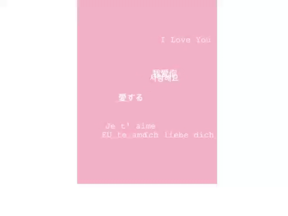
效果还算可以,毕竟只是弄着玩。
进一步
如果现在我要求,鼠标hover某个item的时候,它就变色,同时暂停动画,应该怎么办?
很简单,直接添加一个hover伪类即可。修改后的css:
    .container {
      width: 500px;
      height: 700px;
      margin: auto;
      background-color: pink;
    }

    .item {
      width: 300px;
      height: 50px;
      font-size: 30px;
      font-family: 'Courier New', Courier, monospace;
      color: white;
    }

    .item:hover {
      color: antiquewhite;
      cursor: pointer;
      animation-play-state: paused;
    }

    .item:nth-child(1) {
      animation: move 10s 0.5s alternate-reverse linear infinite both;
    }

    .item:nth-child(2) {
      animation: move 8s 1s alternate-reverse linear infinite both;
    }

    .item:nth-child(3) {
      animation: move 7s 0.8s alternate-reverse linear infinite both;
    }

    .item:nth-child(4) {
      animation: move 6s 0.7s alternate-reverse linear infinite both;
    }

    .item:nth-child(5) {
      animation: move 10s 1.1s alternate-reverse linear infinite both;
    }

    .item:nth-child(6) {
      animation: move 9s 1.3s alternate-reverse linear infinite both;
    }

    .item:nth-child(7) {
      animation: move 5s 1s alternate-reverse linear infinite both;
    }

    @keyframes move {
      from {
        transform: translate(0);
      }

      10% {
        transform: translate(300px, 40px);
      }

      20% {
        transform: translate(0px, 80px);
      }

      30% {
        transform: translate(300px, 120px);
      }

      40% {
        transform: translate(0px, 160px);
      }

      50% {
        transform: translate(300px, 200px);
      }

      60% {
        transform: translate(0px, 240px);
      }

      70% {
        transform: translate(300px, 280px);
      }

      80% {
        transform: translate(0px, 320px);
      }

      90% {
        transform: translate(300px, 360px);
      }

      100% {
        transform: translate(0px, 400px);
      }
    }
本来兴高采烈去试试,结果发现,hover的时候,文字颜色确实变了,但动画没有暂停。
这是为什么呢?我以为是代码写错了,但仔细检查,并没有错误。
后来灵光一动,发现了问题。我把hover写在了item:nth-child的前面。在hover中设置动画的状态是暂停,但这子元素选择器中设置的状态是running,覆盖了前面的暂停。因此,必须把hover放在子元素伪类选择器的后面。
修改代码:
    .container {
      width: 500px;
      height: 700px;
      margin: auto;
      background-color: pink;
    }

    .item {
      width: 300px;
      height: 50px;
      font-size: 30px;
      font-family: 'Courier New', Courier, monospace;
      color: white;
    }

    .item:nth-child(1) {
      animation: move 10s 0.5s alternate-reverse linear infinite both;
    }

    .item:nth-child(2) {
      animation: move 8s 1s alternate-reverse linear infinite both;
    }

    .item:nth-child(3) {
      animation: move 7s 0.8s alternate-reverse linear infinite both;
    }

    .item:nth-child(4) {
      animation: move 6s 0.7s alternate-reverse linear infinite both;
    }

    .item:nth-child(5) {
      animation: move 10s 1.1s alternate-reverse linear infinite both;
    }

    .item:nth-child(6) {
      animation: move 9s 1.3s alternate-reverse linear infinite both;
    }

    .item:nth-child(7) {
      animation: move 5s 1s alternate-reverse linear infinite both;
    }

    @keyframes move {
      from {
        transform: translate(0);
      }

      10% {
        transform: translate(300px, 40px);
      }

      20% {
        transform: translate(0px, 80px);
      }

      30% {
        transform: translate(300px, 120px);
      }

      40% {
        transform: translate(0px, 160px);
      }

      50% {
        transform: translate(300px, 200px);
      }

      60% {
        transform: translate(0px, 240px);
      }

      70% {
        transform: translate(300px, 280px);
      }

      80% {
        transform: translate(0px, 320px);
      }

      90% {
        transform: translate(300px, 360px);
      }

      100% {
        transform: translate(0px, 400px);
      }
    }

    .item:hover {
      color: antiquewhite;
      cursor: pointer;
      animation-play-state: paused;
    }
最终效果
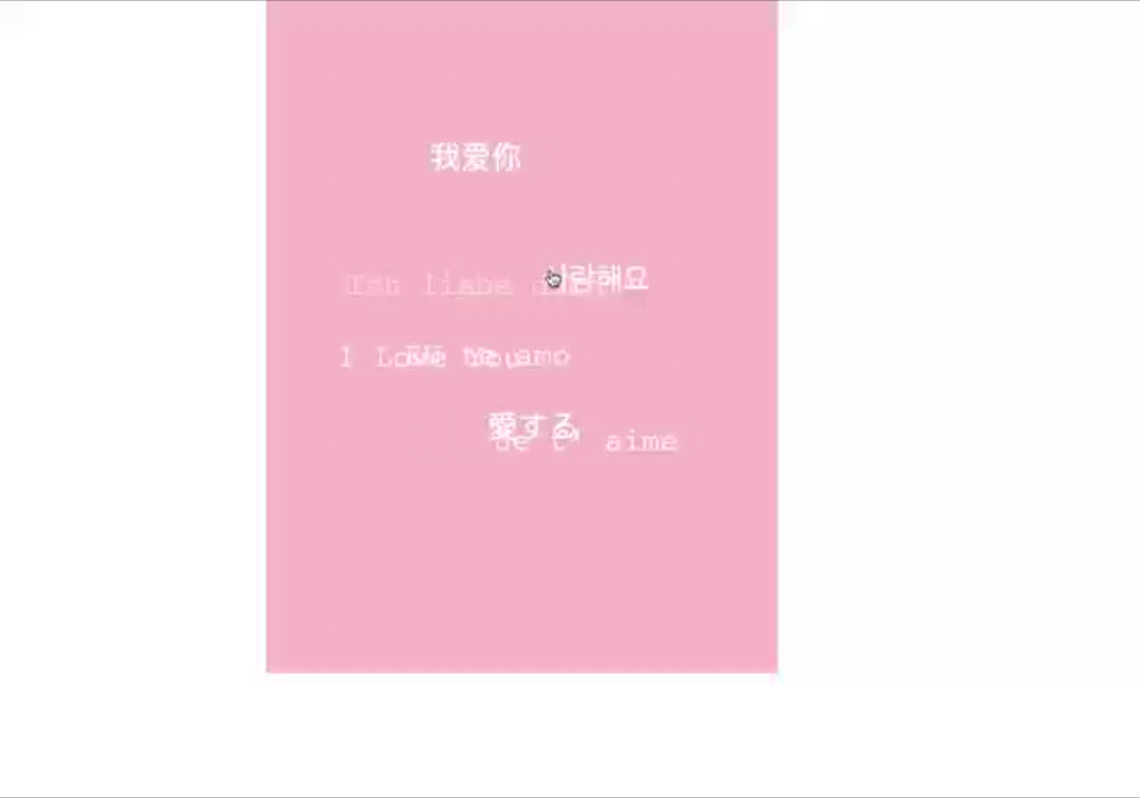
很好!
总结
一个非常非常简单的小案例。以后记住,在加hover的时候,尽量放在后面,以防被其他样式覆盖。
边栏推荐
猜你喜欢


随机推荐
Unity2D horizontal version game tutorial 4 - item collection and physical materials
typescript10-commonly used basic types
手把手教你配置Jenkins自动化邮件通知
Teach you how to configure Jenkins automated email notifications
"Actual Combat" based on part-of-speech extraction in the field of e-commerce and its decision tree model modeling
权限管理怎么做的?
计算S=a+aa+…+aa…a
1782. 统计点对的数目 双指针
android的webview缓存相关知识收集
关于Redis相关内容的基础学习
case语句的综合结果,你究竟会了吗?【Verilog高级教程】
typescript17 - function optional parameters
Rocky/GNU之Zabbix部署(1)
Meta元宇宙部门第二季度亏损28亿 仍要继续押注?元宇宙发展尚未看到出路
想要写出好的测试用例,先要学会测试设计
MySql data recovery method personal summary
聚簇索引和非聚簇索引到底有什么区别
Chi-square distribution of digital image steganography
Responsive layout vs px/em/rem
MySQL高级-六索引优化