当前位置:网站首页>Rendering of kotlin jetpack compose tab using animatedvisibility
Rendering of kotlin jetpack compose tab using animatedvisibility
2022-06-23 19:36:00 【Ango cannot move】
Continue with the last blog
This lesson realizes
When there is content, the animation appears below tab
And below tab You can choose Switch

Change the file to
package com.anguomob.jecpack.activity.compose.todo.one

import androidx.compose.animation.AnimatedVisibility
import androidx.compose.animation.core.FastOutLinearInEasing
import androidx.compose.animation.core.FastOutSlowInEasing
import androidx.compose.animation.core.TweenSpec
import androidx.compose.animation.fadeIn
import androidx.compose.animation.fadeOut
import androidx.compose.foundation.background
import androidx.compose.foundation.layout.*
import androidx.compose.foundation.shape.CircleShape
import androidx.compose.material.*
import androidx.compose.runtime.Composable
import androidx.compose.runtime.mutableStateOf
import androidx.compose.runtime.remember
import androidx.compose.ui.Alignment
import androidx.compose.ui.Modifier
import androidx.compose.ui.graphics.Color
import androidx.compose.ui.graphics.vector.ImageVector
import androidx.compose.ui.res.stringResource
import androidx.compose.ui.unit.dp
import com.anguomob.jecpack.activity.compose.todo.bean.ToDoIcon
import com.anguomob.jecpack.activity.compose.todo.bean.TodoItem

@Composable
fun TodoInputText(text: String, onTextChanged: (String) -> Unit, modifier: Modifier = Modifier) {
    TextField(
        value = text,
        onValueChange = onTextChanged,
        modifier = modifier,
        colors = TextFieldDefaults.textFieldColors(backgroundColor = Color.Transparent),
        maxLines = 1,
    )
}

@Composable()
fun TodoEditButton(
    onClick: () -> Unit,
    text: String,
    modifier: Modifier = Modifier,
    enable: Boolean = true
) {
    TextButton(
        onClick = onClick,
        shape = CircleShape,
        colors = ButtonDefaults.buttonColors(),
        modifier = modifier,
        enabled = enable
    ) {
        Text(text)
    }
}

@Composable
fun TodoItemInput(onItemComplete: (TodoItem) -> Unit) {
    val (text, setText) = remember {
        mutableStateOf("")
    }

    val (icon, setIcon) = remember {
        mutableStateOf(ToDoIcon.Default)
    }
    //icon Whether it can be one depends on whether the text has content
    val iconsVisible = text.isNotBlank()

    Column {
        Row(
            Modifier
                .padding(horizontal = 16.dp)
                .padding(top = 16.dp)
        ) {

            TodoInputText(
                text = text,
                modifier = Modifier
                    .weight(1f)
                    .padding(end = 8.dp),
                onTextChanged = setText

            )
            TodoEditButton(
                onClick = {
                    onItemComplete(TodoItem(text))
                    setText("")
                },
                text = "Add",
                modifier = Modifier.align(Alignment.CenterVertically),
                enable = text.isNotBlank()
            )

        }
        AnimatedIconRow(
            visible = iconsVisible,
            icon = icon,
            onIconChange = setIcon,
            modifier = Modifier.padding(8.dp)
        )

    }
}

// Row of icons   Depending on whether the text box has content   Auto bounce and retract
@Composable
fun AnimatedIconRow(
    modifier: Modifier = Modifier,
    visible: Boolean,
    icon: ToDoIcon,
    onIconChange: (ToDoIcon) -> Unit
) {
    val enter = remember {
        fadeIn(animationSpec = TweenSpec(300, easing = FastOutLinearInEasing))
    }

    val exit = remember {
        fadeOut(animationSpec = TweenSpec(100, easing = FastOutSlowInEasing))
    }
    // Minimum height 16dp
    AnimatedVisibility(visible = visible, enter = enter, exit = exit, modifier = modifier) {
        IconRow(icon = icon, onIconChange = onIconChange)
    }


}

@Composable
fun IconRow(icon: ToDoIcon, onIconChange: (ToDoIcon) -> Unit, modifier: Modifier = Modifier) {
    Row(modifier = modifier) {
        for (todoIcon in ToDoIcon.values()) {
            SelectableIconButton(
                icon = todoIcon.imageVector,
                iconContentDescription = todoIcon.contentDescription,
                onIconSelect = { onIconChange(todoIcon) },
                isSelected = todoIcon == icon
            )
        }
    }
}

@Composable
fun SelectableIconButton(
    icon: ImageVector,
    iconContentDescription: Int,
    onIconSelect: () -> Unit,
    isSelected: Boolean,
    modifier: Modifier = Modifier
) {
    // Icons checked and unchecked   The colors are different
    val tint = if (isSelected) {
        MaterialTheme.colors.primary
    } else {
        MaterialTheme.colors.onSurface.copy(alpha = 0.6f)
    }
    TextButton(onClick = onIconSelect, shape = CircleShape, modifier = modifier) {
        Column {
            Icon(
                imageVector = icon,
                tint = tint,
                contentDescription = stringResource(id = iconContentDescription)
            )
            if (isSelected) {
                Box(
                    Modifier
                        .padding(top = 3.dp)
                        .width(icon.defaultWidth)
                        .height(1.dp)
                        .background(tint)
                )
            } else {
                Spacer(modifier = Modifier.height(4.dp))
            }
        }

    }
}
Those things are used for disassembly

Add a new status . It contains the default icon The icon also has a selected status
This is used in state improvement .

There are mainly two animations in this method The animation contains system components
AnimatedVisibility
It also contains a customized component
IconRow
Let's continue to look at this
IconRow
Components
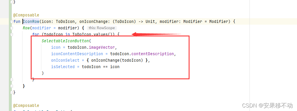
Iterate over the enumeration type and give the iterated loop to a new component
Let's take a look at this new component

He's actually a textButton
And added shape. The brothers said it was necessary to add shape ah In fact, there is no So you can delete
Then, whether the bottom underline is selected or not is hidden
The brothers have just finished learning animation Is it possible to live a whole life
Tolerable
@Composable
fun SelectableIconButton(
    icon: ImageVector,
    iconContentDescription: Int,
    onIconSelect: () -> Unit,
    isSelected: Boolean,
    modifier: Modifier = Modifier
) {
    // Icons checked and unchecked   The colors are different
    val tint = if (isSelected) {
        MaterialTheme.colors.primary
    } else {
        MaterialTheme.colors.onSurface.copy(alpha = 0.6f)
    }


    val enter = remember {
        fadeIn(animationSpec = TweenSpec(300, easing = FastOutLinearInEasing))
    }

    val exit = remember {
        fadeOut(animationSpec = TweenSpec(100, easing = FastOutSlowInEasing))
    }


    TextButton(onClick = onIconSelect, modifier = modifier) {
        Column {
            Icon(
                imageVector = icon,
                tint = tint,
                contentDescription = stringResource(id = iconContentDescription)
            )
            // Minimum height 16dp
            AnimatedVisibility(visible = isSelected, enter = enter, exit = exit) {
                Box(
                    Modifier
                        .padding(top = 3.dp)
                        .width(icon.defaultWidth)
                        .height(1.dp)
                        .background(tint)
                )
            }
        }

    }
}
So every time you click, you will get feedback Users may prefer
Of course, you can optimize the animation that you have learned in the future
边栏推荐
- SAP实施项目上的内部顾问与外部顾问,相互为难还是相互成就?
- 基于微信小程序的婚纱影楼小程序开发笔记
- How can enterprises do business monitoring well?
- Advanced network accounting notes (6)
- 宝安区航城街道领导一行莅临联诚发参观调研
- Robust extraction of specific signals with time structure (Part 1)
- Hardware development notes (6): basic process of hardware development, making a USB to RS232 module (5): creating USB package library and associating principle graphic devices
- Obtain equipment information
- 直播回顾 | 云原生混部系统 Koordinator 架构详解(附完整PPT)
- 8、AI医生案例
猜你喜欢

Dataease template market officially released

LeetCode 每日一题——30. 串联所有单词的子串

为什么你的数据图谱分析图上只显示一个值?

不止雷军 iQOO产品经理也称赞高通骁龙8+:焕然一新

Function definition and function parameters

The yuan universe killer is coming! Xiao Zha offered 4 VR head displays to challenge the visual Turing test

Hotline salon issue 26 - cloud security session
好用的人事管理软件有哪些?人事管理系统软件排名!

盘点四种WiFi加密标准:WEP、WPA、WPA2、WPA3

Idea console displays Chinese garbled code
随机推荐
Ges graph computing engine hyg unveils the secrets of Graph Segmentation
8. AI doctor case
【One by One系列】IdentityServer4(八)使用EntityFramework Core对数据进行持久化
活动报名 | MongoDB 5.0 时序存储特性介绍
Naacl 2022 finds | byte proposes MTG: multilingual text generation data set
Are there conditions for making new bonds? Is it safe to make new bonds
Machine learning jobs
Check four WiFi encryption standards: WEP, WPA, WPA2 and WPA3
Convex optimization notes
CV convolution neural network
ElastricSearch第二弹之分片原理
Hardware development notes (6): basic process of hardware development, making a USB to RS232 module (5): creating USB package library and associating principle graphic devices
直播分享| 腾讯云 MongoDB 智能诊断及性能优化实践
A review of comparative learning
Advanced network accounting notes (VIII)
User analysis aarrr model (pirate model)
Cloud security daily 220623: the red hat database management system has found an arbitrary code execution vulnerability and needs to be upgraded as soon as possible
Principles of microcomputer Chapter 6 notes arrangement
从零开发小程序和公众号【第二期】
Robust extraction of specific signals with time structure (Part 2)