当前位置:网站首页>QT official example: QT quick controls - Gallery
QT official example: QT quick controls - Gallery
2022-07-02 18:16:00 【Friendly, friend】
This example demonstrates common Qt Quick Control .

Main window code :
import QtQuick
import QtQuick.Layouts
import QtQuick.Controls
import Qt.labs.settings
import "." as App
ApplicationWindow
{
id: window
width: 360
height: 520
visible: true
title: "Qt Quick Control "
function help()
{
let displayingControl = listView.currentIndex !== -1
let currentControlName = displayingControl
? listView.model.get(listView.currentIndex).title.toLowerCase() : ""
let url = "https://doc.qt.io/qt-5/" + (displayingControl ? "qml-qtquick-controls2-" + currentControlName + ".html"
: "qtquick-controls2-qmlmodule.html");
Qt.openUrlExternally(url)
}
required property var builtInStyles
Settings
{
id: settings
property string style
}
Shortcut
{
sequences: ["Esc", "Back"]
enabled: stackView.depth > 1
onActivated: navigateBackAction.trigger()
}
Shortcut
{
sequence: StandardKey.HelpContents
onActivated: help()
}
Action
{
id: navigateBackAction
icon.name: stackView.depth > 1 ? "back" : "drawer"
onTriggered:
{
if (stackView.depth > 1)
{
stackView.pop()
listView.currentIndex = -1
} else {
drawer.open()
}
}
}
Shortcut
{
sequence: "Menu"
onActivated: optionsMenuAction.trigger()
}
Action
{
id: optionsMenuAction
icon.name: "menu"
onTriggered: optionsMenu.open()
}
header: ToolBar
{
RowLayout
{
spacing: 20
anchors.fill: parent
ToolButton
{
action: navigateBackAction
}
Label
{
id: titleLabel
text: listView.currentItem ? listView.currentItem.text : "Gallery"
font.pixelSize: 20
elide: Label.ElideRight
horizontalAlignment: Qt.AlignHCenter
verticalAlignment: Qt.AlignVCenter
Layout.fillWidth: true
}
ToolButton
{
action: optionsMenuAction
Menu
{
id: optionsMenu
x: parent.width - width
transformOrigin: Menu.TopRight
Action
{
text: " Set up "
onTriggered: settingsDialog.open()
}
Action
{
text: " help "
onTriggered: help()
}
Action
{
text: " About "
onTriggered: aboutDialog.open()
}
}
}
}
}
Drawer
{
id: drawer
width: Math.min(window.width, window.height) / 3 * 2
height: window.height
interactive: stackView.depth === 1
ListView
{
id: listView
focus: true
currentIndex: -1
anchors.fill: parent
delegate: ItemDelegate
{
width: listView.width
text: model.title
highlighted: ListView.isCurrentItem
onClicked:
{
listView.currentIndex = index
stackView.push(model.source)
drawer.close()
}
}
model: ListModel
{
ListElement { title: "BusyIndicator"; source: "qrc:/pages/BusyIndicatorPage.qml" }
ListElement { title: "Button"; source: "qrc:/pages/ButtonPage.qml" }
ListElement { title: "CheckBox"; source: "qrc:/pages/CheckBoxPage.qml" }
ListElement { title: "ComboBox"; source: "qrc:/pages/ComboBoxPage.qml" }
ListElement { title: "DelayButton"; source: "qrc:/pages/DelayButtonPage.qml" }
ListElement { title: "Dial"; source: "qrc:/pages/DialPage.qml" }
ListElement { title: "Dialog"; source: "qrc:/pages/DialogPage.qml" }
ListElement { title: "Delegates"; source: "qrc:/pages/DelegatePage.qml" }
ListElement { title: "Frame"; source: "qrc:/pages/FramePage.qml" }
ListElement { title: "GroupBox"; source: "qrc:/pages/GroupBoxPage.qml" }
ListElement { title: "PageIndicator"; source: "qrc:/pages/PageIndicatorPage.qml" }
ListElement { title: "ProgressBar"; source: "qrc:/pages/ProgressBarPage.qml" }
ListElement { title: "RadioButton"; source: "qrc:/pages/RadioButtonPage.qml" }
ListElement { title: "RangeSlider"; source: "qrc:/pages/RangeSliderPage.qml" }
ListElement { title: "ScrollBar"; source: "qrc:/pages/ScrollBarPage.qml" }
ListElement { title: "ScrollIndicator"; source: "qrc:/pages/ScrollIndicatorPage.qml" }
ListElement { title: "Slider"; source: "qrc:/pages/SliderPage.qml" }
ListElement { title: "SpinBox"; source: "qrc:/pages/SpinBoxPage.qml" }
ListElement { title: "StackView"; source: "qrc:/pages/StackViewPage.qml" }
ListElement { title: "SwipeView"; source: "qrc:/pages/SwipeViewPage.qml" }
ListElement { title: "Switch"; source: "qrc:/pages/SwitchPage.qml" }
ListElement { title: "TabBar"; source: "qrc:/pages/TabBarPage.qml" }
ListElement { title: "TextArea"; source: "qrc:/pages/TextAreaPage.qml" }
ListElement { title: "TextField"; source: "qrc:/pages/TextFieldPage.qml" }
ListElement { title: "ToolTip"; source: "qrc:/pages/ToolTipPage.qml" }
ListElement { title: "Tumbler"; source: "qrc:/pages/TumblerPage.qml" }
}
ScrollIndicator.vertical: ScrollIndicator { }
}
}
StackView
{
id: stackView
anchors.fill: parent
initialItem: Pane
{
id: pane
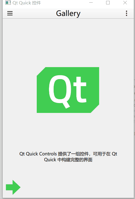
Image
{
id: logo
width: pane.availableWidth / 2
height: pane.availableHeight / 2
anchors.centerIn: parent
anchors.verticalCenterOffset: -50
fillMode: Image.PreserveAspectFit
source: "images/qt-logo.png"
}
Label
{
text: "Qt Quick Controls Provides a set of controls , Can be used in Qt Quick Build a complete interface in "
anchors.margins: 20
anchors.top: logo.bottom
anchors.left: parent.left
anchors.right: parent.right
anchors.bottom: arrow.top
horizontalAlignment: Label.AlignHCenter
verticalAlignment: Label.AlignVCenter
wrapMode: Label.Wrap
}
Image
{
id: arrow
source: "images/arrow.png"
anchors.left: parent.left
anchors.bottom: parent.bottom
}
}
}
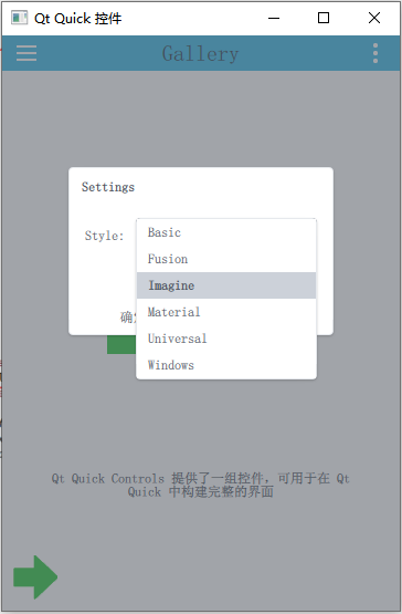
Dialog
{
id: settingsDialog
x: Math.round((window.width - width) / 2)
y: Math.round(window.height / 6)
width: Math.round(Math.min(window.width, window.height) / 3 * 2)
modal: true
focus: true
title: "Settings"
standardButtons: Dialog.Ok | Dialog.Cancel
onAccepted:
{
settings.style = styleBox.displayText
settingsDialog.close()
}
onRejected:
{
styleBox.currentIndex = styleBox.styleIndex
settingsDialog.close()
}
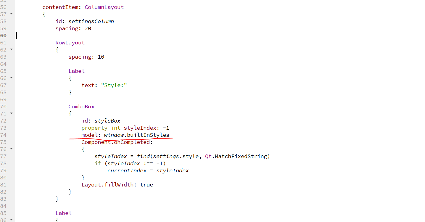
contentItem: ColumnLayout
{
id: settingsColumn
spacing: 20
RowLayout
{
spacing: 10
Label
{
text: "Style:"
}
ComboBox
{
id: styleBox
property int styleIndex: -1
model: window.builtInStyles
Component.onCompleted:
{
styleIndex = find(settings.style, Qt.MatchFixedString)
if (styleIndex !== -1)
currentIndex = styleIndex
}
Layout.fillWidth: true
}
}
Label
{
text: "Restart required"
color: "#e41e25"
opacity: styleBox.currentIndex !== styleBox.styleIndex ? 1.0 : 0.0
horizontalAlignment: Label.AlignHCenter
verticalAlignment: Label.AlignVCenter
Layout.fillWidth: true
Layout.fillHeight: true
}
}
}
Dialog
{
id: aboutDialog
modal: true
focus: true
title: "About"
x: (window.width - width) / 2
y: window.height / 6
width: Math.min(window.width, window.height) / 3 * 2
contentHeight: aboutColumn.height
Column
{
id: aboutColumn
spacing: 20
Label
{
width: aboutDialog.availableWidth
text: "Qt Quick Controls The module provides based on Qt Quick Next generation user interface controls ."
wrapMode: Label.Wrap
font.pixelSize: 12
}
Label
{
width: aboutDialog.availableWidth
text: " And Qt Quick Controls 1 comparison ,Qt Quick Controls It's simpler 、 More lightweight 、 faster "
wrapMode: Label.Wrap
font.pixelSize: 12
}
}
}
}Interface structure :
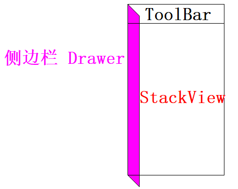
Left side panel
    Drawer
    {
        id: drawer
        width: Math.min(window.width, window.height) / 3 * 2
        height: window.height
        interactive: stackView.depth === 1

        ListView
        {
            id: listView

            focus: true
            currentIndex: -1
            anchors.fill: parent

            delegate: ItemDelegate
            {
                width: listView.width
                text: model.title
                highlighted: ListView.isCurrentItem
                onClicked:
                {
                    listView.currentIndex = index
                    stackView.push(model.source)
                    drawer.close()
                }
            }

            model: ListModel
            {
                ListElement { title: "BusyIndicator"; source: "qrc:/pages/BusyIndicatorPage.qml" }
                ListElement { title: "Button"; source: "qrc:/pages/ButtonPage.qml" }
                ListElement { title: "CheckBox"; source: "qrc:/pages/CheckBoxPage.qml" }
                ListElement { title: "ComboBox"; source: "qrc:/pages/ComboBoxPage.qml" }
                ListElement { title: "DelayButton"; source: "qrc:/pages/DelayButtonPage.qml" }
                ListElement { title: "Dial"; source: "qrc:/pages/DialPage.qml" }
                ListElement { title: "Dialog"; source: "qrc:/pages/DialogPage.qml" }
                ListElement { title: "Delegates"; source: "qrc:/pages/DelegatePage.qml" }
                ListElement { title: "Frame"; source: "qrc:/pages/FramePage.qml" }
                ListElement { title: "GroupBox"; source: "qrc:/pages/GroupBoxPage.qml" }
                ListElement { title: "PageIndicator"; source: "qrc:/pages/PageIndicatorPage.qml" }
                ListElement { title: "ProgressBar"; source: "qrc:/pages/ProgressBarPage.qml" }
                ListElement { title: "RadioButton"; source: "qrc:/pages/RadioButtonPage.qml" }
                ListElement { title: "RangeSlider"; source: "qrc:/pages/RangeSliderPage.qml" }
                ListElement { title: "ScrollBar"; source: "qrc:/pages/ScrollBarPage.qml" }
                ListElement { title: "ScrollIndicator"; source: "qrc:/pages/ScrollIndicatorPage.qml" }
                ListElement { title: "Slider"; source: "qrc:/pages/SliderPage.qml" }
                ListElement { title: "SpinBox"; source: "qrc:/pages/SpinBoxPage.qml" }
                ListElement { title: "StackView"; source: "qrc:/pages/StackViewPage.qml" }
                ListElement { title: "SwipeView"; source: "qrc:/pages/SwipeViewPage.qml" }
                ListElement { title: "Switch"; source: "qrc:/pages/SwitchPage.qml" }
                ListElement { title: "TabBar"; source: "qrc:/pages/TabBarPage.qml" }
                ListElement { title: "TextArea"; source: "qrc:/pages/TextAreaPage.qml" }
                ListElement { title: "TextField"; source: "qrc:/pages/TextFieldPage.qml" }
                ListElement { title: "ToolTip"; source: "qrc:/pages/ToolTipPage.qml" }
                ListElement { title: "Tumbler"; source: "qrc:/pages/TumblerPage.qml" }
            }

            ScrollIndicator.vertical: ScrollIndicator { }
        }
    }
Place a list view in the middle , The view has a vertical indicator .
When you press an item in the view , The corresponding page enters the stack view .
Click the button on the left of the toolbar , Current page out of stack :
    Action
    {
        id: navigateBackAction
        icon.name: stackView.depth > 1 ? "back" : "drawer"
        onTriggered:
        {
            if (stackView.depth > 1)
            {
                stackView.pop()
                listView.currentIndex = -1
            } else {
                drawer.open()
            }
        }
    }
Switch theme function

In the loading main interface qml Give initialization attribute to file .

That's all the points worth mentioning in this example .
Types and knowledge points involved :
- Settings
- Shortcut
- Action
- ToolButton
- Label
- Menu
- Drawer
- ListView
- StackView
- Pane
- Dialog
- ComboBox
- Page
- Flickable
- BusyIndicator
- Button
- CheckBox
- DelayButton
- SwipeDelegate
- CheckDelegate
- ItemDelegate
- RadioDelegate
- SwitchDelegate
- Delegated removal animation
- ButtonGroup
- Frame
- RadioButton
- GroupBox
- PageIndicator
- ProgressBar
- RangeSlider
- ScrollIndicator
- ScrollBar
- Slider
- SpinBox
- SwipeView
- Switch
- TabBar
- TabButton
- TextArea
- TextField
- ToolTip
- Tumbler
边栏推荐
- win10 卸载cuda
- How can you omit a large number of switch statements
- 一个优秀程序员可抵五个普通程序员!
- Wechat applet video sharing platform system graduation design completion (1) development outline
- Yingguang pmc131 SOP16 16pin eight bit MCU
- Detailed explanation of map set
- Unified interface for reading and writing data files in xml/json/ini and ubjson formats
- Easyai notes - machine learning
- Interview, about thread pool
- Qt官方示例:Qt Quick Controls - Gallery
猜你喜欢
Wechat applet video sharing platform system graduation design completion (8) graduation design thesis template
微信小程序视频分享平台系统毕业设计毕设(3)后台功能

Hbuilderx runs to the mobile phone or simulator and prompts that the device is not found
A good programmer is worth five ordinary programmers!

【Golang | gRPC】使用gRPC实现简单远程调用

MySQL -- basic operation of database
Taiwan Feiling fm8pb513b MCU provides MCU program development product design

My creation anniversary
Wechat nucleic acid detection and appointment applet system graduation design (3) background function

Aloam code reading and summary
随机推荐
Editor Editor Extension add button and logo in scene view
微信小程序视频分享平台系统毕业设计毕设(1)开发概要
719. 找出第 K 小的数对距离
Babbitt | metauniverse daily must read: can you buy a virtual anchor for 1000 yuan? Is this the live gospel of small businesses or "cutting leeks"
Embedded development board ~ description
详解Kubernetes网络模型
D构造函数问题
Two pieces of nature a day! Duan Fengfeng, an alumnus of the University of science and technology of China, was the third Chinese winner of the belby medal
MySQL安装与配置
如何下载微信支付证书(API证书)
Finally detailed explanation
Graduation summary
Wechat nucleic acid detection and appointment applet system graduation design (3) background function
Wechat applet video sharing platform system graduation design completion (4) opening report
巴比特 | 元宇宙每日必读:一千块就能买一个虚拟主播?这是小企业的直播福音还是在“割韭菜”?...
Installation tutorial and simple call of Matplotlib
Wechat nucleic acid detection appointment applet system graduation design completion (5) task statement
em120.gige. h
Typescript
Bluetooth technology | new working mode of wearable devices of the Internet of things, and Bluetooth ble helps the new working mode