当前位置:网站首页>可视化介绍 Matplotlib 和 Plotnine
可视化介绍 Matplotlib 和 Plotnine
2022-06-27 00:28:00 【月亮鱼与十四行】
Matplotlib 是 Python 中类似 MATLAB 的绘图工具,笔者在校学习时经常使用Matlab,所以将其视为数据可视化的入门导航,但其风格往往较规整,调整起来语法也较复杂。Plotnine则弥补了Python数据化的不足,类似R语言,可以说是ggplot2在Python上的移植版,笔者在做美赛时因其细腻的绘图风格有了初步接触,调整语法较简单,但美中不足并不支持中文,相关资料也较少。现在趁夏季学期的空档,介绍一下它们的基本用法。
构架
对于Matplotlib而言,其做的是一种串行式的加法,具有层层堆叠的特点。最底层为Canvas(画板) ,在之上构建Figure(画布) ,再在画布之上构建Axes(绘图区) ,而坐标轴(axis) 、图例(legend) 等辅助显示层以及图像层都建立在Axes之上,面向绘图对象。
这很像我们用画板作画的过程,我们先找到一块画板,然后铺上一张画布,再在画布上选定了作画的区域,在这个区域里我们画上了蓝天和白云,并在蓝天和白云旁边可以继续写字一样。
对于Plotnine而言,其做的是一种并行式的加法,具有次次递进的特点。这套图形语法把绘图过程分为了数据(data)、映射(mapping)、几何对象(geom)、统计变换(stats)、标度(scale)、坐标系(coord)、分面(facet)几个部分,各个部分是相互独立的。不同于Matplotlib,当前后之间存在较强关联时,修改往往变得繁琐,而Plotnine只需修改对应部分的设置即可。
这很像对雕像进行修饰的过程,加一个花环,戴一顶帽子,但摘下雕像上的花环和帽子也是同样的简单,特别是样式主题(theme)的选取,使得样式调整变得更加方便。
绘图函数
对于Matplotlib来说,绘图函数叫matplotlib.pyplot,一般记为plt;对于Plotnine而言,是ggplot。 用好这两个基本函数,然后查找我们所需绘制的图表类型,就能完成基本的绘图任务。用例子来看,比如我们现在有这么一组数据,要去绘制柱状图:
median_age_dict = {

    'coutry': ['New Zealand', 'Spain', 'Ireland', 'Israel', 'Denmark', 'Norway', 'Netherlands', 'Australia', 'Italy', 'Sweden'],
    'age': [39.0, 37.0, 35.0, 34.0, 34.0, 34.0, 34.0, 34.0, 34.0, 34.0]
    }
plt
import matplotlib.pyplot as plt
import pandas as pd

median_age_dict = {

    'country': ['New Zealand', 'Spain', 'Ireland', 'Israel', 'Denmark', 'Norway', 'Netherlands', 'Australia', 'Italy',
           'Sweden'],
    'age': [39.0, 37.0, 35.0, 34.0, 34.0, 34.0, 34.0, 34.0, 34.0, 34.0]
}
median_age = pd.DataFrame(median_age_dict)

# 创建窗体
plt.figure('matplotlib')
# 绘图
plt.bar(median_age['country'],median_age['age'])
# 展示
plt.show()

ggplot
from plotnine import *
import pandas as pd

median_age_dict = {

    'country': ['New Zealand', 'Spain', 'Ireland', 'Israel', 'Denmark', 'Norway', 'Netherlands', 'Australia', 'Italy',
           'Sweden'],
    'age': [39.0, 37.0, 35.0, 34.0, 34.0, 34.0, 34.0, 34.0, 34.0, 34.0]
}
median_age = pd.DataFrame(median_age_dict)

# 绘图,美中不足,不支持中文
sep = (ggplot(median_age,aes('country','age',fill='country'))+
              # 二维条形图
              geom_col()
              )
# 展示
print(sep)

看得出来,ggplot的绘图风格更为亮丽,直接展示时绘图显示要素也更为丰富,而plt则较为规整,属于加啥才能显示啥的状态,图例和坐标轴名称都没有主动显示。
风格多样化的常识
掌握柱状图、曲线图和散点图的绘制,懂得图例和坐标轴的调整,能够调整线型和点型,并能完成图片的指定形式保存,基本就能满足日常学习中的绘图需要。 日后有空可再分别具体说明。
对于Matplotlib的学习, matplotlib官网上资料足够充分,民间也有很多详细的资料,如Matplotlib教程,其语法与Matlab近似,因此也可与Matlab中函数的用法类比迁移。
对于Plotnine的学习,《python数据可视化之美》提供了很好的一张导例图,特展示如下。同样可以参照R语言的ggplot2的语法进行学习,民间这方面的资料也很多,如 ggplot2高效实用指南。
Plotnine学习手册


Matplotlib模拟动态森林失火
最后展示一下自己做过的两个更为复杂的实例,第一个是模拟森林动态失火的实例,采用Matplotlib画了方格演化的动态显示。
#Here we have a 2-D battle field
#One side is green, the other is blue
import matplotlib.animation as animation  # 保存动图
import matplotlib.pyplot as plt
import numpy as np
from matplotlib.ticker import MultipleLocator
import random

#define class cell
class Cell:

    def __init__(self,HP,GEN,site):
        self.HP = HP
        #self.POS = POS
        self.GEN = GEN
        self.site = site

#The LOS caused by the enemies
    def Attack(self):
        LOS =  random.uniform(2, 4)
        return LOS

#The CURE provided by the teammates
    def Heal(self):
        CURE = random.uniform(1,3)
        return CURE

#Judge if the cell is dead
    def Sign(self):
        if self.HP <= 0:
            return True
        else:
            return False

#create the cell list
def create_cells(Num,HP):
    # the list of sites
    sites = []
    for j in range(int(np.sqrt(Num))):
        for k in range(int(np.sqrt(Num))):
            sites.append([j, k])
    random.shuffle(sites)

    # The amounts of green cells
    Green = random.randint(int(np.fix(np.sqrt(Num))), Num)
    cells = []
    for i in range(0, Green):
        cells.append(Cell(HP[0], 'green', sites[i]))
    for i in range(Green, Num):
        cells.append(Cell(HP[1], 'blue', sites[i]))
    return cells

#the battle between two cells
def battle(Cell_1,Cell_2):
    if Cell_1.GEN == Cell_2.GEN:
        Cell_1.HP += Cell_2.Heal()
        Cell_2.HP += Cell_1.Heal()
    else:
        Cell_1.HP -= Cell_2.Attack()
        Cell_2.HP -= Cell_1.Attack()
    return [Cell_1.HP,Cell_2.HP]

#the war between the cells
def war(cells):
    # for i in range(len(cells)):
    # HP = battle(cells[i-1], cells[i])
    # cells[i-1].HP = HP[0]
    # cells[i].HP = HP[1]
    Num = len(cells)
    Grid = int(np.sqrt(Num))
    for cell_1 in cells:
        for cell_2 in cells:
            if cell_1.site[1] == cell_2.site[1]:
                if cell_1.site[0] == 0:
                    if cell_2.site[0] == 1 or cell_2.site[0] == Grid:
                        HP = battle(cell_1, cell_2)
                        cell_1.HP = HP[0]
                        cell_2.HP = HP[1]
                elif cell_1.site[0] == Grid:
                    if cell_2.site[0] == 0 or cell_2.site[0] == Grid - 1:
                        HP = battle(cell_1, cell_2)
                        cell_1.HP = HP[0]
                        cell_2.HP = HP[1]
                else:
                    if cell_2.site[0] == cell_1.site[1] - 1 or cell_2.site[0] == cell_1.site[1] + 1:
                        HP = battle(cell_1, cell_2)
                        cell_1.HP = HP[0]
                        cell_2.HP = HP[1]
            elif cell_1.site[0] == cell_2.site[0]:
                if cell_1.site[1] == 0:
                    if cell_2.site[1] == 1 or cell_2.site[1] == Grid:
                        HP = battle(cell_1, cell_2)
                        cell_1.HP = HP[0]
                        cell_2.HP = HP[1]
                elif cell_1.site[1] == Grid:
                    if cell_2.site[1] == 0 or cell_2.site[1] == Grid - 1:
                        HP = battle(cell_1, cell_2)
                        cell_1.HP = HP[0]
                        cell_2.HP = HP[1]
                else:
                    if cell_2.site[1] == cell_1.site[1] - 1 or cell_2.site[1] == cell_1.site[1] + 1:
                        HP = battle(cell_1, cell_2)
                        cell_1.HP = HP[0]
                        cell_2.HP = HP[1]

    return cells

# visual the war
def visual(cells,ims):
    ax = plt.subplot(111)
    plt.ion()
    reddead = 0
    greenlive = 0
    bluelive = 0

    # get the color
    for cell in cells:
        x = np.linspace(cell.site[0], cell.site[0] + 1)
        if cell.Sign():
            ax.fill_between(x, cell.site[1], cell.site[1] + 1, facecolor='red')
            reddead += 1
        else:
            if cell.GEN == 'green':
                ax.fill_between(x, cell.site[1], cell.site[1] + 1, facecolor='green')
                greenlive += 1
            elif cell.GEN == 'blue':
                ax.fill_between(x, cell.site[1], cell.site[1] + 1, facecolor='blue')
                bluelive += 1

    # set the scale
    plt.xlim(0, np.sqrt(len(cells)))
    plt.ylim(0, np.sqrt(len(cells)))
    ax.xaxis.set_major_locator(MultipleLocator(1))
    ax.yaxis.set_major_locator(MultipleLocator(1))
    ax.xaxis.grid(True, which='major')  # major,color='black'
    ax.yaxis.grid(True, which='major')  # major,color='black'
    plt.pause(0.8)
    ims.append(ax.findobj())

    # print([reddead, greenlive, bluelive])
    return [reddead, greenlive, bluelive]

def simulata(cells):
     fig = plt.figure()
     ims = []
     initial = visual(cells,ims)
     state = [initial]
     i = 0
     while state[i][0] < initial[1] and state[i][0] < initial[2]:
         cells = war(cells)
         state.append(visual(cells, ims))
         i +=1
     ani = animation.ArtistAnimation(fig, ims, interval=500, repeat_delay=1000)
     ani.save("test.gif", writer='pillow')

     return state


# Here we have a try, assume that we have Num cells
Num = 256
cells = create_cells(Num,[10,10])
state = simulata(cells)
print('Below is the result of simulation:\n',state)
greenlive_ratio = state[-1][1]/state[0][1]
bluelive_ratio = state[-1][2]/state[0][2]
print('\ngreenlive ratio is ',state[-1][1],'/',state[0][1], greenlive_ratio,
      '\nbluelive ratio is',state[-1][2],'/',state[0][2],bluelive_ratio)
效果显示是一个动图,并由matplotlib.animation实现动图的保存。
Plotnine点线图
另一个是用Plotnine画的一组数据的点线图,此时能看到整个风格是比较紧凑雅观的。
import numpy as np
from plotnine import *
import pandas as pd

def pit():
	# 数据
    df = {
    'x': [], 'y': [], 'label': []}

    y1 = [25978.40, 25978.40, 25978.40, 25978.40, 25978.40, 25978.40,
          25978.40, 25978.40, 25978.40, 25978.40, 25978.40]

    y2 = [12511.43, 12511.43, 12511.43, 12511.43, 12511.43, 11440.20,

          10368.96, 14418.96, 18468.96, 24969.96, 31470.96]

    y3 = [47111.58, 47111.58, 47111.58, 46111.58, 45111.58, 42602.52,

          40093.45, 35093.45, 30093.45, 27264.94, 24436.42]

    y4 = [7055.95, 7055.95, 7055.95, 7555.95, 8055.95, 9550.86,
          11045.76, 8074.72, 5103.67, 4645.83, 4187.98]

    y5 = [86468.18, 86468.18, 86468.18, 86968.18, 87468.18, 89553.58,

          91638.97, 95560.02, 99481.06, 96266.42, 93051.78]

    Num = 11
    for i in range(Num):
        df['x'].append(i + 1)
        df['y'].append(y1[i])
        df['label'].append('CO')

    for i in range(Num):
        df['x'].append(i + 1)
        df['y'].append(y2[i])
        df['label'].append('WY')

    for i in range(Num):
        df['x'].append(i + 1)
        df['y'].append(y3[i])
        df['label'].append('AZ')

    for i in range(Num):
        df['x'].append(i + 1)
        df['y'].append(y4[i])
        df['label'].append('NM')

    for i in range(Num):
        df['x'].append(i + 1)
        df['y'].append(y5[i])
        df['label'].append('CA')

    cases = ['(0,1)', '(0.2,0.8)', '(0.4,0.6)', '(0.6,0.4)', '(0.8,0.2)', '(1,0)']

    df = pd.DataFrame(df)

    COLOR = ('#F91400', '#FF328E')
    SHAPE = ('o', 's')

    # 绘图
    first_plot = (ggplot(df, aes('x', 'y', shape='label', fill='label', color='label')) +
    			 # 点线图结合
                  geom_point(size=3) +
                  geom_line(size=1) +
                  labs(x=' ', y="", title=' ') +
                  # 坐标轴调整
                  scale_x_continuous(limits=(0, 11), breaks=np.linspace(1, 11, 6), labels=cases) +
                  # 风格调整,这是很方便灵活的一步
                  theme_bw(
                  )
                  )

    first_plot.save('alplan.png', width=10, height=4.5)
    print(first_plot)

pit()

边栏推荐
- Play OLED, u8g2 animation, increasing numbers, random triangles, etc
- memcached基础6
- 解决STC8G1K08程序不能运行的问题和端口配置
- Reading graph augmentations to learn graph representations (lg2ar)
- JS library for number formatting
- xml学习笔记
- Lambda表达式
- buuctf-pwn write-ups (6)
- Memorizing byte order of big and small end
- 统计无向图中无法互相到达点对数[经典建邻接表+DFS统计 -> 并查集优化][并查集手册/写的详细]
猜你喜欢
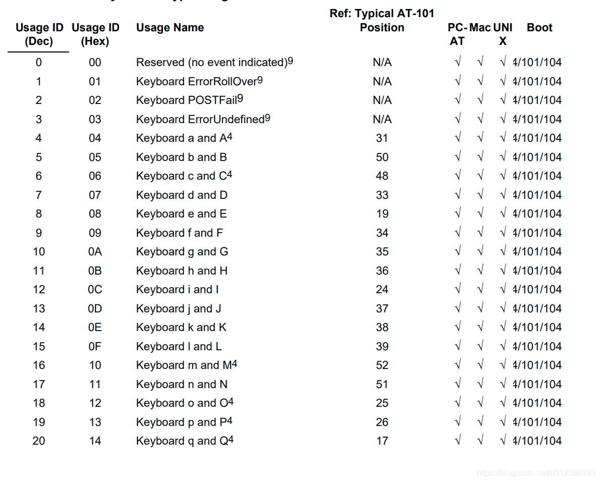
USB协议中HID设备描述符以及键盘按键值对应编码表
![自定义JSP[if,foreach,数据,select]标签](/img/a2/fc75c182d572d86f4466323e31d6c3.png)
自定义JSP[if,foreach,数据,select]标签

解决STC8G1K08程序不能运行的问题和端口配置

matlab数据类型 —— 字符型

墨者学院-X-Forwarded-For注入漏洞实战
Basic introduction to C program structure Preview

ArcGIS 镶嵌数据集切片丢失问题处理

【Vscode】预览md文件

史上最难618,TCL夺得电视行业京东和天猫份额双第一

How to convert an old keyboard into a USB keyboard and program it yourself?
随机推荐
3-wire SPI screen driving mode
The most difficult 618 in history, TCL won the first place in both jd.com and tmall.com shares in the TV industry
墨者学院-X-Forwarded-For注入漏洞实战
ESP32-SOLO开发教程,解决CONFIG_FREERTOS_UNICORE问题
Esp32-solo development tutorial to solve config_ FREERTOS_ UNICORE problem
Bootstrapblazor + FreeSQL actual combat chart usage (2)
How to use ch423? Cheap domestic IO expansion chip
2022年地理信息系统与遥感专业就业前景与升学高校排名选择
Hid device descriptor and keyboard key value corresponding coding table in USB protocol
MATLAB data type - character type
Custom MVC (imported into jar package) + difference from three-tier architecture + reflection + interview questions
直播回顾 | 子芽&CCF TF:云原生场景下软件供应链风险治理技术浅谈
Lwip之定时机制
05 | standard design (Part 2): how to standardize the different styles of commit information, which are difficult to read?
05 | 規範設計(下):commit 信息風格迥异、難以閱讀,如何規範?
Operating instructions and Q & A of cec-i China learning machine
About Random Numbers
buuctf-pwn write-ups (6)
解决unable to create a folder to save the sketch: mkdir sketch
Lambda表达式