“ my dear friend , I heard you wrote a lot of pages , I have a page here , How much code do you think you need ?”
“ Let me see , It's OK , It's just a query table , Now we all use it ProComponent 了 , Use that to write fast . I think , almost 200 OK, it's OK .”
“ Well , That's true. , Official secondary packaging component library ,200 Is that all right ? Um. , Sure . wait , Whether the code you said contains the operation buttons ?”
“ Operate the button ? It refers to the 【 newly added 】【 details 】 Are these buttons ?”
“ Yeah .”
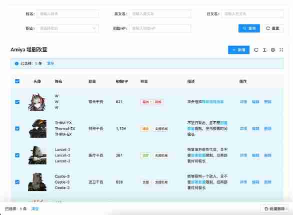
“ What does it look like after ordering , You didn't show me !”
“ Oh , It looks like this .”

“ Oh ~ It's like this , That's simple , It's just a pop-up form , Hang on and add 100 All right .”
“ that 【 Delete 】 Well ?”

“ Is this .10 OK, that's it .”
“ ha-ha , Don't worry , And batch deletion !”

“ Oh oh , It's not too hard , Most of the forms come with them Api, After deleting and refreshing the form request, you are done . Just record the options , Give me another 10 OK, I think it's almost done . But I think after you check it , There is also a bar at the bottom of the page , hold 【 Batch deletion 】 There's the button , I little interesting , But it's not that hard , Add another 20 OK, I think it's almost done .”
“ ha-ha , Yes , I calculate , It's almost 340 Come on .”
“ Yeah , Writing such a page , This amount of code is normal .”
“ If you turn the page , Keep the options of the previous page ?”
“ This one , How can anyone do this now , These are off the shelf components , You don't think it's troublesome. I think it's troublesome , And it's not necessary , Who CARES for .”
“ Just tell me if you can !”
“ You are looking for fault on purpose, aren't you ! Besides , It's not difficult. ,antd The table does not have a preserveSelectedRowKeys Attribute , I think it can be realized with that , Or listen to the table selection event , Just save a variable . Really not line , Just click the page to delete it , Not much trouble .”
“ Say so , It's really not necessary , But I think it's better , If you want to delete more than one , Every time you delete it, you need to delete it several times , And after deleting , The data is gone , The data on the second page will run to the first page , Will worry about whether they will delete the wrong .”
“ That's OK , As long as you're not tired , Just write . I don't think so , If you really want to do , Use that api Just fine , At best, add another one 20 All right .”
“ Oh ! by the way , I forgot to say , When this number is suspended, you can see the options .”

“... You played pretty well , The data all have , Create a Popover Set it up , It's OK .”
“ Yes , In this case , Is almost 400 Let's go .”
“ Um. , You need more , Almost almost .”
“ ha-ha , I spent a total of... On this page 134 Line code , You think it's possible
“??? How did you do it , Show me .“
“ I took a look , interesting , This component uses a large json, The configuration is passed in, right , This kind of package is quite common .”
“ Yes , You see, this is one of the clips , Top of table query , Just specify search: true That's all right. .”
{
  title: ' English name ',
  key: 'en'
  search: true
}
“ It's like this , I can see that there is placeholder ah , I didn't see you pass it in .”
“ Oh , That is automatically generated , Like here , Will generate " Please enter the English name ".”
“ What if you want to customize ?”
“ Of course , It needs to be written like this .”
{
  title: ' English name ',
  key: 'en'
  search: {
    placeholder: ' Please enter the English name '
  }
}
“ Oh ~ This can also be an object, right , What if there is a selection box above ?”
“ Also simple , add to options and type: 'select' That's all right. .”
{
  title: ' occupation ',
  key: 'class',
  type: 'select',
  options: [
    { label: ' Guards ', value: '1' },
    { label: ' Sniper ', value: '2' },
    { label: ' The magician reloads ', value: '3' },
    { label: ' Medical Officer ', value: '4' },
    { label: ' Reload the operator ', value: '5' },
    { label: ' Assistant ', value: '6' },
    { label: ' Special agents ', value: '7' },
    { label: ' Pioneer ', value: '8' }
  ],
  search: true
}
“ You this options and type Why not put it in search In the object ?”
“ ha-ha , You don't know , Because if it's written like this , Tables can also be configured with this , Written in search Words in the object , You can only query the region for your own use .”
“ Tables can also be configured with this ? What is the use of these two forms .”
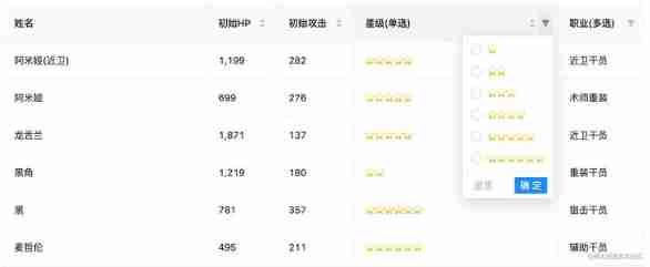
“ This column of the table , Can pass options translate , Suppose the data is a 1, Then this column will be based on options To find this label, This is the corresponding label yes Guards , So what the page shows is Guards . In addition, if the table has a filter , add to filter: true There will be a filter .”

“ Sure , It's very convenient , that type Well ? You can't use this form .”
“ Yes , This is the case. , It's for dialog Pop up editor used . In this way, a selection box can be displayed in the pop-up window .”
{
  title: ' occupation ',
  key: 'class',
  type: 'select',
  options: [
    { label: ' Guards ', value: '1' },
    { label: ' Sniper ', value: '2' },
    { label: ' The magician reloads ', value: '3' },
    { label: ' Medical Officer ', value: '4' },
    { label: ' Reload the operator ', value: '5' },
    { label: ' Assistant ', value: '6' },
    { label: ' Special agents ', value: '7' },
    { label: ' Pioneer ', value: '8' }
  ],
  search: true,
+ dialog: true
}
“ Oh oh ! got it , It specifies dialog: true after , It will be displayed in the pop-up window .”
“ Yes , If it is only displayed in the pop-up window , And the table doesn't show ?”
“ That can be done like this . Appoint table: false That's all right. .”
{
  title: ' occupation ',
  key: 'class',
  type: 'select',
  options: [
    { label: ' Guards ', value: '1' },
    { label: ' Sniper ', value: '2' },
    { label: ' The magician reloads ', value: '3' },
    { label: ' Medical Officer ', value: '4' },
    { label: ' Reload the operator ', value: '5' },
    { label: ' Assistant ', value: '6' },
    { label: ' Special agents ', value: '7' },
    { label: ' Pioneer ', value: '8' }
  ],
  dialog: true,
+ table: false
}
“ got it . This is a pop-up window 、 form 、 The query is mixed together , by the way , Why don't I see the new code to open the pop-up window ?”
“ Well , That requires a little more code . hold addApi Pass in as a request interface , Reassign action="add" Just fine ?”
<AySearchTable
  title="Amiya  Additions and deletions "
  dialogFormExtend={{
    fields: fields,
    addApi
  }}
>
  <AyAction action="add"> newly added </AyAction>
</AySearchTable>
“ It can also ? Why? ? It's so hard that you don't need to listen for button click events , Then control the pop-up display , Then request the interface , After that, close the pop-up window to refresh the page ?”
“ Yes , It is assumed that the pop-up window and the table share the same configuration by default , And most of the pop-up windows are the same , So I encapsulated all the operations , That's all that's left . Of course, if it's too complicated , Or there is no common column with the table , Just define another 'fields: dialogFields', Completely separate from the table fields, Use your own .”
“ Oh oh , Can you can , Then I understand , The same is true of revision .”
“ Yes , When editing , There will be default values ? At this time, we put record Pass in , As the default value of the form .”
const ctrl: AyTableCtrlField = {
  render: (value: string, record: Record) => {
    return (
      <AyCtrl>
        <AyAction record={record} action="update">
           edit
        </AyAction>
      </AyCtrl>
    )
  }
}

<AySearchTable
  title="Amiya  Additions and deletions "
  dialogFormExtend={{
    fields: fields,
    addApi
  }}
/>
“ Sure , Sure ! This component turns common operations into instructions .”
“ Yes , If your details require a request interface , Then there is no need for record 了 , Delete it and change it to detailApi and detailParams, They are the requested interface and the requested parameters ,action="view" The command will automatically return the requested data , As the default value of the form after the pop-up window is opened .”
<AyAction detailParams={record.sort_id} detailApi={detailApi} action="view"> details </AyAction>“ got it , Very good ! By the way, you just said that paging was deleted , Is it easy to use this component ?”
“ Yes , Let me show you , This is a few more steps , First step , To add selectionType="checkbox" Turn on tick ; The second step , add to selectShowKey="cn", Use it to decide which name to display when the bubble is suspended , And use tag The label wraps , because tag Tags can be deleted , In this way, you can also click tag On the label X, To cancel the option , There is no need to turn to the previous page to cancel the selection ; The third step , Add... To the delete button action="delete" attribute , Add to batch delete action="batch-delete" attribute , Add on label deleteApi={deleteApi} Interface , You can finish deleting and batch deleting .”
const ctrl: AyTableCtrlField = {
  render: (value: string, record: Record) => {
    return (
      <AyCtrl>
        <AyAction record={record} action="delete">
           Delete
        </AyAction>
      </AyCtrl>
    )
  }
}

<AySearchTable
  title="Amiya  Additions and deletions "
  selectionType="checkbox"
  rowKey="sort_id"
  ctrl={ctrl}
  selectShowKey="cn"
  deleteApi={deleteApi}
>
  <AyAction action="batch-delete"> Batch deletion </AyAction>
</AySearchTable>
“ Oh oh , Is that all right ? That's quite convenient , After all, you don't need to write a lot of code to write . by the way , I just looked at the code , The above is a renderType: 'html', What is the function of this .”
{
  title: ' describe ',
  key: 'feature',
  width: 200,
  renderType: 'html'
}
“ Guess what ?”
“ Render this column as html And so on. ?”
“ Is ah , besides , also unitdatetimestate And so on , You can look at this .”
“ Sure , What if I don't have any of them ?”
“ Just waiting for you to ask , It seems that you have used other secondary packaging , This component provides two ways , The first can specify render Method .”
{
  title: ' full name ',
  key: 'cn',
  search: true,
  dialog: {
    required: true
  },
  table: {
    //  Render custom content
    render: (text: string, record: Record) => {
      return (
        <div>
          <div>{record.cn}</div>
          <div>{record.en}</div>
          <div>{record.jp}</div>
        </div>
      )
    }
  }
},
“ The second kind , You can register globally , After registering , Can be like renderType: 'star' This way, use .”
import { registerTableRender, RenderProps } from 'amiya'

/**
 * @decs  register  renderType
 * @param renderTypeName string  Registration type name
 * @param text string  At present  col  The data of
 * @param record object  At present  row  The data of
 * @param field  Current configuration items
 *
 * @returns ReactNode
 */
registerTableRender('renderTypeName', ({ text, record, field }: RenderProps) => {
  return <span>{text}</span>
})

//  The actual use
const fields = [
  {
    renderType: 'renderTypeName' //  Registered name
  }
]“ good heavens , This is direct to me render It doesn't make any difference , But use the registration method , hold render Written in other public places , It really makes the current page Cleaner .”
“ Yes , Two ways to choose freely . Look at it like this , You see , Does it save a lot of code , If you use jsx Grammar sugar will be more economical , That only needs 90 Line code .”
“ Yeah , The other secondary packaging I have seen is the lack of this , Use both json, When used, there is a large blank space on the right side of the editor , The code is too long , Very uncomfortable , I like your way of writing , I advise them , They don't listen , It's so easy to control .”
 <AyFields>
   <AyField
     title=" Head portrait "
     key="icon"
     width={80}
     align="center"
     renderType="image"
   />
   <AyField title=" full name " key="cn" search />
   <AyField title=" English name " key="en" search dialog table={false} />
   {// ...}
 </AyFields>
“ What a saving , I haven't seen anything like this , however , This component encapsulates so much , Can others use it ? Do you understand ?”
“ exactly , If there is no introduction , No one understands . So this component supports complete TypeScript Tips , Documentation is also prepared , The usage of tables is introduced in detail , Look at the pile of menus on the left , They are all introducing tables api Of .”

“ and , There are also full page level examples , It can also be used as a reference .”
“ I saw the , This is a secondary package component library , I think there are other components , Let me look back and experience it .”
“ well , Waiting for your news .”


