当前位置:网站首页>Matplotlib swordsman line - first acquaintance with Matplotlib
Matplotlib swordsman line - first acquaintance with Matplotlib
2022-07-02 09:13:00 【Qigui】
Individuality signature : The most important part of the whole building is the foundation , The foundation is unstable , The earth trembled and the mountains swayed . And to learn technology, we should lay a solid foundation , Pay attention to me , Take you to firm the foundation of the neighborhood of each plate .
Blog home page : Qigui's blog
Included column :Python The Jianghu cloud of the three swordsmen
From the south to the North , Don't miss it , Miss this article ,“ wonderful ” May miss you yo
Triple attack( Three strikes in a row ):Comment,Like and Collect—>Attention
List of articles
Matplotlib brief introduction
know Matlpotlib
- Matplotlib yes Python Of 2D Drawing library , It makes it easy for users to graph data , And provide a variety of output formats .
- Matplotlib It can be used to draw all kinds of static , dynamic , Interactive charts , We know Seaborn,Pandas The drawing interface is also based on Matplotlib More advanced packaging .
- Matplotlib It's a very powerful one Python drawing tools , We can use this tool to present a lot of data more intuitively in the form of charts .
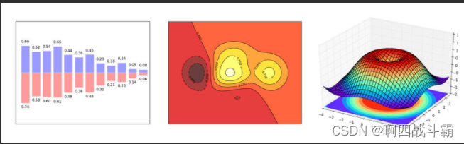
- Matplotlib You can draw a line diagram 、 Scatter plot 、 Contour map 、 Bar chart 、 Histogram 、3D graphics 、 Even graphic animation and so on .
install Matplotlib library
- Use pip
pip install matplotlib
- Use conda
conda install matplotlib
- Install the official version
https://matplotlib.org/stable/users/installing/index.html
Take a simple chestnut
- introduce Matplotlib And named it plt, Note that this introduces matplotlib.pyplot Instead of introducing matplotlib.
- Matplotlib The image is drawn on figure( Such as windows,jupyter forms ) Upper , every last figure It also contains one or more axes( A sub region that can specify a coordinate system ).
- Simplest creation figure as well as axes The way is through pyplot.subplots command , establish axes in the future , have access to Axes.plot Draw the simplest line chart .
import matplotlib.pyplot as plt
import numpy as np

x = np.linspace(0, 2 * np.pi, 200)
y = np.sin(x)

fig, ax = plt.subplots()
ax.plot(x, y)
plt.show()
Output graph :
Matplotlib Chart window
- Matplotlib → One python Version of matlab Drawing interface , With 2D Mainly , Support python、numpy、pandas Basic data structure , Efficient operation and rich chart Library .
import numpy as np
import pandas as pd
import matplotlib.pyplot as plt
# This show() The main method is to display the drawn graphics , When we finish drawing the figure , You can call this method .
# Chart window 1 → plt.show()
plt.plot(np.random.rand(10))
plt.show()
# Directly generate charts
# Chart window 2 → Magical function , Embed chart
# adopt Jupyter My magic command %matplotlib inline Can be directly in jupyter notebook Show the chart in , You don't need to use every chart plt.show() To show
% matplotlib inline
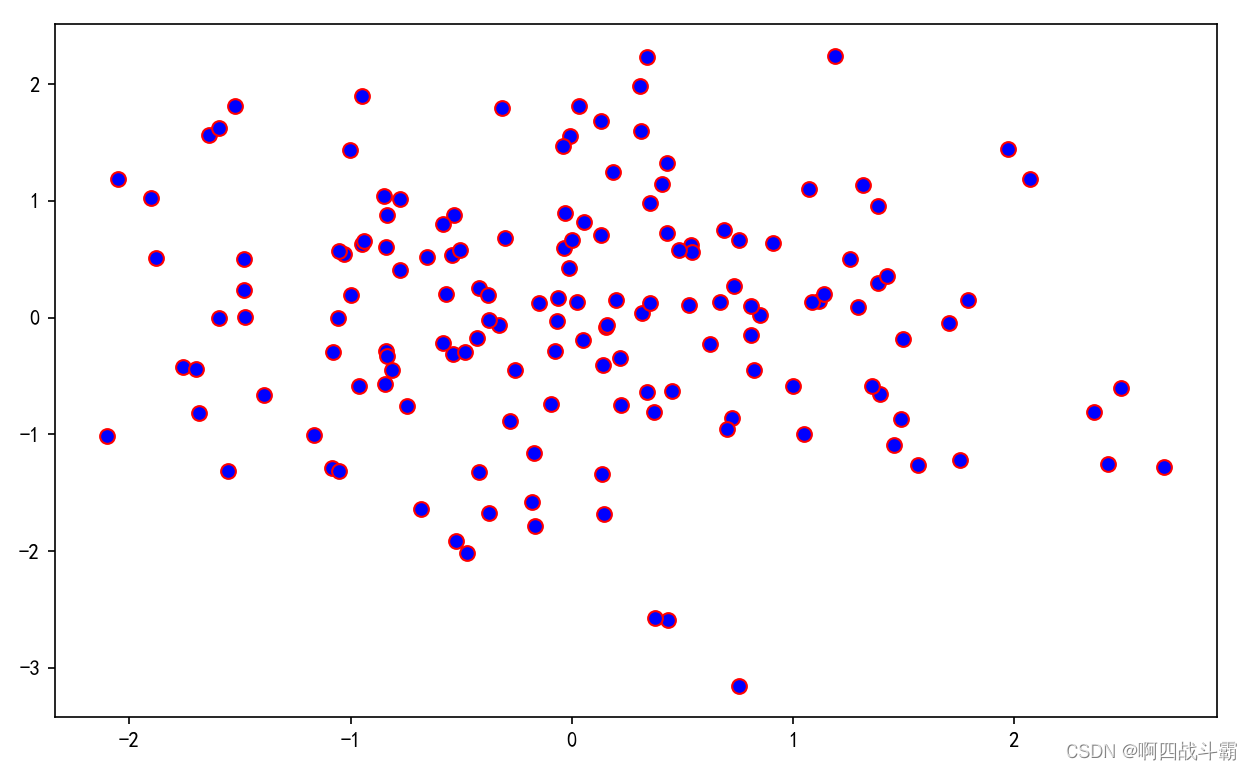
x = np.random.randn(1000)
y = np.random.randn(1000)
plt.scatter(x,y)
# Directly embedded in the chart , no need plt.show()
# <matplotlib.collections.PathCollection at ...> Represents the chart object
# Chart window 3 → Magical function , Pop up interactive matplotlib window
% matplotlib notebook
s = pd.Series(np.random.randn(100))
s.plot(style = 'k--o',figsize=(10,5))
# Interconvertible matplotlib window , no need plt.show()
# It can be adjusted
# Chart window 4 → Magical function , eject matplotlib Console
% matplotlib qt5
df = pd.DataFrame(np.random.rand(50,2),columns=['A','B'])
df.hist(figsize=(12,5),color='g',alpha=0.8)
# Interactive console
# If the display mode has been set ( such as notebook), You need to restart and then run the magic function
# Interactive Windows Embedded in web pages and Console , Only one
#plt.close()
# close window
#plt.gcf().clear()
# Empty the contents of the chart every time
Part of the diagram
A complete matplotlib Images usually include the following four levels , These layers are also called containers (container)
- Figure: Top level , To hold all drawing elements
- Axes:matplotlib The core of the universe , Contains a large number of elements to construct a subgraph , One figure It can be composed of one or more subgraphs
- Axis:axes The subordinate level of , It's used to deal with all coordinates and axes , Grid related elements
- Tick:axis The subordinate level of , It's used to deal with all the elements related to the scale
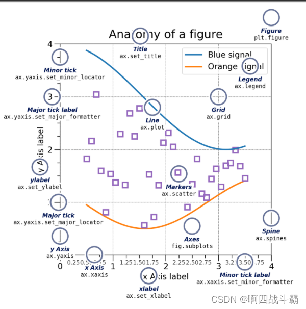
Figure
The easiest way to create a new drawing is to use pyplot:
- adopt plt.subplot() Command to create Figure and Axes
- axes Is the coordinate system of the drawing
- figure Is the drawing window
fig = plt.figure()  #  An empty figure without an axis
fig, ax = plt.subplots()  #  Uniaxial graph , Create one that contains a axes Of figure
fig, axs = plt.subplots(2, 2)  #  have 2x2 Graph of axis grid
Axes
Axis object ( Pay attention to differences stay Axes and Axis ) Provide scales and scale labels Provide the scale for the data in the axis . Every Axes also Yes :
- A title ( By setting set_title())
- One x label ( By setting set_xlabel())
- One y The tag set passes set_ylabel()).
Axis
These objects set scales and limits and generate scales ( Mark On shaft ) And scale labels ( String marking the scale ).
Artist
Everything visible on the picture is an artist ( even to the extent that Figure, Axes, and Axis object ). When the graph is rendered , be-all Artists are canvas . Most artists are tied to a shaft ; In this way Artists cannot be shared by multiple axes , Nor can it move from one axis to another .
Input type of drawing function
numpy.array or numpy.asarray
- Drawing function expectation numpy.array perhaps numpy.ma.masked_array As Input , Or it can be passed to the object numpy.asarray. A class similar to an array ,
- for example pandas Data objects and numpy.matrix May not work as expected . The common agreement is to convert these into numpy.array Objects before painting .
- for example , To convert a numpy.matrix. The code is as follows :
b = np.matrix([[1, 2], [3, 4]])
b_asarray = np.asarray(b)
dict 、 numpy.recarray, or pandas.DataFrame
- Most methods will also resolve addressable objects , for example dict 、 numpy.recarray, or pandas.DataFrame. Matplotlib Allow this data Keyword parameters and generate a graph of passing strings Corresponding to x and y Variable .
np.random.seed(19680801)  # seed the random number generator.
data = {
    'a': np.arange(50),
        'c': np.random.randint(0, 50, 50),
        'd': np.random.randn(50)}
data['b'] = data['a'] + 10 * np.random.randn(50)
data['d'] = np.abs(data['d']) * 100

fig, ax = plt.subplots(figsize=(5, 2.7))
ax.scatter('a', 'b', c='c', s='d', data=data)
ax.set_xlabel('entry a')
ax.set_ylabel('entry b');
Two drawing interfaces
OO style
- Create graphics explicitly (figure) And axis (axes), And call methods on them , Also known as OO Pattern (object-oriented style)
- adopt plt.subplot() Command to create Figure and Axes, And then to axes Data binding
x = np.linspace(0, 2, 100)  #  Sample data

#  Be careful , Even in OO In style , We also use it 'pyplot.figure' To create a drawing
fig, ax = plt.subplots(figsize=(5, 2.7))
ax.plot(x, x, label='linear')  #  stay x,y Draw some data on the axis
ax.plot(x, x**2, label='quadratic')  #  stay x,y Draw more data on the axis
ax.plot(x, x**3, label='cubic')  #  There are more
ax.set_xlabel('x label')  #  take x Add labels to the shaft
ax.set_ylabel('y label')  #  take y Add labels to the shaft
ax.set_title("Simple Plot")  #  Add title to axis
ax.legend();  #  Add a legend
Output graph :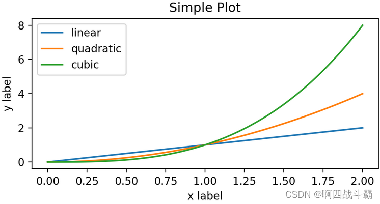
pyplot style
- rely on pyplot Automatically create and manage figure and axes, And the use of pyplot Function to plot
- There is also a simpler way to create ,matplotlib.pyplot Methods can be used directly in the current axes Draw an image on , If the user does not specify axes,matplotlib Will help you automatically create a .
x = np.linspace(0, 2, 100)  #  Sample data

plt.figure(figsize=(5, 2.7))
plt.plot(x, x, label='linear')  #  stay x,y Draw some data on the axis .
plt.plot(x, x**2, label='quadratic')  # etc.
plt.plot(x, x**3, label='cubic')
plt.xlabel('x label')
plt.ylabel('y label')
plt.title("Simple Plot")
plt.legend();
Output graph :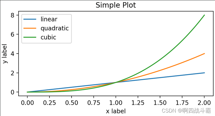
General drawing template
OO Drawing template
import matplotlib.pyplot as plt
import numpy as np

# 1  Prepare the data
x = np.linspace(0, 2, 100)
y = x**2

# 2  Set the drawing style , This step is not necessary , The style can also be set in the drawing image
mpl.rc('lines', linewidth=4, linestyle='-.')

# 3  Define the layout
fig, ax = plt.subplots()

# 4  The plot
ax.plot(x, y, label='linear')

# 5  Add tags , Text and legend
ax.set_xlabel('x label')
ax.set_ylabel('y label')
ax.set_title("Simple Plot")
ax.legend()
Output graph :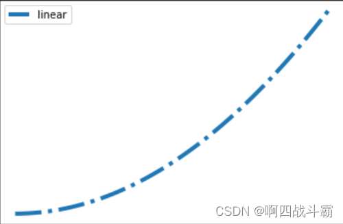
pyplot Drawing template
import matplotlib.pyplot as plt
import numpy as np

# 1  Prepare the data
x = np.linspace(-3, 3, 50)
y1 = 2*x + 1
y2 = x**2

# 2  Define the image window
plt.figure(num=3, figsize=(8, 5))

# 3  drawing
plt.plot(x, y2)
plt.plot(x, y1, color='red', linewidth=1.0, linestyle='--')

# 4  Define the coordinate axis range and name
plt.xlim((-1, 2))
plt.ylim((-2, 3))
plt.xlabel('I am x')
plt.ylabel('I am y')

# 5  Define axis scale and name
new_ticks = np.linspace(-1, 2, 5)
plt.xticks(new_ticks)
plt.yticks([-2, -1.8, -1, 1.22, 3],[r'$really\ bad$', r'$bad$', r'$normal$', r'$good$', r'$really\ good$'])

# 6  Set the image border color
ax = plt.gca()
ax.spines['right'].set_color('none')
ax.spines['top'].set_color('none')

# 7  Adjust the scale and border position
ax.xaxis.set_ticks_position('bottom')
ax.spines['bottom'].set_position(('data', 0))
ax.yaxis.set_ticks_position('left')
ax.spines['left'].set_position(('data',0))
plt.show()
边栏推荐
- NPOI 导出Word 字号对应
- Right click menu of QT
- C # save web pages as pictures (using WebBrowser)
- [staff] time sign and note duration (full note | half note | quarter note | eighth note | sixteenth note | thirty second note)
- Webflux responsive programming
- Chrome用户脚本管理器-Tampermonkey 油猴
- Chrome浏览器插件-Fatkun安装和介绍
- Oracle 相关统计
- QT drag event
- 2022/2/13 summary
猜你喜欢
Multi version concurrency control mvcc of MySQL
![[go practical basis] how to install and use gin](/img/0d/3e899bf69abf4e8cb7e6a0afa075a9.png)
[go practical basis] how to install and use gin

What is the future value of fluorite mine of karaqin Xinbao Mining Co., Ltd. under zhongang mining?
Ora-12514 problem solving method
Complete solution of servlet: inheritance relationship, life cycle, container, request forwarding and redirection, etc
Matplotlib剑客行——没有工具用代码也能画图的造型师
The channel cannot be viewed when the queue manager is running

《统计学习方法》——第五章、决策树模型与学习(上)

西瓜书--第六章.支持向量机(SVM)
将一串数字顺序后移
随机推荐
Gocv boundary fill
Oracle delete tablespace and user
Analysis and solution of a classical Joseph problem
Right click menu of QT
使用递归函数求解字符串的逆置问题
Watermelon book -- Chapter 6 Support vector machine (SVM)
Move a string of numbers backward in sequence
AMQ6126问题解决思路
Redis安装部署(Windows/Linux)
C call system sound beep~
C# 高德地图 根据经纬度获取地址
Watermelon book -- Chapter 5 neural network
[go practical basis] how to install and use gin
十年开发经验的程序员告诉你,你还缺少哪些核心竞争力?
How to realize asynchronous programming in a synchronous way?
Sentinel reports failed to fetch metric connection timeout and connection rejection
西瓜书--第五章.神经网络
别找了,Chrome浏览器必装插件都在这了
Npoi export word font size correspondence
Data type case of machine learning -- using data to distinguish men and women based on Naive Bayesian method