当前位置:网站首页>Detailed explanation of use scenarios and functions of polar coordinate sector diagram
Detailed explanation of use scenarios and functions of polar coordinate sector diagram
2022-07-05 16:36:00 【Desai smart number visual interactive platform】
Polar charts can be displayed very intuitively Cube , In this way, you can see at a glance which variables have similar values 、 Variables and outliers of variables can be displayed intuitively . The polar chart is suitable for viewing those variables with high or low scores in the data set , Can well show the differences between the data , Show the key features of multiple data sets , And the comparison of values . It is generally applicable to the value of multiple data in multiple dimensions .
Polar charts are not suitable for data with many kinds of data , It seems that the graphics will look bloated , Make the graphics more chaotic , This will reduce readability , As a result, the data cannot be seen at a glance .
Next, let me talk about Intelligent visualization platform The polar coordinate fan diagram in the large screen ” Applicable scenarios and functions of components , The following large screen is the template large screen of this platform , among “ Average salary of different degrees ” The polar sector chart component of the histogram is used .

This time, we will mainly focus on the usage scenarios and applicable scenarios of components , Polar sector graph belongs to the classification of histogram , We can find the polar sector graph by expanding the histogram , Click or drag to add components to the large screen .
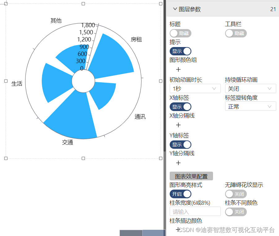
The default effect of polar sector diagram is shown in the following figure , You can see that the polar sector chart supports many personalized settings .
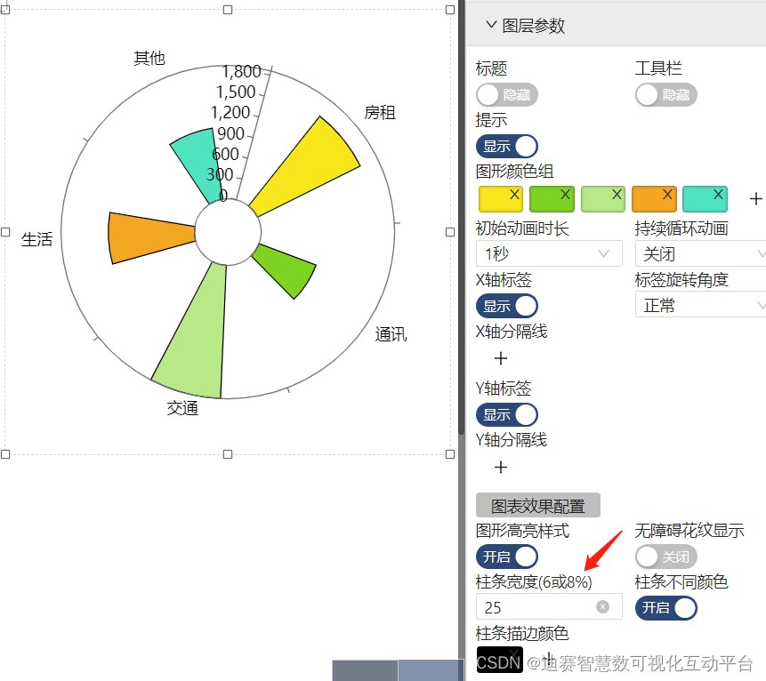
When using this component , We want every data set to have its own characteristics , At this time, we can refer to the graphic color group to add different colors to achieve the distinction between different data , This also facilitates the observation of data , monitoring .
Click... In the graphic color group ”+” No. add different colors , I want every data set to have different colors , The premise is that “ Different colors of columns ” The switch is on , In this way, the color distinction between different data can be achieved .
Similarly, if you want to make the data component display more obvious , Data differentiation is more obvious , You can also set the stroke color of the column bar .
The effect of setting is shown in the following figure :

When there are too many datasets , At this time, you can choose to adjust the width of the column , So that when there are too many data sets, they don't look so bloated .
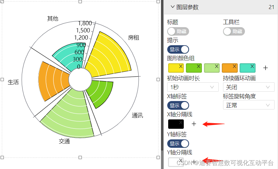
When it is necessary to strictly distinguish the data sets of each part , You can add X The dividing line of the axis , Add color .
When it is necessary to show each scale in each data set more intuitively , Then you can add Y The dividing line of the axis , Add color .
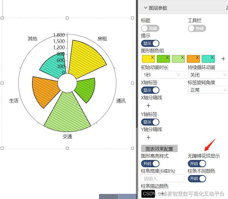
When using components , When there is color perception disorder , At this time, you can open “ Barrier free pattern display switch ”, The effect is shown below .
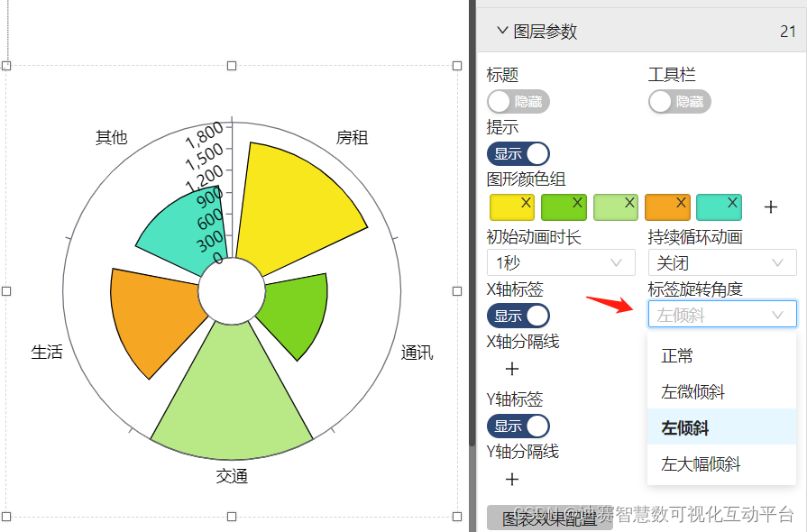
If the position of the scale label of the component is not satisfactory, or overlaps with a sector , At this time, you can choose to adjust the label scale position .
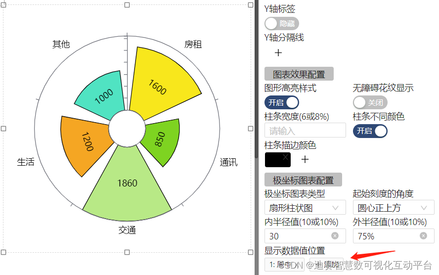
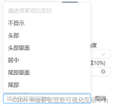
If you don't want to observe through the scale label , Want to more intuitively view the size of data from the legend , At this time, you can add it to the desired location by displaying the location of the data .
Available 5 Personalize your settings in places
Each component has its own applicable scenario , You can use rich imagination , To create the large screen you want , Applying the right components will be complicated Data reports simplify , Let the data meet ” speak ”. As long as the large screen components are used reasonably , You can easily Data visualization , You can log in to the official website of the platform to view the operation function guidance .
边栏推荐
- Cartoon: what is the eight queens problem?
- ES6 drill down - ES6 generator function
- [vulnerability warning] cve-2022-26134 conflict Remote Code Execution Vulnerability POC verification and repair process
- 漫画:什么是蓝绿部署?
- 迁移/home分区
- 如何将mysql卸载干净
- How to set the WiFi password of the router on the computer
- ES6深入—async 函数 与 Symbol 类型
- Cs231n notes (top) - applicable to 0 Foundation
- 普洛斯数据中心发布DC Brain系统,科技赋能智慧化运营管理
猜你喜欢
【深度学习】深度学习如何影响运筹学?
数据湖(十四):Spark与Iceberg整合查询操作
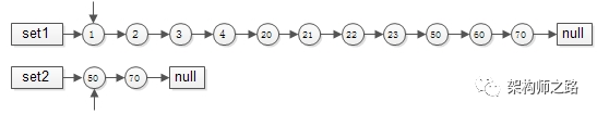
Summary of methods for finding intersection of ordered linked list sets
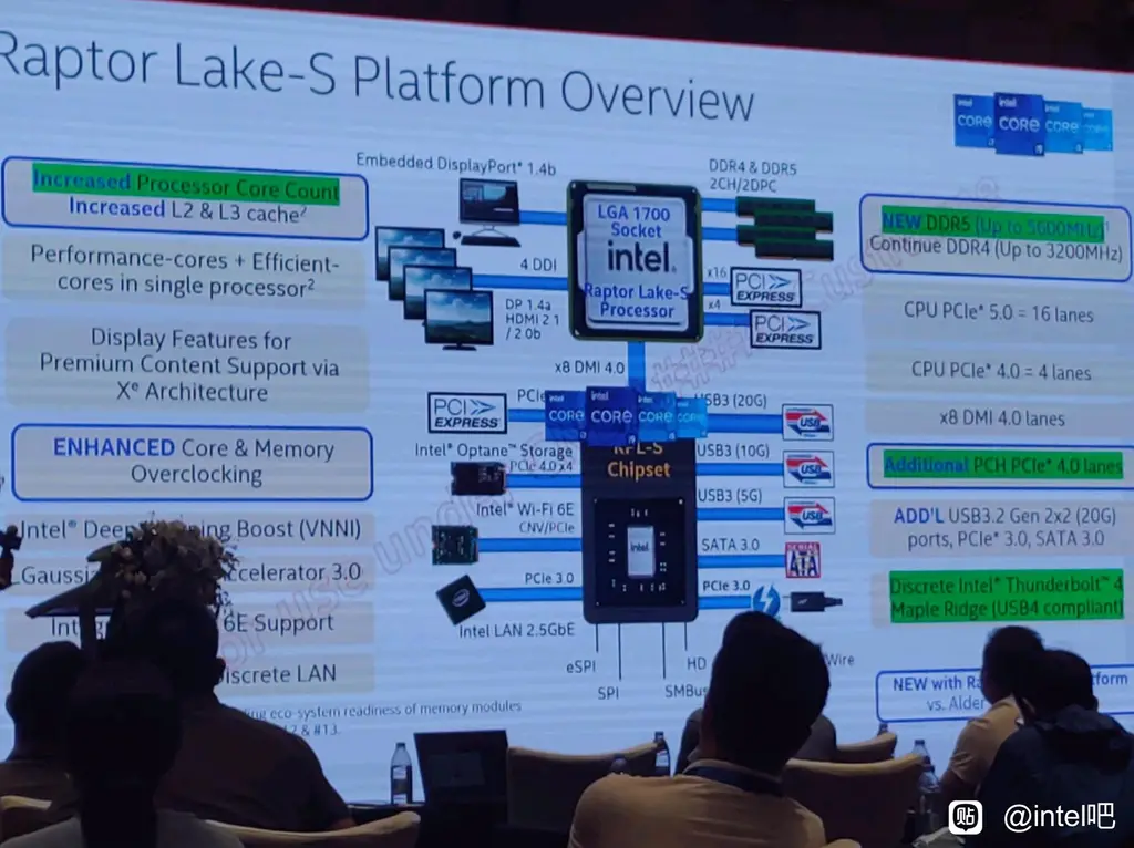
Intel 13th generation Raptor Lake processor information exposure: more cores, larger cache
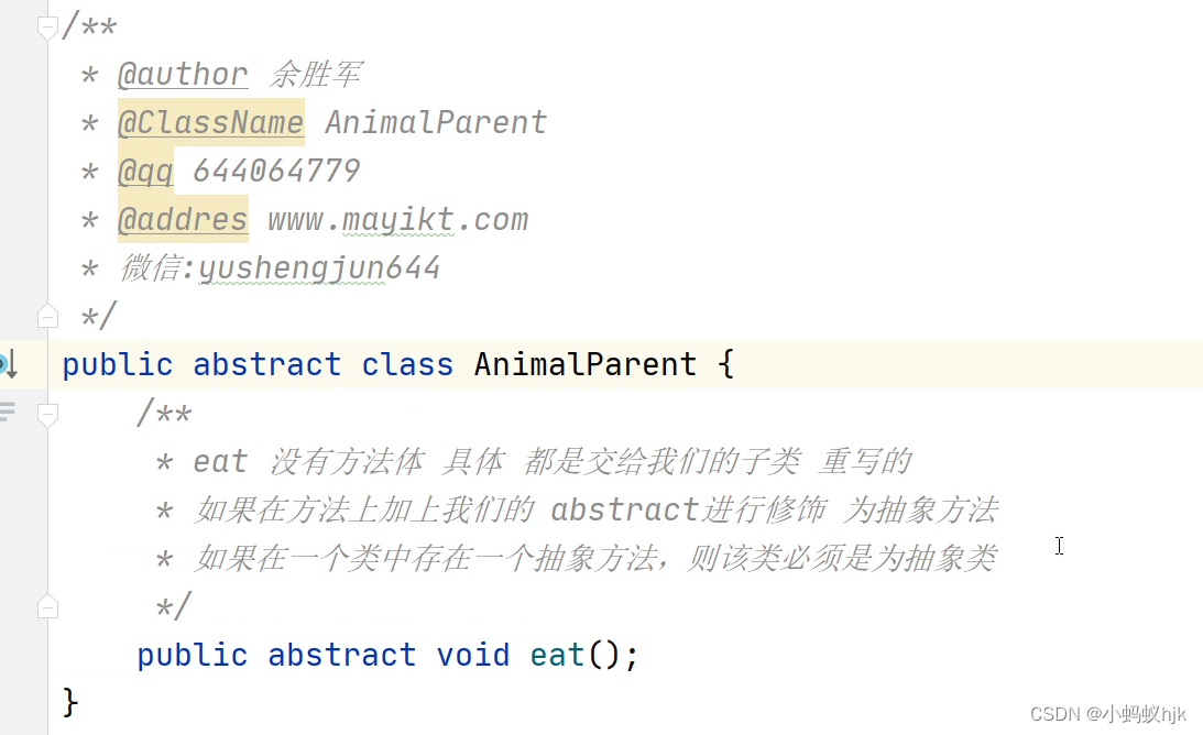
Subclasses and superclasses of abstract classes
ES6 deep - ES6 class class

迁移/home分区
Flet教程之 09 NavigationRail 基础入门(教程含源码)
list去重并统计个数
![[Netease Yunxin] research and practice of super-resolution technology in the field of real-time audio and video](/img/69/3aedcdafb2b4e83087dc1ce593dc38.png)
[Netease Yunxin] research and practice of super-resolution technology in the field of real-time audio and video
随机推荐
Cartoon: what is the eight queens problem?
【学术相关】多位博士毕业去了三四流高校,目前惨不忍睹……
Starkware: to build ZK "universe"
Cartoon: what is blue-green deployment?
单商户 V4.4,初心未变,实力依旧!
践行自主可控3.0,真正开创中国人自己的开源事业
The new version of effect editor is online! 3D rendering, labeling, and animation, this time an editor is enough
yarn 常用命令
Cheer yourself up
Research and development efficiency measurement index composition and efficiency measurement methodology
The difference between abstract classes and interfaces
公司自用的国产API管理神器
One click installation script enables rapid deployment of graylog server 4.2.10 stand-alone version
Relationship between objects and classes
How to use FRP intranet penetration +teamviewer to quickly connect to the intranet host at home when mobile office
Seaborn绘制11个柱状图
Transaction rollback exception
Data Lake (XIV): spark and iceberg integrated query operation
Exception com alibaba. fastjson. JSONException: not match : - =
The list set is summed up according to a certain attribute of the object, the maximum value, etc