当前位置:网站首页>Tablayout usage details (modify text size, underline style, etc.)
Tablayout usage details (modify text size, underline style, etc.)
2022-06-10 13:30:00 【yechaoa】
Catalog
Select by default or specify that
The underline width is equal to the text
effect :
This is how the official website introduces :
TabLayout provides a horizontal layout to display tabs. ( Horizontal tab )
rely on :
implementation 'com.google.android.material:material:1.2.1'Code mode :
TabLayout tabLayout = ...;
 tabLayout.addTab(tabLayout.newTab().setText("Tab 1"));
 tabLayout.addTab(tabLayout.newTab().setText("Tab 2"));
tabLayout.addTab(tabLayout.newTab().setText("Tab 3"));XML The way :
 <android.support.design.widget.TabLayout
         android:layout_height="wrap_content"
         android:layout_width="match_parent">

     <android.support.design.widget.TabItem
             android:text="@string/tab_text"/>

     <android.support.design.widget.TabItem
             android:icon="@drawable/ic_android"/>

</android.support.design.widget.TabLayout>relation ViewPager:
<android.support.design.widget.TabLayout
        android:id="@+id/tab_layout"
        android:layout_width="match_parent"
        android:layout_height="wrap_content"
        android:background="@color/white"
        app:tabIndicatorColor="@color/red"
        app:tabMode="fixed"
        app:tabSelectedTextColor="@color/black"
        app:tabTextColor="@color/gray"/>

    <android.support.v4.view.ViewPager
        android:id="@+id/view_pager"
        android:layout_width="match_parent"
android:layout_height="wrap_content"/>Java Code :
mTabLayout = (TabLayout) findViewById(R.id.tab_layout);
mViewPager = (ViewPager) findViewById(R.id.view_pager);// Set up adapter
mViewPager.setAdapter(new SimpleFragmentPagerAdapter(getSupportFragmentManager()));
// relation viewpager
mTabLayout.setupWithViewPager(mViewPager);private class SimpleFragmentPagerAdapter extends FragmentPagerAdapter {
private String tabTitles[] = new String[]{"tab1", "tab2", "tab3"};
private Fragment[] mFragment = new Fragment[]{new Fragment1(), new Fragment2(), new Fragment3()};
private SimpleFragmentPagerAdapter(FragmentManager fm) {
super(fm);
}
@Override
public Fragment getItem(int position) {
return mFragment[position];
}
@Override
public int getCount() {
return mFragment.length;
}
@Override
public CharSequence getPageTitle(int position) {
return tabTitles[position];
}
}In this way, most of the requirements can be basically realized
Common properties :
- app:tabIndicatorColor="@color/red" The color of the indicator
- app:tabIndicatorHeight The height of the indicator , Remove the indicator and set it directly 0dp
- app:tabMode="fixed" Display mode ,fixed Indicates that the display is divided equally ,scrollable The slide show
- app:tabSelectedTextColor="@color/black" Select the text color
- app:tabTextColor="@color/gray" Unselected text color
- app:tabMinWidth="50dp" Minimum width , Can be controlled tab Width , Including the width of the indicator
- app:tabMaxWidth="100dp" Maximum width
All attributes :
Advanced usage :
Set icon
mTabLayout.getTabAt(0).setIcon(R.mipmap.ic_launcher);Add listening
mTabLayout.addOnTabSelectedListener(new TabLayout.OnTabSelectedListener() {
            @Override
            public void onTabSelected(TabLayout.Tab tab) {
                // Choose
            }

            @Override
            public void onTabUnselected(TabLayout.Tab tab) {
                // Not selected
            }

            @Override
            public void onTabReselected(TabLayout.Tab tab) {
                // Checked again
            }
});Select by default or specify that
mTabLayout.getTabAt(position).select();relation ViewPager If yes, select Viewpager It's the same
mViewPager.setCurrentItem(position);Text size 、 style
app:tabTextAppearance="@style/MyTabLayout" <!--TabLayout font size -->
<style name="MyTabLayout">
<item name="android:textSize">20sp</item>
<item name="android:textStyle">bold</item>
<item name="android:textAllCaps">false</item>
</style>textAllCaps Set case The underline width is equal to the text
app:tabIndicatorFullWidth="false"Underline style
app:tabIndicator="@drawable/shape_tab_indicator"<?xml version="1.0" encoding="utf-8"?>
<layer-list xmlns:android="http://schemas.android.com/apk/res/android">
<item
android:width="15dp"
android:height="5dp"
android:gravity="center">
<shape>
<corners android:radius="5dp" />
<!--color Invalid , Source code tabIndicatorColor-->
<solid android:color="@color/colorPrimary" />
</shape>
</item>
</layer-list>Width 、 Height 、 Fillet, etc
Github:
边栏推荐
- Im instant messaging development: the underlying principle of process killed and app skills to deal with killed
- 常识,神经元数量,小鼠的脑内神经元大约在7000万个、人类约有860亿个
- How to configure multiple data sources
- 移动app性能测试有哪些需要进行?性能测试报告如何收费?
- 学籍管理系统
- QA of some high frequency problems in oauth2 learning
- Typescript introductory notes (personal)
- Application analysis of key recording and playing of wt2003h4-16s voice chip
- [spark] (task8) pipeline channel establishment in sparkml
- [deep learning] the credit card fraud anomaly detection based on the deep learning autoencoder is very effective
猜你喜欢
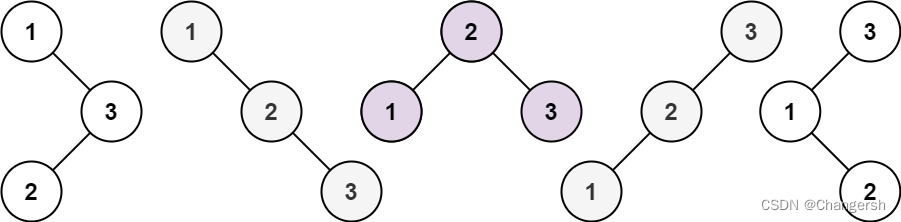
Leetcode 96. Different binary search trees

智慧校园安全通道及视频监控解决方案

3. web page development tool vs Code
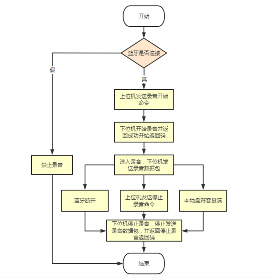
【无标题】音频蓝牙语音芯片,WT2605C-32N实时录音上传技术方案介绍

Ultra detailed ffmpeg installation and simple use tutorial

NanoMQ Newsletter 2022-05|v0.8.0 发布,新增 WebHook 拓展接口和连接认证 API

H. 265 introduction to coding principles
Leetcode 96. Différents arbres de recherche binaires

32、树莓派的简单测试串口通信和超声波模块测距
![buuctf [PHP]CVE-2019-11043](/img/ba/d97fe48acfd20daa66d47f34d99cf1.png)
buuctf [PHP]CVE-2019-11043
随机推荐
【深度学习】基于深度学习Autoencoder的信用卡欺诈异常检测,效果非常牛逼
Unity typewriter to automatically roll text to the bottom of the text box
Neuron Newsletter 2022 - 05 | ajout de 2 entraînements Sud et 1 Application Nord, mise en œuvre de l'extension personnalisée par Modbus TCP
Multithreading killer ---countdownlatch & cyclicbarrier
如果再写for循环,我就锤自己了
[spark] (task8) pipeline channel establishment in sparkml
Performance test plan (plan) template
Handling work ticket system
Shell Encyclopedia
Student status management system
【无标题】
Leetcode 96. Different binary search trees
Development trend of Web Development
mTabLayout. setOnTabSelectedListener is deprecated
12、 Process address space (PMAP; vdso; MMAP)
QA of some high frequency problems in oauth2 learning
'getWidth()' is deprecated,'getHeight()' is deprecated
[deep learning] the credit card fraud anomaly detection based on the deep learning autoencoder is very effective
Leetcode 96. Différents arbres de recherche binaires
13、 System call and shell (freesanding shell, terminal and job control)