当前位置:网站首页>页面标题组件
页面标题组件
2022-07-02 17:23:00 【臧小川】
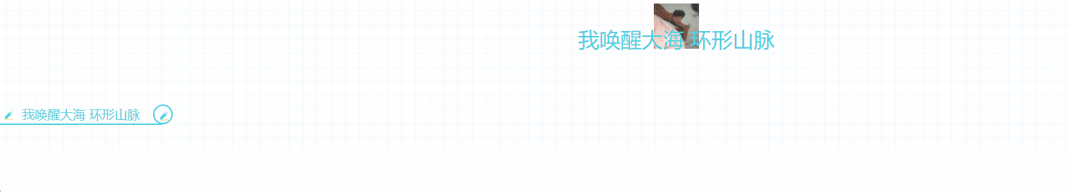
效果图
JS
import styles from './style.less'

const index = () =>
{

    return (
        <div className={
    styles.markdown}>
            <h1 className={
    styles.heading_h1}>
                我唤醒大海 环形山脉
            </h1>
            <h3 className={
    styles.heading_h3}>
                我唤醒大海 环形山脉
            </h3>
        </div>
    );
};
export default index
CSS
.markdown {

  word-break: break-word;
  line-height: 1.75;
  font-weight: 400;
  font-size: 15px;
  overflow-x: hidden;
  color: #2b2b2b;
  font-family: -apple-system, system-ui, BlinkMacSystemFont, Helvetica Neue, PingFang SC, Hiragino Sans GB, Microsoft YaHei, Arial, sans-serif;
  background-image: linear-gradient(90deg, rgba(159, 219, 252, .15) 3%, transparent 0), linear-gradient(1turn, rgba(159, 219, 252, .15) 3%, transparent 0);
  background-size: 20px 20px;
  background-position: 50%;

  h1, h2, h3, h4, h5, h6 {

    padding: 30px 0;
    margin-top: 35px;
    margin-bottom: 10px;
    color: #4dd0e1
  }

  // ! H1 标题 .heading_h1 {

    font-size: 30px;
    text-align: center;
    position: relative;
    width: max-content;
    margin: 0 auto
  }

  .heading_h1:before {

    position: absolute;
    content: "";
    z-index: -1;
    top: -20px;
    height: 100%;
    width: 100px;
    left: 0;
    right: 0;
    margin: 0 auto;
    background: url('https://www.dataojocloud.com/dataeye/v1/data/image/get?imageid=617a5596fd73380b818dc300') no-repeat 50%;
    background-size: 64px 64px;
    opacity: .84
  }

  .heading_h1:after {

    position: absolute;
    content: "";
    width: 150%;
    left: -25%;
    height: 50%;
    bottom: 12px;
    border-radius: 50%;
    background: linear-gradient(transparent 80%, rgba(77, 208, 225, .8));
    background-size: 400% 200%;
    opacity: .6;
    animation: h1Animate 6s linear infinite
  }

  @keyframes h1Animate {

    0% {

      background-position: 100% 100%
    }

    50% {

      background-position: 100% 50%
    }

    to {

      /* background-pos… */
      background-position: 100% 100%
    }
  }

  .markdown-body h1, .markdown-body h2, .markdown-body h3, .markdown-body h4, .markdown-body h5, .markdown-body h6 {

    padding: 30px 0;
    margin-top: 35px;
    margin-bottom: 10px;
    color: #4dd0e1;
  }

  // ! H3D 标题 .heading_h3 {

    margin: 30px 0;
    font-size: 18px;
    position: relative;
    padding: 4px 32px;
    width: max-content;
  }

  .heading_h3::before {

    border-bottom: 2px solid #4dd0e1;
    width: 100%;
    content: "";
    display: block;
    height: 28px;
    position: absolute;
    left: 0;
    top: 0;
    bottom: -2px;
    margin: auto;
    background-size: 28px 28px;
    background-image: url(data:image/png;base64,iVBORw0KGgoAAAANSUhEUgAAACAAAAAgCAYAAABzenr0AAABRklEQVRYR2NkGGDAOMD2M4w6YDQERkNg+ITAppcfY/8zMv3wF+NdTUrZQpUQ2PT6cz8Dw/8CkMWMDIwNvqK8jcQ6gmIHNN19EaXPx1XPyMCghrCUKcpPlGc5MY6gyAE+Fx52MjL8j3cU5a1UYWXtZGBkEAVb+p8hxU+Mby5NHQCxnKEMaskzJ37uFmUetkmMjAzrfUX4woixHBJlZAA0y2EmPPYU4enLkhGeQIqRJDsAh+UgO7duNpD3IcVykkOA2paT5ABaWE60A2hlOdEO8D3/4CMDIyMfWvySFefoaYSoROh74eFXBgYGLiTNVLGc+BC48PAnAwMDG9QBVLOcaAd8P5ox+x/jf5AjGLgYfnwnKqv9/8/PwPO/kFF/MSj0cAKiouD/0bgYoixFU8RovWgJIX1EOYCQIZTIjzpgNARGQ2DAQwAAvHBaIdB7zxsAAAAASUVORK5CYII=);
    background-repeat: no-repeat;
    animation: h3AnimationBefore 2s infinite alternate;
  }

  .heading_h3::after {

    content: "";
    display: block;
    width: 28px;
    height: 28px;
    position: absolute;
    border: 2px solid #4dd0e1;
    border-radius: 50%;
    right: -15px;
    top: 0;
    bottom: 0;
    margin: auto;
    background-size: 28px 28px;
    background-image: url(data:image/png;base64,iVBORw0KGgoAAAANSUhEUgAAACAAAAAgCAYAAABzenr0AAABRklEQVRYR2NkGGDAOMD2M4w6YDQERkNg+ITAppcfY/8zMv3wF+NdTUrZQpUQ2PT6cz8Dw/8CkMWMDIwNvqK8jcQ6gmIHNN19EaXPx1XPyMCghrCUKcpPlGc5MY6gyAE+Fx52MjL8j3cU5a1UYWXtZGBkEAVb+p8hxU+Mby5NHQCxnKEMaskzJ37uFmUetkmMjAzrfUX4woixHBJlZAA0y2EmPPYU4enLkhGeQIqRJDsAh+UgO7duNpD3IcVykkOA2paT5ABaWE60A2hlOdEO8D3/4CMDIyMfWvySFefoaYSoROh74eFXBgYGLiTNVLGc+BC48PAnAwMDG9QBVLOcaAd8P5ox+x/jf5AjGLgYfnwnKqv9/8/PwPO/kFF/MSj0cAKiouD/0bgYoixFU8RovWgJIX1EOYCQIZTIjzpgNARGQ2DAQwAAvHBaIdB7zxsAAAAASUVORK5CYII=);
    animation: h3AnimationAfter 2s infinite alternate;
  }

  @keyframes h3AnimationBefore {

    0% {

      width: 28px
    }

    25% {

      width: 100%
    }

    50% {

      width: 100%
    }

    to {

      width: 100%
    }
  }

  @keyframes h3AnimationAfter {

    0% {

      transform: rotate(0)
    }

    10% {

      transform: rotate(0)
    }

    50% {

      transform: rotate(-1turn)
    }

    to {

      transform: rotate(-1turn)
    }
  }
}
效果图

Main
import Caption from './Caption'
const index = () =>
{

    return (
        <Caption>我唤醒大海 环形山脉</Caption>
    );
};
export default index
JS
import styles from './style.less'
const index = ({
      children }) =>
{

    return (
        <h3 className={
    styles.heading_h3}>
            {
    children}
        </h3>

    );
};
export default index
CSS
 .heading_h3 {

   //    margin: 30px 0;
   font-size: 18px;
   position: relative;
   padding: 4px 32px;
   width: max-content;
   color: #4dd0e1
 }

 .heading_h3::before {

   border-bottom: 2px solid #4dd0e1;
   width: 100%;
   content: "";
   display: block;
   height: 28px;
   position: absolute;
   left: 0;
   top: 0;
   bottom: -2px;
   margin: auto;
   background-size: 28px 28px;
   background-image: url(data:image/png;base64,iVBORw0KGgoAAAANSUhEUgAAACAAAAAgCAYAAABzenr0AAABRklEQVRYR2NkGGDAOMD2M4w6YDQERkNg+ITAppcfY/8zMv3wF+NdTUrZQpUQ2PT6cz8Dw/8CkMWMDIwNvqK8jcQ6gmIHNN19EaXPx1XPyMCghrCUKcpPlGc5MY6gyAE+Fx52MjL8j3cU5a1UYWXtZGBkEAVb+p8hxU+Mby5NHQCxnKEMaskzJ37uFmUetkmMjAzrfUX4woixHBJlZAA0y2EmPPYU4enLkhGeQIqRJDsAh+UgO7duNpD3IcVykkOA2paT5ABaWE60A2hlOdEO8D3/4CMDIyMfWvySFefoaYSoROh74eFXBgYGLiTNVLGc+BC48PAnAwMDG9QBVLOcaAd8P5ox+x/jf5AjGLgYfnwnKqv9/8/PwPO/kFF/MSj0cAKiouD/0bgYoixFU8RovWgJIX1EOYCQIZTIjzpgNARGQ2DAQwAAvHBaIdB7zxsAAAAASUVORK5CYII=);
   background-repeat: no-repeat;
   animation: h3AnimationBefore 2s infinite alternate;
 }

 .heading_h3::after {

   content: "";
   display: block;
   width: 28px;
   height: 28px;
   position: absolute;
   border: 2px solid #4dd0e1;
   border-radius: 50%;
   right: -15px;
   top: 0;
   bottom: 0;
   margin: auto;
   background-size: 28px 28px;
   background-image: url(data:image/png;base64,iVBORw0KGgoAAAANSUhEUgAAACAAAAAgCAYAAABzenr0AAABRklEQVRYR2NkGGDAOMD2M4w6YDQERkNg+ITAppcfY/8zMv3wF+NdTUrZQpUQ2PT6cz8Dw/8CkMWMDIwNvqK8jcQ6gmIHNN19EaXPx1XPyMCghrCUKcpPlGc5MY6gyAE+Fx52MjL8j3cU5a1UYWXtZGBkEAVb+p8hxU+Mby5NHQCxnKEMaskzJ37uFmUetkmMjAzrfUX4woixHBJlZAA0y2EmPPYU4enLkhGeQIqRJDsAh+UgO7duNpD3IcVykkOA2paT5ABaWE60A2hlOdEO8D3/4CMDIyMfWvySFefoaYSoROh74eFXBgYGLiTNVLGc+BC48PAnAwMDG9QBVLOcaAd8P5ox+x/jf5AjGLgYfnwnKqv9/8/PwPO/kFF/MSj0cAKiouD/0bgYoixFU8RovWgJIX1EOYCQIZTIjzpgNARGQ2DAQwAAvHBaIdB7zxsAAAAASUVORK5CYII=);
   animation: h3AnimationAfter 2s infinite alternate;
 }

 @keyframes h3AnimationBefore {

   0% {

     width: 28px
   }

   25% {

     width: 100%
   }

   50% {

     width: 100%
   }

   to {

     width: 100%
   }
 }

 @keyframes h3AnimationAfter {

   0% {

     transform: rotate(0)
   }

   10% {

     transform: rotate(0)
   }

   50% {

     transform: rotate(-1turn)
   }

   to {

     transform: rotate(-1turn)
   }
 }
边栏推荐
- options should NOT have additional properties
- 【每日一题】第二天
- The text editor hopes to mark the wrong sentences in red, and the text editor uses markdown
- Leetcode interview question 17.01 Addition without plus sign
- Leetcode 面试题 17.04. 消失的数字
- R语言ggplot2可视化:gganimate包创建动态柱状图动画(gif)、使用transition_states函数在动画中沿给定维度逐步显示柱状图
- Leetcode (154) -- find the minimum value II in the rotation sort array
- After 22 years in office, the father of PowerShell will leave Microsoft: he was demoted by Microsoft for developing PowerShell
- The second bullet of AI development and debugging series: the exploration journey of multi machine distributed debugging
- Leetcode interview question 16.17 Continuous sequence
猜你喜欢

300+ documents! This article explains the latest progress of multimodal learning based on transformer
【每日一题】第一天

Leetcode interview question 17.04 Vanishing numbers
Singapore summer tourism strategy: play Singapore Sentosa Island in one day
A simple PHP personal card issuing program v4.0

揭秘得物客服IM全链路通信过程
The text editor hopes to mark the wrong sentences in red, and the text editor uses markdown
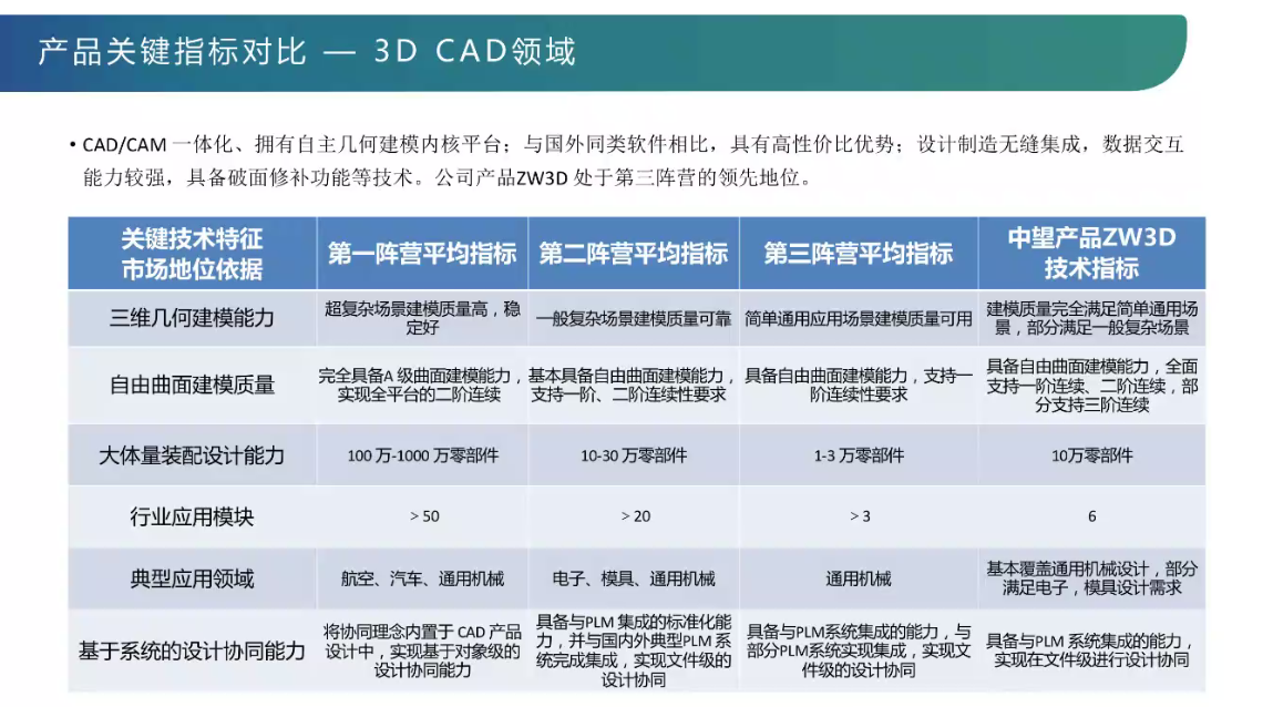
工业软件讲堂-三维CAD设计软件的核心技术解析----讲坛第二次讲座

Responses of different people in technology companies to bugs | daily anecdotes

After 22 years in office, the father of PowerShell will leave Microsoft: he was demoted by Microsoft for developing PowerShell
随机推荐
Matlab中弧度转角度、角度转弧度
Leetcode 面试题 16.11. 跳水板
Ali was wildly asked by the interviewer on three sides. Redis dared not write 'proficient' on his resume anymore
Leetcode interview question 17.01 Addition without plus sign
The official docker image running container in version 1.5.1 can be set to use MySQL 8 driver?
NM01-独立于总线协议的NM模块功能概述与API定义
工业软件讲堂-三维CAD设计软件的核心技术解析----讲坛第二次讲座
哪个券商公司网上开户佣金低又安全又可靠
Leetcode (81) -- search rotation sort array II
Competence of product manager
Deep learning mathematics foundation
Night God simulator +fiddler packet capture test app
服务器php环境搭建教程,PHP服务端环境搭建图文详解
科技公司不同人对Bug的反应 | 每日趣闻
Tips for material UV masking
故障排查:kubectl报错ValidationError: unknown field \u00a0
第一次去曼谷旅游怎么玩?这份省钱攻略请收好
What is cloud primordial? This time, I can finally understand!
LightGroupButton* sender = static_cast<LightGroupButton*>(QObject::sender());
阿里三面被面试官狂问Redis,简历上再也不敢写'精通'了