当前位置:网站首页>【R】【密度聚类、层次聚类、期望最大化聚类】
【R】【密度聚类、层次聚类、期望最大化聚类】
2022-07-03 12:03:00 【爱笑的冷面鬼】
文章目录
数据集:2 维数据集—Countries,可以用平面图清晰的展示聚类效果。该数据集含有 68 个国家和地区的出生率(%)与死亡率(%)。
实验目的:通过对该数据集进行分析,发现不同国家与地区的出生率与死亡率,并根据比较进行公共卫生的预测与防御。
本实验利用密度聚类、层次聚类和期望最大化聚类对上述数据集进行聚类分析,并将三种聚类方法进行简单的比较。
1.对数据集进行加载、预处理集可视化
1.1 加载数据集
setwd("存放数据集的路径")
countries<-read.csv("countries.csv") #读取数据集
1.2 数据预处理
dim(countries)
head(countries)
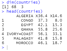
从 head()结果图中可以发现该数据集没有列名,且行所对应的是数字,不是相应国家。
下面我们要对行列名进行修改:
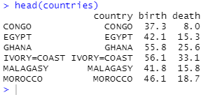
names(countries)<-c("country","birth","death") #设置三个变量名字
var<-countries$country #取变量 country 的值赋值给 var

var<-as.character(var) #将赋值的变为字符型
head(var)

for(i in 1:68) row.names(countries)[i]=var[i]#将数据集 countries 的行名命名为响应国家名
head(countries)
1.3 将样本点进行可视化
plot(countries$birth,countries$death) #画出所有 68 个样本点
c<-which(countries$country=="聚类点1")
d<-which(countries$country=="聚类点2")
e<-which(countries$country=="聚类点3")
f<-which(countries$country=="聚类点4")
g<-which(countries$country=="聚类点5")
h<-which(countries$country=="聚类点6")
m<-which.max(countries$birth) #获取出生率最高的点在数据集中的位置

points(countries[c(c,d,e,f,g,h,m),-1],pch=16)#以实心圆点标出如上样本点

legend(countries$birth[c],countries$death[c],"天狼星区",bty="n",xjust=0.5,cex=0.8)
#标出天狼星区样本点的图例
legend(countries$birth[d],countries$death[d],"参宿七星区",bty="n",xjust=0.5,cex=0.8)
legend(countries$birth[e],countries$death[e],"蓝移星区",bty="n",xjust=0.5,cex=0.8)
legend(countries$birth[f],countries$death[f],"菲律星区",bty="n",xjust=0.5,cex=0.8)
legend(countries$birth[g],countries$death[g],"塞协尔星区",bty="n",xjust=0.5,cex=0.8)
legend(countries$birth[h],countries$death[h],"大角星区",bty="n",xjust=0.5,cex=0.8)
legend(countries$birth[m],countries$death[m],countries$country[m],bty="n",xjust=1,cex=0.8)
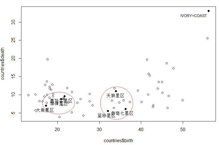
从图中我们大概能看出,(菲律星区、塞协尔星区、大角星区)可聚为一类;
9天狼星区、参宿七星区、蓝移星区)为一类;
象牙海岸/非洲(IVORY-COAST)等为一类。
并且(天狼星区)与(参宿七星区、蓝移星区)的出生率相近,死亡率却要高约 5 个百分比。
以上就是对数据的预处理部分,下面开始对该数据集密度聚类:
2.密度聚类(DBSCAN 算法)
2.1 加载程序包
install.packages("fpc")
library(fpc)
2.2 设置聚类参数阈值并可视化
#设置聚类的参数:半径和密度
ds1=dbscan(countries[,-1],eps=1,MinPts=5)#取半径参数 eps 为 1,密度阈值 MinPts 为 5
ds2=dbscan(countries[,-1],eps=4,MinPts=5)#取半径参数 eps 为 4,密度阈值 MinPts 为 5
ds3=dbscan(countries[,-1],eps=4,MinPts=2)#取半径参数 eps 为 4,密度阈值 MinPts 为 2
ds4=dbscan(countries[,-1],eps=8,MinPts=2)#取半径参数 eps 为 8,密度阈值 MinPts 为 2

ds1;ds2;ds3;ds4

par(mfcol=c(2,2)) #设置 4 张图按照 2 行 2 列摆放的空白位置
plot(ds1,countries[,-1],main="1:MinPts=5 eps=1")#绘制MinPts=5,eps=1 时的结果
plot(ds3,countries[,-1],main="3:MinPts=2 eps=4")#绘制MinPts=2,eps=4 时的结果
plot(ds2,countries[,-1],main="2:MinPts=5 eps=4")#绘制MinPts=5,eps=4 时的结果
plot(ds4,countries[,-1],main="4:MinPts=2 eps=8")#绘制MinPts=2,eps=8 时的结果
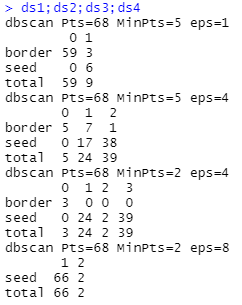
半径1,阈值5:DBSCAN 算法将绝大多数样本都判定为噪声点仅 9 个密度极为相近的样本点被判定为有效聚类。
半径4,阈值5:仅有 5 个样本被判定为噪声点,而剩余样本都被归为相应的类别簇中。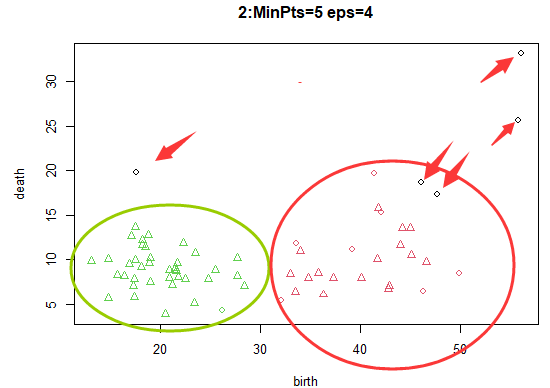
半径4,阈值2:更多的样本被归入相互密度可达样本类别。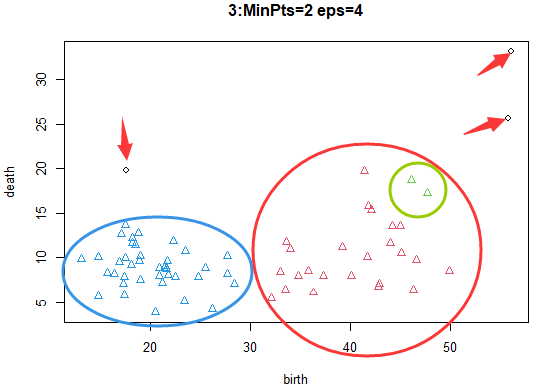
半径8,阈值2:由于核心对象、密度可达等高年的判定条件在很大程度上被放松,可想而知,会有大量的样本点被归为同类中。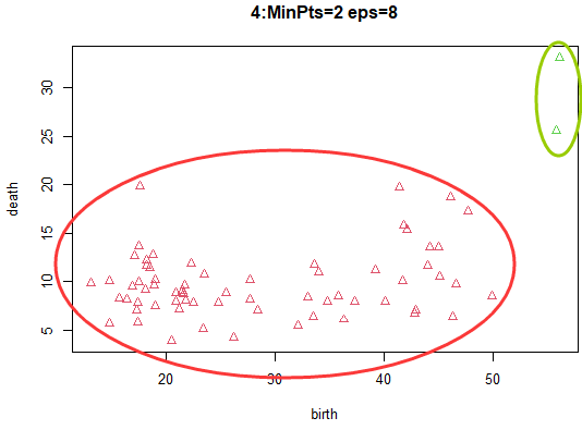
由可视化,得出 DBSCAN 算法的参数取值规律:
- 半径参数(eps)与阈值参数(MinPts)的取值差距越大,所得类别总数越小;
- 半径参数(eps)相对于阈值参数(MinPts)较小时,越多的样本被判定为噪声点或边缘点。
2.3 密度聚类
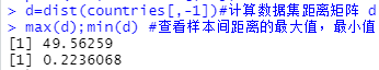
1)密度聚类之前需要计算数据集的距离矩阵:
d=dist(countries[,-1])#计算数据集距离矩阵 d
max(d);min(d) #查看样本间距离的最大值,最小值
2)对样本间的距离进行分段处理:
结合最大值最小值相差 50 (49.56259-0.2236068)左右,取居中段数为 30 并展示数据分类结果
library(ggplot2)
interval=cut_interval(d,30)
#对各样本间的距离进行分段处理,结合最大值最小值相差 50 左右,取居中段数为 30
table(interval) #展示数据分类结果
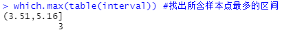
which.max(table(interval)) #找出所含样本点最多的区间

3)用不同阈值、不同半径进行密度聚类并可视化
根据上图可知:样本点距离大多在(3.15,5.16]之间,因此考虑半径参数(eps)的取值为 3、4、5、密度阈值参数取 1-10:
for(i in 3:5) #半径参数取 3,4,5
{

  for(j in 1:10) #密度阈值参数取 1 至 10
  {

    ds=dbscan(countries[,-1],eps=i,MinPts=j) #在半径为i,阈值为j时,作dbscan 距离
    print(ds)
  }
}

部分结果如上所示
3.层次聚类(hclust算法)
3.1 层次聚类
fit_hc=hclust(dist(countries[,-1])) #对 countries 数据集进行系谱聚类
print(fit_hc)
plot(fit_hc)

从聚类图(无标签)可以看到,在图的最下端每个样本点各占一个分支自成一类,越往上看一条分支下的样本点数越多,直至最下端所有样本点聚为一类。在图的左侧以高度指标衡量树形图的高度。
3.2 层次聚类参数调整并展示结果
group_k3=cutree(fit_hc,k=3)
#利用剪枝函数 cutree()中的参数 k 控制输入 3 类别的系谱聚类结果
group_k3
table(group_k3)


group_h18=cutree(fit_hc,h=18)
#利用剪枝函数中的参数 h 控制输出Height=18 时的系谱聚类结果
group_h18
table(group_h18)


上图分别是利用剪枝函数中的参数 h 控制输出 Height=3 和18时的聚类结果。
sapply(unique(group_k3),function(g)countries$country[group_k3==g])
#查看如上K=3的聚类结果中各类别样本
plot(fit_hc)
rect.hclust(fit_hc,k=4,border="blue")
#用蓝色矩形框出4分类的聚类结果
rect.hclust(fit_hc,k=3,border="red")
#用红色矩形框出3分类的聚类结果
rect.hclust(fit_hc,k=7,which=c(2,6),border="green")
#用绿矩形框出7分类的第2类和第6类的聚类结果
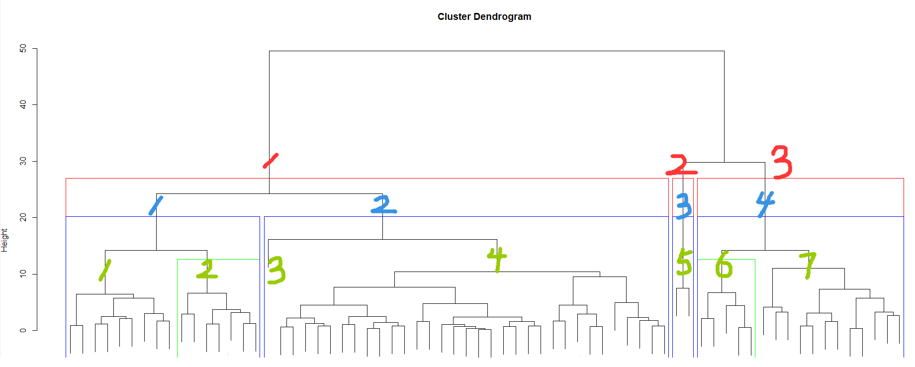
设置类别数的聚类效果如上图所示
4.期望最大化聚类(Mclust算法)
4.1 期望最大化聚类并获取相关信息
1)加载相关包
library(mclust)
2)进行期望最大化聚类并获取相关信息
fit_EM=Mclust(countries[,-1]) #对 countries 数据集进行 EM 聚类
summary(fit_EM)#获取 EM 聚类结果的信息汇总
summary(fit_EM,parameters=TRUE) #获取 EM 聚类结果的细节信息
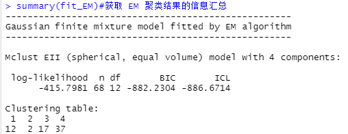

从结果可以看出,最优类别数为 4,且各类别分别含有 12、2、17、37 个样本。
4.2 结果图形展示
plot(fit_EM)
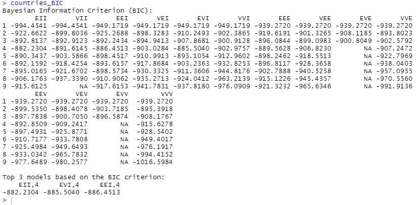
countries_BIC<-mclustBIC(countries[,-1])#获取数据集 countries 在各模型和类别数下的 BIC 值
countries_BICsum=summary(countries_BIC,data=countries[,-1])#获取数据集 countries 的 BIC 值概况
countries_BICsum
countries_BIC
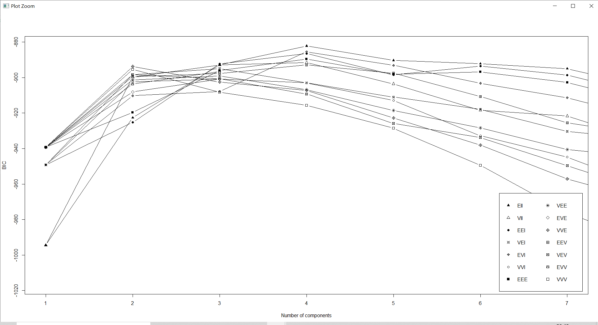
plot(countries_BIC,G=1:7,col="black")
names(countries_BICsum)
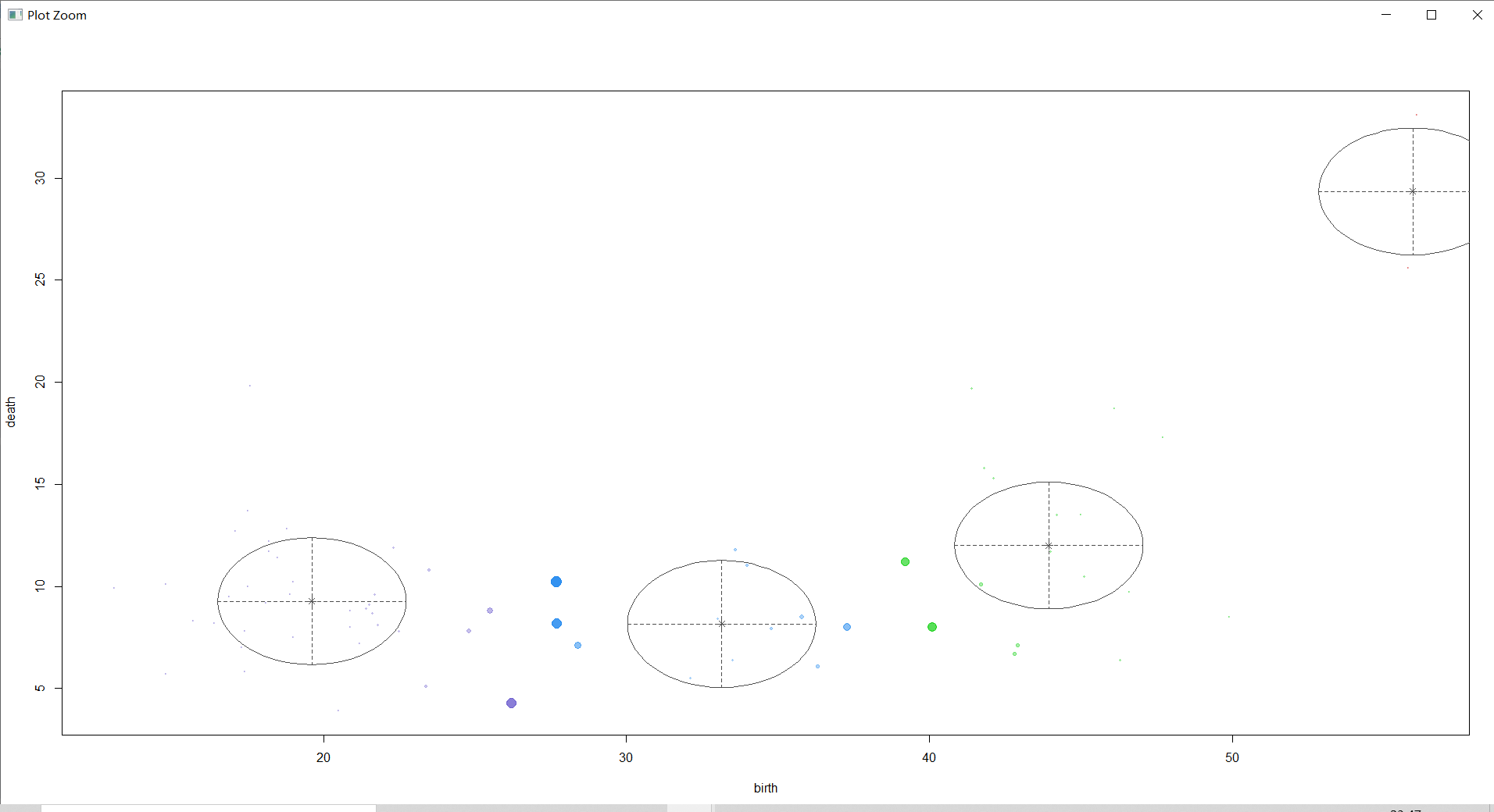
mclust2Dplot(countries[,-1],classification=countries_BICsum$classification,parameters=countries_BICsum$parameters,col="black")
#绘制分类图
①查看BIC:

②查看classification:

③查看uncertainty:
④查看density:
countries_BIC<-mclustBIC(countries[,-1])#获取数据集 countries 在各模型和类别数下的 BIC 值
countries_BICsum=summary(countries_BIC,data=countries[,-1])#获取数据集 countries 的 BIC 值概况
countries_BICsum
countries_BIC

plot(countries_BIC,G=1:7,col="black")
names(countries_BICsum)

mclust2Dplot(countries[,-1],classification=countries_BICsum$classification,parameters=countries_BICsum$parameters,col="black")
#绘制分类图
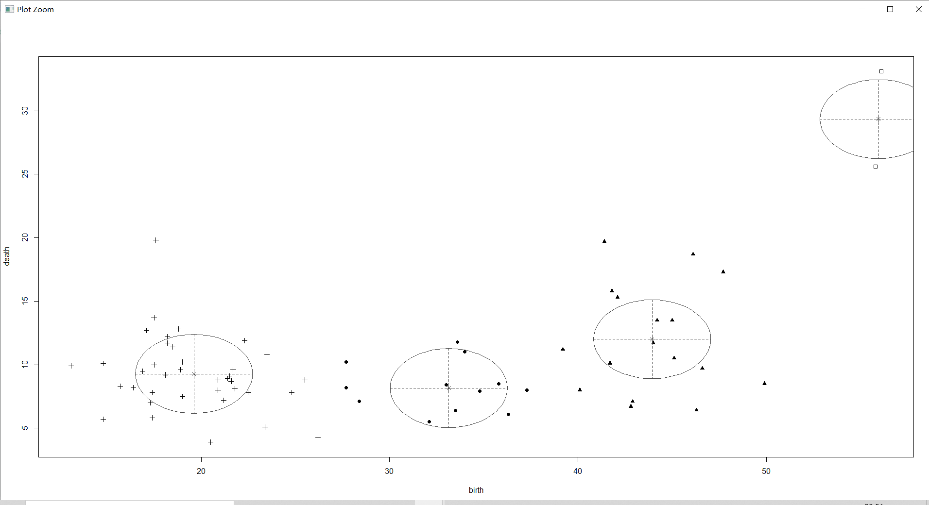
上图不仅将各类别样本的主要分布区域用椭圆圈出,并标出了类别中心点,且以样本点图形的大小来显示该样本归属于相应类别的概率大小。
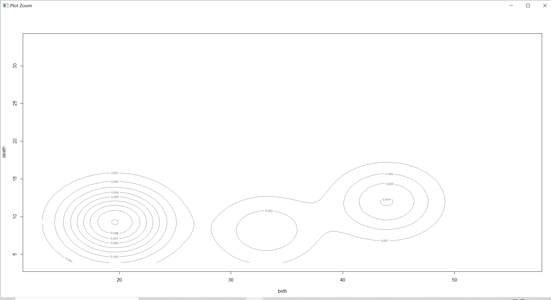
countries_Dens=densityMclust(countries[,-1])#对每一个样本进行密度估计

2维密度图
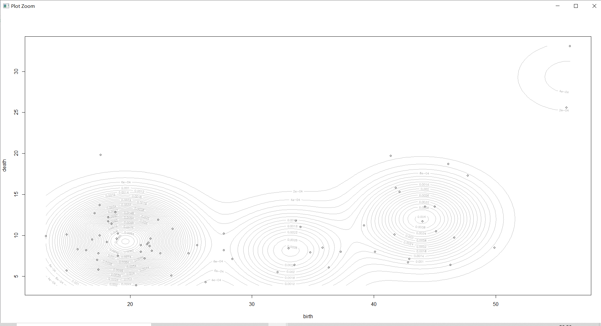
plot(countries_Dens,countries[,-1],col="grey",nlevels=55)#作 2 维密度图
①查看BIC:

②查看density:
3维密度图
plot(countries_Dens,type="persp",col=grey(0.8)) #作 3 维密度图
①查看BIC:
②查看density:
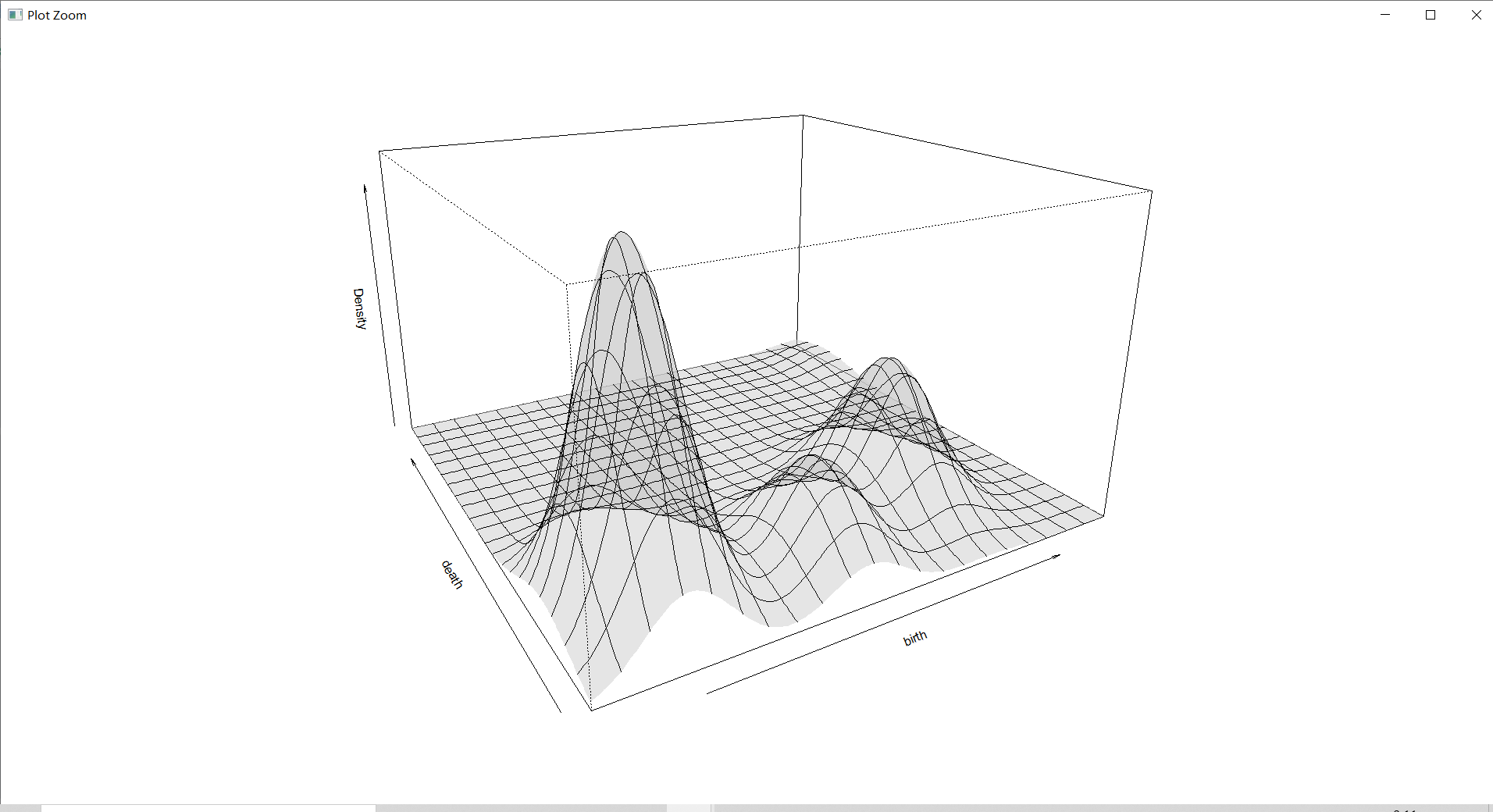
(需要加载一会)
密度估计图是三维的图形,它更直观的展示了密度区域,使得对密度的疏密有个大致的了解。
总结
系谱聚类?:从可视化中就可以感受到系谱聚类与上个实验中的均值聚类和中心点聚类的不同。系谱聚类的可视化图就像是一个族谱一样分了很多不同的分支,而分支的最底端是所有的样品点名称。
密度聚类:与其它聚类的不同之处在于需要对它设置阈值和半径。相对于以上的均值聚类、中心点聚类和系谱聚类来说,它的优势在于弥补了前者只能发现“类圆形”聚类簇的缺陷,而密度聚类算法由于是基于“密度”来聚类的,可以在具有噪声的空间数据库中发现任意形状的簇。
期望最大化聚类:思路十分巧妙,在使用该算法进行聚类时,它将数据集看作一个含有隐形变量的概率模型,并以实现模型最优化,即获取与数据本身性质最契合的聚类方式为目的,通过“反复估计”模型参数找出最优解,同时给出相应的最优类别数 K。因此,期望最大化聚类相对于前面提到的聚类来说更为抽象。
Reference
dbscan: Density-based Spatial Clustering of Applications with Noise (DBSCAN)/文RDocumentation
hclust: Hierarchical Clustering/文RDocumentation
Mclust: Model-Based Clustering/文RDocumentation
R语言数据挖掘实践----聚类分析的常用函数/文个人图书馆@新用户26922hFh
实验资料
数据集&R语言代码
提取码:1111(这里应该会自动填充)
边栏推荐
- Drop down refresh conflicts with recyclerview sliding (swiperefreshlayout conflicts with recyclerview sliding)
- Integer case study of packaging
- (latest version) WiFi distribution multi format + installation framework
- 十條職場規則
- Write a simple nodejs script
- Keep learning swift
- Sword finger offer10- I. Fibonacci sequence
- Node. Js: use of express + MySQL
- Alibaba is bigger than sending SMS (user microservice - message microservice)
- Pytext training times error: typeerror:__ init__ () got an unexpected keyword argument 'serialized_ options'
猜你喜欢
电压环对 PFC 系统性能影响分析

【ManageEngine】IP地址扫描的作用

Sword finger offer05 Replace spaces

Application of ncnn Neural Network Computing Framework in Orange Pi 3 Lts Development Board

Sword finger offer10- I. Fibonacci sequence

The latest version of lottery blind box operation version

社交社区论坛APP超高颜值UI界面

如何在微信小程序中获取用户位置?
LeetCode 0556. Next bigger element III - end of step 4
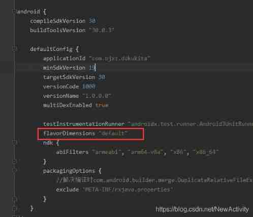
studio All flavors must now belong to a named flavor dimension. Learn more
随机推荐
Sword finger offer03 Repeated numbers in the array [simple]
Eureka self protection
The solution to change the USB flash disk into a space of only 2m
GaN图腾柱无桥 Boost PFC(单相)七-PFC占空比前馈
Idea packages the web project into a war package and deploys it to the server to run
Tianyi ty1208-z brush machine detailed tutorial (free to remove)
Apache Mina Development Manual
elastic_ L01_ summary
【ArcGIS自定义脚本工具】矢量文件生成扩大矩形面要素
Gan totem column bridgeless boost PFC (single phase) seven PFC duty cycle feedforward
[embedded] - Introduction to four memory areas
公纵号发送提示信息(用户微服务--消息微服务)
What is more elegant for flutter to log out and confirm again?
[exercice 7] [principe de la base de données]
Powerful avatar making artifact wechat applet
[problem exploration and solution of one or more filters or listeners failing to start]
社交社区论坛APP超高颜值UI界面
Kotlin notes - popular knowledge points asterisk (*)
Swift5.7 extend some to generic parameters
[judgment question] [short answer question] [Database Principle]