当前位置:网站首页>Boder radius has four values, and boder radius exceeds four values
Boder radius has four values, and boder radius exceeds four values
2022-07-06 20:17:00 【imkaifan】
Problem description :
border-radius If it is 4 Value , In turn, it represents the upper left corner 、 Upper right corner 、 The lower right corner 、 The lower left corner .
But if you write it like this, it won't work ? border-radius: 69px 62px 69px 69px/97px 93px 97px 97px;
boder-radius The role of
Back to the beginning ,css What did this magic wand do ?
CSS attribute border-radius Allows you to set the rounded edges of elements . When using a radius, determine a circle , When using two radii, determine an ellipse . This ( Ellipse ) The intersection of the circle and the border forms a fillet effect .
Even if the element has no border , Rounded corners can also be used background above , The specific effect is affected by background-clip influence
demo1: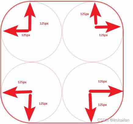
<!DOCTYPE html>
<html lang="en">
<head>
  <meta charset="UTF-8">
  <meta http-equiv="X-UA-Compatible" content="IE=edge">
  <meta name="viewport" content="width=device-width, initial-scale=1.0">
  <title>Document</title>
  <style>
    .myDiv {

      display: flex;
      flex-wrap: wrap;
      width: 500px;
      height: 500px;
      border: 2px solid red;
      border-radius: 125px 125px 125px 125px;
    }
  </style>
</head>
<body>
   <div class="myDiv">
   </div>
</body>
</html>
Code and schematic diagram above , Roughly know how to draw this trajectory
demo2:
border-radius To put it bluntly, you can draw an irregular figure , But we can know from the above , Irregularity is irregularity , But it must be round , Or right angles , Writing a negative value does not mean that it is an obtuse angle , Or sharp corners . Negative values are treated as 0
border-radius: 4px 3px 6px / 2px 4px;

/*  Equivalent to : */
border-top-left-radius:     4px 2px;
border-top-right-radius:    3px 4px;
border-bottom-right-radius: 6px 2px;
border-bottom-left-radius:  3px 4px;


border-radius: 25px 50px 70px 60px/50px 25px 10px 10px;
  /*  Equivalent to : */
border-top-left-radius:     25px 50px;
border-top-right-radius:    50px 25px;
border-bottom-right-radius: 70px 10px;
border-bottom-left-radius:  60px 10px;
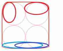
border-radius: 25px 50px 70px 60px/50px 25px 10px 10px; The drawing is the above figure , Don't omit the eight values , Or you need to remember the corresponding relationship of missing values , Too annoying , So don't try to save trouble , Write the whole , Others can understand
边栏推荐
猜你喜欢
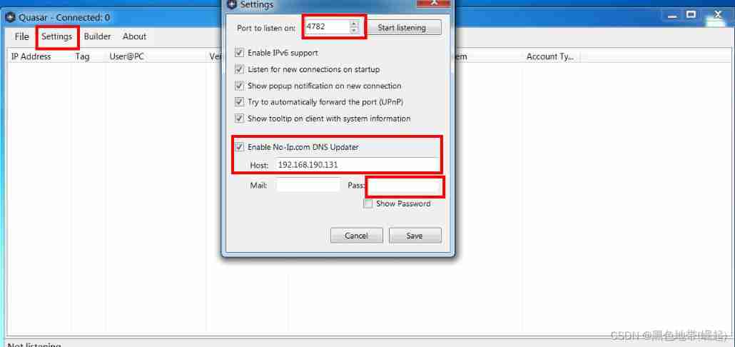
Configuration and simple usage of the EXE backdoor generation tool quasar

Example of shutter text component
![[Yann Lecun likes the red stone neural network made by minecraft]](/img/95/c3af40c7ecbd371dd674aea19b272a.png)
[Yann Lecun likes the red stone neural network made by minecraft]
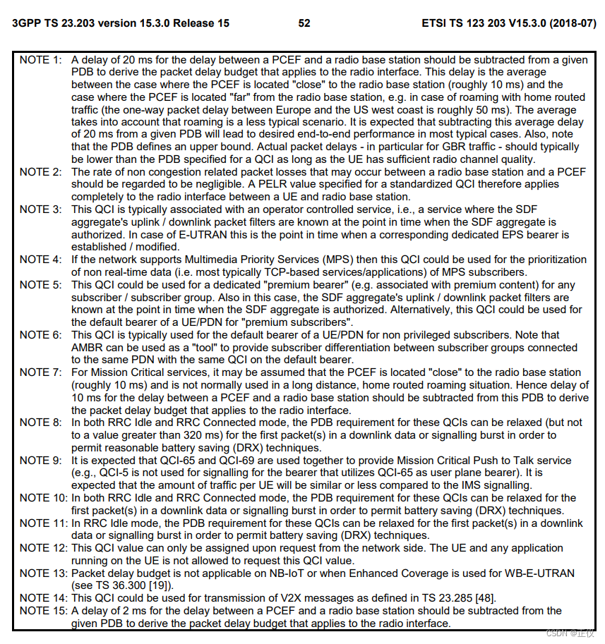
Standardized QCI characteristics
腾讯安卓开发面试,android开发的基础知识
Jupyter launch didn't respond after Anaconda was installed & the web page was opened and ran without execution
Web security - payload
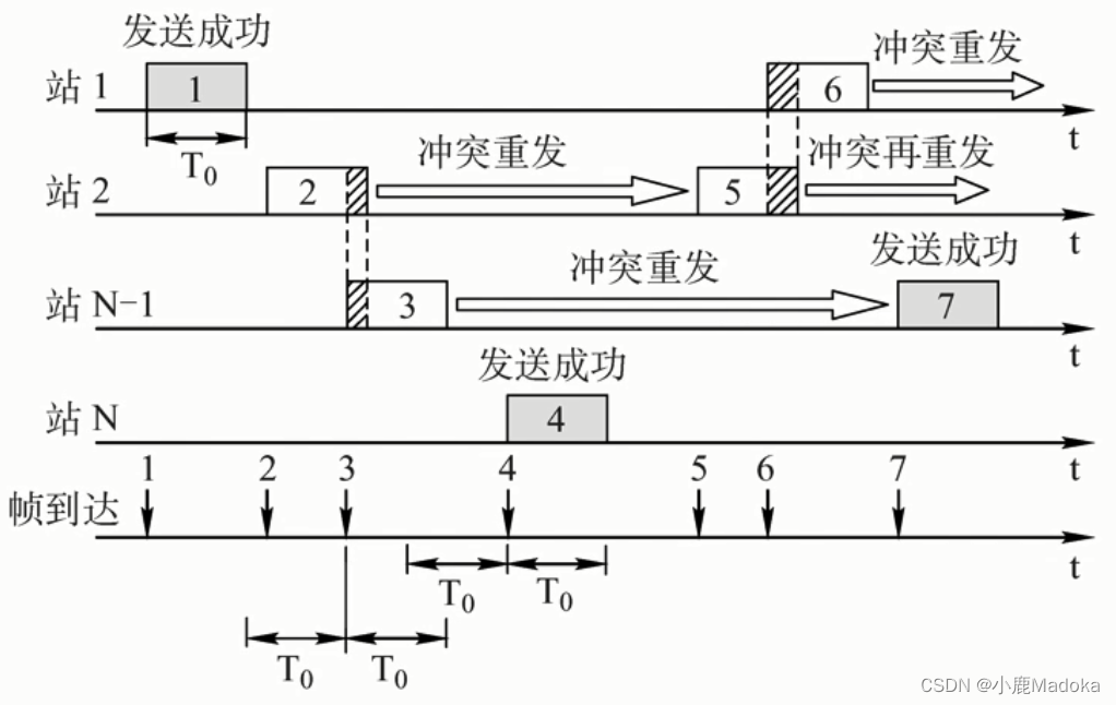
【计网】第三章 数据链路层(3)信道划分介质访问控制
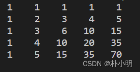
棋盘左上角到右下角方案数(2)
Cesium 点击绘制圆形(动态绘制圆形)
随机推荐
Catch ball game 1
01 基础入门-概念名词
AddressSanitizer 技术初体验
Digital triangle model acwing 1018 Minimum toll
Example of applying fonts to flutter
JVM_ Common [interview questions]
Continuous test (CT) practical experience sharing
POJ 3207 Ikki&#39; s Story IV – Panda&#39; s Trick (2-SAT)
永磁同步电机转子位置估算专题 —— 基波模型类位置估算概要
小微企业难做账?智能代账小工具快用起来
Unity load AB package
某东短信登录复活 安装部署教程
Appx code signing Guide
HDU 1026 Ignatius and the Princess I 迷宫范围内的搜索剪枝问题
Tencent architects first, 2022 Android interview written examination summary
8086指令码汇总表(表格)
Number of schemes from the upper left corner to the lower right corner of the chessboard (2)
leetcode先刷_Maximum Subarray
Discussion on beegfs high availability mode
Cesium 两点之间的直线距离