当前位置:网站首页>一篇文章带你了解CSS3圆角知识
一篇文章带你了解CSS3圆角知识
2020-11-06 20:42:00 【Python进阶者】
一、浏览器支持
表中的数字指定完全支持该属性的第一个浏览器版本。
数字后面的 -webkit- 或者 -moz- 使用时需要指定前缀。
| 属性 | Chrome | Firefox | Safari | Opera | IE |
|---|---|---|---|---|---|
| border-radius | 5.0 4.0 -webkit- | 9.0 | 4.0 3.0 -moz- | 5.0 3.1 -webkit- | 10.5 |
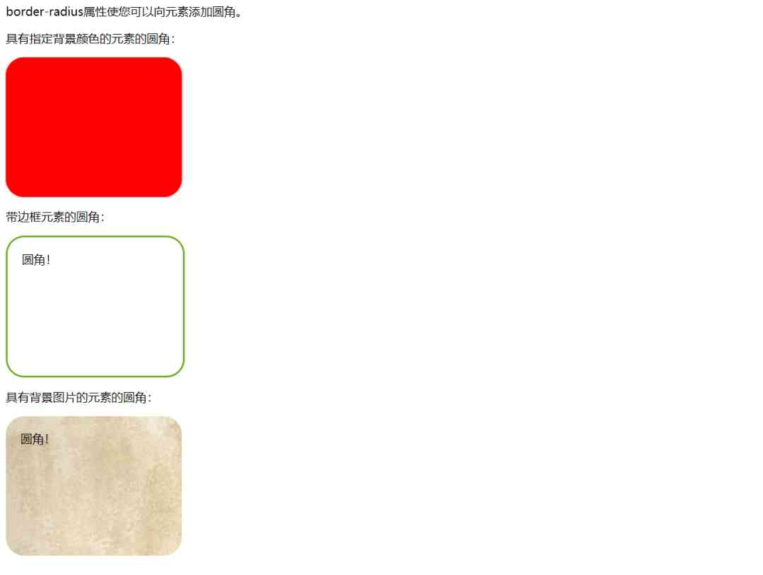
二、border-radius 属性
1. 创建具有背景图的圆角
CSS3中,可以使用border-radius属性,为元素指定圆角显示。
代码如下:
<!DOCTYPE html>
    <html>
    <meta charset="UTF-8">
    <title>项目</title>

    <head>
        <style>
            #rcorners1 {
                border-radius: 25px;
                background: #f00;
                padding: 20px;
                width: 200px;
                height: 150px;
            }

            #rcorners2 {
                border-radius: 25px;
                border: 2px solid #73AD21;
                padding: 20px;
                width: 200px;
                height: 150px;
            }

            #rcorners3 {
                border-radius: 25px;
                background: url(img/fy_indexBg.jpg);
                background-position: left top;
                background-repeat: repeat;
                padding: 20px;
                width: 200px;
                height: 150px;
            }
</style>
    </head>

    <body>

        <p>The border-radius property allows you to add rounded corners to elements.</p>
        <p>Rounded corners for an element with a specified background color:</p>
        <!--1.具有指定背景色的圆角元素-->
        <p id="rcorners1">Rounded corners!</p>
        <p>Rounded corners for an element with a border:</p>
        <!--2.带边框的圆角元素:-->
        <p id="rcorners2">Rounded corners!</p>
        <!--3.带背景图的圆角元素-->
        <p>Rounded corners for an element with a background image:</p>
        <p id="rcorners3">Rounded corners!</p>

    </body>

</html>
提示:
border-radius属性实际是border-top-left-radius, border-top-right-radius, border-bottom-right-radius 和 border-bottom-left-radius 属性的简写。
2. 为每个角指定弧度
如果只为border-radius属性指定一个值,则此半径将应用于所有4个角。
另外可以根据自己开发的需求,分别指定每个角。以下是规则:
四个值: 第一个值适用于左上角,第二个值适用于右上方,第三值应用于右下角,第四值适用于左下角。
三个值: 第一个值适用于左上,二值适用于右上和左下,右下第三值适用于。
两个值: 第一个值适用于左上和右下角,和二值适用于右上和左下角。
一个值: 所有的四个角都是圆的。
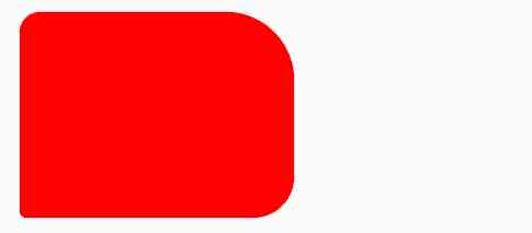
实例1:
1.四个值 - border-radius: 15px 50px 30px 5px
#rcorners4 {
    border-radius: 15px 50px 30px 5px;
    background: #f00;
    padding: 20px;
    width: 200px;
    height: 150px;
}
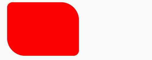
2.三个值 - border-radius: 15px 50px 30px
#rcorners5 {
    border-radius: 15px 50px 30px;
    background: #f00;
    padding: 20px;
    width: 200px;
    height: 150px;
}
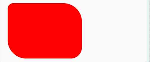
3.两个值 - border-radius: 15px 50px
#rcorners6 {
    border-radius: 15px 50px;
    background: #f00;
    padding: 20px;
    width: 200px;
    height: 150px;
}
完整代码 :
<!DOCTYPE html>
<html lang="en">
<head>
  <meta charset="UTF-8">
  <title>项目</title>
  <style>
  #rcorners4 {
      border-radius: 15px 50px 30px 5px;
      background: #f00;
      padding: 20px;
      width: 200px;
      height: 150px;
  }

  #rcorners5 {
      border-radius: 15px 50px 30px;
      background: #f00;
      padding: 20px;
      width: 200px;
      height: 150px;
  }

  #rcorners6 {
      border-radius: 15px 50px;
      background: #f00;
      padding: 20px;
      width: 200px;
      height: 150px;
  }
</style>
</head>
<body>

<p>四个值 - border-radius: 15px 50px 30px 5px:</p>
<p id="rcorners4"></p>

<p>三个值 - border-radius: 15px 50px 30px:</p>
<p id="rcorners5"></p>

<p>两个值 - border-radius: 15px 50px:</p>
<p id="rcorners6"></p>

</body>
</html>
实例2:
创建椭圆形的圆角
创建椭圆形的圆角
椭圆边框 :border-radius: 50px/15px
#rcorners7 {
    border-radius: 50px/15px;
    background: #73AD21;
    padding: 20px;
    width: 200px;
    height: 150px;
}

椭圆边框 : border-radius: 15px/50px
#rcorners8 {
        border-radius: 15px/50px;
        background: #73AD21;
        padding: 20px;
        width: 200px;
        height: 150px;
    }

椭圆边框 : border-radius: 50%
#rcorners9 {
        border-radius: 50%;
        background: #73AD21;
        padding: 20px;
        width: 200px;
        height: 150px;
    }
完整代码:
<!DOCTYPE html>
<html lang="en">
<head>
<meta charset="UTF-8">
<title>项目</title>
<style>
#rcorners7 {
border-radius: 50px/15px;
background: #73AD21;
padding: 20px;
width: 200px;
height: 150px;
}
#rcorners8 {
border-radius: 15px/50px;
background: #73AD21;
padding: 20px;
width: 200px;
height: 150px;
}
#rcorners9 {
border-radius: 50%;
background: #73AD21;
padding: 20px;
width: 200px;
height: 150px;
}
</style>
</head>
<body>
<p>椭圆边框 - border-radius: 50px/15px:</p>
<p id="rcorners7"></p>
<p>椭圆边框 - border-radius: 15px/50px:</p>
<p id="rcorners8"></p>
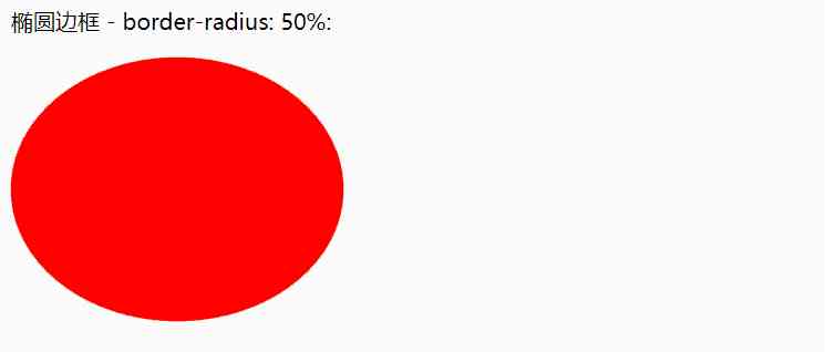
<p>椭圆边框 - border-radius: 50%:</p>
<p id="rcorners9"></p>-->
</body>
</html>
三、总结
1、本文主要讲解了CSS3圆角,通过一些属性的演示,丰富的案例,帮助大家理解CSS知识。希望大家可以耐心的去学习,同时希望碰到问题主动搜索,尝试一下,总会有解决方法。
2、代码很简单,希望能帮到你。
想学习更多Python网络爬虫与数据挖掘知识,可前往专业网站:http://pdcfighting.com/ 想学习更多Python网络爬虫与数据挖掘知识,可前往专业网站:http://pdcfighting.com/
版权声明
本文为[Python进阶者]所创,转载请带上原文链接,感谢
https://my.oschina.net/u/4521128/blog/4703060
边栏推荐
- Sort the array in ascending order according to the frequency
- 多机器人行情共享解决方案
- 前端都应懂的入门基础-github基础
- TRON智能钱包PHP开发包【零TRX归集】
- Just now, I popularized two unique skills of login to Xuemei
- CCR炒币机器人:“比特币”数字货币的大佬,你不得不了解的知识
- 从海外进军中国,Rancher要执容器云市场牛耳 | 爱分析调研
- After brushing leetcode's linked list topic, I found a secret!
- Why do private enterprises do party building? ——Special subject study of geek state holding Party branch
- Use of vuepress
猜你喜欢

Flink的DataSource三部曲之二:内置connector
Troubleshooting and summary of JVM Metaspace memory overflow
2019年的一个小目标,成为csdn的博客专家,纪念一下
制造和新的自动化技术是什么?

Did you blog today?
Use of vuepress

Just now, I popularized two unique skills of login to Xuemei
连肝三个通宵,JVM77道高频面试题详细分析,就这?
小程序入门到精通(二):了解小程序开发4个重要文件
Examples of unconventional aggregation
随机推荐
Why do private enterprises do party building? ——Special subject study of geek state holding Party branch
Face to face Manual Chapter 16: explanation and implementation of fair lock of code peasant association lock and reentrantlock
Analysis of ThreadLocal principle
Using consult to realize service discovery: instance ID customization
03_ Detailed explanation and test of installation and configuration of Ubuntu Samba
Using Es5 to realize the class of ES6
快快使用ModelArts,零基礎小白也能玩轉AI!
[performance optimization] Nani? Memory overflow again?! It's time to sum up the wave!!
深度揭祕垃圾回收底層,這次讓你徹底弄懂她
Serilog原始碼解析——使用方法
带你学习ES5中新增的方法
Technical director, to just graduated programmers a word - do a good job in small things, can achieve great things
Python自动化测试学习哪些知识?
After brushing leetcode's linked list topic, I found a secret!
阿里云Q2营收破纪录背后,云的打开方式正在重塑
“颜值经济”的野望:华熙生物净利率六连降,收购案遭上交所问询
Tool class under JUC package, its name is locksupport! Did you make it?
DevOps是什么
ES6学习笔记(五):轻松了解ES6的内置扩展对象
Examples of unconventional aggregation