当前位置:网站首页>[data analysis and visualization] key points of data drawing 5- the problem of error line
[data analysis and visualization] key points of data drawing 5- the problem of error line
2022-06-13 02:34:00 【The winter holiday of falling marks】
Key points of data drawing 5- Error line problem
List of articles
Error bars give a general concept of measurement accuracy , real ( No error ) How far the value may differ from the reported value . If the value displayed on the bar graph is the result of aggregation ( For example, the average value of multiple data points ), You may need to display error bars . But we must be careful with the error lines , The specific reasons will be given later .
Drawing of error line
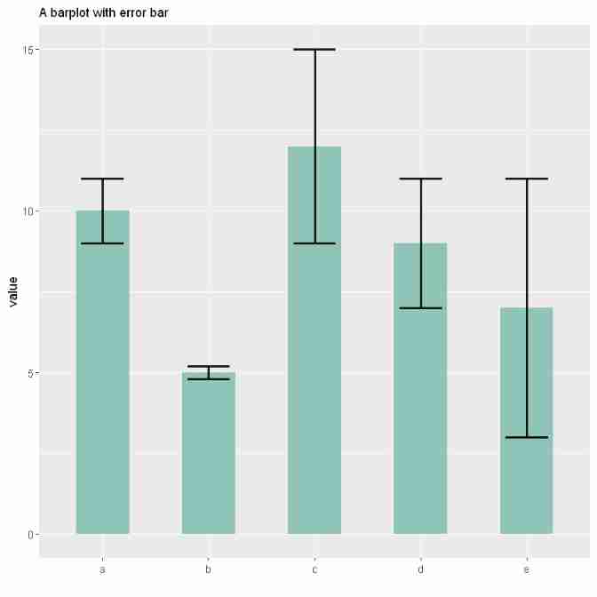
In the following illustration , Reported 5 individual group. The bar heights represent their average values . The black error bars provide information about how individual observations are scattered around the mean . for example , Seems to be groupB The measurement results in groupE More accurate in .
#  Load the library
library(tidyverse)
library(hrbrthemes)
library(viridis)
library(patchwork)

#  Create data
data <- data.frame(
    #  Create lower case numbers
    name=letters[1:5],
    value=sample(seq(4,15),5),
    sd=c(1,0.2,3,2,4)
)

#  Display data
head(data)
| name | value | sd | |
|---|---|---|---|
| <fct> | <int> | <dbl> | |
| 1 | a | 10 | 1.0 |
| 2 | b | 5 | 0.2 |
| 3 | c | 12 | 3.0 |
| 4 | d | 9 | 2.0 |
| 5 | e | 7 | 4.0 |
#  mapping
ggplot(data) +
#  Draw bar
geom_bar( aes(x=name, y=value), stat="identity", fill="#69b3a2", alpha=0.7, width=0.5) +
#  Draw error bars
geom_errorbar( aes(x=name, ymin=value-sd, ymax=value+sd), width=0.4, colour="black", alpha=0.9, size=1) +
theme(
  legend.position="none",
  plot.title = element_text(size=11)
) +
ggtitle("A barplot with error bar") +
xlab("")
Problems in the error line
Error bars hide information
Error bars can hide a lot of information . As shown in the figure below , This is a PLOS Biology A journal paper Beyond Bar and Line Graphs: Time for a New Data Presentation Paradigm Map in . It shows that the complete data may imply different conclusions from the summary statistics . among A A chart is a bar chart with error bars for summarizing data . But from A In the figure , We can't get A Clear data distribution information of the two data groups in the figure , because A The graph may correspond to different data group distribution information .A May correspond to B,C,D,E Four pictures , These four graphs show completely different data distribution information .B The chart shows that two data groups have the same type of data distribution ,C The figure shows that the second data group has abnormal values ,D The chart shows that the distribution of the two groups of data is different ,E The chart shows that the sample numbers of the two groups of data are different .

therefore , The same bar chart with error bars can actually tell a very different story , These data are hidden to the reader . So display personal data information as much as possible .
How error bars are calculated
The second problem with error lines is that there are many ways to calculate error lines , And it is not always clear which one is being shown . Error bars are usually calculated in three different ways , Choosing different calculation methods sometimes gives very different results . Here are their definitions and how to use them in R Count up .
standard deviation (SD)
Represents the dispersion of variables . The calculation formula is the square root of variance
#  Calculate variance
sd <- sd(vec)
#  Calculate the square root
sd <- sqrt(var(vec))
Standard error (SE)
Represents the standard deviation of the mean value of the variable , The calculation method is as follows SD Divided by the square root of the sample size . By calculation ,SE Less than SD. For very large sample sizes ,SE Tend to 0.
se = sd(vec) / sqrt(length(vec))
confidence interval (CI)
Represents the specific probability that a value exists in it . It is calculated as t*SE, among t The value is t Test at a specific significance level alpha The statistic value under . Its value is usually rounded to when there is a large sample size 1.96. however , If the sample size is large or the distribution is not normal , It's better to use bootstrap Method to calculate CI.
alpha=0.05
t=qt((1-alpha)/2 + .5, length(vec)-1)
#  A large amount of data is taken as 1.96
# t = 1.96
CI=t*se
above 3 Indicators in the famous Iris When applied to a dataset . The average sepal length and the average length of the three Iris species were expressed by error lines .
#  Reading data
data <- iris %>% select(Species, Sepal.Length)
head(data)
| Species | Sepal.Length | |
|---|---|---|
| <fct> | <dbl> | |
| 1 | setosa | 5.1 |
| 2 | setosa | 4.9 |
| 3 | setosa | 4.7 |
| 4 | setosa | 4.6 |
| 5 | setosa | 5.0 |
| 6 | setosa | 5.4 |
#  Calculate the standard deviation separately , Standard error , confidence interval
my_sum <- data %>%
  group_by(Species) %>%
  summarise(
    n=n(),
    mean=mean(Sepal.Length),
    sd=sd(Sepal.Length)
  ) %>%
  mutate( se=sd/sqrt(n))  %>%
  mutate( ic=se * qt((1-0.05)/2 + .5, n-1))
#  standard deviation
p1 <- ggplot(my_sum) +
  geom_bar( aes(x=Species, y=mean), stat="identity", fill="#69b3a2", alpha=0.7, width=0.6) +
  geom_errorbar( aes(x=Species, ymin=mean-sd, ymax=mean+sd), width=0.4, colour="black", alpha=0.9, size=1) +
  ggtitle("standard deviation") +
  theme(
    plot.title = element_text(size=6)
  ) +
  xlab("") +
  ylab("Sepal Length")

#  Standard error
p2 <- ggplot(my_sum) +
  geom_bar( aes(x=Species, y=mean), stat="identity", fill="#69b3a2", alpha=0.7, width=0.6) +
  geom_errorbar( aes(x=Species, ymin=mean-se, ymax=mean+se),width=0.4, colour="black", alpha=0.9, size=1) +
  ggtitle("standard error") +
  theme(
    plot.title = element_text(size=6)
  ) +
  xlab("") +
  ylab("Sepal Length")

#  confidence interval
p3 <- ggplot(my_sum) +
  geom_bar( aes(x=Species, y=mean), stat="identity", fill="#69b3a2", alpha=0.7, width=0.6) +
  geom_errorbar( aes(x=Species, ymin=mean-ic, ymax=mean+ic), width=0.4, colour="black", alpha=0.9, size=1) +
  ggtitle("confidence interval") +
  theme(
    plot.title = element_text(size=6)
  ) +
  xlab("") +
  ylab("Sepal Length")

p1 + p2 + p3

Obviously , this 3 Indicators report very different visualizations and conclusions . So you should always specify metrics for error bars .
resolvent
It is best to avoid error bars as much as possible . Of course , If you only have summary statistics , It's impossible . however , If you know each data point , Please show them . There are several possible solutions . Box charts with scatter information are suitable for relatively small amounts of data . When there is a lot of data , Using violin data graphs is another way .
ggplot(data,aes(x=Species, y=Sepal.Length)) +
#  mapping ,notch by TRUE It means drawing a violin , Otherwise, draw a box diagram
geom_boxplot( fill="#69b3a2", notch=T) +
#  Plot data point information
geom_jitter( size=0.9, color="orange", width=0.1) +
ggtitle("confidence interval") +
theme(
  plot.title = element_text(size=6)
) +
xlab("") +
ylab("Sepal Length")

Reference resources
边栏推荐
- [keras learning]fit_ Generator analysis and complete examples
- Use of OpenCV 11 kmeans clustering
- Understand HMM
- Fast Color Segementation
- How to do Internet for small enterprises
- Gadgets: color based video and image cutting
- Opencvsharp4 pixel read / write and memory structure of color image and gray image
- Model prediction of semantic segmentation
- 在IDEA使用C3P0連接池連接SQL數據庫後卻不能顯示數據庫內容
- Surpass the strongest variant of RESNET! Google proposes a new convolution + attention network: coatnet, with an accuracy of 89.77%!
猜你喜欢

What are the differences in cache/tlb?

speech production model

05 tabbar navigation bar function

Jump model between mirrors

Paper reading - beat tracking by dynamic programming

Opencv 15 face recognition and eye recognition

Opencvshare4 and vs2019 configuration
![Leetcode 450. 删除二叉搜索树中的节点 [二叉搜索树]](/img/39/d5c4d424a160635791c4645d6f2e10.png)
Leetcode 450. 删除二叉搜索树中的节点 [二叉搜索树]

Open source video recolor code

Yovo3 and yovo3 tiny structure diagram
随机推荐
Opencv 17 face recognition
[pytorch]fixmatch code explanation - data loading
Principle and steps of principal component analysis (PCA)
Deep learning the principle of armv8/armv9 cache
Advanced stair climbing
AutoX. JS invitation code
Mbedtls migration experience
Basic exercises of test questions Fibonacci series
Fast Color Segementation
Stm32f4 DMA Da sine wave generator keil5 Hal library cubemx
[reading papers] transformer miscellaneous notes, especially miscellaneous
Introduction to easydl object detection port
Think about the possibility of attacking secure memory through mmu/tlb/cache
Matlab: obtain the figure edge contour and divide the figure n equally
Armv8-m (Cortex-M) TrustZone summary and introduction
Termux SSH first shell start
Paper reading - joint beat and downbeat tracking with recurrent neural networks
Laravel 权限导出
Superficial understanding of conditional random fields
Barrykay electronics rushes to the scientific innovation board: it is planned to raise 360million yuan. Mr. and Mrs. Wang Binhua are the major shareholders