当前位置:网站首页>How to use data to tell a wonderful story?
How to use data to tell a wonderful story?
2022-06-23 05:04:00 【Desai intelligent digital visual interactive platform】
- What is data narrative
Definition of data story telling : Transform data information analysis into a widely accessible form of data visualization , Through the use of visual tools to visualize and analyze data, the process of influencing various business decisions, strategies and actions of enterprises . Data storytelling has many advantages to promote business development .
Data narration can effectively convey the information plot and the intimacy of narration , Visualize with the right data , Organize data into logic , And simplify the complicated data information , Use simpler visual narration to attract the target audience .
- How to tell stories with data
How to use data to create attractive 、 A lot of information 、 A compelling story , So as to achieve the purpose of effective communication , And how to fit the chart , How to eliminate clutter , How to focus the audience's attention , How to think like a designer , Turn the data into a wonderful story . And explain it together with case study .
- Establish a clear audience
In the production Data visualization Before , Clearly know who your audience data is ? You need them to know or do something ? We use it 《 Contemporary parents' International Children's Day 》 As an example , It is clear that the data audience is : children 、 Parents . Want them to know , Children's Day is coming , And the data related to children's day and children's day of parents' childhood . The determination of audience users can be Visual narration Framework , It establishes the basis of data presentation effect and Visual narrative The need for .

- Select a valid chart
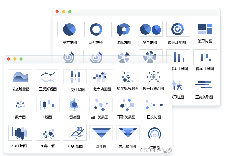
Presentation of data , What is the best way to show ? There are many types of data visualization charts : Broken line diagram 、 Histogram 、 Sort chart 、 Mind mapping 、 Radar map 、 Heat map 、 Box picture 、 Waterfall Plot 、 Maps, etc , What kind of data is suitable for each chart and what kind of scenario is suitable for ?
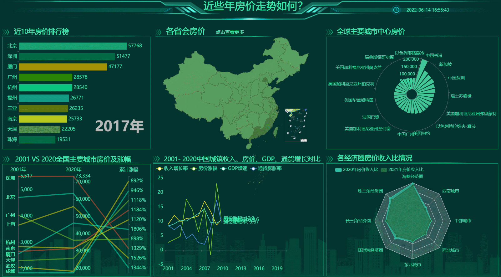
With 《 What is the trend of house prices in recent years 》 As an example . The housing price data of each provincial capital includes all provinces and cities in the country , It is best to use the map of China ; near 10 Ranking of annual house prices , The data spans the time dimension of ten years , Use dynamic data sorting diagram to show the best . Choose the chart with the right data , Is the best way to display data visualization .
- The large screen design should focus on the line of sight and avoid clutter
Clutter is your enemy , Data visualization screen The most taboo is disorder . When a blank page or screen , The audience's energy is occupied by the disordered charts . At this point, the meaning that the large screen wants to convey needs to spend more attention to try to identify , It also takes up extra brain power .
How to design a large screen , We need to think like designers , Strategically establish a graphical hierarchy , Help guide the audience to understand the information in the desired order .
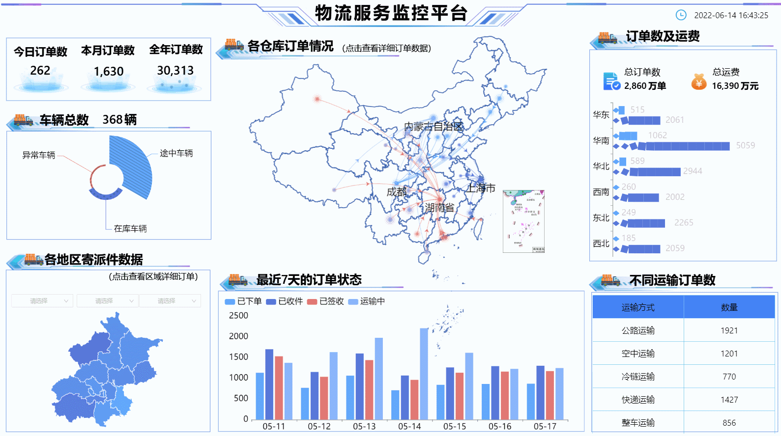
With 《 Logistics service monitoring platform 》 As an example , Visually, it is simple without losing its level , The large screen highlights the size of the chart 、 Color 、 Location and other attributes , And guide the audience to pay attention to what the designer expects from these attributes . Orders of each warehouse , Position in the middle and highlight the size , The vision tells us that this is the key data of the large screen .
- Choose the right data visualization tool
Choose a good one Visualization tools , It is the basis for data to tell a good story . There are many visualization tools in the domestic market , How to choose is particularly important .
First of all, the data chart should be rich , The more the better , The greater the range of options ; The second is operability , The simpler, the better , It is best to Zero code configuration ; Last but not least , free ! No charge for use . These points of this platform are consistent with , Friends who have visual needs can try it out .
- Conclusion
Data visualization It is the crystallization of science and art , It has a scientific side , We can follow the data to find the rules , There is also an artistic side , Present data with visible beauty , Use artistic thinking to simplify the process of audience understanding information .
边栏推荐
猜你喜欢

How to make social media the driving force of cross-border e-commerce? This independent station tool cannot be missed!

Actual combat | multiple intranet penetration through Viper
OGNL Object-Graph Navigation Language

Mini Homer - can you get a remote map data transmission link for hundreds of yuan?

go学习记录二(Window)

Abnova fluorescent dye 510-m streptavidin scheme

Shadertoy basic teaching 01. Circle drawing (explanation of smoothstep() function)

PaddlePaddle模型服务化部署,重新启动pipeline后出现报错,trt报错

2 万字 + 20张图|细说 Redis 九种数据类型和应用场景

Laravel 8.4 routing problem. At the end is the cross reference table on the left side of the editor, which can be understood by Xiaobai
随机推荐
Examples of corpus data processing cases (part of speech encoding, part of speech restoration)
1183. electricity
静态双位置继电器 XJLS-84/440/DC220V
DO280OpenShift命令及故障排查--常见故障排除和章节实验
Laravel customizes the paging style through the service provider
Thinkphp6 solving jump problems
聊聊 C# 中的 Composite 模式
Flask Foundation: environment setup + configuration + mapping between URL and attempt + redirection + database connection
Install and run mongodb under win10
Left and right values
Gson typeadapter adapter
Pads and flash symbols in cadence
ICer技能02makefile脚本自跑vcs仿真
Can bus Basics
开发一年不到,来面试居然敢开口要20K,面完连8K都不想给~
With the arrival of intelligent voice era, who is defining AI in the new era?
Const understanding II
dolphinscheduler 2.0.5 任务测试(spark task)报错:Container exited with a non-zero exit code 1
395. redundant path
ICer技能02makefile脚本自跑vcs仿真