当前位置:网站首页>利用 clip-path 绘制不规则的图形
利用 clip-path 绘制不规则的图形
2022-07-06 11:32:00 【不二博客】
在日常开发过程中UI设计师会存在不规则的形状和设计,在大多数的情况下我们使用了背景图片来渲染不规则的形状,但这与性能优化减少HTTP请求的原则是背道而驰的。
比如说UI设计师希望我们渲染出一个带有渐变颜色的菱形。

也许大家想到可以通过 transform: skew(-10deg) 函数来使图形倾斜,这看起来是一个不错的方案,但是我们想里面添加一些内容。

如下图右侧我们使用 transform: skew(-10deg) 改变你的元素的倾斜角度,但是其内部的元素也继承了父级的 transform 属性发生了倾斜。显然这不是UI设计师想要的效果。
此刻肯定会有机智的小伙伴说,既然子元素继承了父元素的 transform: skew(-10deg) 属性,那么我们设置子元素的 transform: skew(10deg) 属性不就可以了吗?

而此时此刻又出现了一下新的问题,虽然我们已经使子元素水平展示,但是我们元素的中点也发生了倾斜,同样也达不到UI设计师的要求。
而想要实现效果其实很简单,我们只需要 clip-path 来代替掉 transform 即可。
// transform: skew(-10deg);
clip-path: polygon(0% 100%, 15% 0%, 100% 0%, 85% 100%);
clip-path
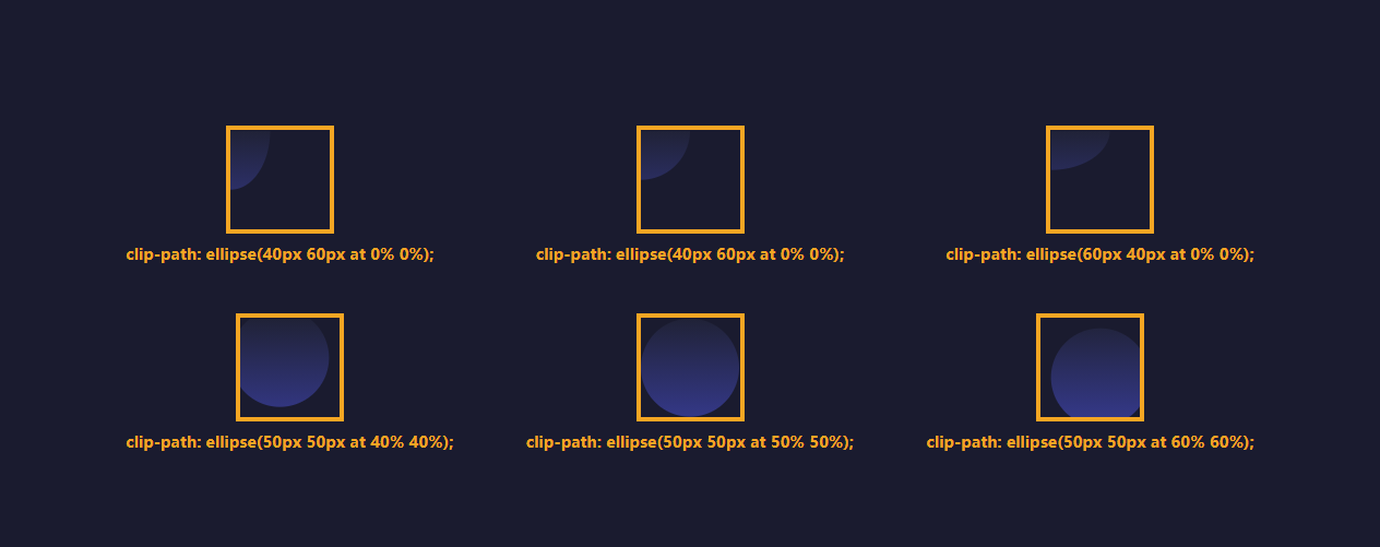
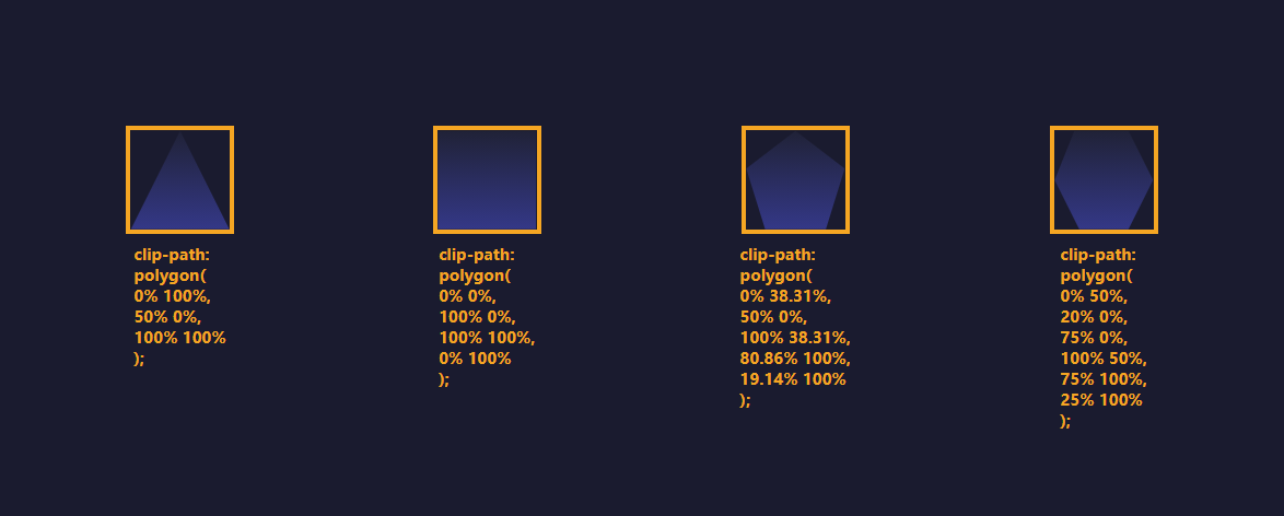
顾名思义,clip-path 是一个剪裁的路径,路径内的展示,路径外的隐藏。
inset 矩形
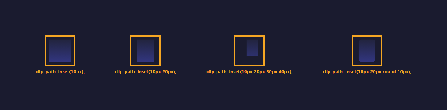
circle 圆形

ellipse 椭圆
polygon 多边形
怎么样,现在看到以上的属性,再反思一下之前的项目中,一定会有clip-path可代替或者简化的地方。
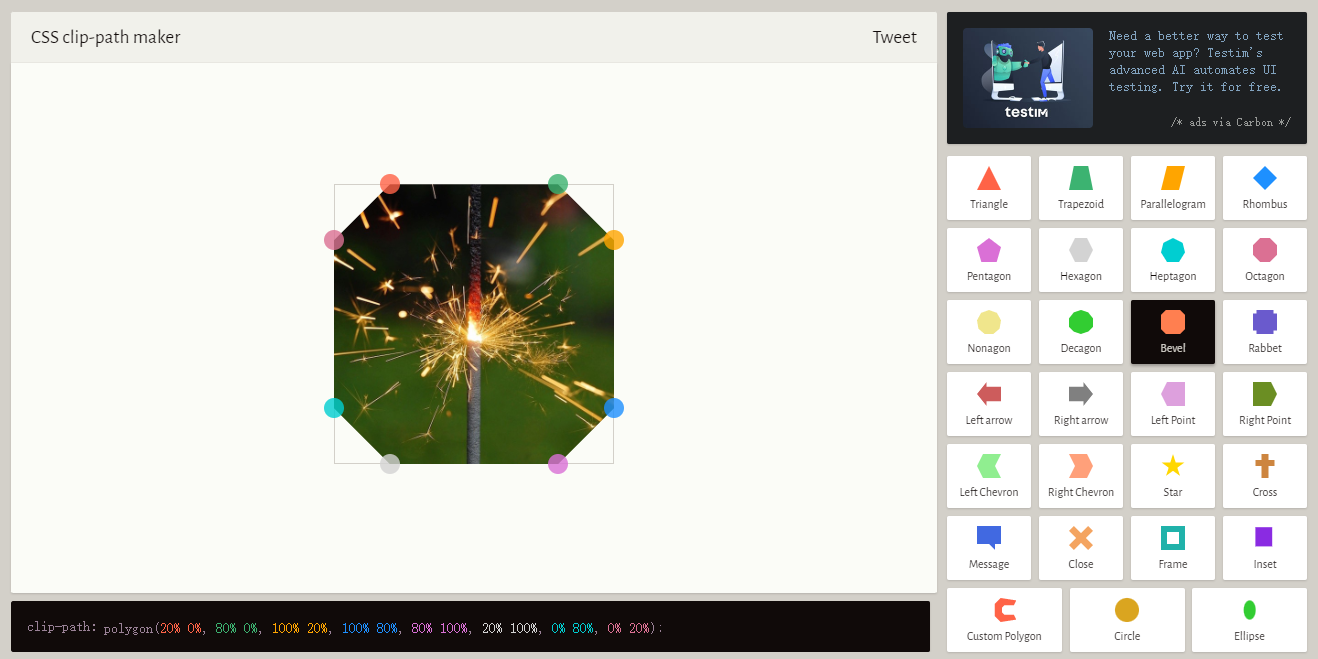
在这里推荐一款 clip-path 可视化工具,可以帮助我们快速的构建出想要的图形。
https://bennettfeely.com/clippy/
url 路径
除了以上基础的图形以外,我们还可以设置 svg 作为我们的路径进行剪裁。
<!-- 爱心 svg -->
<svg>
  <clipPath id="love" clipPathUnits="objectBoundingBox">
    <path
      d="M0.5,1
      C 0.5,1,0,0.7,0,0.3
      A 0.25,0.25,1,1,1,0.5,0.3
      A 0.25,0.25,1,1,1,1,0.3
      C 1,0.7,0.5,1,0.5,1 Z"
    />
  </clipPath>
</svg>

<style>
div {
  clip-path: url(#love);
}
</style>

延伸
以上就是 clip-path 的常用的一些属性了,那么我们到底可以通过 clip-path 实现什么效果呢?
比如我们来绘制绘制一个包含气泡消息的的聊天窗口。

<div class="message">
  <div class="message-pohoto">
    <img src="./logo.png" alt="" />
  </div>
  <div class="message-text">
    没有什么比让自己时刻保持优秀让人感到辛苦的了。从今天起,放弃对优秀的执念吧。与其执着于优秀,不妨让自己拥有不逃避任何事情的勇敢。不惧失败,果断地推进工作,让自己尽快成为那个敢于面对一切的勇者。
  </div>
</div>
<style>
  body,
  html {
    background-color: #f9f9f9;
  }

  .message {
    display: flex;
    align-items: flex-start;
    padding: 20px 10px;
  }

  .message-pohoto {
    padding-right: 20px;
  }

  .message-pohoto > img {
    width: 46px;
    height: 46px;
    border-radius: 50%;
  }

  .message-text {
    display: inline-block;
    position: relative;
    min-height: 46px;
    box-sizing: border-box;
    display: flex;
    align-items: center;
    color: #fff;
    font-size: 14px;
    padding: 10px 10px 10px 15px;
    --bg: linear-gradient(45deg, #ff3c41, #ff9800);
    filter: drop-shadow(0 0 4px rgba(0, 0, 0, 0.5));
  }

  .message-text::before,
  .message-text::after {
    content: "";
    position: absolute;
    width: 100%;
    height: 100%;
    left: 0;
    top: 0;
    background: var(--bg);
    z-index: -1;
  }

  .message-text::before {
    clip-path: inset(0 0 0 5px round 5px);
  }
  .message-text::after {
    clip-path: polygon(0% 23px, 5px calc(23px + 5px), 5px calc(23px - 5px));
  }
总结
clip-path 可以剪裁出各种不规则的形状,使用的好可以简化我们的工作,同时也可以实现很多特殊的效果,是非常值得大家去学习和运用~
最后
感谢你的阅读~
如果觉得这篇文章对你有所帮助,点赞、在看是最大的支持!
边栏推荐
- The list of people who passed the fifth phase of personal ability certification assessment was published
- short i =1; i=i+1与short i=1; i+=1的区别
- [paper notes] transunet: transformers make strongencoders for medical image segmentation
- First day of rhcsa study
- The slave i/o thread stops because master and slave have equal MySQL serv
- Airiot IOT platform enables the container industry to build [welding station information monitoring system]
- Reflection and illegalaccessexception exception during application
- Interface test tool - postman
- 业务与应用同步发展:应用现代化的策略建议
- The dplyr package of R language performs data grouping aggregation statistical transformations and calculates the grouping mean of dataframe data
猜你喜欢

思維導圖+源代碼+筆記+項目,字節跳動+京東+360+網易面試題整理

Countdown 2 days | live broadcast preview of Tencent cloud message queue data import platform

Characteristic colleges and universities, jointly build Netease Industrial College
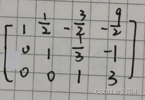
数学知识——高斯消元(初等行变换解方程组)代码实现
![[translation] a GPU approach to particle physics](/img/07/57036c925155cab36678c696e89440.jpg)
[translation] a GPU approach to particle physics
深入分析,Android面试真题解析火爆全网

Help improve the professional quality of safety talents | the first stage of personal ability certification and assessment has been successfully completed!
Carte de réflexion + code source + notes + projet, saut d'octets + jd + 360 + tri des questions d'entrevue Netease
Benefit a lot, Android interview questions
Spark foundation -scala
随机推荐
R language ggplot2 visual time series histogram: visual time series histogram through two-color gradient color matching color theme
ModuleNotFoundError: No module named ‘PIL‘解决方法
Leetcode topic [array] - 119 Yang Hui triangle II
Unlock 2 live broadcast themes in advance! Today, I will teach you how to complete software package integration Issues 29-30
受益匪浅,安卓面试问题
R语言ggplot2可视化:使用ggpubr包的ggviolin函数可视化小提琴图
保证接口数据安全的10种方案
黑马--Redis篇
五金机电行业智能供应链管理系统解决方案:数智化供应链为传统产业“造新血”
Analysis of frequent chain breaks in applications using Druid connection pools
10 schemes to ensure interface data security
打家劫舍III[后序遍历与回溯+动态规划]
关于静态类型、动态类型、id、instancetype
Carte de réflexion + code source + notes + projet, saut d'octets + jd + 360 + tri des questions d'entrevue Netease
Computer network: sorting out common network interview questions (I)
How word displays modification traces
[paper notes] transunet: transformers make strongencoders for medical image segmentation
pychrm社区版调用matplotlib.pyplot.imshow()函数图像不弹出的解决方法
凤凰架构3——事务处理
倒计时2天|腾讯云消息队列数据接入平台(Data Import Platform)直播预告