当前位置:网站首页>Flex布局详解
Flex布局详解
2022-07-31 16:34:00 【m0_67394006】
Flex 布局详解
一、入门
1. flex 是什么?
- flex 是 Flexible Box 的缩写,就是弹性盒子布局的意思
2. 为什么我们需要 flex
解决元素居中问题
自动弹性伸缩,合适适配不同大小的屏幕,和移动端
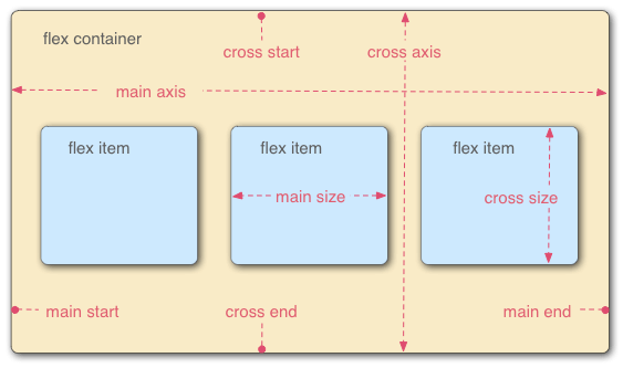
3.flex 常见术语 三个2
序号
简记
术语
1
二成员
容器和项目(container / item)
2
二根轴
主轴与交叉轴(main-axis / cross-axis)
3
二根线
起始线(main/cross-start)与结束线(main/cross-end)
二、容器 container 的属性
外面的大容器的属性的设置
1. flex-direction   主轴方向
2. flex-wrap        主轴一行满了换行
3. flex-flow        1和2的组合
4. justify-content  主轴元素对齐方式
5. align-items      交叉轴元素对齐方式//单行
6. align-content    交叉轴行对齐方式//多行
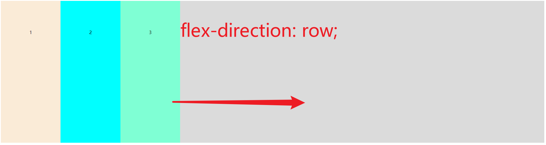
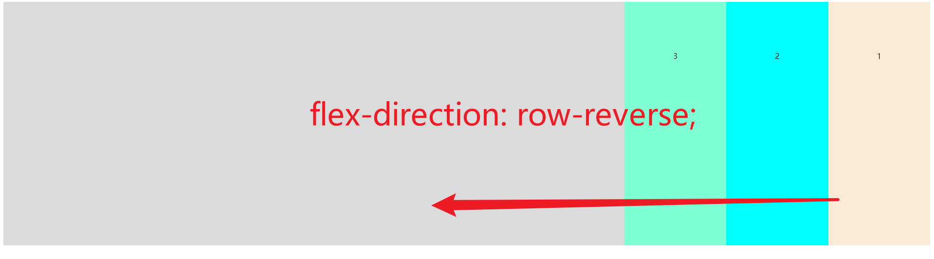
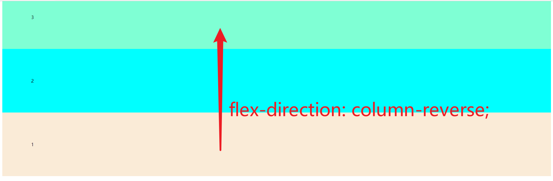
1.flex-direction 主轴方向
row(默认值):主轴为水平方向,起点在左端。
row-reverse:主轴为水平方向,起点在右端。
column:主轴为垂直方向,起点在上沿。
column-reverse:主轴为垂直方向,起点在下沿。

code
<!DOCTYPE html>
<html lang="en">
<head>
    <meta charset="UTF-8">
    <meta name="viewport" content="width=device-width, initial-scale=1.0">
    <title>Document</title>
</head>
<style>
.container{
    display: flex;
    height: 600px;
    background-color: rgb(219, 219, 219);
}
.container{
    flex-direction: row;
    /* flex-direction: row-reverse; */
    /* flex-direction: column; */
    /* flex-direction: column-reverse; */
}
.item{
    padding: 100px;
}
</style>
<body>
    <div class="container">
        <div class="item" style="background-color: antiquewhite;">1</div>
        <div class="item" style="background-color: aqua;">2</div>
        <div class="item" style="background-color: aquamarine;">3</div>
    </div>
</body>
</html>
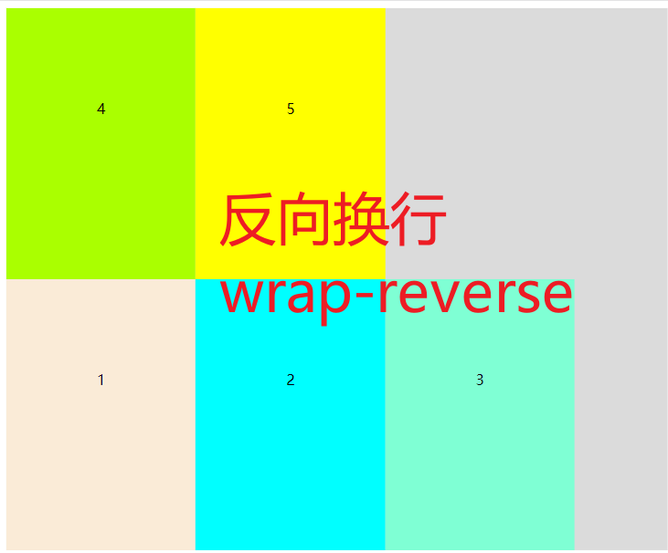
2. flex-wrap 主轴一行满了换行
nowrap (默认值) 不换行压缩宽度
wrap    换行
wrap-reverses 反向换行


code
<!DOCTYPE html>
<html lang="en">
<head>
    <meta charset="UTF-8">
    <meta name="viewport" content="width=device-width, initial-scale=1.0">
    <title>Document</title>
</head>
<style>
.container{
    display: flex;
    height: 600px;
    background-color: rgb(219, 219, 219);
}
.container{
    /* flex-wrap: nowrap; */
    flex-wrap: wrap;
    /* flex-wrap: wrap-reverse; */
}
.item{
    padding: 100px;
}
</style>
<body>
    <div class="container">
        <div class="item" style="background-color: antiquewhite;">1</div>
        <div class="item" style="background-color: aqua;">2</div>
        <div class="item" style="background-color: aquamarine;">3</div>
        <div class="item" style="background-color: #aaff00;">4</div>
        <div class="item" style="background-color: #ffff00;">5</div>
    </div>
</body>
</html>
3. flex-flow 1和2的组合
flex-low: [flex-direction] [flex-wrap]
就是 1 和 2 的组合,简写,同上,这里不赘述.
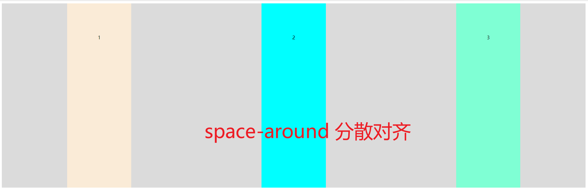
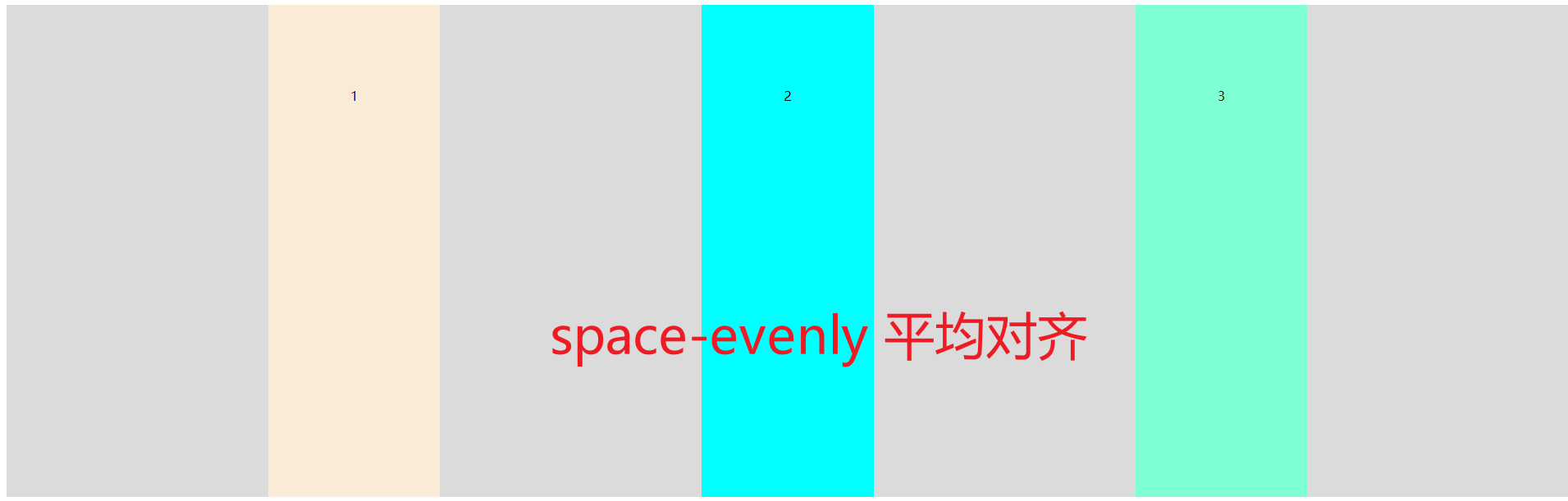
4.justify-content 主轴元素对齐方式
这里是元素的对齐,区别于刚刚的「方向」
flex-start (默认)靠着main-start对齐//参考常见术语(一般是左方向)
flex-end   靠着main-end对齐//参考常见术语(一般是右方向)
center     靠着主轴居中对齐//一般就是居中对齐
space-between 两端对齐,靠着容器壁,剩余空间平分
space-around  分散对齐,不靠着容器壁,剩余空间在每个项目二侧平均分配
space-evenly  平均对齐,不靠着容器壁,剩余空间平分


code
<!DOCTYPE html>
<html lang="en">
<head>
    <meta charset="UTF-8">
    <meta name="viewport" content="width=device-width, initial-scale=1.0">
    <title>Document</title>
</head>
<style>
.container{
    display: flex;
    height: 600px;
    background-color: rgb(219, 219, 219);
}
.container{
    /* justify-content: flex-start; */
    /* justify-content: flex-end; */
    /* justify-content: center; */
    /* justify-content: space-between; */
    /* justify-content: space-around; */
    justify-content: space-evenly;
}
.item{
    padding: 100px;
}
</style>
<body>
    <div class="container">
        <div class="item" style="background-color: antiquewhite;">1</div>
        <div class="item" style="background-color: aqua;">2</div>
        <div class="item" style="background-color: aquamarine;">3</div>
    </div>
</body>
</html>
5.align-items item「项目」在交叉轴上对齐方式「单轴」
这个是 container 容器的属性,设置的是 items 项目元素在交叉轴上对齐样式
flex-start:交叉轴的起点对齐。
flex-end:交叉轴的终点对齐。
center:交叉轴的中点对齐。
baseline: 项目的第一行文字的基线对齐。
stretch(默认值)伸展:如果项目未设置高度或设为auto,将占满整个容器的高度。
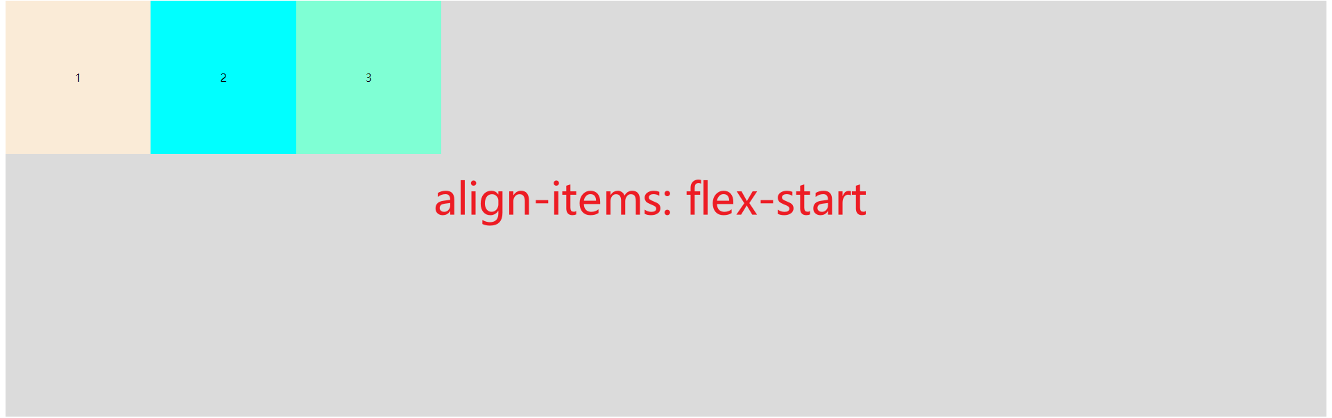


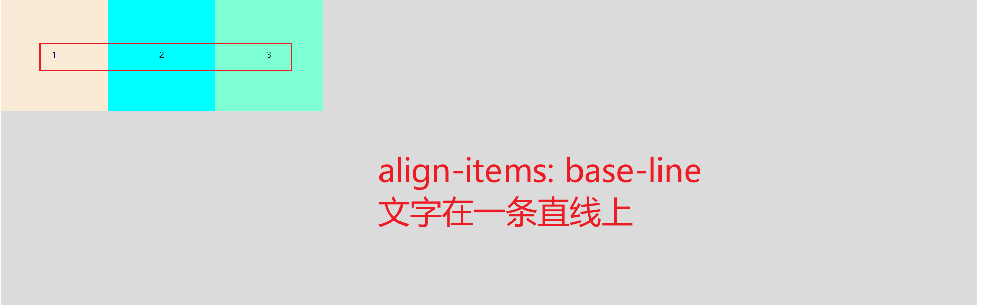
(一般用不着,本来就在一条直线上)

伸展,就是会填充宽度
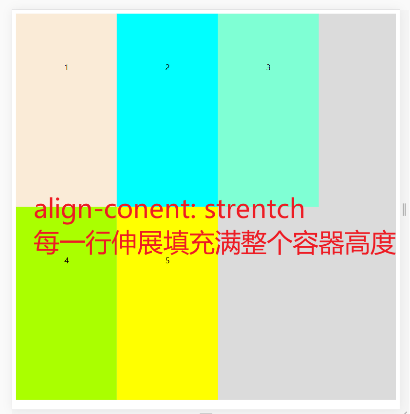
6. align-content 交叉轴行对齐方式 多行
这个和 justify-content 属性一模一样,
justify-conent,align-items,align-content 都极度相似.
flex-start (每一行)(默认)靠着cross-start对齐//参考常见术语(一般是左方向)
flex-end   (每一行)靠着cross-end对齐//参考常见术语(一般是右方向)
center     (每一行)靠着cross线居中对齐//一般就是居中对齐
space-between (每一行)两端对齐,靠着容器上下壁,剩余空间平分
space-around  (每一行)分散对齐,不靠着容器壁,剩余空间在每个项目二侧平均分配
strentch      (每一行)伸缩,占满整个高度


code
<!DOCTYPE html>
<html lang="en">
<head>
    <meta charset="UTF-8">
    <meta name="viewport" content="width=device-width, initial-scale=1.0">
    <title>Document</title>
</head>
<style>
.container{
    display: flex;
    height: 800px;
    background-color: rgb(219, 219, 219);
    /* 因为需要多行,所以要换行 */
    flex-wrap: wrap;
}
.container{
    align-content: flex-start;
    /* align-content: flex-end; */
    /* align-content: center; */
    /* align-content: space-between; */
    /* align-content: space-around; */
    /* align-content: stretch; */

}
.item{
    padding: 100px;
}
</style>
<body>
    <div class="container">
        <div class="item" style="background-color: antiquewhite;">1</div>
        <div class="item" style="background-color: aqua;">2</div>
        <div class="item" style="background-color: aquamarine;">3</div>
        <div class="item" style="background-color: #aaff00;">4</div>
        <div class="item" style="background-color: #ffff00;">5</div>
    </div>
</body>
</html>
三、项目元素 item 的属性
容器里面的子元素item「项目」的属性
flex-grow:长大
flex-shrinik: 缩小
align-self: 覆盖container align-items 属性
order 排序
flex-basis: 有效宽度
1.flex-grow 长大
在容器主轴上存在剩余空间时,
flex-grow才有意义该属性的值,称为放大因子, 常见的属性值如下:
序号
属性值
描述
1
0默认值
不放大,保持初始值
2
initial
设置默认值,与0等效
3
n
放大因子: 正数
放大后的效果

<!DOCTYPE html>
<html lang="en">
<head>
    <meta charset="UTF-8">
    <meta name="viewport" content="width=device-width, initial-scale=1.0">
    <title>Document</title>
</head>
<style>
.container{
    display: flex;
    height: 800px;
    background-color: rgb(219, 219, 219);
}
.item{
    padding: 100px;
}
.item1{
    /* 其他的都是0,这一个是1,所以能所有剩下的空间都是item1的 */
    flex-grow: 1;
}

</style>
<body>
    <div class="container">
        <div class="item item1" style="background-color: antiquewhite;">1</div>
        <div class="item" style="background-color: aqua;">2</div>
        <div class="item" style="background-color: aquamarine;">3</div>
    </div>
</body>
</html>
2. flex-shrinik: 缩小
- 当容器主轴 “空间不足” 且 “禁止换行” 时,
flex-shrink才有意义 - 该属性的值,称为收缩因子, 常见的属性值如下:
序号
属性值
描述
1
1默认值
允许项目收缩
2
initial
设置初始默认值,与 1 等效
3
0
禁止收缩,保持原始尺寸
4
n
收缩因子: 正数
示例:

<!DOCTYPE html>
<html lang="en">
<head>
    <meta charset="UTF-8">
    <meta name="viewport" content="width=device-width, initial-scale=1.0">
    <title>Document</title>
</head>
<style>
.container{
    display: flex;
    height: 800px;
    width: 400px;
    background-color: rgb(219, 219, 219);
    flex-direction: row;
    flex-wrap: nowrap;
    align-content: flex-start;
}
.item{
    width: 200px;
    height: 200px;
    font-size: 1.5rem;
    /* 禁止收缩 */
    flex-shrink: 0;
}
.item1{
    flex-shrink: 1;
}
.item2{
    flex-shrink: 0;
}
.item3{
    flex-shrink: 3;
}
/*  container 容器的宽度是 400,3个字元素总宽度是 600 超过了 200
    然后按照比例缩小到这些元素上 200/4 = 50
    item1 缩小 50 * 1 = 50,还剩 150
    item2 不缩小
    item3 缩小 50 * 3 = 150 还剩 50
 */

</style>
<body>
    <div class="container">
        <div class="item item1" style="background-color: antiquewhite;">1</div>
        <div class="item item2" style="background-color: aqua;">2</div>
        <div class="item item3" style="background-color: aquamarine;">3</div>
    </div>
</body>
</html>
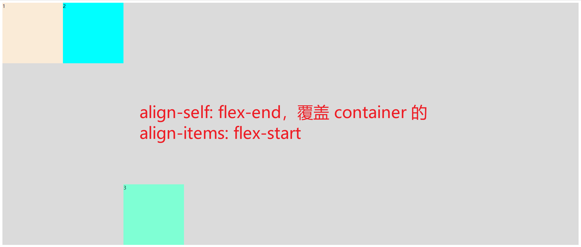
3. align-self: 覆盖container align-items 属性
- 该属性可覆盖容器的
align-items, 用以自定义某个项目的对齐方式
序号
属性值
描述
1
auto默认值
继承 align-items 属性值
2
flex-start
与交叉轴起始线对齐
3
flex-end
与交叉轴终止线对齐
4
center
与交叉轴中间线对齐: 居中对齐
5
stretch
在交叉轴方向上拉伸
6
baseline
与基线对齐(与内容相关用得极少)
例子:
html
<!DOCTYPE html>
<html lang="en">
<head>
    <meta charset="UTF-8">
    <meta name="viewport" content="width=device-width, initial-scale=1.0">
    <title>Document</title>
</head>
<style>
.container{
    display: flex;
    height: 800px;
    background-color: rgb(219, 219, 219);
    flex-direction: row;
    flex-wrap: nowrap;
}
.container{
    /* container指定容器的对齐 flex-start */
    align-items: flex-start;
}
.item{
    width: 200px;
    height: 200px;
}
.item3{
    /* 元素3 item3 覆盖container的设置,flex-end */
    align-self: flex-end;
}

</style>
<body>
    <div class="container">
        <div class="item item1" style="background-color: antiquewhite;">1</div>
        <div class="item item2" style="background-color: aqua;">2</div>
        <div class="item item3" style="background-color: aquamarine;">3</div>
    </div>
</body>
</html>
4. order 排序

就是将元素重新排序
code
<!DOCTYPE html>
<html lang="en">
<head>
    <meta charset="UTF-8">
    <meta name="viewport" content="width=device-width, initial-scale=1.0">
    <title>Document</title>
</head>
<style>
.container{
    display: flex;
    height: 800px;
    background-color: rgb(219, 219, 219);
}

.item{
    width: 200px;
    height: 200px;
    order: 0;
}
.item1{
    order: 3;
}

</style>
<body>
    <div class="container">
        <div class="item item1" style="background-color: antiquewhite;">1</div>
        <div class="item item2" style="background-color: aqua;">2</div>
        <div class="item item3" style="background-color: aquamarine;">3</div>
    </div>
</body>
</html>
5. flex-basis属性
flex-basis属性定义了在分配多余空间之前,项目占据的主轴空间(main size)。浏览器根据这个属性,计算主轴是否有多余空间。它的默认值为auto,即项目的本来大小。
.item {
  flex-basis: <length> | auto; /* default auto */
}
它可以设为跟width或height属性一样的值(比如350px),则项目将占据固定空间。
参考:
Flex 布局教程:语法篇 - 阮一峰的网络日志 (ruanyifeng.com)
flex布局(主轴方向 、主轴项目对齐方式 、交叉轴项目对齐 、项目顺序 、项目独立对齐方向 ) - 前端 - php中文网博客
)
先自我介绍一下,小编13年上师交大毕业,曾经在小公司待过,去过华为OPPO等大厂,18年进入阿里,直到现在。深知大多数初中级java工程师,想要升技能,往往是需要自己摸索成长或是报班学习,但对于培训机构动则近万元的学费,着实压力不小。自己不成体系的自学效率很低又漫长,而且容易碰到天花板技术停止不前。因此我收集了一份《java开发全套学习资料》送给大家,初衷也很简单,就是希望帮助到想自学又不知道该从何学起的朋友,同时减轻大家的负担。添加下方名片,即可获取全套学习资料哦
边栏推荐
- AcWing 1282. 搜索关键词 题解((AC自动机)Trie+KMP)+bfs)
- go图书管理系统
- 单细胞测序流程(单细胞rna测序)
- 百度网盘网页版加速播放(有可用的网站吗)
- 【源码解析】BeanFactory和FactoryBean
- C language - function
- Applicable scenario of multi-master replication (2) - client and collaborative editing that require offline operation
- Website vulnerability repair service provider's analysis of unauthorized vulnerability
- SHELL内外置命令
- flutter设置statusbar状态栏的背景颜色和 APP(AppBar)内部颜色一致方法。
猜你喜欢
研发过程中的文档管理与工具
![[TypeScript]OOP](/img/d7/b3175ab538906ac1b658a9f361ba44.png)
[TypeScript]OOP

.NET 20th Anniversary Interview - Zhang Shanyou: How .NET technology empowers and changes the world

使用互相关进行音频对齐
研发过程中的文档管理与工具

selenium的常见方法及使用
![[Network Communication 3] Advantech Gateway Modbus Service Settings](/img/ec/e9e1d9a374183ecaa8a8c9437ec82c.png)
[Network Communication 3] Advantech Gateway Modbus Service Settings

仿生毛毛虫机器人源码
智能垃圾桶(八)——红外对管传感器(树莓派pico)

【TypeScript】深入学习TypeScript类型操作
随机推荐
动态规划之线性dp(下)
Smart Trash Can (8) - Infrared Tube Sensor (Raspberry Pi pico)
宁波大学NBU IT项目管理期末考试知识点整理
After the form is submitted, the page does not jump [easy to understand]
动态规划之线性dp(上)
Mariabackup implements incremental data backup for Mariadb 10.3
LeetCode_733_Image rendering
上传图片-微信小程序(那些年的坑记录2022.4)
【Yugong Series】July 2022 Go Teaching Course 022-Dictionary of Go Containers
MySQL multi-table union query
小程序:matlab解微分方程「建议收藏」
2022年整理LeetCode最新刷题攻略分享(附中文详细题解)
Masterless replication system (2) - read and write quorum
[7.28] Code Source - [Fence Painting] [Appropriate Pairs (Data Enhanced Version)]
Handling write conflicts under multi-master replication (4) - multi-master replication topology
How C programs run 01 - the composition of ordinary executable files
Implementing DDD based on ABP
How to install CV2 smoothly in Anaconda
2020微信小程序反编译教程(小程序反编译源码能用吗)
LevelSequence源码分析