当前位置:网站首页>Matplotlib drawing
Matplotlib drawing
2022-07-03 10:09:00 【Most appropriate commitment】
Catalog
Various attributes of graphics
Directly in figure Upper foundation drawing
figure Basic drawing + line attribute
Axes: Subgraphs 、 Axis domain , For display figure Small figure in the panel
Axes: Axis , scale and Axis title
Axes:plot mapping , legend, Text , mark , grid , In the picture , Different axis drawing
library
import matplotlib.pyplot as plt
import numpy as np

# 0.3 - 3.5  Between   Set up  100 A little bit
x = np.linspace(0.3, 3.5, 100)

#  random number

#  Will return  0-1 Random number between
np.random.rand()

#  Will return   contain 2 individual 0 To 1 List of random numbers between
y = np.random.rand(n)

#  Will return  n1 X n2  The random number matrix of
y = np,random,rand(n1,n2)


# np.random.randn()   Usage is similar. , however   The return is   The mean for 0,
#  The standard deviation is 1 Of   Normal distribution , That is, the return value will exceed (0-1)


#   stay  0~10  Inside   formation  100 A little bit
boxWeight = np.random.randint(0,10,100)
Various attributes of graphics
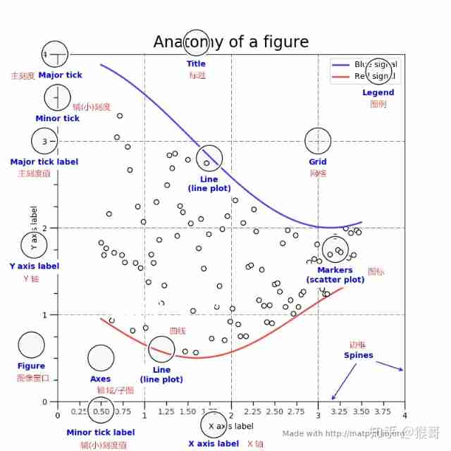
Figure:
Image window , contain Axes,tiles,Legends Wait for the outermost window , yes windows Application window .
figure attribute
fig = plt.figure()
fig = plt.figure(figsize=(8, 6), dpi=80)
## Set the handle
fig = plt.gcf() # Get the current figure
fig = ax1.figure # Gets the window to which the specified sub graph belongs
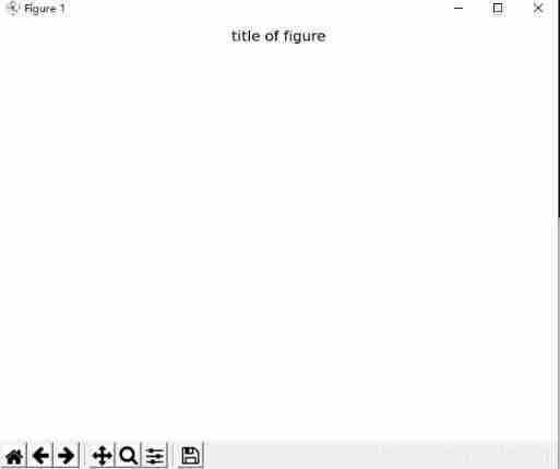
### fig Title settings for
fig.suptitle('title of figure')
# Title of picture
# fig.suptitle() Is the title of the canvas , plt.title() Is the title of the diagram
plt.title('title of picture')
plt.savefig('aa.jpg',dpi=400,bbox_inches='tight')
#savefig Save the picture ,dpi The resolution of the ,bbox_inches The size of the white space around the subgraph
Directly in figure Upper foundation drawing
###   Not recommended , It is recommended to use  Axes

x = np.linespace(-2,6,50)  # from -2 to 6, total 50 points
y1 = x + 3
y2 = 3 - x
plt.figure()
plt.plot(x,y1)
plt.plot(x,y2)

plt.show()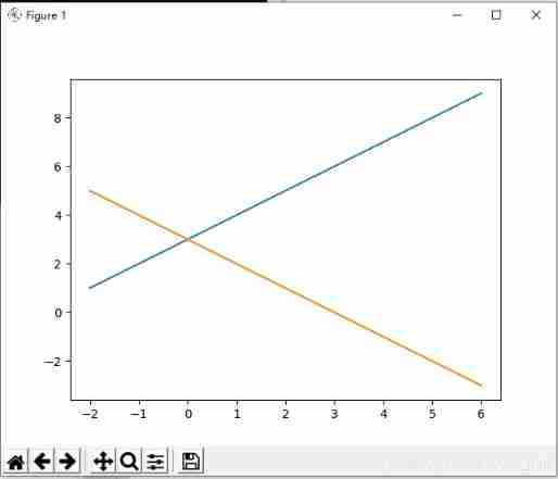
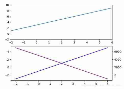
figure Basic drawing + line attribute
x = np.linspace(-2,6,50)  # from -2 to 6, total 50 points
y1 = x + 3
y2 = 3 - x


#  Directly generate one at a time ax Subgraphs , Then operate directly in the subgraph

plt.subplot(2,1,1)
plt.plot(x,y1)


#  Set the width of the line , Color , Linetype ,  obtain Line2D Handle of attribute  list
# plt.plot()  Medium label='y1'  Have to add  plt.legend()  Will show
line = plt.plot(x,y,label='y1',color='purple',linewidth=2, linestyle='--')
plt.legend()


line[0].set_linewidth(5)  # plt.plot  and  ax.plot  Can get the drawing   Line set


# axis limit

plt.axis([-2,-2, 6,10])
##  The same thing

plt.xlim(-2,6)
plt.ylim(-2,10)


plt.subplot(2,1,2)
plt.plot(x,y2)


#   Set up   Level ,  Vertical line
plt.axhline(y=0, c='r', ls='--', lw=2)    #  Level
plt.axvline(x=4, c='r', ls='--', lw=2)    #  Vertical line


#   Set up   vertical / level    Reference area  +  Fill color
plt.axvspan(xmin=4, xmax=6, facecolor='y', alpha=0.3)
plt.axhspan(ymin=0, ymax =0.5, facecolor='y', alpha=0.3)


#   Set up    arrow
plt.annotate('important point', xy=(2, 6), xytext=(3, 1.5),
 weight='bold', color='b', arrowprops=dict(facecolor='black', shrink=0.05)
            )


plt.show()
shortcoming :
figure Drawing directly on , Can't change axis Related properties , So it's not recommended , Recommended settings figure, Then set the axes( Even if there is only one axes), Then set the Related properties of subgraph , And draw .
advantage
But directly figure Draw on , Able to use Vertical line , Level , Add special points , Mark, etc
Axes: Subgraphs 、 Axis domain , For display figure Small figure in the panel
# axes[0] axes[1] axes[2] axes[3]  Can be used to axis  call
fig,axes = plt.subplots(2,2)

#  You can also define a subgraph at a time
ax = plt.subplot(2,2,1)

axis: Corresponding ax Medium x axis and y axis.
Axes: Axis , scale and Axis title
##  Subgraph title
ax.set_title(' ')

##  Name of coordinate axis of subgraph
ax.set_xlabel(' ')
ax.set_ylabel(' ')


##  Change the axis range

ax.set_xlim([-5,6])
ax.set_ylim([-2,10])

##  Change the axis scale

ax.set_xticks([-1,0,1])
ax.set_yticks(range(-2,10,1))


##  Change axis scale name

ax.set_yticklabels([r'-1', r'0', r'+1'])

ax.set_xticklabels(labels=['x1','x2','x3','x4','x5'],rotation=-30,fontsize='small')
# Set the display text of the scale ,rotation Rotation Angle ,fontsize font size


###  Set the size scale

from matplotlib.ticker import MultipleLocator

#  Main scale
xmajorLocator = MultipleLocator(2)
# Define the scale difference of the horizontal major scale label as 2 Multiple . It's just a few ticks apart to show a label text
ymajorLocator = MultipleLocator(3)
# Define the scale difference of the vertical major scale label as 3 Multiple . It's just a few ticks apart to show a label text

ax.xaxis.set_major_locator(xmajorLocator)
ax.yaxis.set_major_locator(ymajorLocator)

#  Secondary scale
# take x The axis scale label is set to 5 Multiple
xminorLocator = MultipleLocator(5)
# Put this y The axis scale label is set to 0.2 Multiple
yminorLocator = MultipleLocator(0.2)

# Display the position of the secondary scale label , No label text
ax.xaxis.set_minor_locator(xminorLocator)
ax.yaxis.set_minor_locator(yminorLocator)


###   Set up   grid
ax1.xaxis.grid(True, which='major')      #x The grid of the axis uses the defined major scale format
ax1.yaxis.grid(True, which='major')      #x The grid of the axis uses the defined major scale format   major, minor


###  Set up   Axis scale ( Size scale ) Of   Format

from matplotlib.ticker import  FormatStrFormatter


xmajorFormatter = FormatStrFormatter('%3.1f')
ymajorFormatter = FormatStrFormatter('%1.1f')

ax.xaxis.set_major_formatter(xmajorFormatter)
ax.yaxis.set_major_formatter(ymajorFormatter)


###  hide   That is not used ax

axes[j].axis('off')


###    Axis inversion
axes[i].invert_yaxis()

###    Sets the position of the axis
axes[i].xaxis.set_ticks_position('top')

Axes:plot mapping , legend, Text , mark , grid , In the picture , Different axis drawing
x = np.linspace(-2,6,50)  # from -2 to 6, total 50 points
y1 = x + 3
y2 = 3 - x
y3 = 1000+ 1000*x


ax = plt.subplot(1,1,1)


###  Set line handle
line1, line2 = ax.plot(x,y1,'r', x,y2,'b')

### Set the line width under the line handle
line1.set_linewidth(2)
line2.set_linewidth(2)


###  color Color change    linestyle Change Linetype    linewidth  Change the line width    marker  Change point type
###  markersize  Change the size of the point  alpha transparency

line = ax.plot(x,y,label='y',alpha=0.5, color='purple',linewidth=2, linestyle='--',
marker='p', markersize=5 )

###  Color , Point type , Linetype   Can be abbreviated to :
### ax.plot(x,y,'rp-')

##  line[0].set_linewidth = 5;    line Get is plot Line set of drawing


###  Set the line legend
ax.legend([line1,line2],['y = x+3','y = 3 - x'],loc='best')

## loc = 'best', 'upper right', 'upper left', 'lower left', 'lower right', 'right',
## 'center left',
## 'center right', 'lower center', 'upper center', 'center'


# Display text at specified location ,plt.text()
#weight : normal | bold | bolder | lighter | 100 | 200 | 300 | 400 | 500 | 600 | 700 |
#  800 | 900
ax.text(2.8, 7, r'y=3*x', weight='bold',color='b')


# Add labels , Parameters : Annotated text 、 Point of reference 、 Text location 、 Text font , Text color , Arrow properties
ax.annotate('important point', xy=(2, 6), xytext=(3, 1.5),
 weight='bold', color='b', arrowprops=dict(facecolor='black', shrink=0.05)
            )


#  Show grid .which The value of the parameter is major( Just draw the big scale )、minor( Just draw small scales )、both, The default value is major.
# axis by 'x','y','both'

ax.grid(b=True,which='major',axis='both',alpha= 0.5,
color='skyblue',linestyle='--',linewidth=2)


 In the picture
axes1 = plt.axes([.2, .3, .1, .1], facecolor='y')
# Add a sub graph to the current window ,rect=[ Left ,  Next ,  wide ,  high ],
#  It's using   The proportion   Locate
axes1.plot(x,y2)


#  In a subgraph   Same as x Axis , Different y Axis    ;  Same as y Axis , Different x Axis
# ax1.twinx()   ax1.twiny()

ax2 = ax1.twinx()
ax2.plot(x,y3,label='y3',color='blue')

color property color

Linetype properties linestyle
- Solid line : '-'
- Dotted line : '--'
- Dotted line : '-.'
- Dotted line : ':'
- spot : '.'
Point type marker
Pixels : ','
circular : 'o'
Upper triangle : '^'
Lower triangle : 'v'
Left triangle : '<'
Right triangle : '>'
square : 's'
plus : '+'
Fork : 'x'
Prismatic : 'D'
Fine prismatic : 'd'
Tripod down : '1'( It's Ya )
Tripod up : '2'
The tripod faces left : '3'
The tripod faces right : '4'
hexagon : 'h'
Rotate hexagon : 'H'
Pentagonal : 'p'
Vertical line : '|'
Level : '_'
graphics
Scatter plot
It can be used to set special points , And use annotate() Annotate ; You can set the scatter chart
## s : size  Size of points , The default is 20   ; c / color  Color  ; marker  Point type  ; alpha : 0-1  transparency
##  linewidth :  The peripheral line width of the point , The default is 0
plt.scatter([3],[6],s=20, c='blue', marker='o', alpha = None,linewidth=None)


## x,y  by list
plt.scatter(x,y)


###   Bubble chart
a= np.random.randn(100)
b= np.random.randn(100)

plt.scatter(a,b,s=np.power(10*a+20*b,2), c=np.random.rand(100),
cmap= plt.cm.RdYlBu,marker='o')
Histogram , Bar chart and Histogram + Stacked graph
#  x  Express  x coordinate ,  The data type is int, float
#  height  Indicates the height of the histogram ,   The data type is  int , float  type
#  width  Express   The width of the histogram ,  stay 0~1 Between
#  bottom  Indicates the starting position of the histogram , That is to say y The starting coordinates of the axis ,  You can't do it from 0 Start
#  align = 'center', 'edge'   Indicate whether the scale is in the middle or on the side of each column
#  hatch = '\\'   '/'  '\\/'  '-'
#  edgecolor  Indicates the border color
#  linewidth  Indicates the width of the border
#  tick_label:  Subscript label   ,   Quantity and sum x,height The quantity is the same , Used in substitution x Axis number
#  log :  Histogram yz The axis uses scientific counting , Bool type
#  alpha :  Express   transparency


### vertial  Histogram

plt.bar(x, height, width=0.8, align='edge',color='c',hatch='/', tick_label=['A','B','C','D'])

plt.xlabel()
plt.ylabel()


###  horizontal   Bar chart

###   The parameters are the same as above ,  however  bottom  Change it into  left
plt.barh()


###  hist()    Used to draw histograms    For display  x  Distribution of data in
#  x   Express   The data points     for example   Distribution in (0,10) Between 100 It's an integer
# bins   Express    Points of distribution      for example   Express  (0,10)  Of   Distribution point
# histtype  :  step, stepfilled, barstacked:  Two bar charts with stacked bars ,
# bar:  The width of the bar can be different
# rwidth  Express   Strip shape   Width
# alpha  Presentation transparency
# density  False , True  Express  Y Number of shafts , Or density

#  Histograms are used to show   Distribution of data ,  Only x Need to define , bin Used to describe   The range of data


plt.hist(x, bins=bins, color='g', histtype='')


#  Stacked graph
#  Used to place one bar chart above another ,eg:  Indicates quarterly growth

# practice :  Put the second histogram / The design of bar chart  bottom( For histogram ) perhaps left ( For bar charts )  Set as the first histogram / Bar chart   bottom/left = y/ height


x = [1,2,3,4,5]
y1 = [6,10,4,5,1]
y2 = [2,6,3,8,5]

#  First create  y1  label stay  legend It will be displayed later
plt.bar( x,y1, align='center',color = 'k', tick_label = ['A','B','C','D','E'] ,label = ' First quarter ')

#  And then in  y1  Create above  y2

plt.bar( x,y2, align='center', bottom=y1, color = 'k', label = ' The two quarter ')


plt.xlabel(' Different branches ')
plt.ylabel(' results ')

plt.legend()

plt.show()


#  Bar chart   barh    take  bottom  Switch to left
Block diagram ( Bar chart / The histogram is placed side by side )
The pie chart
#  nums:   Represents the number of each part
#  labels:  Label representing each part
#  colors:  Represents the color of each part
#  explode = [0,0.1,0,0]   Represents the prominent part of each part
#  autopct = '%3.1f%%'   Express   The percentage displayed in each section
#  startangle=60   The starting angle is 60°
#  shadow = False ; True    Indicates whether there is a shadow
plt.pie(nums, explode, labels=labels, autopct='%3.1f%%',startangle=60,
 colors=colors,shadow=False)


#  Indicates that the pie chart is circular ,  Not oval
plt.axis('equal')
Cotton stick chart
###
#  x:  Indicates that the baseline is x Position on the shaft , y:   Express   The difference is  y The length on the shaft
#  linefmt  Indicates the form of cotton stick
#  markerfmt  Indicates dot
#  basefmt  Represents the style of the baseline


plt.stem(x,y,linefmt='-.',markerfmt='o',basefmt='-')
boxplot
# x:  Represents a data list

plt.boxplot(x)

# plt.ylabel()   Express y The title of the axis
# plt.title()    Indicates the title of the box diagram
# plt.xtick([1],[' Random number generator AlphaRM'])
Error bar chart
plt.errorbar(x,y,fmt='bo:',yerr=0.2,xerr=0.02)Two dimensional cloud image
###  Two dimensional cloud image
### vmin  by   minimum value ,  vmax  by   Maximum .   The maximum and minimum colors in the gradient

ax.imshow( matrix ,cmap=plt.cm.cool,vmin=-5, vmax=5,alpha = None)
cmap Color
| autumn | red - orange - yellow |
| bone | black - white ,x Line |
| cool | green - Magenta |
| copper | black - copper |
| flag | red - white - blue - black |
| gray | black - white |
| hot | black - red - yellow - white |
| hsv | hsv Color space , red - yellow - green - green - blue - Magenta - red |
| inferno | black - red - yellow |
| jet | blue - green - yellow - red |
| magma | black - red - white |
| pink | black - powder - white |
| plasma | green - red - yellow |
| prism | red - yellow - green - blue - purple -...- Green mode |
| spring | Magenta - yellow |
| summer | green - yellow |
| viridis | blue - green - yellow |
| winter | blue - green |
Epipolar diagram
theta = np.linspace(0, 2*np.pi, 12, endpoint=False)
r = 30* np.random.rand(12)

#  theta : angle
#  r:  distance
#  color:  Line color
#  linewidth  Line width
#  marker  Point type ;  mfc  The color of the point ;  ms  Size of points


plt.polar( theta,r, color = 'chartreuse', linewidth=2, marker='*', mfc='b',ms=10 )
Three dimensional diagram
ax = fig.add_subplot(1,1,1,projection='3d')     # 3d drawing


##  3D lines

theta = np.linspace(-4 * np.pi, 4 * np.pi, 100)
z = np.linspace(-2, 2, 100)
r = z**2 + 1
x = r * np.sin(theta)
y = r * np.cos(theta)
ax.plot(x, y, z, label='parametric curve')


##  Surface map

x,y=np.mgrid[-2:2:20j,-2:2:20j]  # obtain x Axis data ,y Axis data   X,Y = np.meshgrid(X,Y)
z=x*np.exp(-x**2-y**2)   # obtain z Axis data


surf = ax.plot_surface(x,y,z,rstride=2,cstride=1,cmap=plt.cm.coolwarm,alpha=0.8)


ax.set_zlim(z_min, z_max)


fig.colorbar(surf, shrink=0.5, aspect=5)
Reference and copy the link source :
python Drawing books - The search results - You know
Python The line type when drawing in _lei_jw The blog of -CSDN Blog
边栏推荐
- 2312、卖木头块 | 面试官与狂徒张三的那些事(leetcode,附思维导图 + 全部解法)
- Of course, the most widely used 8-bit single chip microcomputer is also the single chip microcomputer that beginners are most easy to learn
- CV learning notes convolutional neural network
- 4G module designed by charging pile obtains signal strength and quality
- Crash工具基本使用及实战分享
- Leetcode interview question 17.20 Continuous median (large top pile + small top pile)
- 2021-10-27
- SCM is now overwhelming, a wide variety, so that developers are overwhelmed
- Wireshark use
- (1) 什么是Lambda表达式
猜你喜欢
03 FastJson 解决循环引用
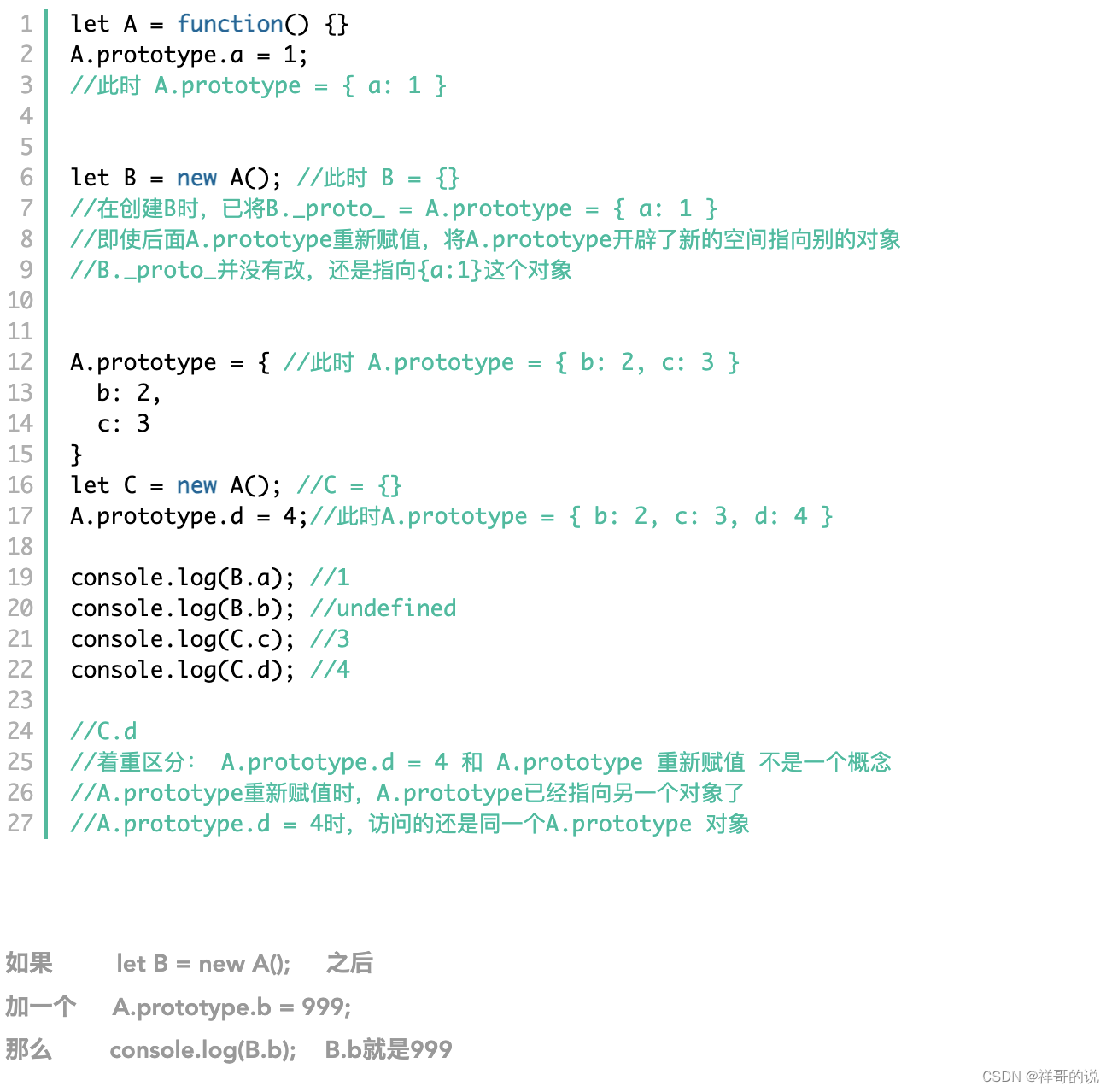
JS foundation - prototype prototype chain and macro task / micro task / event mechanism

Opencv Harris corner detection
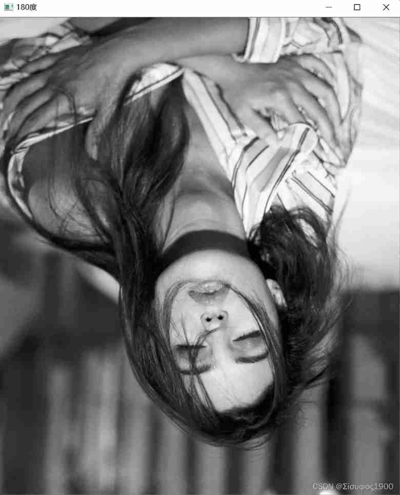
Opencv image rotation
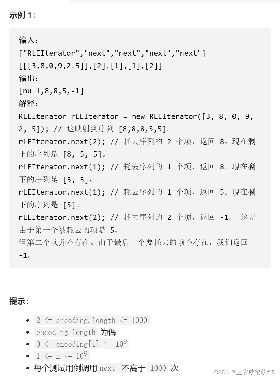
LeetCode - 900. RLE 迭代器

Of course, the most widely used 8-bit single chip microcomputer is also the single chip microcomputer that beginners are most easy to learn

LeetCode - 508. Sum of subtree elements with the most occurrences (traversal of binary tree)

Adaptiveavgpool1d internal implementation
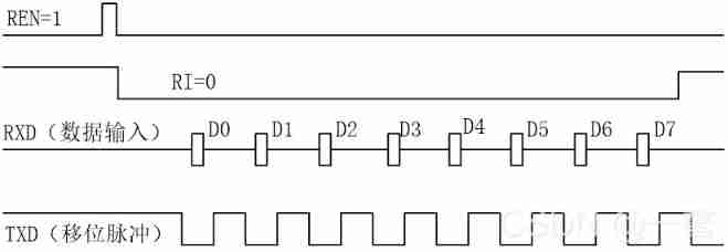
Working mode of 80C51 Serial Port
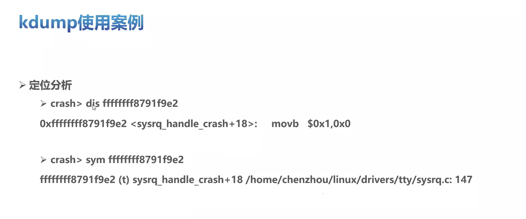
openEuler kernel 技術分享 - 第1期 - kdump 基本原理、使用及案例介紹
随机推荐
Windows下MySQL的安装和删除
2312、卖木头块 | 面试官与狂徒张三的那些事(leetcode,附思维导图 + 全部解法)
Markdown latex full quantifier and existential quantifier (for all, existential)
CV learning notes - Stereo Vision (point cloud model, spin image, 3D reconstruction)
Wireshark use
After clicking the Save button, you can only click it once
Notes on C language learning of migrant workers majoring in electronic information engineering
CV learning notes ransca & image similarity comparison hash
Installation and removal of MySQL under Windows
Leetcode 300 longest ascending subsequence
(1) What is a lambda expression
使用密钥对的形式连接阿里云服务器
LeetCode - 1670 设计前中后队列(设计 - 两个双端队列)
4G module IMEI of charging pile design
Opencv image rotation
Pycharm cannot import custom package
Of course, the most widely used 8-bit single chip microcomputer is also the single chip microcomputer that beginners are most easy to learn
QT detection card reader analog keyboard input
3.2 Off-Policy Monte Carlo Methods & case study: Blackjack of off-Policy Evaluation
SCM is now overwhelming, a wide variety, so that developers are overwhelmed