当前位置:网站首页>响应式移动Web测试题
响应式移动Web测试题
2022-07-04 06:41:00 【HHppGo】
第一题
下列选项中对bootstrap中的能让元素只在小屏设备隐藏的类是( B )
A: hidden-xs
B: hidden-sm
C: hidden-md
D: hidden-lg
解析:
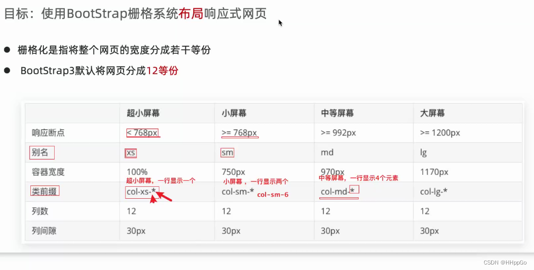
hidden-xs是超小屏;hidden-sm是小屏;hidden-md是中屏;hidden-lg是大屏
第二题
下列选项中能清除父容器左右15px内边距的类是( D )
A: container
B: col-md-1
C: container-fluid
D: row
解析:
container是设置版心效果;col-md-1是在中屏上一行显示12个;container-fluid是通栏效果;row是消除父容器左右15px的内边距
第三题
下列关于bootstrap的使用描述错误的是( C )
A: Bootstrap下载的包里面有css,js,font文件夹
B: <!–[if lt IE 9]> 这个是针对低版本ie浏览器的兼容处理
C: Bootstrap只能通过浏览器下载的本地文件形式引入项目里面 解析:(通过cdn在线加速也可以)
D: 引入了对应的bootstrap.css就可以直接使用它提供的一些类
第四题
在超大屏上面每行显示4个元素, 中等屏幕上显示3个元素,小屏上显示2个元素,超小屏幕上显示1个元素。下列关于不同屏幕下类名的书写正确的是( A )
A:
<div class="row">
     <div class="col-lg-3 col-md-4 col-sm-6 col-xs-12">1</div>
</div>
B:
<div class="row">
      <div class="col-lg-4 col-md-3 col-sm-2 col-xs-1">1</div>
</div>
C:
<div class="row">
      <div class="col-lg-3 col-md-4 col-sm-2 col-xs-1">1</div>
</div>
D:
<div class="row">
      <div class="col-lg-3">1</div>
</div>
解析:
col-xs是超小屏;col-sm是小屏;col-md是中屏;col-lg是大屏;用12除以每行要显示的元素个数,就是后面的数字了
第五题
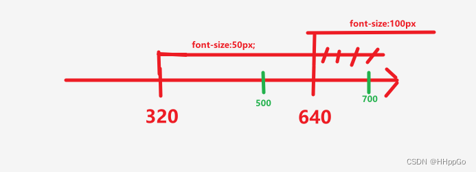
<style> @media screen and (min-width: 320px) {
       html {
       font-size: 50px; } } @media screen and (min-width: 640px) {
       html {
       font-size: 100px; } } .top {
       height: 1rem; font-size: .5rem; background-color: green; color: #fff; text-align: center; line-height: 1rem; } </style>
</head>

<body>
    <div class="top">购物车</div>
</body>
上面案例中的top元素在屏幕宽度为500px和700px时 字体大小分别是多少( D )
A: 25px 25px
B: 50px 50px
C: 16px 16px
D: 25px 50px
解析:
如图所示:min-width:320px 意思是 大于等于320px,(即:最小是320px);
同理,max-width:某某px 意思是 小于等于某某px,(即:最大是某某px)
图中:>=640px的样式把>=320px样式中>=640的部分给覆盖了
因此,屏幕宽度为500px的html字体大小是font-size:50px
屏幕宽度为700px的html字体大小是font-size:100px
又因为rem是以html字号大小为一个单位的,即:1rem = 1 * HTML字号大小
因此,最后结果:用html字体大小再分别乘以0.5,即是最后的答案。
注:.5rem == 0.5rem
第六题
关于Bootstrap的选项错误的是( C )
A: Bootstrap 的初始化代码使用的是 normalize.css
B: Bootstrap 是移动设备优先的,为了确保适当的绘制和触屏缩放,需要在 head标签之中添加 viewport 元数据标签
C: 处于中等屏幕时,使用.col-md-表示,.container 最大宽度1170px
D: 列偏移,col-*-offset-实现原理是使用margin-left进行实现的
解析:
中等屏幕,对应的容器宽度是970px
第七题
以下代码中,哪一个可以使用媒体查询判断宽度(768px~992px)并引入对应css文件( C )
A: <link rel="stylesheet" href="one.css">

 B: <link rel="stylesheet" media="screen and ( min-width:992px )" href="two.css">

 C: <link rel="stylesheet" media="screen and ( max-width:992px ) and ( min-width:768px )" href="three.css">

 D: <link rel="stylesheet" media="screen and ( min-width:992px ) and ( max-width:768px )" href="three.css">
解析:
max-width: 992px意思是 视口宽度<=992px;min-width: 768px意思是 视口宽度>=768px;
第八题 [多选]
bootstrap的类col-sm-4描述正确的是(BC )
A: 仅仅在小屏设备生效
B: 在小屏设备及以上设备生效
C: 生效时宽度占1/3
D: 生效时宽度占1/4
第九题 [多选]
下列关于布局容器的描述正确的是(ABC )
A: Bootstrap预先定义好了两个容器样式类:.container, .container-fluid
B: container类,已经通过媒体查询处理了屏幕范围
C: container-fluid,宽度为百分百,适合于单独移动端开发
D: container类不是响应式
第十题 [多选]
下列关于栅格系统介绍的描述正确的是( ABC )
A: 格系统用于通过一系列的行(row)与列(column)的组合来创建页面布局
B: 栅格系统,随着屏幕或视口(viewport)尺寸的增加,系统会自动分为最多12列
C: 屏幕变化,container变化,12等份的每一份变化,我们的界面元素的大小依据每一等份来设置,那么也就实现了屏幕适配
D: 栅格系统就是container类
边栏推荐
- Considerations for testing a website
- 198. House raiding
- Background and current situation of domestic CDN acceleration
- Mysql 45讲学习笔记(七)行锁
- C réaliser des jeux de serpents gourmands
- Internet of things protocol ZigBee ZigBee module uses the concept of protocol stack
- Mysql 45讲学习笔记(十三)表数据删掉一半,表文件大小不变
- Fast power (template)
- 8. Factory method
- tars源码分析之1
猜你喜欢
![[backpack DP] backpack problem](/img/7e/1ead6fd0ab61806ce971e1612b4ed6.jpg)
[backpack DP] backpack problem
C language - Blue Bridge Cup - Snake filling
Mysql 45讲学习笔记(七)行锁
Shopping malls, storerooms, flat display, user-defined maps can also be played like this!
R statistical mapping - random forest classification analysis and species abundance difference test combination diagram
Google Chrome Portable Google Chrome browser portable version official website download method
what the fuck! If you can't grab it, write it yourself. Use code to realize a Bing Dwen Dwen. It's so beautiful ~!
![[Android reverse] function interception (CPU cache mechanism | CPU cache mechanism causes function interception failure)](/img/7e/02bb01480257cd56537914a7247733.jpg)
[Android reverse] function interception (CPU cache mechanism | CPU cache mechanism causes function interception failure)
uniapp 自定义环境变量
2022 Xinjiang's latest eight members (Safety Officer) simulated examination questions and answers
随机推荐
List of top ten professional skills required for data science work
Native Cloud - SSH articles must be read on Cloud (used for Remote Login to Cloud Server)
Software keywords and process information intercepted by Golden Shield video player
Summary of leetcode BFS question brushing
Mysql 45讲学习笔记(十三)表数据删掉一半,表文件大小不变
MySQL 45 learning notes (XI) how to index string fields
Mysql 45讲学习笔记(七)行锁
Mysql 45讲学习笔记(十)force index
tars源码分析之8
期末周,我裂开
[backpack DP] backpack problem
Mysql 45讲学习笔记(六)全局锁
Invalid bound statement (not found): com. example. mapper. TblUserRecordMapper. login
How does the recv of TCP socket receive messages of specified length?
金盾视频播放器拦截的软件关键词和进程信息
ABCD four sequential execution methods, extended application
Tar source code analysis Part 10
Cervical vertebra, beriberi
P26-P34 third_ template
Learning multi-level structural information for small organ segmentation