当前位置:网站首页>Seaborn数据可视化
Seaborn数据可视化
2022-07-07 15:32:00 【En^_^Joy】
用Seaborn做数据可视化
Seaborn与Matplotlib
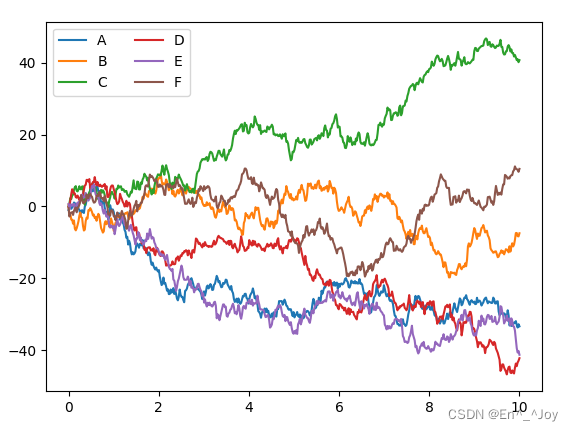
Matplotlib画图
import matplotlib as mpl
import matplotlib.pyplot as plt
import numpy as np

plt.figure()

x = np.linspace(0, 10, 500)
y = np.cumsum(np.random.randn(500, 6), 0)

plt.plot(x, y)
plt.legend('ABCDEF', ncol=2, loc='upper left')

# 显示图片
plt.show()
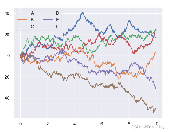
Seaborn有许多高级的画图功能,而且可以改写Matplotlib的默认参数,从而用简单的Matplotlib获得更好的效果,可以用Seaborn的set()方法设置样式
其他代码和上面的一样,只是添加导入这个模块和使用set()函数
import matplotlib as mpl
import matplotlib.pyplot as plt
import numpy as np
import seaborn as sns

sns.set()
plt.figure()

x = np.linspace(0, 10, 500)
y = np.cumsum(np.random.randn(500, 6), 0)

plt.plot(x, y)
plt.legend('ABCDEF', ncol=2, loc='upper left')

# 显示图片
plt.show()
Seaborn图形介绍
很多图形用Matplotlib都可以实现,三用Seaborn会更方便
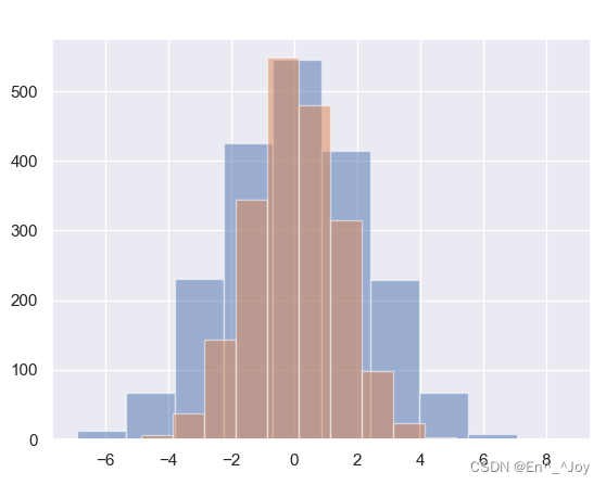
频次直方图、KDE和密度图
频次直方图
import matplotlib as mpl
import matplotlib.pyplot as plt
import numpy as np
import seaborn as sns
import pandas as pd

sns.set()
plt.figure()

data = np.random.multivariate_normal([0, 0], [[5, 2], [2, 2]], size=2000)
data = pd.DataFrame(data, columns=['x', 'y'])

for col in 'xy':
    plt.hist(data[col], alpha=0.5)

# 显示图片
plt.show()
用KDE获取变量分布的平滑评估,通过sns.kdeplot实现
for col in 'xy':
    sns.kdeplot(data[col], shade=True)
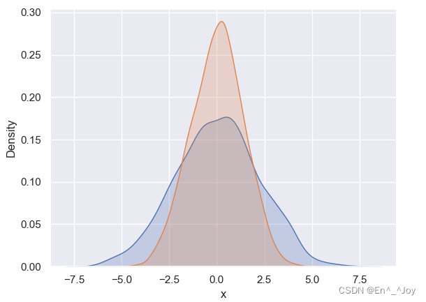
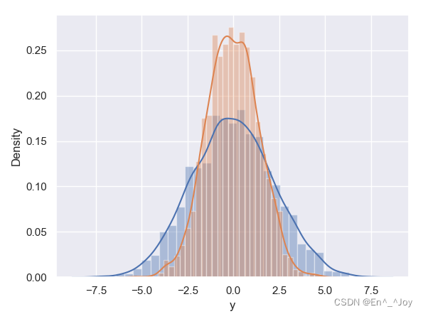
用distplot可以让频次直方图与KDE结合起来
for col in 'xy':
    sns.distplot(data[col])
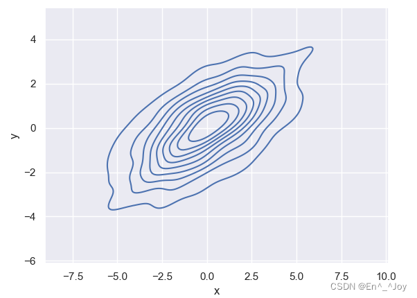
如果想kdeplot输入的是二维数据集,那么可以获得一个二维数可视化
sns.kdeplot(data['x'],data['y'])
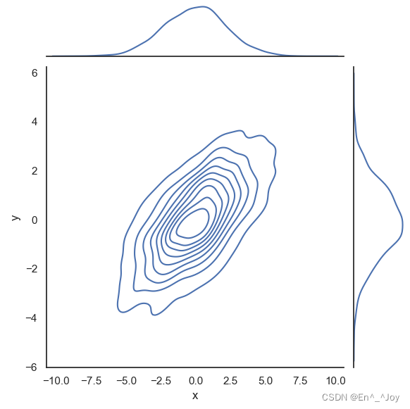
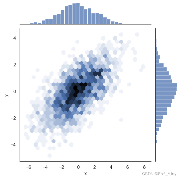
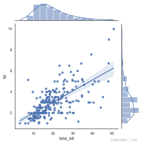
用sns.jointplot可以同时看到两个变量的联合分布与单变量的独立分布,在这里使用白色背景
with sns.axes_style('white'):
    sns.jointplot("x", "y", data, kind='kde')
with sns.axes_style('white'):
    sns.jointplot("x", "y", data, kind='hex')
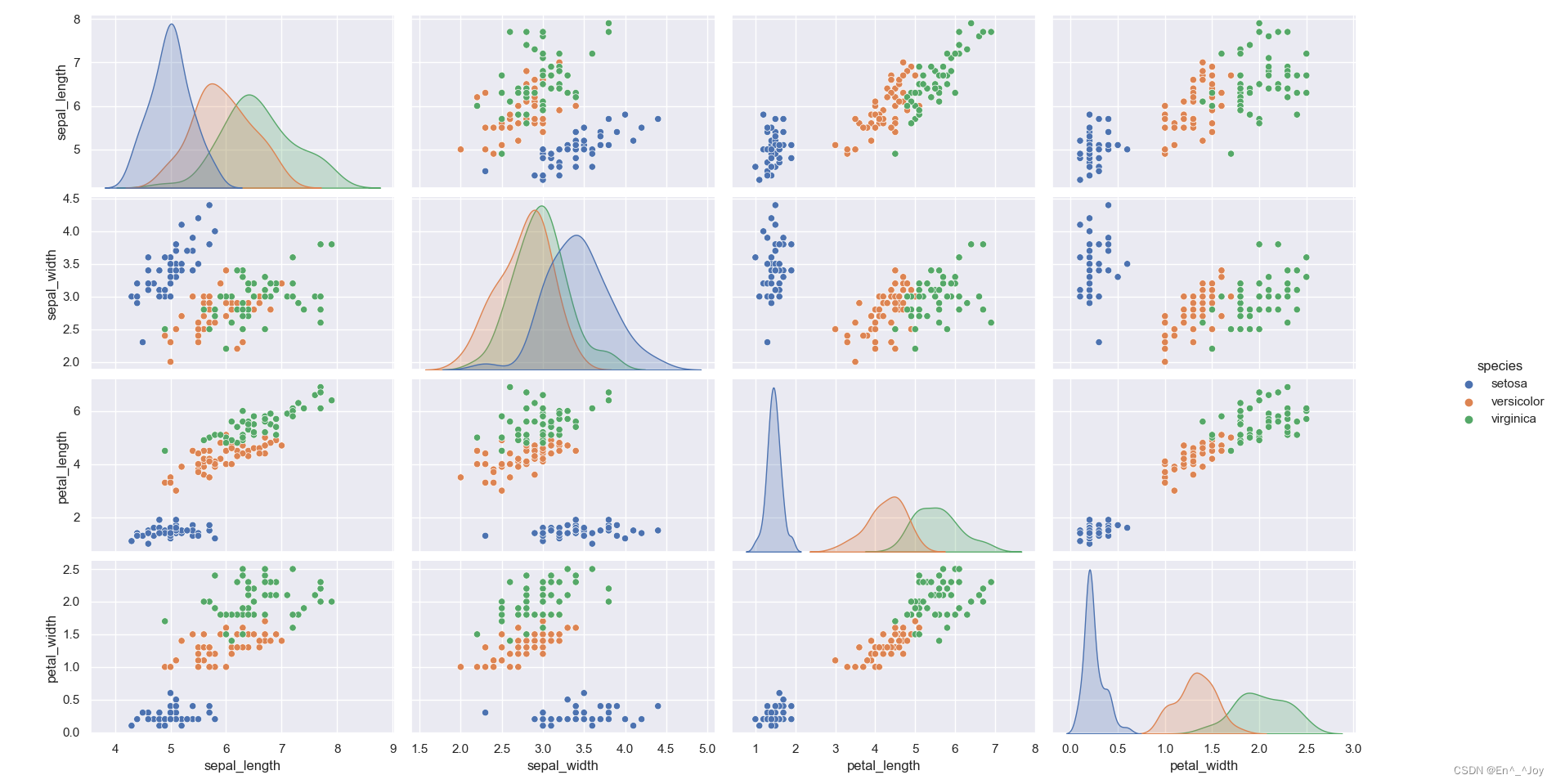
矩阵图
下面是四个变量之间关系的矩阵图
import matplotlib as mpl
import matplotlib.pyplot as plt
import numpy as np
import seaborn as sns
import pandas as pd

sns.set()
plt.figure()

iris = sns.load_dataset("iris")
print(iris.head())
''' sepal_length sepal_width petal_length petal_width species 0 5.1 3.5 1.4 0.2 setosa 1 4.9 3.0 1.4 0.2 setosa 2 4.7 3.2 1.3 0.2 setosa 3 4.6 3.1 1.5 0.2 setosa 4 5.0 3.6 1.4 0.2 setosa '''
sns.pairplot(iris, hue='species', size=2.5)

# 显示图片
plt.show()
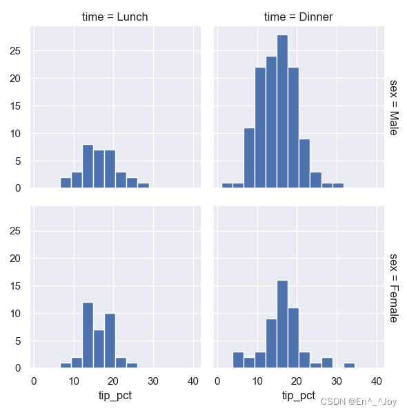
分面频次直方图
import matplotlib as mpl
import matplotlib.pyplot as plt
import numpy as np
import seaborn as sns
import pandas as pd

sns.set()
plt.figure()

tips = sns.load_dataset("tips")
print(tips)
''' total_bill tip sex smoker day time size 0 16.99 1.01 Female No Sun Dinner 2 1 10.34 1.66 Male No Sun Dinner 3 2 21.01 3.50 Male No Sun Dinner 3 3 23.68 3.31 Male No Sun Dinner 2 4 24.59 3.61 Female No Sun Dinner 4 .. ... ... ... ... ... ... ... 239 29.03 5.92 Male No Sat Dinner 3 240 27.18 2.00 Female Yes Sat Dinner 2 241 22.67 2.00 Male Yes Sat Dinner 2 242 17.82 1.75 Male No Sat Dinner 2 243 18.78 3.00 Female No Thur Dinner 2 [244 rows x 7 columns] '''
tips['tip_pct'] = 100*tips['tip']/tips['total_bill']
grid = sns.FacetGrid(tips, row="sex", col="time", margin_titles=True)
grid.map(plt.hist, "tip_pct", bins=np.linspace(1, 40, 15))

# 显示图片
plt.show()
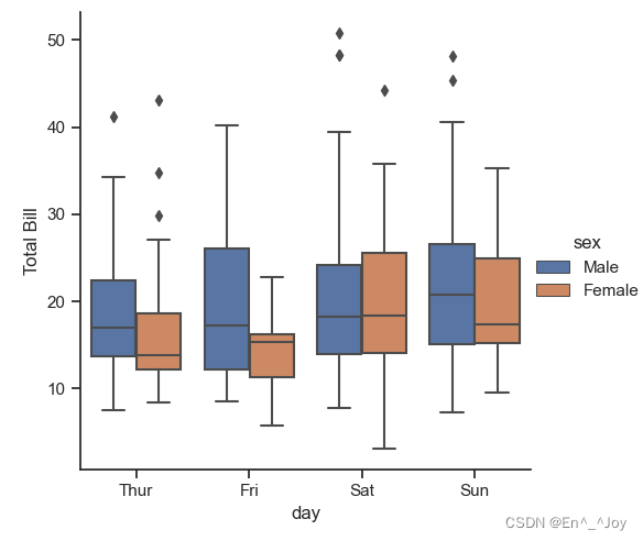
因子图
import matplotlib as mpl
import matplotlib.pyplot as plt
import numpy as np
import seaborn as sns
import pandas as pd

sns.set()
plt.figure()

tips = sns.load_dataset("tips")
tips['tip_pct'] = 100*tips['tip']/tips['total_bill']

with sns.axes_style(style='ticks'):
    g = sns.factorplot("day", "total_bill", "sex", data=tips, kind="box")
    g.set_axis_labels("day", "Total Bill")

# 显示图片
plt.show()
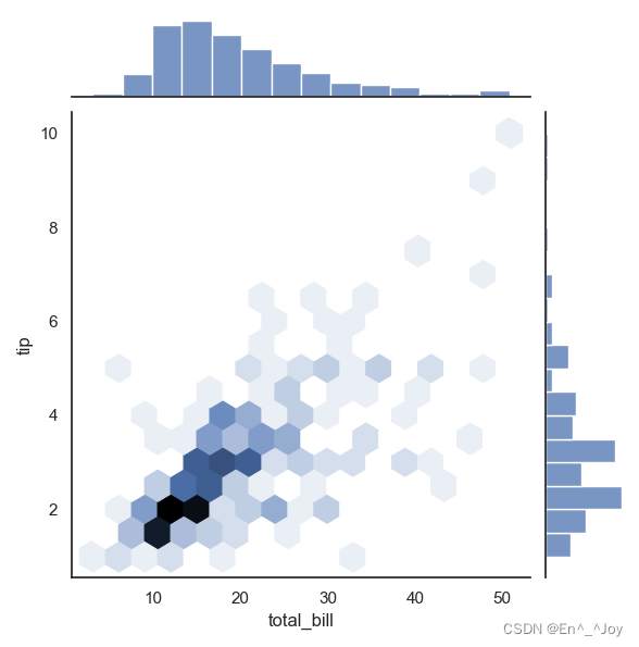
联合分布
with sns.axes_style('white'):
    sns.jointplot("total_bill", "tip", data=tips, kind='hex')
with sns.axes_style('white'):
    sns.jointplot("total_bill", "tip", data=tips, kind='reg')
条形图:sns.factorplot画条形图
import matplotlib as mpl
import matplotlib.pyplot as plt
import numpy as np
import seaborn as sns
import pandas as pd
sns.set()
plt.figure()
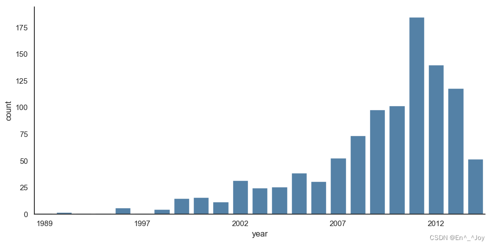
planets = sns.load_dataset('planets')
print(planets.head())
''' method number orbital_period mass distance year 0 Radial Velocity 1 269.300 7.10 77.40 2006 1 Radial Velocity 1 874.774 2.21 56.95 2008 2 Radial Velocity 1 763.000 2.60 19.84 2011 3 Radial Velocity 1 326.030 19.40 110.62 2007 4 Radial Velocity 1 516.220 10.50 119.47 2009 '''
with sns.axes_style('white'):
g = sns.factorplot("year", data=planets, aspect=2, kind="count", color='steelblue')
g.set_xticklabels(step=5)
# 显示图片
plt.show()
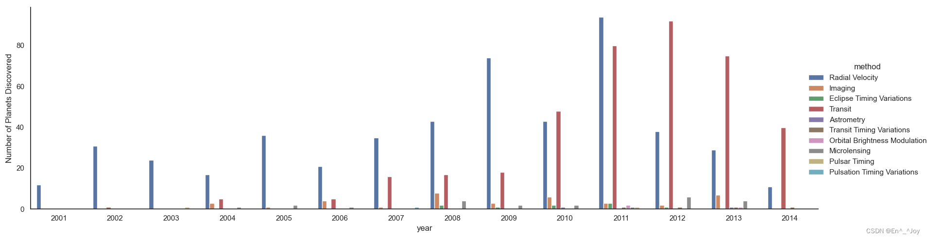
with sns.axes_style('white'):
    g = sns.factorplot("year", data=planets, aspect=4.0, kind="count", hue='method', order=range(2001, 2015))
    g.set_ylabels('Number of Planets Discovered')
边栏推荐
- ByteDance Android gold, silver and four analysis, Android interview question app
- 【图像传感器】相关双采样CDS
- 01tire+ chain forward star +dfs+ greedy exercise one
- The latest interview experience of Android manufacturers in 2022, Android view+handler+binder
- 【MySql进阶】索引详解(一):索引数据页结构
- 正在准备面试,分享面经
- LeetCode 312. 戳气球 每日一题
- [designmode] flyweight pattern
- 记录Servlet学习时的一次乱码
- Tidb cannot start after modifying the configuration file
猜你喜欢
![[designmode] facade patterns](/img/79/cde2c18e2ec8b08697662ac352ff90.png)


随机推荐
谎牛计数(春季每日一题 53)
Vs2019 configuration matrix library eigen
Arduino 控制的双足机器人
低代码(lowcode)帮助运输公司增强供应链管理的4种方式
01tire+链式前向星+dfs+贪心练习题.1
LeetCode 300. 最长递增子序列 每日一题
面试题 01.02. 判定是否互为字符重排-辅助数组算法
LeetCode 152. 乘积最大子数组 每日一题
【DesignMode】代理模式(proxy pattern)
【图像传感器】相关双采样CDS
three. JS create cool snow effect
LocalStorage和SessionStorage
Interface oriented programming
Read PG in data warehouse in one article_ stat
[summary of knowledge] summary of notes on using SVN in PHP
Personal notes of graphics (2)
logback.xml配置不同级别日志,设置彩色输出
Lie cow count (spring daily question 53)
Pycharm terminal enables virtual environment
字节跳动高工面试,轻松入门flutter