当前位置:网站首页>Media query, rem mobile terminal adaptation
Media query, rem mobile terminal adaptation
2022-08-05 06:32:00 【MoXinXueWEB】
单位
rem: 相对于html元素的字体大小;
em: 相对于父元素的字体大小.
总结: rem可以通过修改html里面的文字大小来改变页面中元素的大小,To achieve the overall control.
媒体查询
/* The screen width in540-969Between the pixel is shown as pink */
@media screen and (min-width: 540px) and (max-width: 969px) {

	body {

		background-color: pink;
	}
}
/* Since the childhood to write normal 可以优化 */
@media screen and (min-width: 540px) {

	body {

		background-color: pink;
	}
}
1、mediataype查询类型
| 值 | 解释说明 |
|---|---|
| all | 用于所有设备 |
| 用于打印机和打印浏览 | |
| screen | 用于电脑屏幕、平板电脑、智能手机等 |
2、关键字
| 值 | 解释说明 |
|---|---|
| and | Multiple media features can be together,相当于“且” |
| not | 排除某个媒体类型,相当于“非”,可以省略 |
| only | 指定某个特定的媒体类型,可以省略 |
3、媒体特性
| 值 | 解释说明 |
|---|---|
| width | 定义输出设备中页面可见区域的宽度 |
| min-width | 定义输出设备中页面最小可见区域的宽度 |
| max-width | 定义输出设备中页面最大可见区域的宽度 |
总结: Can according to the different styles of different screen size to change(Since the childhood to write can optimize the code)
4、引入资源
<link rel="stylesheet" media="mediatype and|not|only (media feature)" href="mystylesheet.css">
eg:
/* 针对不同的屏幕尺寸 调用不同的css文件 */
<link rel="stylesheet" media="srceen and (min-width: 320px)" href="style320.css">
<link rel="stylesheet" media="srceen and (min-width: 640px)" href="style640.css">
Less(css预处理器)
引入了变量,Mixin(混入),运算以及函数等功能,降低了CSS的维护成本.(常见的预处理器:Sass、Less、Stylus)
安装 npm install -g less
查看版本 less -v
1、定义变量 @ (区分大小写)
@color: pink;
body {
	backgrounk-color: @color
}
div {
    color: @color
}
2、Vscode插件 (Easy LESS)
自动编译成css文件
3、嵌套
Meet pseudo-classes、交集选择器,我们内层选择器的前面需要加&
a {
	color: red;
	&:hover {
		color: blue;
	}
    &::before {
        content: "";
    }
}
4、运算
- 乘号(*)和除号(/)
- Operators around the middle will be separated a space
1px + 5 - 对于两个不同的单位的值之间的运算,运算结果的值取第一个值的单位
- 如果两个值之间只有一个值有单位,则运算结果就取该单位
rem适配方案
1、less+媒体查询+rem
1.1 A common design draft size width
| 设备 | 常见宽度 |
|---|---|
| iPhone4、5 | 640px |
| iPhone6、7、8 | 750px |
| Android | 大部分4.7~5Inch android device720px, Now the basic use750px |
1.2 The actual development program logic
- 首先我们选一套标准尺寸(750为准);
- 我们用屏幕尺寸,除以,我们划分的份数,得到了html里面的文字大小,但是我们知道不同屏幕下得到的文字大小是不一样的;
- 页面元素的rem值 = 页面元素在750像素下的px值 / html 里面的文字大小
2、lib-flexible+rem
2.1、安装插件 lib-flexible
npm i lib-flexible --save
2.3、在main.js中引入lib-flexible
import 'lib-flexible/flexible'
2.4、安装px2rem loader
npm install px2rem-loader
2.5、配置px2rem-loader
在build文件中找到util.js,将px2rem-loader添加到cssLoaders中,如:
const cssLoader = {
    loader: 'css-loader',
    options: {
      minimize: process.env.NODE_ENV === 'production',
      sourceMap: options.sourceMap
    }
  }
  const px2remLoader = {
    loader: 'px2rem-loader',
    options: {
      remUnit: 75
    }
  }
同时,在generateLoaders方法中添加px2remLoader
function generateLoaders (loader, loaderOptions) {
    const loaders = [cssLoader,px2remLoader]
    if (loader) {
      loaders.push({
        loader: loader + '-loader',
        options: Object.assign({}, loaderOptions, {
          sourceMap: options.sourceMap
        })
      })
    }
2.6、在vueThe root directory of the project of open /src/HelloWorld.vue 文件,把templateAll the stuff from the inside out,Write the following code:
<template>
  <div class="hello">
    适配移动端
  </div>
</template>

<script>
export default {
  name: 'HelloWorld',
  data () {
    return {
      msg: 'Welcome to Your Vue.js App'
    }
  }
}
</script>

<!-- Add "scoped" attribute to limit CSS to this component only -->

<style scoped>
.hello {
  width: 200px;
  height: 200px;
  font-size: 36px;
  margin: 0 auto;
  box-sizing: border-box;
  border: 1px solid green;
}
</style>
边栏推荐
- May I ask how to read the binlog of the two tables of hologres through flink sql, and then how to join?
- disabledDate 日期选择器 datePicker
- Network wiring and digital-to-system conversion
- NAT experiment
- 七种让盒子水平垂直居中的方法
- The method of using ROS1 bag under ROS2
- [问题已处理]-jenkins流水线checkout超时
- el-progress实现进度条颜色不同
- 618, you may be able to wake up a little bit
- 产品学习资料
猜你喜欢
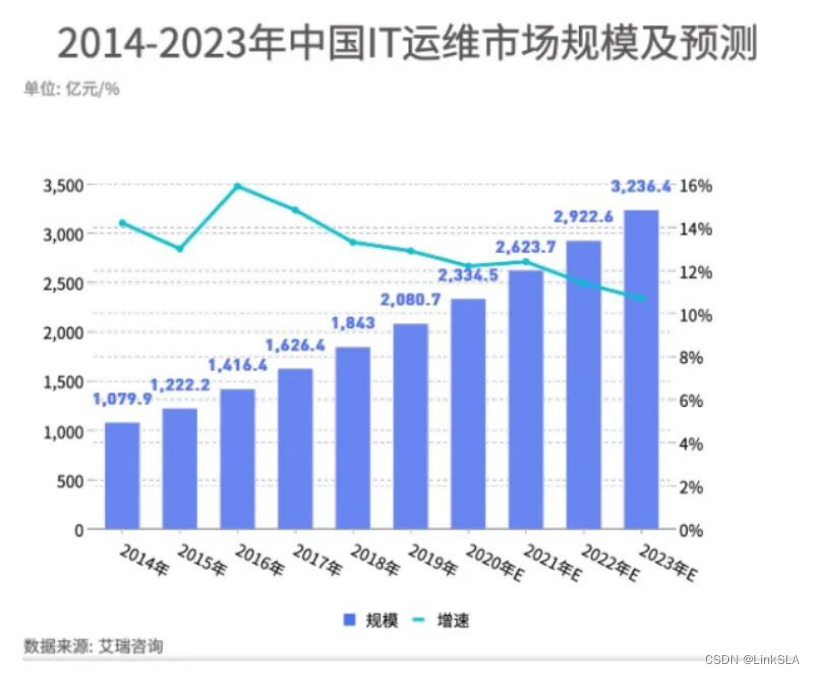
Growth: IT Operations Trends Report
多线程之传递参数
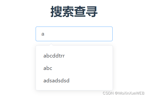
el-autocomplete使用

Into the pre-service, thought they play so flowers
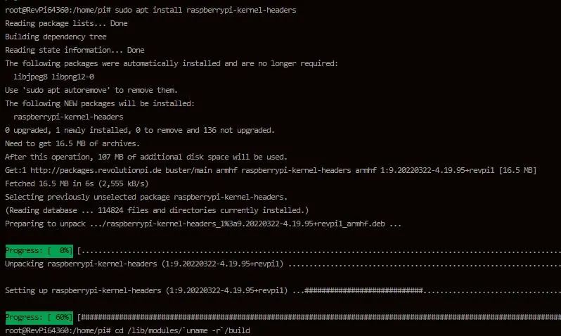
教您简单几步实现工业树莓派正确安装RS232转USB驱动
Teach you simple steps to achieve industrial raspberries pie properly installed RS232 USB drive

What are some things that you only know when you do operation and maintenance?
Switch principle
网络层协议介绍
Network wiring and digital-to-system conversion
随机推荐
产品学习资料
Does flink cdc currently support Gauss database sources?
[issue resolved] - jenkins pipeline checkout timeout
Met with the browser page
Hugo builds a personal blog
初识网页与浏览器
RAID磁盘阵列
selenium学习
wc, grep, tar, vi/vim
智能运维会取代人工运维吗?
NIO works is analysed
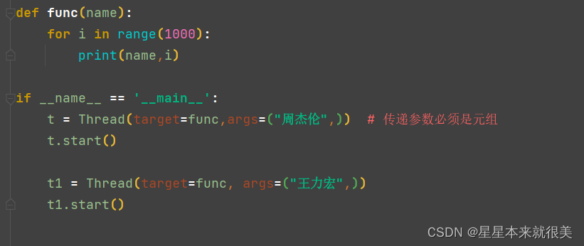
多线程之传递参数
大小屏适配
用户和用户组管理、文件权限管理
Hugo搭建个人博客
Cloud computing - osi seven layers and TCP\IP protocol
原生JS带你了解数组方法实现及使用
微信小程序页面跳转传参
In-depth Zabbix user guide - from the green boy
618, you may be able to wake up a little bit