当前位置:网站首页>An article will take you to understand CSS3 fillet knowledge
An article will take you to understand CSS3 fillet knowledge
2020-11-06 20:42:00 【Python advanced】
One 、 Browser support
The number in the table specifies the first browser version that fully supports this property .
After the number -webkit- perhaps -moz- You need to specify the prefix when you use it .
| attribute | Chrome | Firefox | Safari | Opera | IE |
|---|---|---|---|---|---|
| border-radius | 5.0 4.0 -webkit- | 9.0 | 4.0 3.0 -moz- | 5.0 3.1 -webkit- | 10.5 |
Two 、border-radius attribute
1. Create rounded corners with background image
CSS3 in , have access to border-radius attribute , Specify fillet display for elements .
The code is as follows :
<!DOCTYPE html>
<html>
<meta charset="UTF-8">
<title> project </title>
<head>
<style>
#rcorners1 {
border-radius: 25px;
background: #f00;
padding: 20px;
width: 200px;
height: 150px;
}
#rcorners2 {
border-radius: 25px;
border: 2px solid #73AD21;
padding: 20px;
width: 200px;
height: 150px;
}
#rcorners3 {
border-radius: 25px;
background: url(img/fy_indexBg.jpg);
background-position: left top;
background-repeat: repeat;
padding: 20px;
width: 200px;
height: 150px;
}
</style>
</head>
<body>
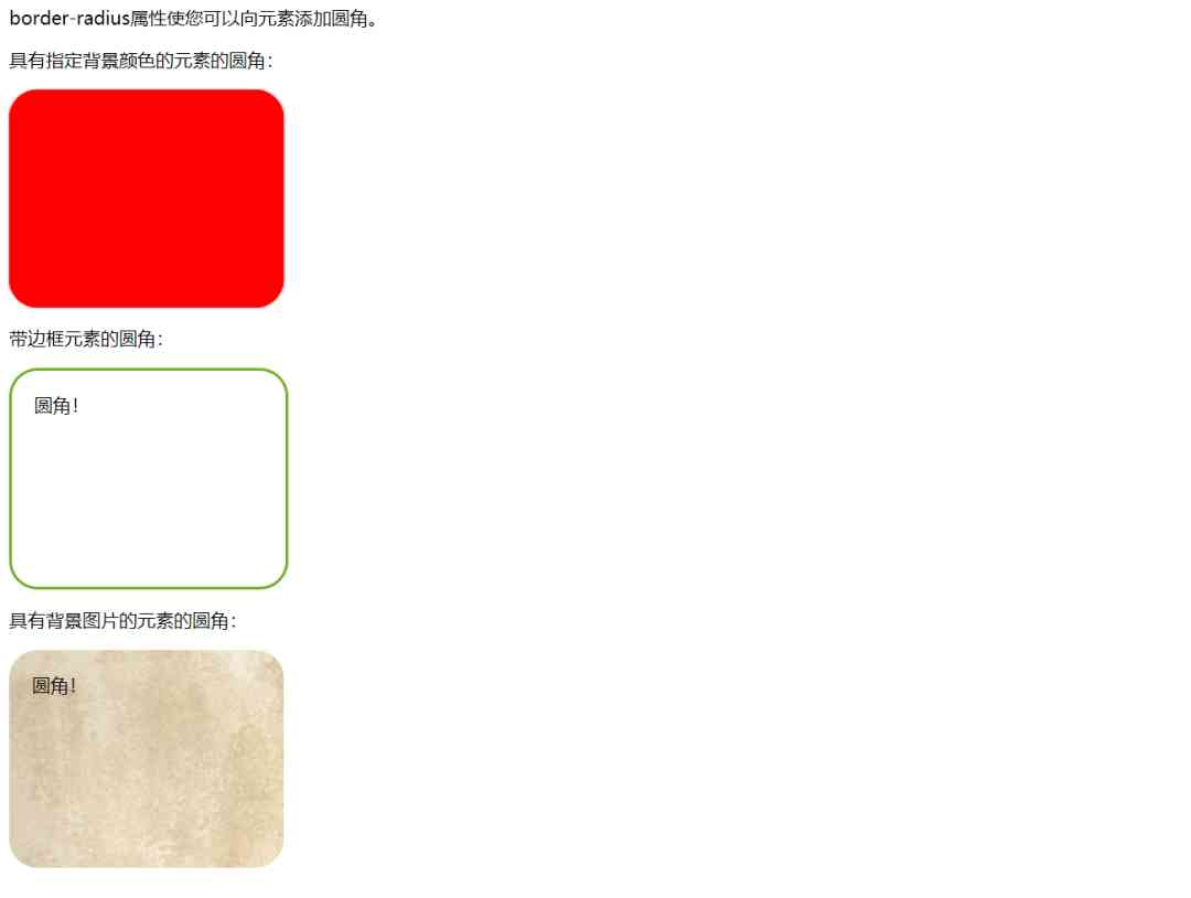
<p>The border-radius property allows you to add rounded corners to elements.</p>
<p>Rounded corners for an element with a specified background color:</p>
<!--1. Rounded element with specified background color -->
<p id="rcorners1">Rounded corners!</p>
<p>Rounded corners for an element with a border:</p>
<!--2. Rounded elements with borders :-->
<p id="rcorners2">Rounded corners!</p>
<!--3. Rounded elements with background image -->
<p>Rounded corners for an element with a background image:</p>
<p id="rcorners3">Rounded corners!</p>
</body>
</html>
Tips :
border-radius The property is actually border-top-left-radius, border-top-right-radius, border-bottom-right-radius and border-bottom-left-radius Short form of property .
2. Specify radians for each angle
If only for border-radius Property specifies a value , Then this radius will be applied to all 4 Corner .
In addition, according to the needs of their own development , Specify each corner separately . Here are the rules :
The four values : The first value applies to the upper left corner , The second value applies to the upper right , The third value is applied to the lower right corner , The fourth value applies to the lower left corner .
Three values : The first value applies to the upper left , Two values apply to upper right and lower left , The third value at the bottom right applies to .
Two values : The first value applies to the upper left and lower right corners , And two values apply to the upper right and lower left corners .
A value : All four corners are round .
example 1:
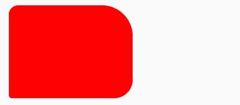
1. The four values - border-radius: 15px 50px 30px 5px
#rcorners4 {
    border-radius: 15px 50px 30px 5px;
    background: #f00;
    padding: 20px;
    width: 200px;
    height: 150px;
}
2. Three values - border-radius: 15px 50px 30px
#rcorners5 {
    border-radius: 15px 50px 30px;
    background: #f00;
    padding: 20px;
    width: 200px;
    height: 150px;
}

3. Two values - border-radius: 15px 50px
#rcorners6 {
    border-radius: 15px 50px;
    background: #f00;
    padding: 20px;
    width: 200px;
    height: 150px;
}

Complete code :
<!DOCTYPE html>
<html lang="en">
<head>
  <meta charset="UTF-8">
  <title> project </title>
  <style>
  #rcorners4 {
      border-radius: 15px 50px 30px 5px;
      background: #f00;
      padding: 20px;
      width: 200px;
      height: 150px;
  }

  #rcorners5 {
      border-radius: 15px 50px 30px;
      background: #f00;
      padding: 20px;
      width: 200px;
      height: 150px;
  }

  #rcorners6 {
      border-radius: 15px 50px;
      background: #f00;
      padding: 20px;
      width: 200px;
      height: 150px;
  }
</style>
</head>
<body>

<p> The four values  - border-radius: 15px 50px 30px 5px:</p>
<p id="rcorners4"></p>

<p> Three values  - border-radius: 15px 50px 30px:</p>
<p id="rcorners5"></p>

<p> Two values  - border-radius: 15px 50px:</p>
<p id="rcorners6"></p>

</body>
</html>
example 2:
Create the rounded corners of the ellipse
Create the rounded corners of the ellipse
Oval border :border-radius: 50px/15px
#rcorners7 {
    border-radius: 50px/15px;
    background: #73AD21;
    padding: 20px;
    width: 200px;
    height: 150px;
}

Oval border : border-radius: 15px/50px
#rcorners8 {
        border-radius: 15px/50px;
        background: #73AD21;
        padding: 20px;
        width: 200px;
        height: 150px;
    }

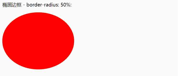
Oval border : border-radius: 50%
#rcorners9 {
        border-radius: 50%;
        background: #73AD21;
        padding: 20px;
        width: 200px;
        height: 150px;
    }
Complete code :
<!DOCTYPE html>
<html lang="en">
<head>
  <meta charset="UTF-8">
  <title> project </title>
  <style>
    #rcorners7 {
        border-radius: 50px/15px;
        background: #73AD21;
        padding: 20px;
        width: 200px;
        height: 150px;
    }

    #rcorners8 {
        border-radius: 15px/50px;
        background: #73AD21;
        padding: 20px;
        width: 200px;
        height: 150px;
    }

    #rcorners9 {
        border-radius: 50%;
        background: #73AD21;
        padding: 20px;
        width: 200px;
        height: 150px;
    }
</style>
</head>
<body>

  <p> Oval border  - border-radius: 50px/15px:</p>
  <p id="rcorners7"></p>

  <p> Oval border  - border-radius: 15px/50px:</p>
  <p id="rcorners8"></p>

  <p> Oval border  - border-radius: 50%:</p>
  <p id="rcorners9"></p>-->

</body>
</html>
3、 ... and 、 summary
1、 This article mainly explains CSS3 Round corners , Through the demonstration of some properties , Rich cases , Help you understand CSS knowledge . I hope you can study patiently , At the same time, I hope to actively search for problems , Try it , There's always a solution .
2、 The code is simple , I hope I can help you .
Want to learn more Python Web crawler and data mining knowledge , Go to a professional website :http://pdcfighting.com/ Want to learn more Python Web crawler and data mining knowledge , Go to a professional website :http://pdcfighting.com/
版权声明
本文为[Python advanced]所创,转载请带上原文链接,感谢
边栏推荐
- C + + and C + + programmers are about to be eliminated from the market
- Cglib 如何实现多重代理?
- Get twice the result with half the effort: automation without cabinet
- Contract trading system development | construction of smart contract trading platform
- Introduction to the structure of PDF417 bar code system
- How does filecoin's economic model and future value support the price of fil currency breaking through thousands
- 解决 WPF 绑定集合后数据变动界面却不更新的问题
- 大会倒计时|2020 PostgreSQL亚洲大会-中文分论坛议程安排
- What are the common problems of DTU connection
- 仅用六种字符来完成Hello World,你能做到吗?
猜你喜欢

2020年数据库技术大会助力技术提升
Behind the first lane level navigation in the industry
Live broadcast preview | micro service architecture Learning Series live broadcast phase 3

For a while, a dynamic thread pool was created, and the source code was put into GitHub
事务的隔离级别与所带来的问题
Named entity recognition in natural language processing: tanford core LP ner (1)
Even liver three all night, jvm77 high frequency interview questions detailed analysis, this?
Multi robot market share solution
StickEngine-架构12-通信协议
(1) ASP.NET Introduction to core3.1 Ocelot
随机推荐
electron 實現檔案下載管理器
For a while, a dynamic thread pool was created, and the source code was put into GitHub
Live broadcast preview | micro service architecture Learning Series live broadcast phase 3
What are Devops
2020年数据库技术大会助力技术提升
nacos、ribbon和feign的簡明教程
前端未來趨勢之原生API:Web Components
Introduction to X Window System
事件监听问题
Digital city responds to relevant national policies and vigorously develops the construction of digital twin platform
游戏开发中的新手引导与事件管理系统
How to turn data into assets? Attracting data scientists
面试官: ShardingSphere 学一下吧
Multi robot market share solution
Share with Lianyun: is IPFs / filecoin worth investing in?
How to demote domain controllers and later in Windows Server 2012
Pollard's Rho algorithm
How about small and medium-sized enterprises choose shared office?
嘉宾专访|2020 PostgreSQL亚洲大会阿里云数据库专场:王涛
使用 Iceberg on Kubernetes 打造新一代雲原生資料湖