当前位置:网站首页>Flex layout
Flex layout
2022-07-01 18:04:00 【Celester_ best】
Recently, I encountered a problem in the development process Flex Problems caused by layout , So when recording this problem , By the way, I'll study systematically Flex Knowledge points of layout , And in the follow-up development will also encounter related Flex The layout problem is added later .
PS: If you are familiar with Flex Knowledge points of , You can directly click “ those Flex The pit of layout ” Jump directly to the relevant position .
Flex Knowledge point
Flex The layout is elastic , It is divided into external container and internal item, By on the outer container display: flex Attribute can realize elastic layout .
Flex The principle of layout : By setting... To the parent element display:flex attribute , To control the position and arrangement of sub elements .
flex Introduction to layout
flex The influence of layout on other style attributes
When the parent element is set to flex After the layout , The child element float、clear、vertical-aligin Properties will be invalidated
flex Properties related to the external container of the layout
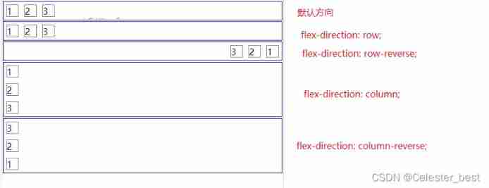
flex-direction Set up flex The main axis direction of the layout

(copy A picture in the rookie tutorial )
flex The layout is divided into spindles (main axis) And side shaft (cross axis), The default horizontal direction is the spindle direction .
flex-direction: row; Default direction , The principal axis is horizontal , The starting point is on the left .
flex-direction: row-reverse; The principal axis is horizontal , The starting point is on the right .
flex-direction: column; The principal axis is perpendicular , The starting point is at the top .
flex-direction: column-reverse; The principal axis is perpendicular , Starting edge .
<template>
  <div class="flex-wrap">
    <div class="container-1 container">
      <div class="item">1</div>
      <div class="item">2</div>
      <div class="item">3</div>
    </div>
    <div class="container-2 container">
      <div class="item">1</div>
      <div class="item">2</div>
      <div class="item">3</div>
    </div>
    <div class="container-3 container">
      <div class="item">1</div>
      <div class="item">2</div>
      <div class="item">3</div>
    </div>
    <div class="container-4 container">
      <div class="item">1</div>
      <div class="item">2</div>
      <div class="item">3</div>
    </div>
    <div class="container-5 container">
      <div class="item">1</div>
      <div class="item">2</div>
      <div class="item">3</div>
    </div>
  </div>
</template>
<script>
export default {
  name: "FlexeDemo",
};
</script>
<style scoped>
.flex-wrap {
  width: 500px;
  height: 500px;
  border: 1px solid gainsboro;
}
.container {
  margin: 2px;
  border: 1px solid blue;
  display: flex;
}
.container-1 {
  /*  Default direction  */
}
.container-2 {
  flex-direction: row;
}
.container-3 {
  flex-direction: row-reverse;
}
.container-4 {
  flex-direction: column;
}
.container-5 {
  flex-direction: column-reverse;
}
.item {
  margin: 5px;
  border: 1px solid gray;
  width: 20px;
  height: 20px;
}
</style>
design sketch :
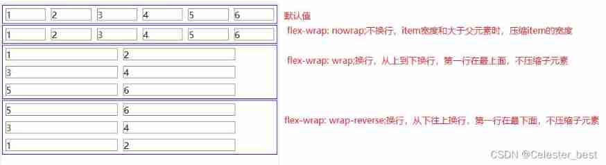
flex-wrap control item Line break
flex-wrap: nowrap; Don't wrap , It's also the default value
flex-wrap: wrap; Line break , Wrap from top to bottom , That is, the first line is at the top
flex-wrap: wrap-reverse; Line break , Wrap from bottom to top , The first line is at the bottom
    <div class="container-6 container">
      <div class="item">1</div>
      <div class="item">2</div>
      <div class="item">3</div>
      <div class="item">4</div>
      <div class="item">5</div>
      <div class="item">6</div>
    </div>
    <div class="container-7 container">
      <div class="item">1</div>
      <div class="item">2</div>
      <div class="item">3</div>
      <div class="item">4</div>
      <div class="item">5</div>
      <div class="item">6</div>
    </div>
    <div class="container-8 container">
      <div class="item">1</div>
      <div class="item">2</div>
      <div class="item">3</div>
      <div class="item">4</div>
      <div class="item">5</div>
      <div class="item">6</div>
    </div>
    <div class="container-9 container">
      <div class="item">1</div>
      <div class="item">2</div>
      <div class="item">3</div>
      <div class="item">4</div>
      <div class="item">5</div>
      <div class="item">6</div>

.container-6 {
  /*  Default  */
}
.container-7 {
  flex-wrap: nowrap;
}
.container-8 {
  flex-wrap: wrap;
}
.container-9 {
  flex-wrap: wrap-reverse;
}
flex-flow Combination attribute
flex-flow The attribute is flex-direction and flex-wrap The combination of attributes
flex-flow: <flex-direction> <flex-wrap>;
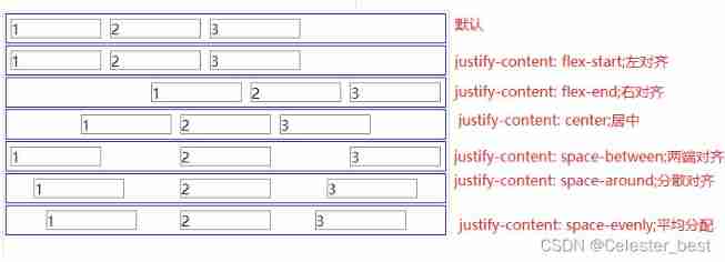
justify-content Set the alignment of the spindle direction
flex-start( The default value is ): Align left
flex-end: Right alignment
center: In the middle
space-between: full-justified , The intervals between the items are all equal .
space-around: Spread alignment , The spacing between each item is equal . therefore , The spacing between items is twice as large as the spacing between items and the border .
justify-content: space-evenly; Average distribution , The blank space is evenly distributed
.container-1 {
  /*  Default alignment  */
}
.container-2 {
  justify-content: flex-start;
}
.container-3 {
  justify-content: flex-end;
}
.container-4 {
  justify-content: center;
}
.container-5 {
  justify-content: space-between;
}
.container-6 {
  justify-content: space-around;
}

.container-7 {
  justify-content: space-evenly;
}
ps: The example only describes the case where the horizontal direction is the spindle .
align-items Set the alignment of the side axis
flex-start: Start alignment of side axis .
flex-end: Align the end of the side axis .
center: Align the midpoint of the side axis .
baseline: Baseline alignment of the first line of text for the project .
stretch( The default value is ) stretch : If the project is not set to height or set to auto, Will fill the entire container .
    <div class="container-10 container2">
      <div class="item">
        <div class="item-1">1</div>
      </div>
      <div class="item">
        <div class="item-2">1</div>
      </div>
      <div class="item">
        <div class="item-3">1</div>
      </div>
    </div>
    <div class="container-11 container2">
      <div class="item">
        <div class="item-1">1</div>
      </div>
      <div class="item">
        <div class="item-2">1</div>
      </div>
      <div class="item">
        <div class="item-3">1</div>
      </div>
    </div>
    <div class="container-12 container2">
      <div class="item">
        <div class="item-1">1</div>
      </div>
      <div class="item">
        <div class="item-2">1</div>
      </div>
      <div class="item">
        <div class="item-3">1</div>
      </div>
    </div>
    <div class="container-13 container2">
      <div class="item">
        <div class="item-1">1</div>
      </div>
      <div class="item">
        <div class="item-2">1</div>
      </div>
      <div class="item">
        <div class="item-3">1</div>
      </div>
    </div>
    <div class="container-14 container2">
      <div class="item">
        <div class="item-1">1</div>
      </div>
      <div class="item">
        <div class="item-2">1</div>
      </div>
      <div class="item">
        <div class="item-3">1</div>
      </div>
    </div>
    <div class="container-15 container2">
      <div class="item">
        <div class="item-1">1</div>
      </div>
      <div class="item">
        <div class="item-2">1</div>
      </div>
      <div class="item">
        <div class="item-3">1</div>
      </div>
    </div>


.container-10 {
  /*  The default value is  */
}
.container-11 {
  align-items: flex-start;
}
.container-12 {
  align-items: flex-end;
}
.container-13 {
  align-items: center;
}
.container-14 {
  align-items: baseline;
}
.container-15 {
  align-items: stretch;
}
.container2 {
  height: 100px;
  margin: 2px;
  border: 1px solid blue;
  display: flex;
}
.item-1 {
  height: 30px;
}
.item-2 {
  height: 50px;
}
.item-3 {
  height: 30px;
}
ps: The example only describes the case where the horizontal direction is the spindle .
flex Inside the layout item Related properties
those Flex The pit of layout
flex:1 invalid
describe : When the child element setting exceeds no newline , If the width of the child element is greater than that of the parent element ,flex:1 invalid
<template>
<div class="flex-wrap">
<div class="item-wrap1">
<p class="p-wrap">
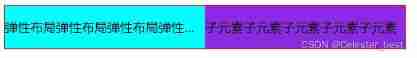
Elastic layout elastic layout elastic layout elastic layout elastic layout elastic layout elastic layout elastic layout elastic layout elastic layout
</p>
</div>
<div class="item-wrap2">
<p class="p-wrap"> Subelement subelement subelement subelement subelement </p>
</div>
</div>
</template>
<script>
export default {
name: "FlexeDemo",
};
</script>
<style scoped>
.flex-wrap {
width: 500px;
border: 1px solid red;
display: flex;
}
.item-wrap1 {
flex: 1;
background-color: aqua;
}
.item-wrap2 {
flex: 1;
background-color: blueviolet;
}
.p-wrap {
white-space: nowrap;
overflow: hidden;
text-overflow: ellipsis;
}
</style>
resolvent :
Add... To the child element width:0 Properties of
.item-wrap1 {
  flex: 1;
  width: 0;
  background-color: aqua;
}
.item-wrap2 {
  flex: 1;
  width: 0;
  background-color: blueviolet;
}
ps: How the spindle is vertical , You need to set height.
边栏推荐
- [2. Basics of Delphi grammar] 4 Object Pascal operators and expressions
- DRF --- response rewrite
- 传感器尺寸、像素、DPI分辨率、英寸、毫米的关系
- Research Report on development prediction and investment direction of nylon filament sewing thread in China (2022 Edition)
- Develop those things: add playback address authentication to easycvr platform
- Win10+vs2019 Community Edition compiling OpenSSL
- Nielseniq found that 60% of the re launched products had poor returns
- Subnet division and summary
- Record 3 - the state machine realizes key control and measures the number of external pulses
- [Verilog quick start of Niuke network question brushing series] ~ priority encoder circuit ①
猜你喜欢

Domestic spot silver should be understood

transform. Forward and vector3 Differences in the use of forward

New patent applications and transfers
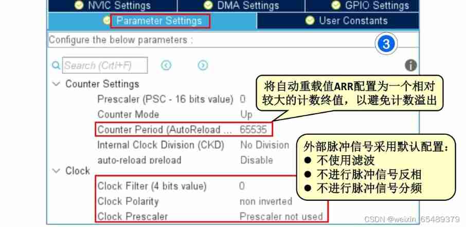
Record 3 - the state machine realizes key control and measures the number of external pulses
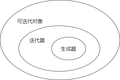
The difference and relationship between iteratible objects, iterators and generators

Cassette helicopter and alternating electric field magnetic manometer DPC

Penetration practice vulnhub range Keyring

2022 Heilongjiang latest fire protection facility operator simulation test question bank and answers

Rotation order and universal lock of unity panel

Extract the compressed package file and retrieve the password
随机推荐
From comedians to NBA Zhan Huang, check the encrypted advertisements during this super bowl
Nearly 60% of the employees strongly support Ctrip's "3+2" working mode, and work at home for two days a week
2022 Heilongjiang latest fire protection facility operator simulation test question bank and answers
Set the style of QT property sheet control
How to learn automated testing?
Length of learning and changing
JS how to convert a string with a delimiter into an n-dimensional array
Develop those things: add playback address authentication to easycvr platform
What is web application security testing technology?
开发那些事儿:EasyCVR平台添加播放地址鉴权
In depth evaluation and development trend prediction report of China's ice cream market (2022 Edition)
To improve the efficiency of office collaboration, trackup may be the best choice
SPIE Western optoelectronics exhibition returned offline and successfully held a science and engineering event
Equipment simulation and deduction training system software
Irradiance, Joule energy, exercise habits
Development cost of smart factory management system software platform
Oracle TRUNC function processing date format
L'ouverture d'un compte d'actions en ligne est - elle sécurisée? Fiable?
Openlayers customize bubble boxes and navigate to bubble boxes
The new server is packaged with the source code of H5 mall with an operation level value of several thousand